


Responsive web design adjusts to the size and capabilities of every device or browser it’s viewed on, thereby guaranteeing that visitors always see the best possible version of your site. With so many devices, browsers and resolutions available on the market today, creating a responsive website is now essential for crafting a successful user experience.
If you’re a designer or web creator about to embark on a new responsive project, you’ll probably need to adjust to thinking in relative sizes and proportions rather than envisioning one fixed and final layout. Read on for expert tips on how to make a responsive website from start to finish.
Thanks to our friends at Editor X for writing and sponsoring this blog post! Editor X is the advanced website creation platform made exclusively for designers & agencies.
How to make a responsive website
- 1. Get started with wireframes
- 2. Define your breakpoints
- 3. Design for small screens first
- 4. Create a fluid grid
- 5. Optimize images for responsive design
- 6. Optimize typography for responsive design
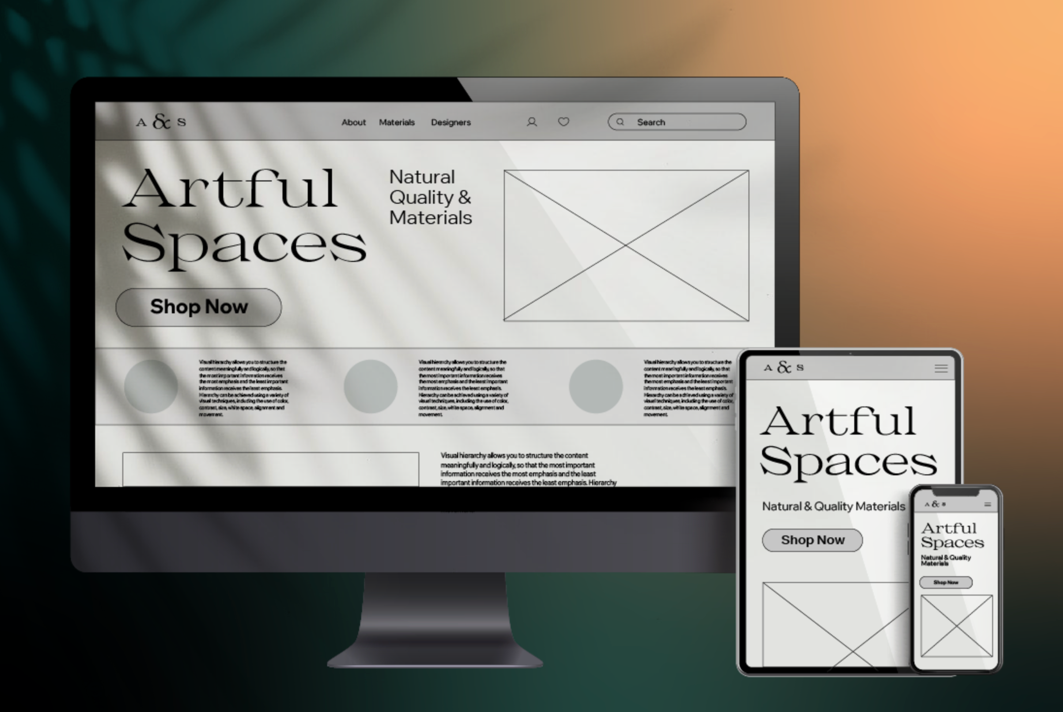
1. Get started with wireframes
The process of creating a responsive website always starts with planning the layout, and there is no better tool for early layouting than wireframes. A wireframe is a schematic representation of a future design, and it’s a convenient method for structuring your layout in an organized, yet low-fidelity manner.
Here are a few important points to consider when wireframing:
✔️ Keep your wireframes unpolished
Speed and simplicity are two key attributes of wireframes. At the early stages of product design, you need to experiment and see what solutions work best for your users. Don’t spend extra time making your wireframes pixel perfect. Instead, create your layout and validate it with your target audience and stakeholders, focusing on functionality and information architecture rather than aesthetics.
✔️ Create wireframes for different groups of devices
Mobile, tablet, and desktop are the most common types of devices that people use to browse the web. When creating wireframes, try and address all three groups to see whether your design scales well across them.
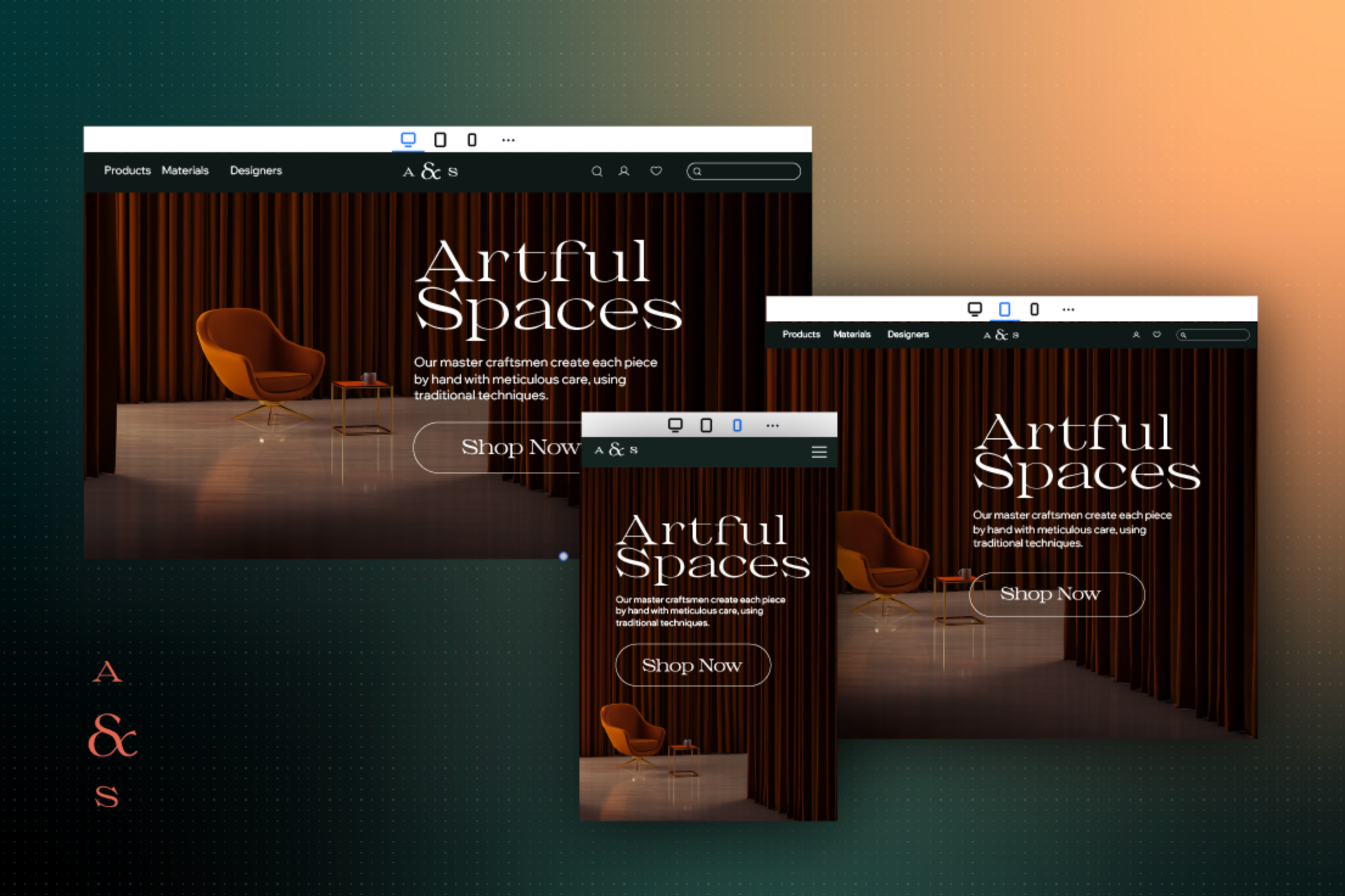
2. Define your breakpoints
Breakpoints are the building blocks of responsive design, making them a crucial step when making a responsive website. Breakpoints are the pixel values at which your design is adjusted, so that visitors always see the best possible version of your site, on any viewport size.
Breakpoints are defined by CSS media queries width (min-width and max-width) and height (min-height and max-height). Those media queries determine the conditions under which specific media attributes are applied, allowing you to change styles based on the type of device or browser that renders the content.
If you’re building your website on Editor X, you’ll have 3 default breakpoints to start with: desktop (1,001 pixels and up), tablet (751-1,000 pixels) and mobile (350-750 pixels). You can also edit the existing breakpoints or add custom breakpoints to fit your project’s needs, code-free.
While there is no universal set of breakpoints, there are a few recommendations you can follow when choosing yours:
- Try to maintain the least number of breakpoints possible. Since designers have to adjust content to match breakpoints, you should strive for around 3 breakpoints for the most device flexibility.
- The main criteria in choosing your breakpoints shouldn’t be your devices, but the content you have. Your content should determine how the layout adjusts to its container.
✔️ Customize the design for every viewport
Be intentional about what you show or hide at different breakpoints. For example, a common approach on mobile is to hide top-level navigation options and use hamburger menus instead. This approach helps you save more real estate on your screen and makes the experience more content-focused. At the same time, make sure not to hide any content that can detract from the user experience.
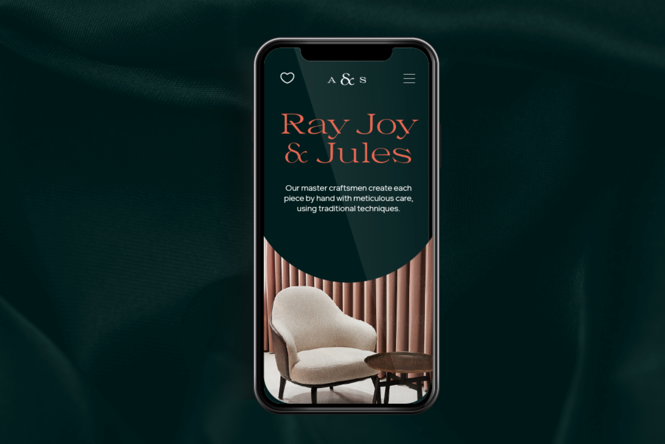
3. Design for small screens first
When it comes to creating responsive layouts, most designers follow a mobile-first approach, meaning they design the content to fit a small screen size first. Create a layout that works well at the smallest breakpoint and then adjust it for larger viewports.
✔️ Practice a content-first way of thinking
When designers craft a mobile experience, they have to think about what content they want to provide users with, and in what order. The small screen size is great motivation to conduct content inventory, evaluate the content and prioritize it according to the needs of end-users. This process helps distinguish essential content from unnecessary elements that on smaller screens, can become a distraction.
The content-first approach also helps create a more solid visual hierarchy. By clearly prioritizing your content and messages, you’re likely to decide what content should be viewed first, what should come up second and so on.
✔️ Consider the physical characteristics of the device itself
When you design for mobile, you don’t only design for a small screen size. You also design for a touchscreen. Both content and interactive elements should be optimized for comfortable interaction with a finger. It is possible to use media queries like orientation and aspect-ratio to define condition checks and alter the design based on the user’s device.
✔️ Test your design on a real device
A design might look perfect on your monitor, but as soon as you start interacting with it on your smartphone, you notice some drawbacks. Define a few key scenarios of interaction such as key tasks that your users want to complete on your website, and try to complete them yourself on an actual mobile phone.
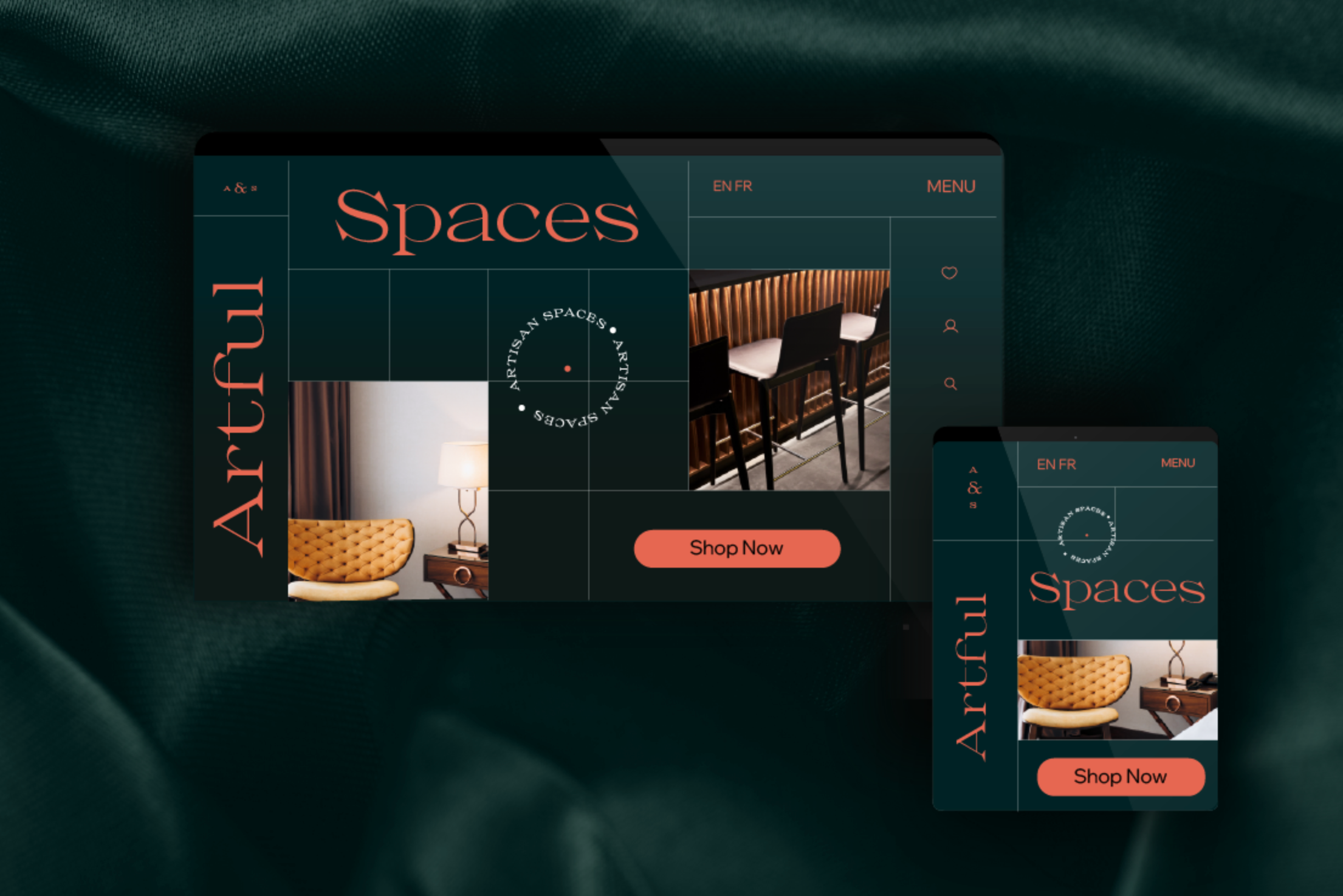
4. Create a fluid grid
A grid is a two-dimensional framework consisting of columns and rows that allows you to precisely position UI elements on a page. Proper use of a grid will help you avoid situations in which individual UI elements overlap in different screen sizes, resulting in a solid layout that’s fully responsive.
Grid allows for the flexibility of creating a tailored layout for each breakpoint you’ve defined, so that the content and design will perfectly fit each viewport. Changing the number of columns and rows in a grid, as well as their size and spacing, can create a better layout for site visitors.
The size of the columns and rows can be defined using different types of grids:
- Fixed (pixels): To create such a grid, you need to set the size of one of your columns or rows to a specific number of screen pixels. This grid type means that your one or all of your columns or rows will maintain a fixed size across all devices.
- Fluid (percentages or fractions): Fluid grids automatically adjust to the available screen space, maintaining a consistent look and feel across multiple devices. Using fraction as a measuring unit makes the size of grid items proportional to each other (e.g. in a grid of 2 columns, if the fraction for the left column is set to 2, and the fraction of right one is set to 1, the left column will take up 2/3 of the available screen space).
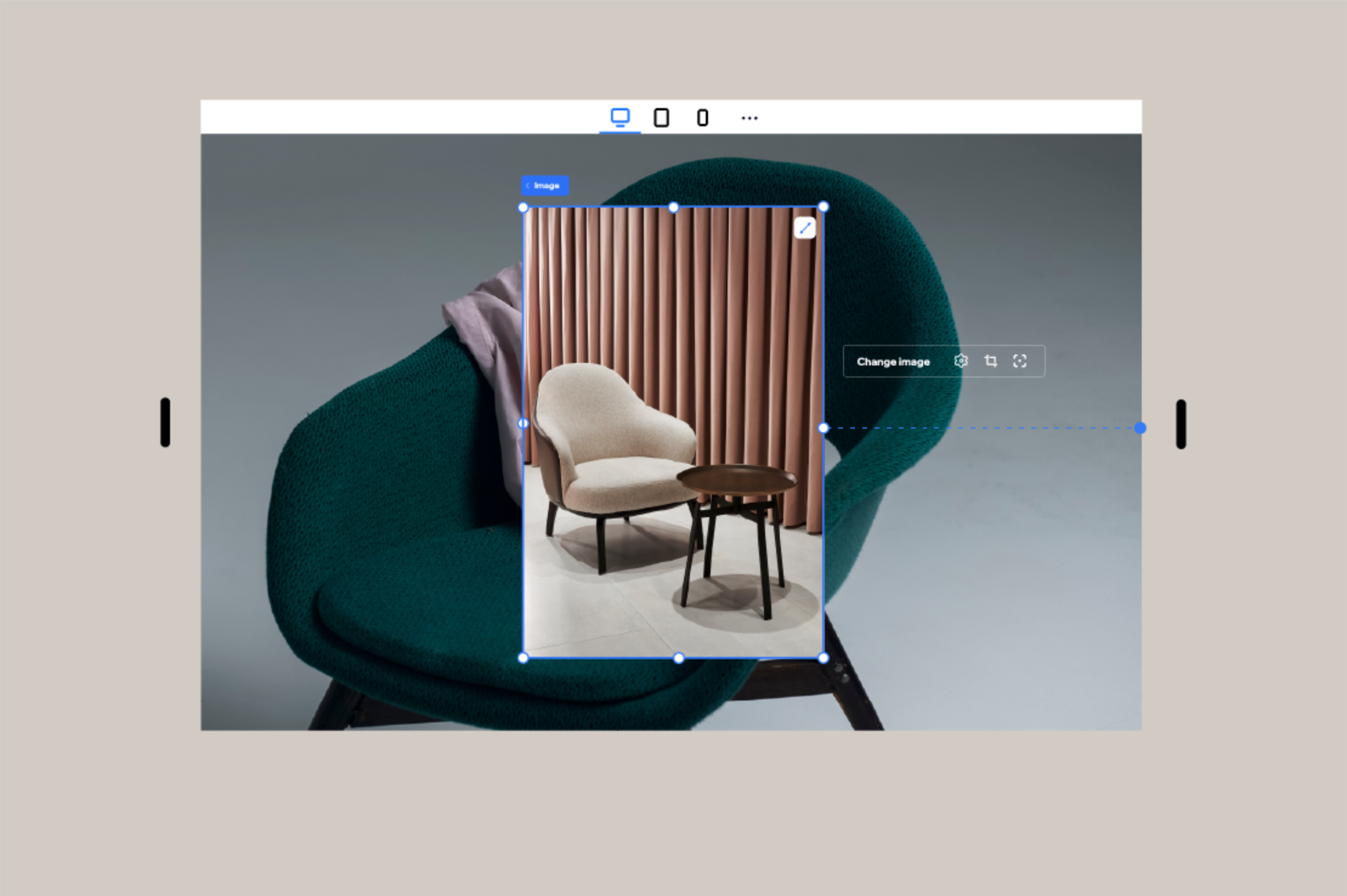
5. Optimize images for responsive design
The quality of images greatly affects the perception of a design. A web page with crisp, properly-sized pictures is more likely to make a positive impression on the site’s visitors.
The problem with images is that they are not naturally fluid, yet you can still modify them to different resolutions. It’s vital to ensure that your visuals retain their highest quality and correct aspect ratio on every screen size.
✔️ Resize images appropriately
It’s possible to resize an image with:
- CSS: The CSS width and max-width attribute can help you to adapt the image to different screen resolutions. The width property defines the fixed width of the image, while max-width makes your image maintain its exact aspect ratio and proportions.
- Editor X: Editor X creators don’t have to use CSS to make their images look great on every screen resolution. Instead, you can control an image’s fluidity by setting an exact width or height, and alternatively by setting a max width or height in percentage or pixel values. This option will scale the image proportionally to the viewport.
Start creating a responsive web design with Editor X today.
High-resolution devices might need to render images at two or three times the normal resolution to achieve decent visual quality (@2x, and @3x). There are various online tools, like Responsive Breakpoints, that can generate the optimal responsive image dimensions.
✔️ Use SVG files when possible
Raster images (images in JPG and PNG formats) have fixed resolutions, but Scalar Vector Graphic (SVG) images are resolution-independent because they’re a vector format that allows the images to scale in size without losing quality.
As a result, SVGs retain the same quality at all resolutions and don’t require any extra optimization. When using vector graphics, try to use SVG files so that they easily scale.
6. Optimize typography for responsive design
Images and text are two building blocks of a web experience. Good readability and legibility are essential properties of a good user experience.
✔️ Select a font family that scales well
When choosing a font family for your design, be sure that your font selection works well both on large and small displays. This allows your typeface to scale nicely across different screen sizes and resolutions. Generally, it’s recommended to use web-safe fonts, or some of the best fonts for websites like Helvetica and Roboto, because they are optimized to look good at different resolutions.
✔️ Define font size in fluid units
Apart from choosing the right font family, it’s also vital to ensure your text will scale smoothly as you resize the screen. Mobile users should never have to pinch to zoom to read the content.
There are many ways designers can define font size, mainly fixed (pixels) and fluid (em and rems). Rems is a type of unit defined in CSS3; font size for text in a container will be selected based on the container width.
Here is a code sample for font size in rems:
html { font-size:100%; }
@media (min-width: 320px) { body {font-size:1rem;} }
@media (min-width: 640px) { body {font-size:1.5rem;} }
Using text scale, Editor X creators can set a minimum and maximum font size for any text element in the editor. You can also set the text to scale between different ranges of maximum and minimum size for different breakpoints to make your website typography fully responsive.
Ready to design a beautiful responsive website? Start creating on Editor X today. ■
✏️ Thanks to Nick Babich for writing this article and Anita Goldstein for designing the graphics.
Find more Process stories on our blog Courtside. Have a suggestion? Contact stories@dribbble.com.


