The housing market continues to set new records.
The S&P CoreLogic Case-Shiller U.S. National Home Price Index just reported its highest one-year gain in history, up nearly 19% through the end of June.
And these gains aren’t concentrated in certain markets.
This real estate bull market is nationwide. Case-Shiller also has an index that measures the 20 major metropolitan areas across the country. It’s up 19% over the past year and 19 of the 20 cities are at new all-time highs.1
These gains are obviously abnormal and can’t last forever.
However, I remain firmly entrenched in the camp that this isn’t another housing bubble. There are structural and market forces that are causing these price gains, even if it all feels out of hand.
You have household formation among the biggest demographic (millennials), generationally low interest rates, constrained supply from a lack of homebuilding following the housing crash and a pandemic that induced people to buy.
But there’s another reason the housing market isn’t as crazy as you think — housing prices in the rest of the developed world have outpaced prices in the U.S. for some time now.
The Dallas Federal Reserve has housing data going back to 1975 for developed markets around the globe. These are the price gains for Australia, Canada, France, the United Kingdom and the United States:
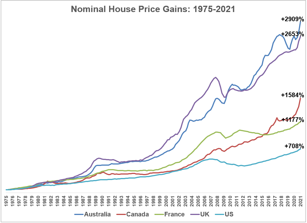
This works out to annual appreciation rates of 7.6%, 7.4%, 6.3% and 5.7% for Australia, the UK, Canada and France, respectively.
Housing price gains in the U.S. look quaint by comparison at just 4.6% per year.
Of course, there are differences in these markets by population, demographics, cities, housing availability, economies, interest rates, etc. It’s hard to make an apples-to-apples comparison.
Perhaps the best way to level the playing field is to look at these gains on an inflation-adjusted basis:
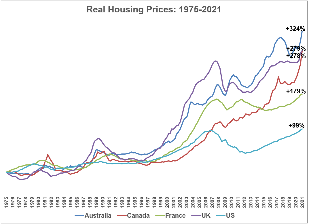
On a real basis, the gains in the U.S. housing market look even more muted than they’ve been in these other countries.
These differences become even more pronounced if we compare real housing prices over time to disposable income.
I was surprised to discover disposable income has actually outpaced housing price gains in the United States over the past 45+ years:
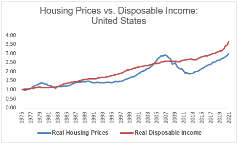
The only extended period of time housing prices were far above disposable income was in the last housing bubble and that quickly corrected.
I wouldn’t have expected this.
Now, this data could be problematic. It could have something to do with the starting point or the compounding nature of this data or some other wonky economic angle I’m missing.
But compare the U.S. chart with that of Australia, the UK, France and Canada:
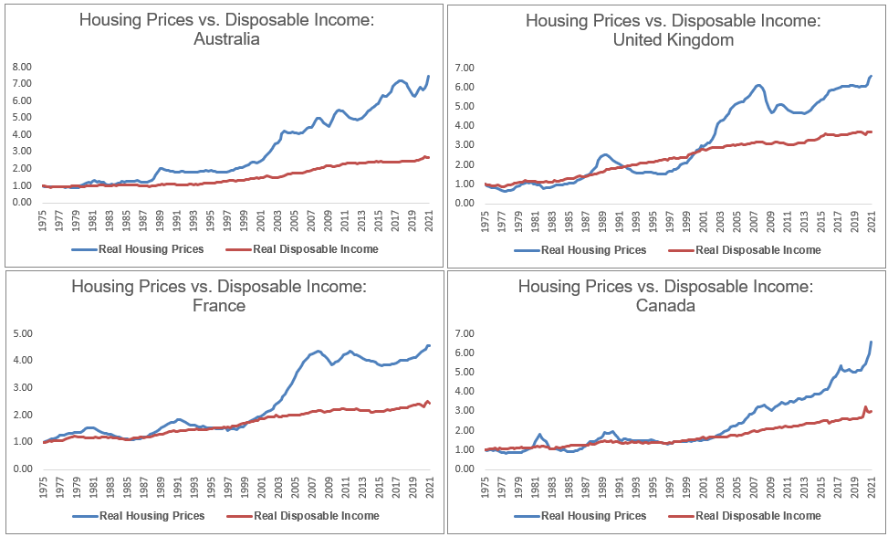
The gap between housing prices and disposable income has gotten progressively worse year after year in these countries. In the U.S., disposable income and housing prices have more or less been moving in lock-step for years.
This is a good summary of all the charts and data I’ve been referencing here for annual growth rates:
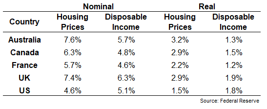
These numbers don’t look quite as bad as the charts but that makes sense when you have close to five decades of data. Compounding over the long haul can make a huge difference.
These numbers don’t make it any easier for those first-time homebuyers in the United States that are having difficulty finding something affordable to buy right now.
However, it could always be worse.
Maybe housing price gains in the U.S. make more sense when you consider them on a relative basis?
Does the U.S. really look like a crazy speculative bubble when compared to these other housing markets?
What if we still have some more catching up to do?
Just throwing it out there…
Further Reading:
Why This is Not Another Housing Bubble
1Chicago is the only one that still hasn’t taken out its previous highs.