Data Journalism Top 10: A New President, Trump’s Twitter Insults, Germany’s Elections, Flying Green
Read this article in
As Joe Biden was sworn in as the 46th president of the United States, much of the international media coverage was focused on an inauguration like no other. Our NodeXL #ddj mapping from January 18 to 24 found a Washington Post analysis of the president’s first address to the nation and a Bloomberg project visualizing the enhanced measures put in place to deal with concerns about security and the coronavirus. In this edition, we also feature a complete list of ex-President Donald Trump’s Twitter insults by The New York Times, an interactive map to follow Germany’s “super election year,” and a discussion of disability, race, and patriarchy in data visualization.
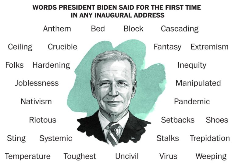
Biden’s Inauguration Speech
The world watched closely as Joe Biden delivered his first presidential address on January 20. The new US commander-in-chief called for unity and expressed his ambition to restore the nation’s faith in democracy. His address also featured many words that had never been used in an inaugural speech before. The Washington Post’s infographic highlighted some of the words — such as “folks,” “virus,” and “extremism” — making their inauguration debut.
What a High Security Inauguration Looks Like
The US presidential inauguration came just two weeks after the US Capitol riots, so in addition to precautions against the spread of COVID-19, the ceremony was marked by extraordinary security measures. Bloomberg produced an interactive map to illustrate the extensive planning and coordination behind an inauguration like no other.
COVID-19 Vaccine Conspiracy Theories
While governments worldwide move forward with vaccine rollout plans, false claims and conspiracy theories about immunization campaigns continue to circulate on social media. Nate Silver’s data news and analysis site FiveThirtyEight examined the arguments between vaccine supporters and those in the anti-vaccination movement, and looked at Facebook’s efforts to curb the spread of misinformation.
End of the Merkel Era
Germany has entered a “super election year” with important regional elections in six of the country’s 16 states. The federal election on September 26 will mark the end of an era with Angela Merkel due to step down after four terms as chancellor. The newspaper Berliner Morgenpost built a special platform to follow the latest election news and polls as voters prepare to cast their ballots.
Vaccinations: When Is Your Turn?
While immunization campaigns are still in their early stages, many countries have already identified priority vaccination groups. In Germany, the newspaper Süddeutsche Zeitung created an interactive tool to help readers find out when they can expect to get their appointment.
Twitter Insults
During his time in office, then-President Trump was infamous for his use of social media. Before Twitter suspended his account on January 8, he often used the platform to post verbal attacks on his opponents and critics. The New York Times published a list documenting Trump’s Twitter insults from the time he declared his candidacy in 2015 to the day he was permanently banned.
Coups and Democracy
In the aftermath of the attack on the Capitol, the world tried to make sense of what the unprecedented event might mean for the future of US democracy. Looking for answers, The Washington Post analyzed data compiled by John Polga-Hecimovich, a Naval Academy political scientist, on 64 “self-coups” attempted worldwide since 1900.
Making Flying Green
In an attempt to make air travel less environmentally harmful, a UN-brokered deal came into force in January. The Carbon Offsetting and Reduction Scheme for International Aviation scheme aims to curb the sector’s net greenhouse gas emissions. But according to an analysis by Deutsche Welle, the mechanism is flawed and unlikely to live up to its promises.
https://twitter.com/dw_environment/status/1352584589923987469
How to Make Data Visualization Better
Infographics often make information more beautiful, but some common design flaws make them inaccessible for visually impaired viewers. In a Twitter thread, data visualization engineer Frank Elavsky suggests ways designers can think beyond colorblindness when considering disabled communities.
Philip Meyer Award Winners
The New York Times’ coronavirus tracking project was the big winner this year at IRE’s coveted Philip Meyer Awards, which recognize the best reporting produced using social science methods. Other publications honored by the judges include The Boston Globe, Reuters, The Marshall Project, and Slate.
Thanks again to Marc Smith and Harald Meier of Connected Action for gathering the links and graphing them. The Top Ten #ddj list is curated weekly.
 Peter Georgiev is GIJN’s social media and engagement editor. Previously, he was part of NBC News’ investigative unit in New York. He also worked as a correspondent for Bulgarian National Television and his reporting has been published by the Guardian, Deutsche Welle, and other international outlets.
For a look at NodeXL’s mapping on #ddj and data journalism on Twitter, check out this map.

Document of the Day: Visual Vocabulary

Tipsheet: Latest Tools for Investigating with Telegram

Investigating Elections: Threat from AI Audio Deepfakes

Updated GIJN Databases (Poverty, Crime, Corruption, and Terrorism)

Data-Driven Journalism: Roundup of Recent Standout Stories

Data Journalism Top 10: Wagner’s Corporate Network, Barbie’s Career History, and Spain’s Election Results

4 Common Angles Data Journalists Use to Tell Stories
Data Journalism Top 10: Everest’s Deadly Legacy, Paris Metro Pollution, Migrant Worker Struggles in Singapore

This work is licensed under a Creative Commons Attribution-NoDerivatives 4.0 International License
Republish our articles for free, online or in print, under a Creative Commons license.
Republish this article
This work is licensed under a Creative Commons Attribution-NoDerivatives 4.0 International License
Read Next
Case Studies Data Journalism GIJC23
Data-Driven Journalism: Roundup of Recent Standout Stories
The best of modern data journalism tells powerful stories that test assumptions. At GIJC23, two experts discussed strong recent investigations and what makes them stand out.
Data Journalism Data Journalism Top 10
Data Journalism Top 10: Wagner’s Corporate Network, Barbie’s Career History, and Spain’s Election Results
GIJN’s weekly round-up of the Top 10 in Data Journalism looks at the Wagner Group’s vast corporate network in Russia, the many careers of Barbie, and Spain’s surprising election results.
Data Journalism News & Analysis
4 Common Angles Data Journalists Use to Tell Stories
At the Online Journalism Blog, data journalism expert Paul Bradshaw analyzed 100 pieces of data that journalists use and found that there are several common story angles.
Data Journalism Data Journalism Top 10
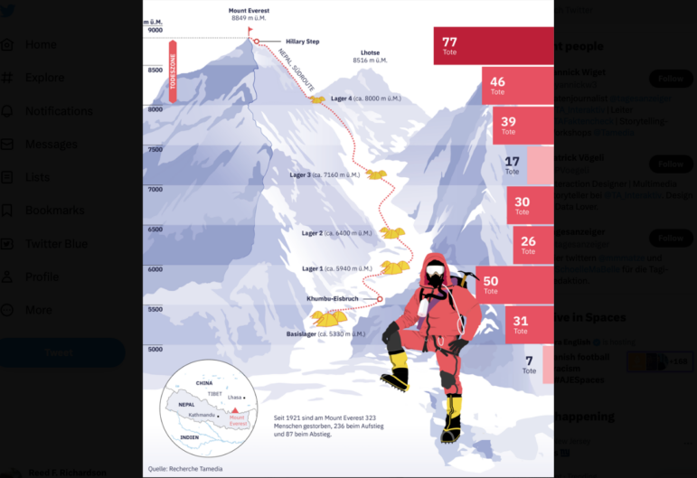
Data Journalism Top 10: Everest’s Deadly Legacy, Paris Metro Pollution, Migrant Worker Struggles in Singapore
This week, GIJN’s Top 10 in Data Journalism examines why the world’s tallest mountain has become increasingly deadly for those trying to climb it, pollution in Paris metro stations, US laws expanding gun access one year after the Uvalde mass shooting, and migrant worker struggles in Singapore.