Coloring plots in R was something I always did using colors in R that are mapped to actual names. For example, Dr. Ying Wei at Columbia University developed an R color cheat sheet with named colors in R. Here is an excerpt from it.
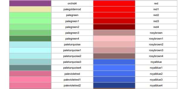
As you can see on the cheat sheet, when you are coloring plots in R, you can call out those colors by the names listed on the cheat sheet so you do not need to use the default plot colors. As an example from the cheat sheet, if you were to set an element equal to the color “orchid4”, it would come out like the color shown on the cheat sheet.
However, as you can tell, that cheat sheet is pretty limited. What if you want to go beyond those named colors when coloring plots in R?
Coloring Plots in R: Palette Inspired by an Image
You may be aware that colors on the web are mapped to hexadecimal codes. Here is an example where I used hexadecimal codes to wake up the colors in an R plot.
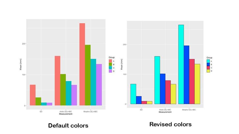
As you can see in the graphic, the original plot has four colors. Here is the code for the original plot that just uses the default colors (accessible on Github).
ggplot(metric_plot_data, aes(x=Measure, y=Mean, fill=Group)) +
	geom_bar(position=position_dodge(), stat="identity") +
	ylab("Mean (mm)") +
	xlab("Measurement")
You can see by the code that the variable “measure” is what is being listed across the x-axis (ED, Histo CEJ-ABC, and Morpho CEJ-ABC). Mean refers to the value being graphed on the y-axis, and Group refers to the grouping of the experimental units. This was the lab study, so I think they were groups of mice. Group=fill is what made R select four default colors and color the bars.
So let’s say you are coloring plots in R and want to recolor this plot. I used to always turn to a cheat sheet to pick out the number of colors I needed, but I felt that was too limiting.
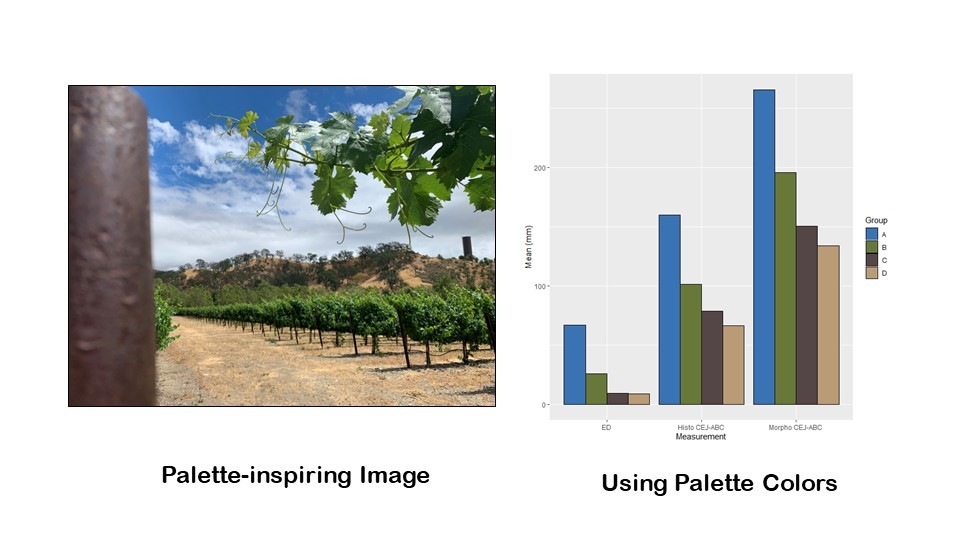
But how do you pick a set of four colors – or any size color palette – that work together very well? One way – the way I basically learned in fashion design school – is to select an image with a color scheme you like. I like to choose an image from nature. For this demonstration, I selected a photo I took when I visited Wente Vineyards in California to inspire my color palette for my four bars in my bar chart. I chose it because I figured I could get a good blue, a solid green, a nice rich dark color from the pole on the left, and a strong neutral that was different from the dark color and wasn’t too light from the ground colors. The diagram shows how I got the codes from these colors off of the image.
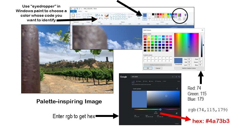
If you open your selected image in Windows Paint or another program where you can look at the properties of selected colors, you can find their “red, green, blue” or “rgb” code. In the diagram, I show how I opened my photograph in Windows Paint, and used the eyedropper feature to put a blue color from the sky on the Paint palette. Then, I used the “edit colors” button to identify the red, green, blue (rgb) code for that blue color, which was Red: 74, Green: 115, and Blue: 179, and is expressed rgb(74,115,179).
Next, I went to Google and searched for “color picker”, and that brought up the online color picker. I typed in the rgb code into the field and hit “enter” (see diagram) to get the hexadecimal code for that color, which was #4a73b3 (they all start with #). I proceeded to do that with all four colors, and I made the following code to remember what they were.
wente_sky <- c("#3a73b3")	#rgb(74,115,179)
wente_leaf <- c("#687839")	#rgb(104,120,57)
wente_pole <- c("#544646") 	#rgb(84,70,70)
wente_ground <- c("#b99b75")	#rgb(185,155,117)
I named them very unique names (e.g., wente_sky instead of skyblue) so they didn’t conflict with existing names from palettes as I showed you above. Next, I assembled them into a string called wente_colors using my new names.
wente_colors <- c(wente_sky, wente_leaf, wente_pole, wente_ground)
This way, I can easily troubleshoot the plot. If I don’t like how the light color – the wente_ground color looks – I know which one of these to edit. I can rearrange them in the string, choose another color and set another variable name and put that in the string to tweak the image, and so on.
Then, to add these colors in instead of the default ones, I made this revised code.
ggplot(metric_plot_data, aes(x=Measure, y=Mean, fill=Group)) +
	geom_bar(position=position_dodge(), stat="identity", color='black') +
	ylab("Mean (mm)") +
	xlab("Measurement") +
	scale_fill_manual(values=wente_colors)
To see the changes, first, look at the geom_bar line. You will see that I added color=’black’ in the call. That’s really just to add the black outline. I still am calling up fill=Group in the aes statement. Ggplot2 is sequential, so what code comes first and what code comes after that matters. Because I put the fill=Group in the aes, R is basically plotting the original default colors all the way through until the last line, which is a new one I added.
The last line, scale_fill_manual, specifies values to overwrite from the fill instructions earlier. You will see I added the argument values = wente_colors, which is the string. If R errors out on this line, a typical mistake is that you have a different amount of things to color than you have specified colors. Imagine I had only included three items in the wente_colors string. Since I have four groups and four colors, that would have caused R to error.
Here's the recolored plot – and personally, I think it looks fabulous!
Coloring Plots in R: Using a “Canned” Palette
If you are making a gorgeous white paper that is long and has a lot of plot, it probably makes sense for you to invest the time to make a palette based on an image. But for these four bars or similar use-cases, I always found it too time-consuming!
That’s why I was so happy when I discovered the web site Coolors.co which lets you shop for canned palettes! Please take a look at my video to see how I shopped for a palette in Coolors.co and came up with the colors I ultimately chose for the plot in the article.
Basically, Coolors.co offers you color bars with the hexadecimal code printed on them that you can copy to the clipboard and paste into your R code. When I made this plot, I had made another plot for another customer recently using these “cool” colors, so I just copied the string out of the previous code.
cool_colors <- c("#00FFED", "#004CFF", "#ED3B61", "#EDED44")
You will see here that I jumped over the step of naming each color, and just lined up all four hexadecimal codes as a string called cool_colors. This would not be easy to troubleshoot, but I guess I was in a hurry!
ggplot(metric_plot_data, aes(x=Measure, y=Mean, fill=Group)) +
	geom_bar(position=position_dodge(), stat="identity", color='black') +
	ylab("Mean (mm)") +
	xlab("Measurement") +
	scale_fill_manual(values=cool_colors)
As you can see, it’s the same old code, but the last line overwrites the default colors using scale_fill_manual and this time specifying our new cool_colors vector. This produces the “beach ball” colors in the plot labeled “revised colors”. Don’t forget – you can get the code on Github here.
Updated October 10, 2022. Added banner October 31, 2022. Updated banners June 16, 2023.
Read all of our data science blog posts!

Descriptive Analysis of Black Friday Death Count Database: Creative Classification
Descriptive analysis of Black Friday Death Count Database provides an example of how creative classification [...]
Nov

Classification Crosswalks: Strategies in Data Transformation
Classification crosswalks are easy to make, and can help you reduce cardinality in categorical variables, [...]
Nov

FAERS Data: Getting Creative with an Adverse Event Surveillance Dashboard
FAERS data are like any post-market surveillance pharmacy data – notoriously messy. But if you [...]
Nov

Dataset Source Documentation: Necessary for Data Science Projects with Multiple Data Sources
Dataset source documentation is good to keep when you are doing an analysis with data [...]
Nov

Joins in Base R: Alternative to SQL-like dplyr
Joins in base R must be executed properly or you will lose data. Read my [...]
Nov

NHANES Data: Pitfalls, Pranks, Possibilities, and Practical Advice
NHANES data piqued your interest? It’s not all sunshine and roses. Read my blog post [...]
Nov

Color in Visualizations: Using it to its Full Communicative Advantage
Color in visualizations of data curation and other data science documentation can be used to [...]
Oct

Defaults in PowerPoint: Setting Them Up for Data Visualizations
Defaults in PowerPoint are set up for slides – not data visualizations. Read my blog [...]
Oct

Text and Arrows in Dataviz Can Greatly Improve Understanding
Text and arrows in dataviz, if used wisely, can help your audience understand something very [...]
Oct

Shapes and Images in Dataviz: Making Choices for Optimal Communication
Shapes and images in dataviz, if chosen wisely, can greatly enhance the communicative value of [...]
Oct

Table Editing in R is Easy! Here Are a Few Tricks…
Table editing in R is easier than in SAS, because you can refer to columns, [...]
Aug

R for Logistic Regression: Example from Epidemiology and Biostatistics
R for logistic regression in health data analytics is a reasonable choice, if you know [...]
1 Comments
Aug

Connecting SAS to Other Applications: Different Strategies
Connecting SAS to other applications is often necessary, and there are many ways to do [...]
Jul

Portfolio Project Examples for Independent Data Science Projects
Portfolio project examples are sometimes needed for newbies in data science who are looking to [...]
Jul

Project Management Terminology for Public Health Data Scientists
Project management terminology is often used around epidemiologists, biostatisticians, and health data scientists, and it’s [...]
Jun

Rapid Application Development Public Health Style
“Rapid application development” (RAD) refers to an approach to designing and developing computer applications. In [...]
Jun

Understanding Legacy Data in a Relational World
Understanding legacy data is necessary if you want to analyze datasets that are extracted from [...]
Jun

Front-end Decisions Impact Back-end Data (and Your Data Science Experience!)
Front-end decisions are made when applications are designed. They are even made when you design [...]
Jun

Reducing Query Cost (and Making Better Use of Your Time)
Reducing query cost is especially important in SAS – but do you know how to [...]
Jun

Curated Datasets: Great for Data Science Portfolio Projects!
Curated datasets are useful to know about if you want to do a data science [...]
May

Statistics Trivia for Data Scientists
Statistics trivia for data scientists will refresh your memory from the courses you’ve taken – [...]
Apr

Management Tips for Data Scientists
Management tips for data scientists can be used by anyone – at work and in [...]
Mar

REDCap Mess: How it Got There, and How to Clean it Up
REDCap mess happens often in research shops, and it’s an analysis showstopper! Read my blog [...]
Mar

GitHub Beginners in Data Science: Here’s an Easy Way to Start!
GitHub beginners – even in data science – often feel intimidated when starting their GitHub [...]
Feb

ETL Pipeline Documentation: Here are my Tips and Tricks!
ETL pipeline documentation is great for team communication as well as data stewardship! Read my [...]
Feb

Benchmarking Runtime is Different in SAS Compared to Other Programs
Benchmarking runtime is different in SAS compared to other programs, where you have to request [...]
Dec

End-to-End AI Pipelines: Can Academics Be Taught How to Do Them?
End-to-end AI pipelines are being created routinely in industry, and one complaint is that academics [...]
Nov

Referring to Columns in R by Name Rather than Number has Pros and Cons
Referring to columns in R can be done using both number and field name syntax. [...]
Oct

The Paste Command in R is Great for Labels on Plots and Reports
The paste command in R is used to concatenate strings. You can leverage the paste [...]
Oct

Coloring Plots in R using Hexadecimal Codes Makes Them Fabulous!
Recoloring plots in R? Want to learn how to use an image to inspire R [...]
Oct

Adding Error Bars to ggplot2 Plots Can be Made Easy Through Dataframe Structure
Adding error bars to ggplot2 in R plots is easiest if you include the width [...]
Oct

AI on the Edge: What it is, and Data Storage Challenges it Poses
“AI on the edge” was a new term for me that I learned from Marc [...]
Jun

Pie Chart ggplot Style is Surprisingly Hard! Here’s How I Did it
Pie chart ggplot style is surprisingly hard to make, mainly because ggplot2 did not give [...]
Apr

Time Series Plots in R Using ggplot2 Are Ultimately Customizable
Time series plots in R are totally customizable using the ggplot2 package, and can come [...]
Apr

Data Curation Solution to Confusing Options in R Package UpSetR
Data curation solution that I posted recently with my blog post showing how to do [...]
Apr

Making Upset Plots with R Package UpSetR Helps Visualize Patterns of Attributes
Making upset plots with R package UpSetR is an easy way to visualize patterns of [...]
4 Comments
Apr

Making Box Plots Different Ways is Easy in R!
Making box plots in R affords you many different approaches and features. My blog post [...]
Mar

Convert CSV to RDS When Using R for Easier Data Handling
Convert CSV to RDS is what you want to do if you are working with [...]
Mar

GPower Case Example Shows How to Calculate and Document Sample Size
GPower case example shows a use-case where we needed to select an outcome measure for [...]
Feb

Querying the GHDx Database: Demonstration and Review of Application
Querying the GHDx database is challenging because of its difficult user interface, but mastering it [...]
Feb

Variable Names in SAS and R Have Different Restrictions and Rules
Variable names in SAS and R are subject to different “rules and regulations”, and these [...]
Feb

Referring to Variables in Processing Data is Different in SAS Compared to R
Referring to variables in processing is different conceptually when thinking about SAS compared to R. [...]
Jan

Counting Rows in SAS and R Use Totally Different Strategies
Counting rows in SAS and R is approached differently, because the two programs process data [...]
Jan

Native Formats in SAS and R for Data Are Different: Here’s How!
Native formats in SAS and R of data objects have different qualities – and there [...]
Jan

SAS-R Integration Example: Transform in R, Analyze in SAS!
Looking for a SAS-R integration example that uses the best of both worlds? I show [...]
Dec

Dumbbell Plot for Comparison of Rated Items: Which is Rated More Highly – Harvard or the U of MN?
Want to compare multiple rankings on two competing items – like hotels, restaurants, or colleges? [...]
2 Comments
Sep

Data for Meta-analysis Need to be Prepared a Certain Way – Here’s How
Getting data for meta-analysis together can be challenging, so I walk you through the simple [...]
Jul

Sort Order, Formats, and Operators: A Tour of The SAS Documentation Page
Get to know three of my favorite SAS documentation pages: the one with sort order, [...]
Nov

Confused when Downloading BRFSS Data? Here is a Guide
I use the datasets from the Behavioral Risk Factor Surveillance Survey (BRFSS) to demonstrate in [...]
2 Comments
Oct

Doing Surveys? Try my R Likert Plot Data Hack!
I love the Likert package in R, and use it often to visualize data. The [...]
2 Comments
Oct

I Used the R Package EpiCurve to Make an Epidemiologic Curve. Here’s How It Turned Out.
With all this talk about “flattening the curve” of the coronavirus, I thought I would [...]
Mar

Which Independent Variables Belong in a Regression Equation? We Don’t All Agree, But Here’s What I Do.
During my failed attempt to get a PhD from the University of South Florida, my [...]
Aug
Recoloring plots in R? Want to learn how to use an image to inspire R color palettes you can use in ggplot2 plots? Read my blog post to learn how.