


Ever since the gradient trend first took off, designers have continued to find new and innovative ways to use gradients in their work. Gone are the days where gradients ruled the UI world—we’re seeing the color trend being used in so many different applications across the design spectrum from graphic design, to illustration, packaging, and so much more.
To inspire you to get a little gradient crazy, we’re sharing a few simple tips and tricks to try out the next time you work with them. Use these techniques to add a fun twist to an otherwise classic gradient and have fun exploring the endless possibilities!
1. Use Gaussian Blur
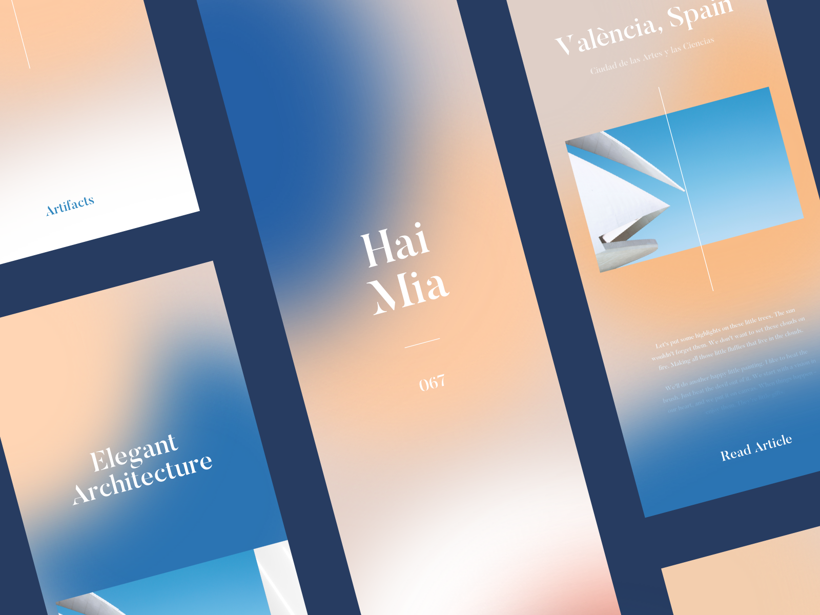
Did you know you can create a gradient effect in Adobe Illustrator without actually using the Gradient tool? To replicate the look and feel of the hazy gradients seen in the Shots below, create a few basic shapes that overlap each other and are different colors. Then, select all shapes and apply the Gaussian Blur effect to create hazy, almost blurry looking color transitions. It’s whimsical, and certainly not your average gradient.
Pro Tip: Before applying Gaussian Blur, go into your ‘Document Raster Effect Settings’ and increase the Pixel number around objects so it’s as high as possible (1000 px should do it). This way, you’ll avoid a choppy looking blur.


Row 1: Valera Pieŭnioŭ for Insoft, Kyle McDowell 🤘🏼, Valery Cheplygin. Row 2: Script & Seal, Omnium, tubik.
2. Create Harsh Lines
Instead of the typical seamless color transitions that you see in gradients, try getting creative with harsher lines. A simple way to do this in Adobe Illustrator is to play around with the color sliders in your Gradients panel. Drag them around to get your desired effect and get inspired by the examples below!
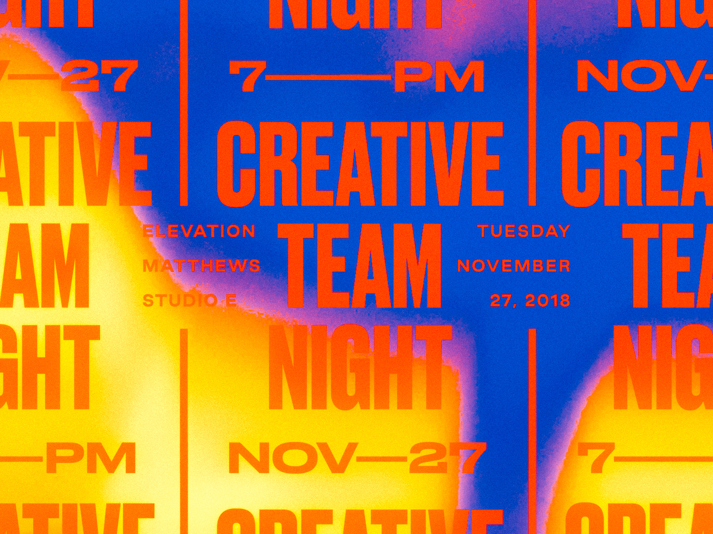


Row 1: Jacob Boyles, Script & Seal, Brent McCormick.
3. Add Texture
Gradients tend to have a very digital look and feel, so a nice way to change things up is to add some texture. In the examples below, designers overlayed a grainy texture over their work. You can easily mimic this effect in Adobe Illustrator by going into Effects in your main menu, hitting Effects Gallery and finding Grain. There’s a ton of Grain settings to explore within that effect, so have fun experimenting!


Row 1: Pierre-Louis Anceau, Nicholas Franchi, Cory Uehara. Row 2: Terry Edward Elkins, Breton Brander, Gonzalo Vazquez.
4. Experiment With Typography
Another dynamic way to use gradients is to apply them to typography. Combining both gradients and text adds a whole new layer of movement and flow to a design piece. You can add tons of cool gradient effects to your letters whether it be through a drop shadow or a fill, and watch your type come alive.
Pro Tip: Gradients only work with fills and strokes—not fonts. If you’re using a font, make sure you create outlines of your text before trying to apply a gradient. To do this, select your text then find your main menu bar and hit Type —> Create Outlines.

Row 1: Tanya Jacobson, Zachary Styles, hunter ellenbarger for FCTRY.
5. Create a Glossy Illusion
A cool trick to give your designs a three dimensional, glossy feel is to create a gradient with two shades of the same color—this works especially well with shades of gold or silver! Designers Nadia Castro and Jay Fletcher have truly mastered this shine effect so check out their profiles for even more inspiration.
Pro Tip: Try combining this glossy gradient with the Grain effect to add even more dimension.


Row 1: Jay Fletcher, Alex Spenser for syncrely, Jay Fletcher. Row 2: Michael Penda, Jay Fletcher, Miguel Camacho.
We hope these tricks got you excited to try out some new design styles! Have fun experimenting with these techniques and don’t be afraid to get crazy with it—You might just stumble upon your own new unique effects.
More resources:
- 5 online gradient picking tools for designers
- Stuck on color? Try the color palette finding technique graphic designers swear by
- 5 must-know Adobe Illustrator tricks for a faster workflow
Find more Inspiration stories on our blog Courtside. Have a suggestion? Contact stories@dribbble.com.


