
Data Journalism Top 10: From Newsroom to Netflix, Inside the Capitol Riot, Vaccine Data, Facebook for News
Read this article in
As governments around the world continue vaccination efforts and extend lockdowns, some experts argue that more data is needed to evaluate the effectiveness of immunization campaigns and mobility restrictions. Our NodeXL #ddj mapping from January 11 to 18 found outlets in Germany and the United Kingdom analyzing government measures to reduce the impact of the COVID-19 pandemic. In this edition, we also feature an insightful interview with former Washington Post journalist Aaron Williams, an interactive timeline of the US Capitol riot by ProPublica, and a refreshing data visualization project by The Pudding.
Exit Interview: From Data Journalist to Netflix
When Aaron Williams took his first steps in the media industry, having software skills felt like “a cheat code to journalism job security.” But years later, after working for several major outlets, Williams realized that being a skilled data/graphics reporter can actually lock you into zero career growth. In this interview, the former Washington Post journalist talks about his decision to join the streaming site Netflix and shares his view on how news organizations can create healthier environments for their staff.
Inside the Capitol Riot
During the riot at the US Capitol on January 6, users of conservative social media network Parler posted videos of themselves storming the building. A programmer archived thousands of publicly uploaded recordings before the social media service was taken down by its web host. ProPublica selected over 500 of them and created an interactive timeline to illustrate how the riot unfolded.
Turning to Social Media for News
How often do you get your news from Facebook? About a third of Americans use it on a regular basis to keep up to date, according to a new Pew Research Center survey. Other popular news sources for US adults include YouTube and Twitter. Despite the spread of conspiracy theories and other forms of misinformation on social media sites, many users say such platforms help them better understand current events.
Florence Nightingale: Dataviz Pioneer
To most people Florence Nightingale is known as the woman who revolutionized the nursing profession during the Crimean War. Nightingale, however, was also a talented mathematician who understood the power of data. This piece by the Financial Times (paywall) tells the story of how Nightingale — the first woman inducted into the Royal Statistical Society — created remarkable diagrams and other examples of data visualization in the 19th century.
COVID-19 and Migration
For much of the previous decade, refugees and migrants arriving in Europe were at the center of heated political debate. As the global news focus has shifted to the battle against COVID-19, an analysis by online media outlet Voxeurop (also published by the European Data Journalism Network) found the virus has disproportionately affected the mental and physical health of these communities.
Future Crops
You might have come across alarming headlines saying that the world has only 100, 60, or even 30 years of harvests left. This study by researcher Hannah Ritchie for Our World in Data, published by a team at the University of Oxford, traces the origins of these claims and argues that they are exaggerated. Still, Ritchie explains that much of our soil is indeed degrading and gives examples of how to protect it by adopting better agricultural practices.
Vaccine Data
More than four million people in the UK have received their first dose of a COVID-19 vaccine since the rollout started last December, according to figures published by the government. But ITV News’ political editor Robert Peston argues that more data is needed to assess the efficiency and effectiveness of the vaccination operation.
Germany’s New Wave of COVID-19 Lockdown
A sharp rise in COVID-19 cases towards the end of 2020 prompted Germany to extend and expand lockdown rules until January 31. But an analysis of mobility data by the newspaper Süddeutsche Zeitung shows that people are still moving around the country more than they did during the first coronavirus wave last spring. This has led some experts to question the effectiveness of the new lockdown.
A Really Cool Project
If you’ve seen any of the US sitcom “Community,” you probably noticed how often the show’s protagonists say “cool.” The Pudding’s new project visualizes the 412 instances this adjective appears in dialogue across the different series of the show. You can also watch a supercut video of “cool” references on YouTube. Just keep in mind that by the end, the word may completely lose its meaning to you.
Empowering Local Reporting
The US-based Local Media Association, in partnership with the Facebook Journalism Project, has announced it will help smaller and mid-sized news organizations to access and transform data into high-impact local journalism. The pilot project aims to enable newsrooms to tell data-driven stories by analyzing local datasets.
Thanks again to Marc Smith and Harald Meier of Connected Action for gathering the links and graphing them. The Top Ten #ddj list is curated weekly.
 Peter Georgiev is GIJN’s social media and engagement editor. Previously, he was part of NBC News’ investigative unit in New York. He also worked as a correspondent for the Bulgarian National Television. His reporting has been published by The Guardian, Deutsche Welle, and other international outlets.
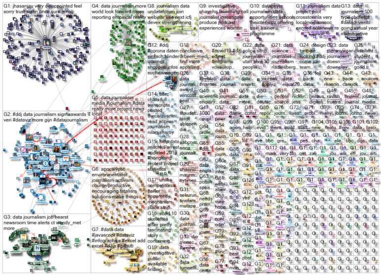
For a look at NodeXL’s mapping on #ddj and data journalism on Twitter, check out this map.

Customise your Browser: Using Add-ons for your Web Research

Tipsheet: Latest Tools for Investigating with Telegram

Investigating Elections: Threat from AI Audio Deepfakes

Updated GIJN Databases (Poverty, Crime, Corruption, and Terrorism)

Data-Driven Journalism: Roundup of Recent Standout Stories
Data Journalism Top 10: Retracing a Migrant Tragedy at Sea, Nepotism in US Politics, and French Police Brutality
Data Journalism Top 10: UK Housing Affordability, Russian Casualty Count, US Book Bans, and Redefining Poverty
Data Journalism Top 10: Everest’s Deadly Legacy, Paris Metro Pollution, Migrant Worker Struggles in Singapore

This work is licensed under a Creative Commons Attribution-NoDerivatives 4.0 International License
Republish our articles for free, online or in print, under a Creative Commons license.
Republish this article
This work is licensed under a Creative Commons Attribution-NoDerivatives 4.0 International License
Read Next
Case Studies Data Journalism GIJC23
Data-Driven Journalism: Roundup of Recent Standout Stories
The best of modern data journalism tells powerful stories that test assumptions. At GIJC23, two experts discussed strong recent investigations and what makes them stand out.
Data Journalism Data Journalism Top 10
Data Journalism Top 10: Retracing a Migrant Tragedy at Sea, Nepotism in US Politics, and French Police Brutality
This week’s Top 10 in Data Journalism looks into a deadly migrant tragedy in the Mediterranean, nepotism in US politics, French police brutality, and record-breaking global warming.
Data Journalism Data Journalism Top 10
Data Journalism Top 10: UK Housing Affordability, Russian Casualty Count, US Book Bans, and Redefining Poverty
In this week’s Top 10 in Data Journalism, GIJN looks at the perilous state of UK housing affordability, tabulating a true Russia casualty count, and the common traits among US banned books.
Data Journalism Data Journalism Top 10
Data Journalism Top 10: Everest’s Deadly Legacy, Paris Metro Pollution, Migrant Worker Struggles in Singapore
This week, GIJN’s Top 10 in Data Journalism examines why the world’s tallest mountain has become increasingly deadly for those trying to climb it, pollution in Paris metro stations, US laws expanding gun access one year after the Uvalde mass shooting, and migrant worker struggles in Singapore.