Is Your Design Inclusive? (And How to Make It More Inclusive)
Is your design for everyone? We talk a lot about creating with an audience in mind, but it’s important to understand that audience can identify in several ways.
Now more than ever before, it is important to create designs and visuals that are inclusive of that entire audience segment. An inclusive aesthetic will make users feel like they are part of the design and that a company, organization, or product is for them.
Inclusivity is more than just accessibility. It’s a combination of function and visual design that creates something that people identify with and want to be a part of.
It’s time to check yourself and your designs, put aside your biases and take a hard look at projects to ensure they are as all-encompassing as they can be. Let’s get started.
The Ultimate Designer Toolkit: 2 Million+ Assets
Envato Elements gives you unlimited access to 2 million+ pro design resources, themes, templates, photos, graphics and more. Everything you'll ever need in your design resource toolkit.


What Is Inclusive Design?
There’s a misconception that inclusive design is made for users with disabilities. While inclusive design can impact this audience, it’s a lot more than that.
The University of Cambridge describes it like this:
Inclusive design emphasizes the contribution that understanding user diversity makes to informing these decisions, and thus to including as many people as possible. User diversity covers variation in capabilities, needs, and aspirations.
Inclusive design takes into account differences in the way people look and interact through imagery and videos. It accounts for function and usability. It presents a more accurate picture of what the world looks like by presenting a range of diversity at all levels.
A website, rand, or company that has an inclusive culture may look this way by default with imagery that reflects different types of people. The challenge is recognizing your own biases (cultural and physical) so that you can show even greater representation.
At the same time, it must be authentic. If you make a women’s product, for example, there are some innate limitations in user imagery. That’s OK. Just take care to show diversity in other ways, such as age or race.
Inclusive Design Checklist
While inclusivity does relate to function, here we are focusing on visual presence. When a visitor sees your design for the first time, what impression are they left with? How does that imagery reflect on the brand as a whole? What are the visitor’s takeaways?
Ask yourself if you have a fair representation of people in images on your website. Do you use words and language that can unintentionally offend? (This happens more commonly than you may think.)
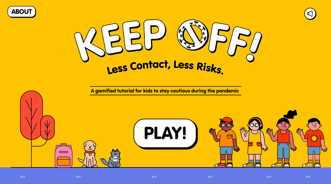
Inclusive design should show a complete range of diversity – ability, language, culture, gender, age, race, and other forms of human difference. It can be something as simple as having an image of someone with a tattoo or as complex as having multiple translations and cultural shifts for content.
Is your design inclusive? Start with a quick analysis.
- Do the people in images look the same? (Age, gender, body shape and size, race, etc.)
- Is content in different backgrounds? (Outside, inside, city, country, etc.)
- Is language welcoming and inviting to all? (Free of stereotypes or degrading terms, etc.)
- Is functionality and usability clear and understandable?
As for the more functional aspects of inclusive web design, this checklist can be a good starting point.
Inclusive Design Principles
Inclusive Design Principles, a project by Henny Swan, Ian Pouncey, Heydon Pickering, and Léonie Watson provides a good starting point for thinking about how to be more inclusive with design. These principles provide guidance for inclusivity in terms of aesthetics, function, and accessibility. (You can even download them as illustrated posters as a reminder.)
The principles include:
- Provide a comparable experience for all users
- Consider situational differences in location, interaction, and ability
- Be consistent with user patterns and functionality
- Give control to users when it makes sense
- Offer choices and alternative user journeys
- Prioritize content with one thing to do or focus on at a time
- Add value with features, content, and visual frameworks
How to Make Projects More Inclusive
This all sounds like a no-brainer, right? You want to create designs that appeal to the widest audience possible.
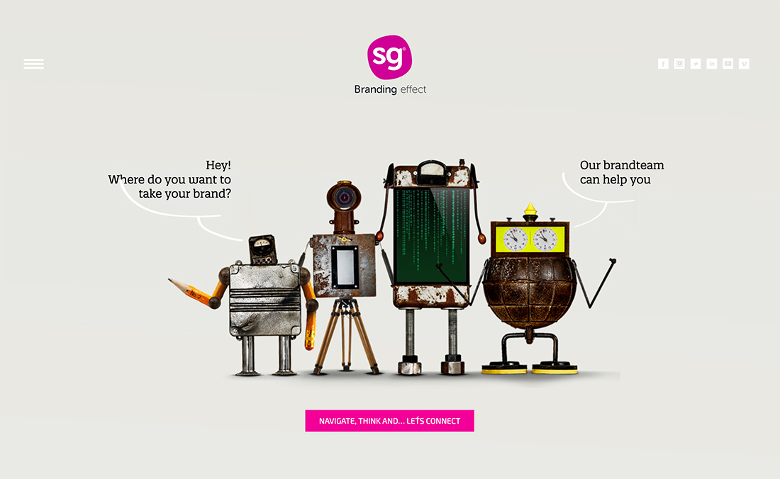
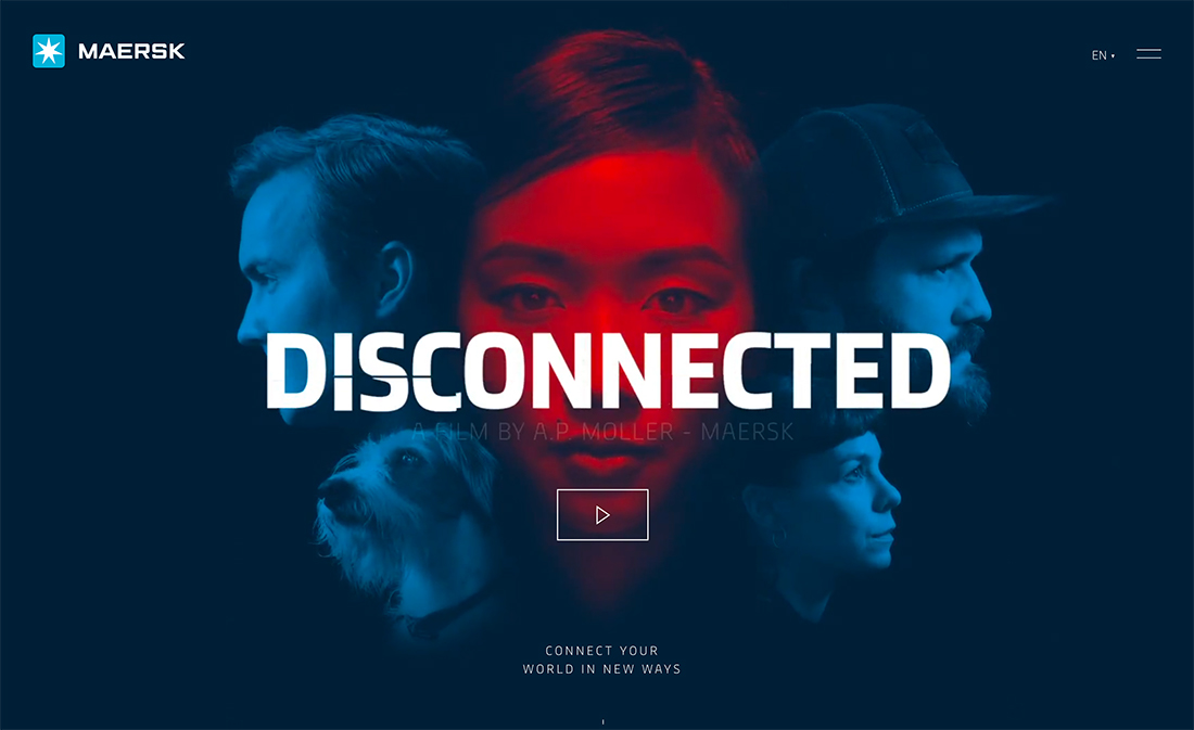
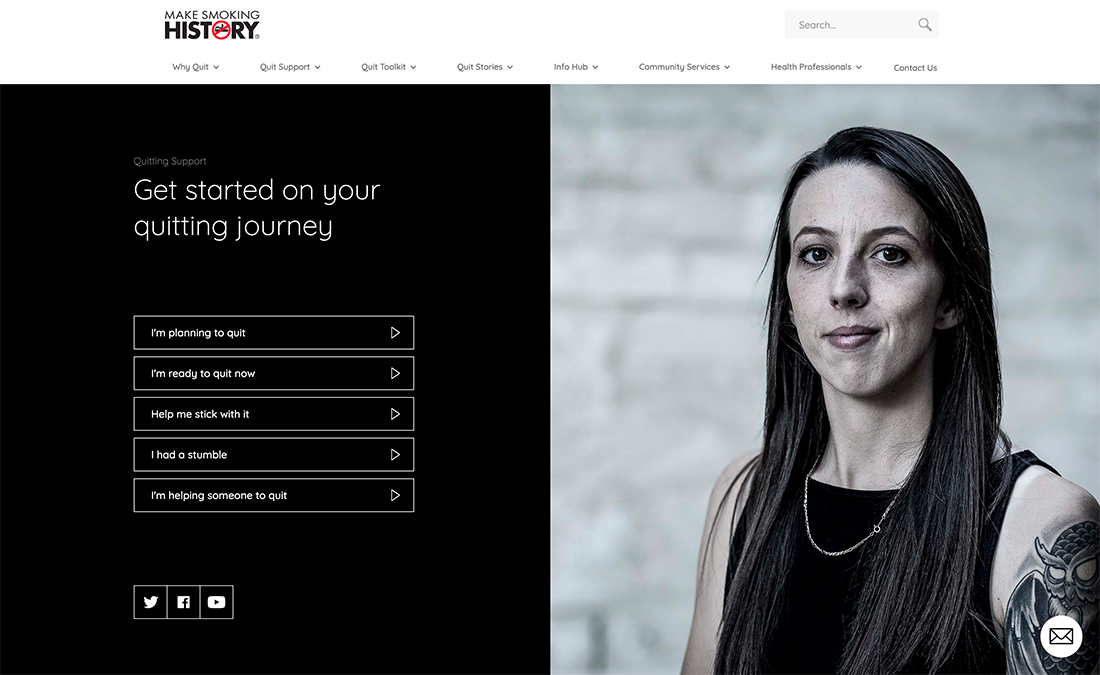
But how often do you come across a website where all the people in the photos are white? Or where none of the children wear glasses? There are so many other instances that show a lack of inclusivity.
Start by thinking about your actual audience. What do they look like? What do they care about? What is important to them? These things should be reflected proportionally in the design.
This is probably a conversation with the design team early in the process. It is likely to be somewhat uncomfortable as well. You will need images and illustrations that reflect this diversity. It makes a lot of sense to communicate this before the photos are taken.
Poll your audience and ask them what they expect to see of your product or brand. Opening lines of communication and gathering that feedback can show you where there are biases that you don’t see and give you an opportunity to be better.
Look at yourself in meetings and photos. Who isn’t a part of your team? When you take a look at your own shortcomings in terms of inclusivity, it is easier to see where there is potential for change. The people who are missing from the conversation could be the most important.
It comes down to this: If your company culture is diverse and inclusive, it is a lot easier to include these people in conversations and create best practices. But if everyone at your table looks and thinks the same, it’s going to be a lot harder to create and design for what you don’t know.
Design decisions to support inclusivity:
- Practice sensitivity; if you think something might be offensive, leave it out
- Warn before harm; let users know if something upsetting may follow
- Provide alternative paths and options
- Take care with alt text; don’t let something slip in that shouldn’t
- Ask questions and test with real people; they will tell you if something isn’t right
Conclusion
Inclusive design comes down to two things: Aesthetics and function. They are equally important, especially in web design.
The first step to creating more inclusive designs is to recognize your own biases. Gather feedback and then work toward creating something that appeals to a wider audience. It’s not always easy, but an inclusive design is good for business because it supports a wider audience base.