- Component IO Custom Components
- Component Development Concepts
- Step 1: Create a Blank Component
- Step 2: Define Fields
- Step 3: Set the Initial Data
- Step 4: Define the Component Code
- Step 5: Preview Your Component
- Step 6: Install the Component on Your Site
- Cue Componentized Workflow!
- Frequently Asked Questions about Creating Custom Components Using Component.io
My Introduction to Component IO article described how you could use pre-built components on any site regardless of the Content Management System, languages, or technologies used. The benefits include:
- hundreds of ready-made, attractive and configurable components to choose from including content blocks, galleries, navigation bars, social media widgets, forms and more
- component code can be installed with a simple cut and paste
- the same components can be used across other pages and sites will updated instantly
- it’s easy for non-technical editors to make changes in a WYSIWYG editor and check it with a live preview
- all users can share Component IO dashboard links and collaborate on the same items
- Component IO is fast and delivers items quickly with a single API call, regardless of the number embedded in the page
- you can switch CMS or build processes at any point and retain components
- a full help guide and real-time chat assistance is available
- a free trial account can be used to test the service with your system.
Component IO Custom Components
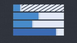
Despite the huge range available, Component IO permits developers to create and edit their own components. In this tutorial, I will illustrate how to create a simple custom bar chart component which can be displayed and configured on any site:
Component Development Concepts
Component IO uses the Vue.js component model. Those with experience with the framework will immediately recognize the concepts and syntax. That said, I’m no Vue.js expert — but a little HTML, CSS and JavaScript knowledge is enough to build a complex component.
All components are encapsulated; their styles and code cannot ‘leak’ to other parts of the page. For example, the bar chart component’s title is an H2 element and we can apply any styles, e.g.
h2 {
  font-family: comic-sans;
  font-size: 8em;
  color: #f00;
}
Vue.js will ensure those (awful!) styles are only applied to our component and not H2 headings elsewhere on the page. However, a style applied to all H2 titles on the page can cascade to our component title. This can be useful since our component can inherit default fonts, colors and dimensions.
Step 1: Create a Blank Component
Log in to component.io, and then click Blank component on the Project page:
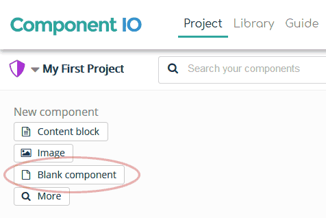
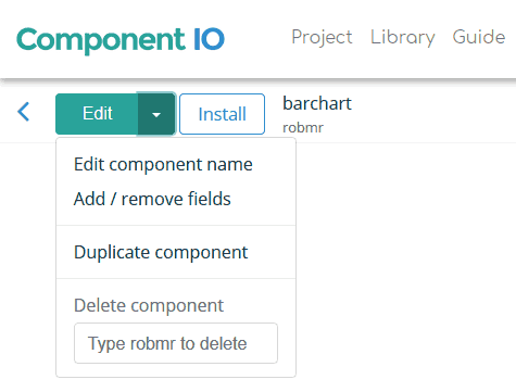
From the Edit menu, choose Edit component name and enter “barchart” or another suitable name.
Step 2: Define Fields
Fields are used to configure a component. They allow:
- Content editors to modify values.
- Other components to be created with a different configuration. For example, if we require two bar charts, we can duplicate the first and change the field values accordingly.
From the Edit menu, choose Add / remove fields and enter the fields you require:
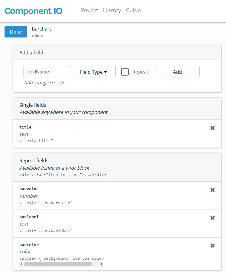
For this control, I defined:
- A single title text field.
- The barvalue numeric field which defines the bar’s value.
- The barlabel text field which defines the bar’s label.
- The barcolor color field which defines the bar’s color.
These last three items had the repeat checkbox checked. We can therefore define any number of data items in our bar chart.
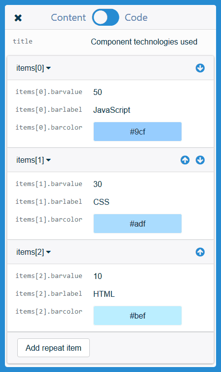
Step 3: Set the Initial Data
Hit the Edit menu to open the Content and Code control. Remaining in the Content section, I entered values for the title and three data items:
Step 4: Define the Component Code
Hit the Code toggle to open the code editor. This is where the component’s HTML, CSS and JavaScript is defined:
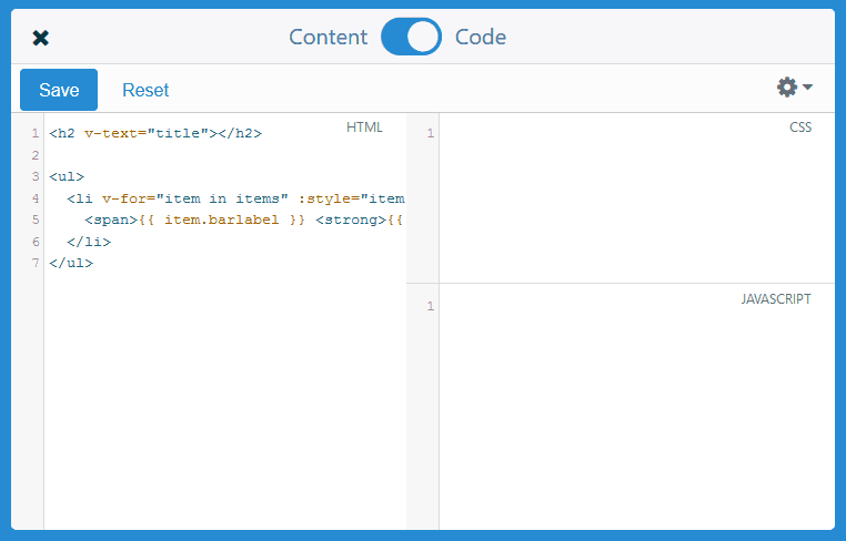
The component HTML documentation describes how templates are created. There is no need for an outer DIV or other element because the component will be automatically given one.
The title field is added first:
<h2 v-text="title"></h2>
Alternatively, we could use:
<h2>{{ title }}</h2>
The chart bars will be contained in a <ul> list element where each <li> displays a single value. The HTML code:
<ul>
    <li v-for="item in items" :style="item.style">
        <span>{{ item.barlabel }}
            <strong>{{ item.barpc }}</strong>
        </span>
    </li>
</ul>
v-for renders the <li> element multiple times depending on the repeating source data (it is assigned to the items array). Note that I have not defined fields for item.style and item.barpc at this stage since they will be calculated in JavaScript code.
The component CSS can now be defined. This will only be applied to the component itself and not any other page elements. Sass SCSS syntax can be adopted for variables, nesting and other functions but I’ve kept it simple here:
h2 {
    font-weight: normal;
}

ul {
    padding: 2px 0;
    margin: 1em 0;
    list-style-type: none;
    border-left: 1px solid #666;
}

li {
    line-height: 1.2;
    padding: 1px 4px;
    margin: 0 0 1px 0;
}

span {
    display: block;
    color: #888;
    mix-blend-mode: difference;
}

strong {
    float: right;
    font-size: 0.8em;
    font-weight: normal;
    line-height: 1.5;
}
Note that I have not set font styles or sizes so the component can inherit these from the page where it is used.
Each Component IO component is a Vue.js instance and can use the standard JavaScript properties and methods. For example:
component.dataholds field values such ascomponent.data.titleandcomponent.data.items[0].barlabel. If we change a value, it will be instantly updated in the component.- the
component.mountedmethod is called as soon as the component has been rendered.
The barchart component requires initialization code to calculate:
- the sum of all bar values (
totValue), and - the highest value (
maxValue). This will have a bar which uses 100% of the available space.
// initialisation
let
    items = component.data.items,
    totValue = 0, maxValue = 0;

for (let i = 0; i < items.length; i++) {
    totValue += items[i].barvalue;
    maxValue = Math.max(maxValue, items[i].barvalue);
    items[i].style = '';
}
The component.mounted method can now calculate each bar’s percentage and create the bar lengths using a CSS background linear-gradient:
// component created
component.mounted = function() {

    for (let i = 0; maxValue && i < items.length; i++) {

        let
            color = items[i].barcolor || '#888',
            pc = Math.round(items[i].barvalue / maxValue * 100);

        // calculate bar percentage
        items[i].barpc = (Math.round(items[i].barvalue / totValue * 100)) + '%';

        // set bar style
        items[i].style = 'background-image:linear-gradient(90deg,' + color + ' ' +
            pc + '%,transparent ' + pc + '%,transparent ' + (100 - pc) + '%);';
    }

};
Hit Save (or press Ctrl + S) and close the editor using the X at the top-left.
Step 5: Preview Your Component
All going well, the component is now rendered as expected:
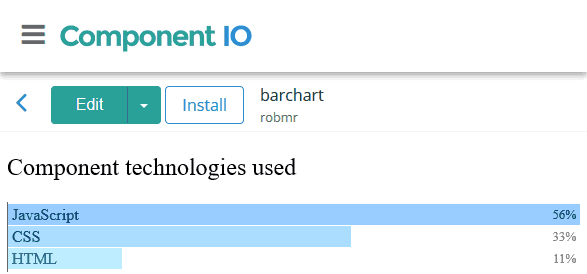
You can change field data to see how it affects the component.
If anything fails, open your browser developer tools (F12 or Ctrl|Cmd + Shift + I) and examine any error messages in the console. The Component IO Guide provides further information about APIs and using code within other frameworks.
Step 6: Install the Component on Your Site
The component can be installed on any website where you are able to insert HTML code (a system such as CodePen.io is ideal). Hit the Install button to view the instructions.
The first component on the page will require both the component HTML, e.g.
<component key=XXXXX></component>
… and the Component IO script (just before the closing </body> tag is ideal):
<script project="YYYYY" src="https://cdn.component.io/v1"></script>
Subsequent components on that page just need their <component> tag.
See the Pen Component.io custom components by Craig Buckler (@craigbuckler) on CodePen.
Users will see an edit icon on the right-hand side of the page if they are logged in to their Component IO account. When they click the icon, they can choose one of the components and edit the field data or code.
Cue Componentized Workflow!
Custom components provides a flexible, modular development workflow for any website regardless of the CMS, server-side language, or technologies. Components can be shared, modified, duplicated and put live without a complicated build process or a rigid CMS plug-in system. You can be productive immediately without having to learn yet another web-based eco-system!
Component IO provides a simple tool which could revolutionize how you approach new features and updates for clients. It’s easy to start with pre-built widgets then create your own component collection. Sign-up is free – you have nothing to lose!
Frequently Asked Questions about Creating Custom Components Using Component.io
What is Component.io and why is it important in creating custom components?
Component.io is a package manager for the web. It allows developers to manage and build web applications using reusable components. This is important in creating custom components because it simplifies the process and makes it more efficient. Instead of writing code from scratch, developers can use existing components and modify them to suit their needs. This not only saves time but also ensures that the components are robust and reliable.
How does Component.io differ from other package managers?
Unlike other package managers, Component.io is specifically designed for the web. It supports both client-side and server-side JavaScript, CSS, images, fonts, and other assets. It also has a simple and intuitive API, making it easy to use even for beginners. Furthermore, it encourages modular development, which promotes code reuse and maintainability.
How do I install Component.io?
To install Component.io, you need to have Node.js and npm (Node Package Manager) installed on your computer. Once you have these, you can install Component.io by running the command ‘npm install -g component’ in your terminal or command prompt. This will install Component.io globally on your computer, allowing you to use it in any project.
How do I create a custom component using Component.io?
Creating a custom component using Component.io involves several steps. First, you need to create a new component using the ‘component create’ command. Then, you need to add dependencies to your component using the ‘component install’ command. After that, you can start writing your component’s code. Once you’re done, you can build your component using the ‘component build’ command. This will generate a build file that you can include in your web application.
Can I use Component.io with other web development tools?
Yes, Component.io can be used with other web development tools. It is compatible with most build tools and module bundlers, such as Webpack and Browserify. It can also be used with task runners like Grunt and Gulp, and testing frameworks like Mocha and Jasmine.
How do I share my custom components with others?
To share your custom components with others, you can publish them on the Component.io registry. This allows other developers to find and use your components in their projects. To publish a component, you need to create a component.json file that describes your component and then run the ‘component publish’ command.
How do I update my custom components?
To update your custom components, you can use the ‘component update’ command. This will fetch the latest versions of your component’s dependencies and update your component accordingly. If you want to update a specific dependency, you can specify it in the command, like ‘component update
How do I manage dependencies in Component.io?
Managing dependencies in Component.io is easy. You can add a dependency to your component by running the ‘component install
Can I use Component.io for large-scale projects?
Yes, Component.io is suitable for both small and large-scale projects. It supports modular development, which is essential for managing complexity in large projects. It also has a robust and scalable architecture, making it capable of handling a large number of components and dependencies.
What are some best practices when using Component.io?
Some best practices when using Component.io include: keeping your components small and focused, reusing components whenever possible, managing your dependencies carefully, testing your components thoroughly, and documenting your components well. These practices will help you create robust and maintainable web applications.
 Craig Buckler
Craig is a freelance UK web consultant who built his first page for IE2.0 in 1995. Since that time he's been advocating standards, accessibility, and best-practice HTML5 techniques. He's created enterprise specifications, websites and online applications for companies and organisations including the UK Parliament, the European Parliament, the Department of Energy & Climate Change, Microsoft, and more. He's written more than 1,000 articles for SitePoint and you can find him @craigbuckler.