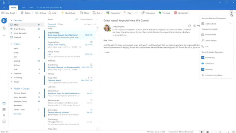
Microsoft has big design changes planned for Outlook on both the Windows and Mac platforms—but especially the Mac. In both cases, the new design direction borrows from Outlook for iOS. Microsoft gave a brief look at the coming updates during the Ignite conference a couple of weeks ago, and both The Verge and MSPoweruser dug into the changes.
Microsoft spent the most time talking about the Mac in terms of visual and UX changes, but the biggest change coming to the Windows version (pictured above) is a streamlined ribbon that is now just one line of commands, with a button right on the ribbon for adding or removing buttons and commands. You’ll still be able to use the older, three-line ribbon if you prefer. Compared to some other mail applications, Outlook has a tendency to expose a lot of features right up front, which can make the interface seem cluttered to some sensibilities. Additionally, the Windows version adds an account-switcher sidebar on the far left that's lifted straight out of the iOS Outlook app.
For the Mac, we'll see a significant visual overhaul. While we liked the Office 365 version of Outlook for Mac, Microsoft acknowledged in the Ignite presentation that Mac users have complained that Outlook for Mac doesn't always follow common Mac software design principles. Some of those ideas have been applied here. But mostly, it looks like Outlook for iOS with features added that weren't available on Macs previously.
-
The new version of Outlook for Mac will borrow many visual elements from the iOS app, but it also presents in a similar way to many other macOS e-mail apps like Spark.
-
Swiping over an e-mail can archive it or delete it, just like on iOS—in this case, you swipe on the touchpad.
-
Having the calendar built in to the e-mail app is a key differentiator of Outlook, especially compared to many Mac e-mail clients. The calendar and appointments system will see some changes.
-
Microsoft is working on improving search results, though the search bar might move from the default Mac app position of the top-right corner.
-
You'll be able to create tables while composing an e-mail.
Added features will include support for tables, the swipe-on-the-touchpad-to-archive-an-e-mail feature that now features prominently in many popular third-party Mac e-mail apps, rescheduling e-mails, an overhauled calendar interface intended to provide as much information as possible before you click on an event, and support for saving e-mails to OneNote.
What Microsoft has laid out is an interesting approach since the company will provide significantly different user interfaces on the two platforms rather than trying to keep things unified cross-platform (like, say, Adobe does with Creative Cloud apps). Microsoft said during the presentation that people go to the Mac because of certain sensibilities common to macOS and Mac apps, so the company sees value in adopting those sensibilities here. However, there may be limits to that. The presenter said that the search bar is in the top-right corner of the window because that's a common practice in Mac applications, but Microsoft isn't confident that's the best place to put it. He suggested that it may move in future iterations.
No timeline was given for the changes, but they are currently being tested internally at Microsoft.
Listing image by Aurich Lawson
reader comments
91