DesignStudio’s new identity for Beat looks to “break through language barriers”
The Athens and South America-based ride hailing app got a colourful new look that features emoji-style symbols to represent everyday scenes in different cities.
DesignStudio has created a new visual identity for taxi app brand Beat, featuring the consultancy’s trademark, colourful style.
Formerly known as Taxibeat, the company was founded in Athens in 2010, and is set to expand to a number of countries across South America.
DesignStudio was briefed to create an identity that would allow the Uber rival to “break through language barriers in international markets” and “connect with their users in new ways”, says the consultancy.
“City code”
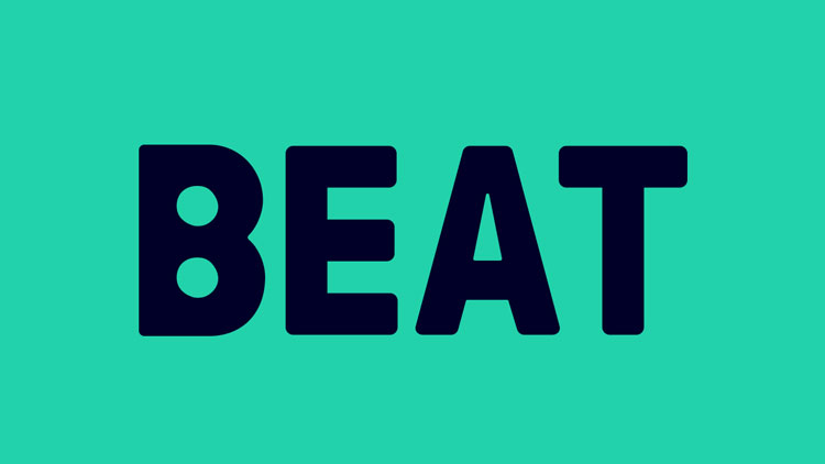
A new, simple logo features a bold, sans-serif, navy typeface that appears in all capitals, and is set against a contrasting aqua background.
The consultancy has designed a series of icons called the “city code”, which can be used interchangeably with text on the app and within the brand’s communications.
The symbols look to hero “everyday moments” in the cities in which Beat operates, says DesignStudio, and include ice-creams, suns, palm trees, speakers and cocktails. They appear in dark navy, aqua and orange.
Beat’s new identity has now rolled out across all touchpoints.


Read this next

-
Post a comment


