


The App Store and Google Play help increase downloads from people who passively (or accidentally) discover your app within each respective platform, or from people who already know you exist.
But neither of those app distribution channels put your mobile app in front of people who don’t already know you exist and who aren’t searching, or people who don’t passively discover you through the app store. Which is a lot of potential users.
Enter: App landing pages.
With app landing pages, not only can you provide a home for branded searches on Google, but you can run targeted marketing campaigns promoting your app to new and broader audiences who never would have known you existed otherwise.
And in this article, we’re going to show you exactly how to create a high-converting app landing page using 17 full length app landing page examples along with best practices from apps that are leading the way.
Get brand new landing page strategies straight to your inbox every week. 23,739 people already are!
What is an app landing page?
An app landing page is a dedicated, standalone web page built to promote your mobile app. Simple.
Whereas your homepage functions as a doorway to the rest of your website, your landing page functions as a destination. In other words, all traffic from all channels will likely encounter your homepage, but only targeted campaign traffic will visit your app landing page.
App landing pages play a crucial role in promoting your app and increasing downloads because, unlike the App Store download page or Google Play download page, you can drive paid campaign traffic to your landing page, thus increasing awareness beyond app stores.
More reach = more app downloads.
Even better, for bootstrap startups, a landing page can serve as your app website while you validate your concept and grow cash flow.
Mobile app landing page best practices
How do you design an app landing page? And what should it include?
At a minimum, every high-converting landing page needs seven core features that accomplish seven core tasks:
- Headline: explain what your app does
- Subheadline: explain how it does it
- Features/benefits: communicate features as benefits
- Copywriting: anticipate and handle objections
- Social proof: make your claims believable
- Visuals/design: show it, don’t just tell
- Call-to-action (CTA): motivate action
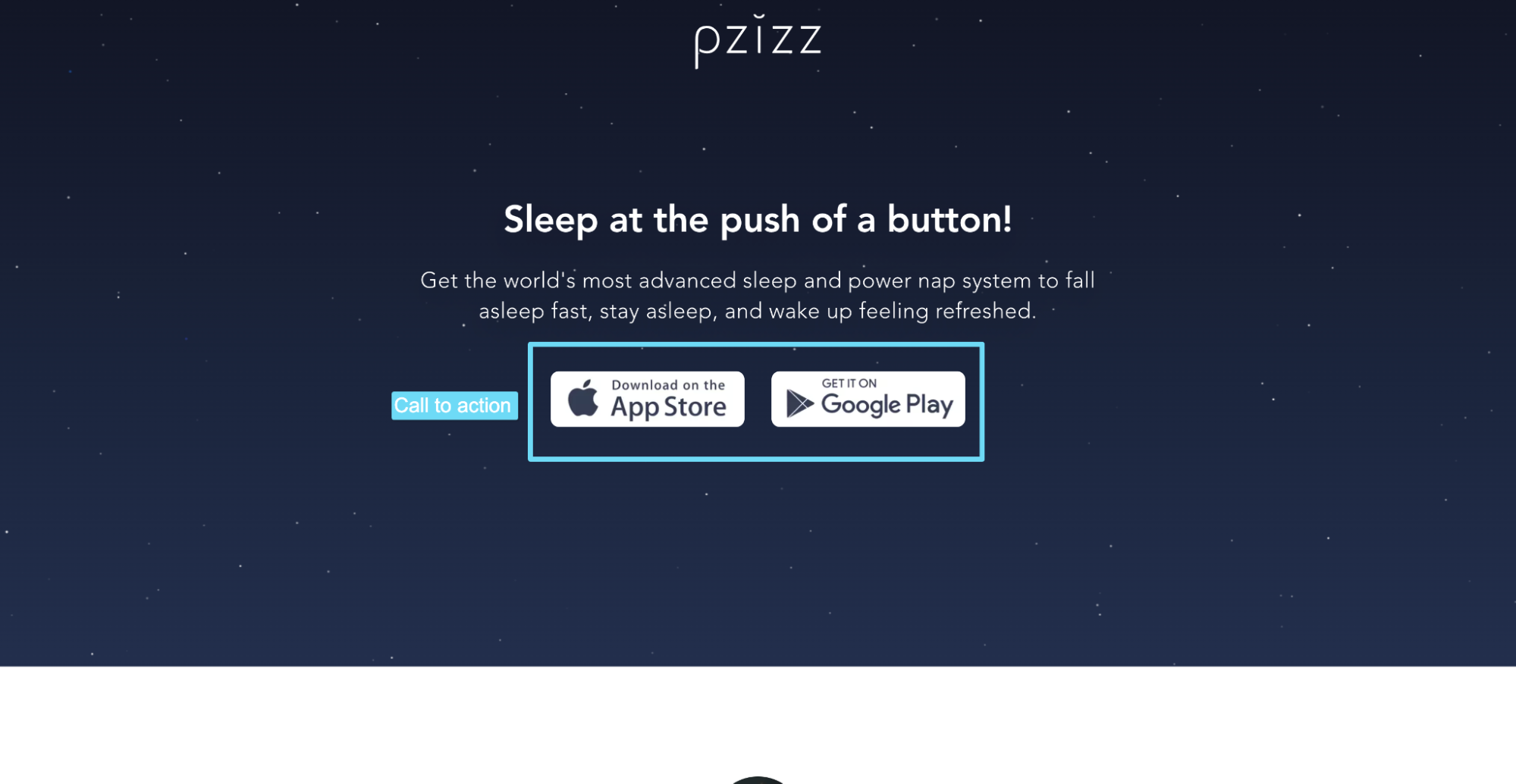
For example, let’s take a look at Pzizz, a mobile app that helps you sleep better.
Headline + subheadline
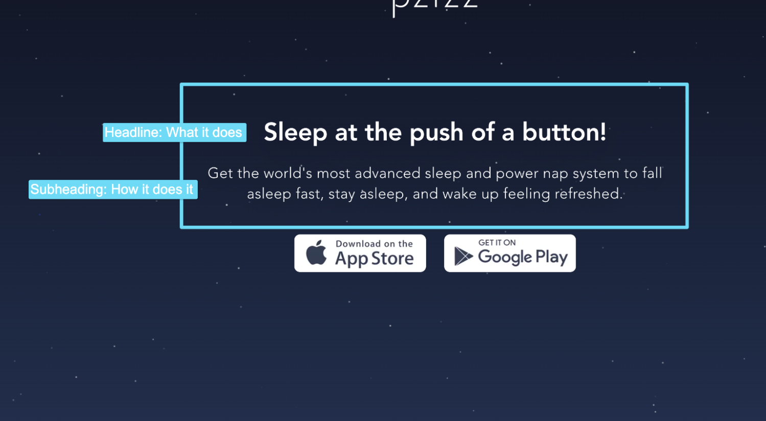
What does Pzizz do? Helps you sleep with a push of a button.
More specifically, how does it work? It helps you get to sleep faster, stay asleep longer, and wake up feeling refreshed.
Admittedly, their heading and subheading could use some work.
A better subheading might look like this:
“Fall asleep faster, stay asleep longer, and wake up more refreshed by leveraging the power of psychoacoustic principles and beautiful audio dreamscapes.”
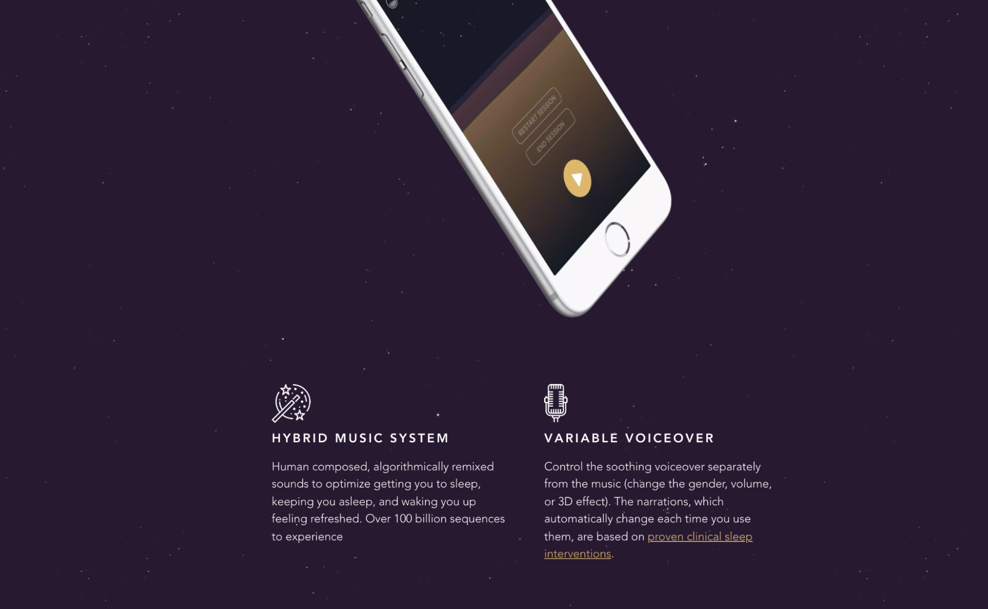
Features/benefits
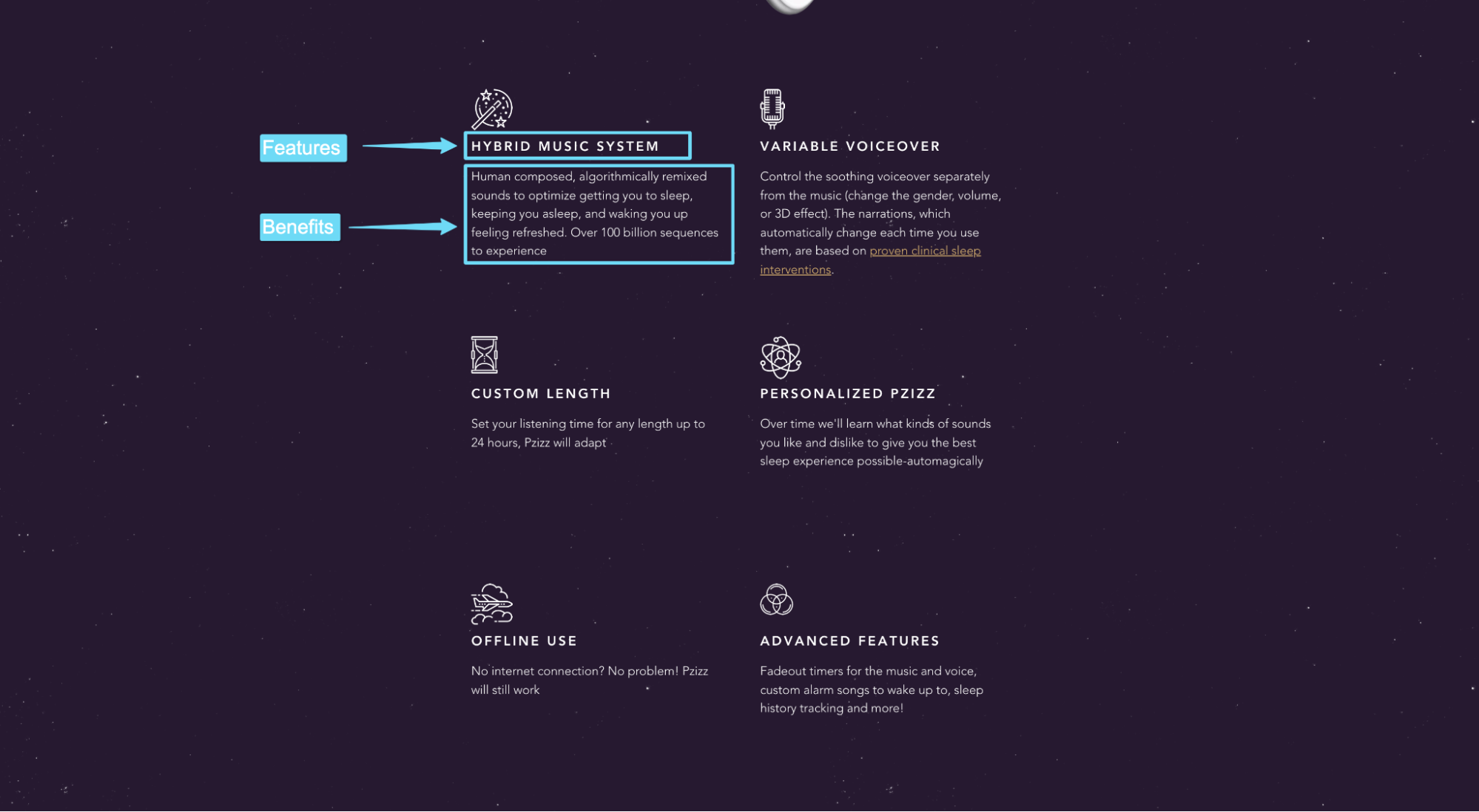
Like Pzizz demonstrates, the best app landing pages go heavy on benefits, light on features.
Copywriting that handles objections
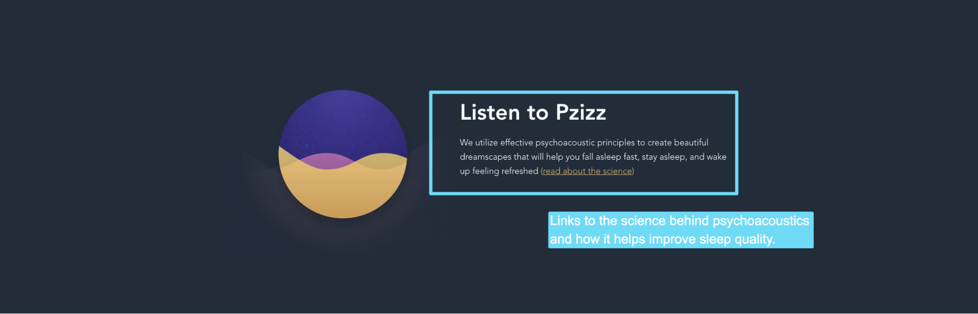
The questions on everyone’s mind: But how do I know this will work?
Pzizz handles this objection by linking to an in-depth white paper on the science behind psychoacoustics.
Though I would recommend that instead of linking to an article or whitepaper, they feature a section within this app landing page that explores the science.
Social proof
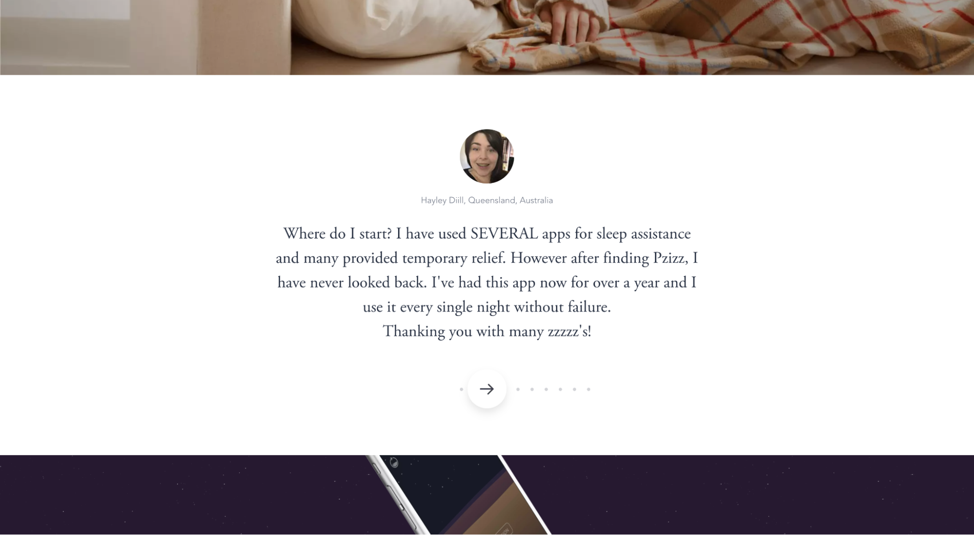
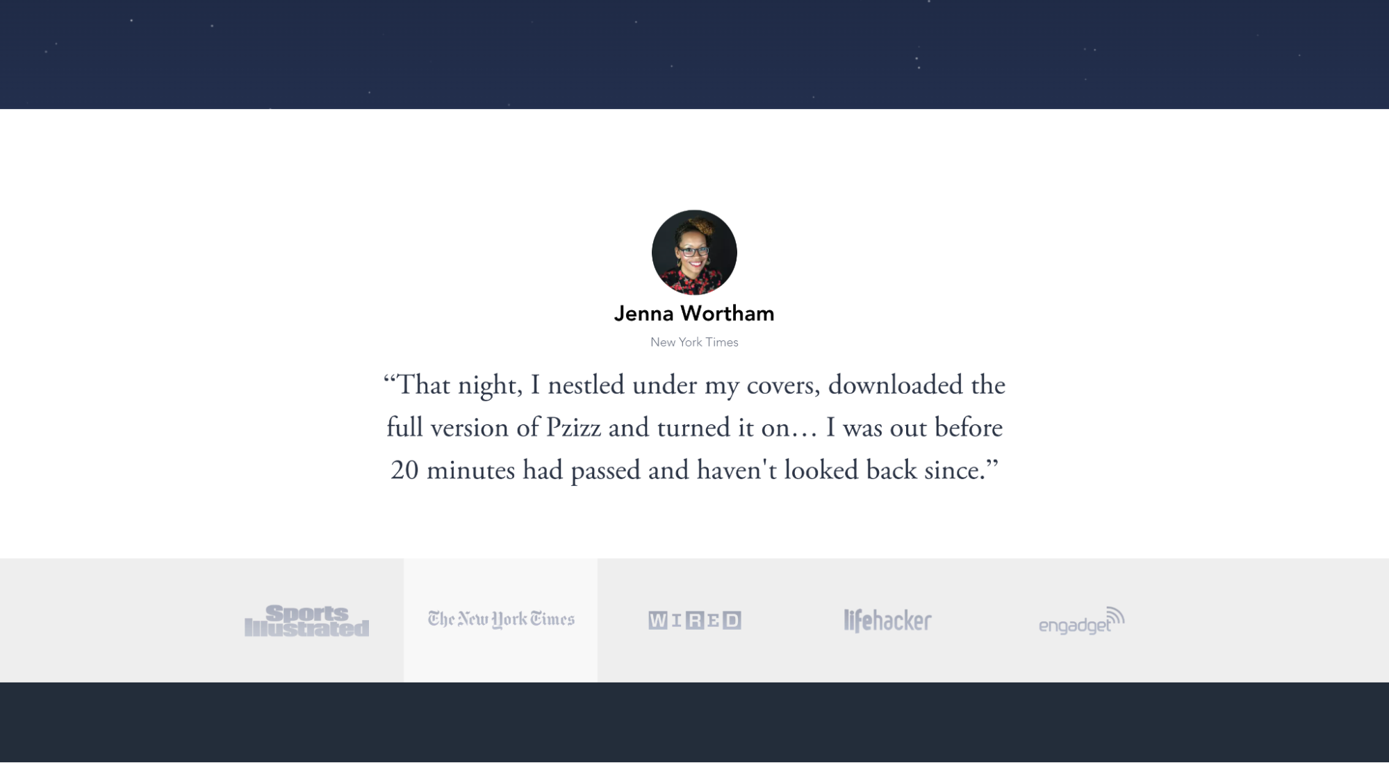
Pzizz makes their claims believable by featuring customer reviews, press mentions, logos and reviews, and even a review from J.K Rowling (pseudo-celebrity endorsement).
Visuals
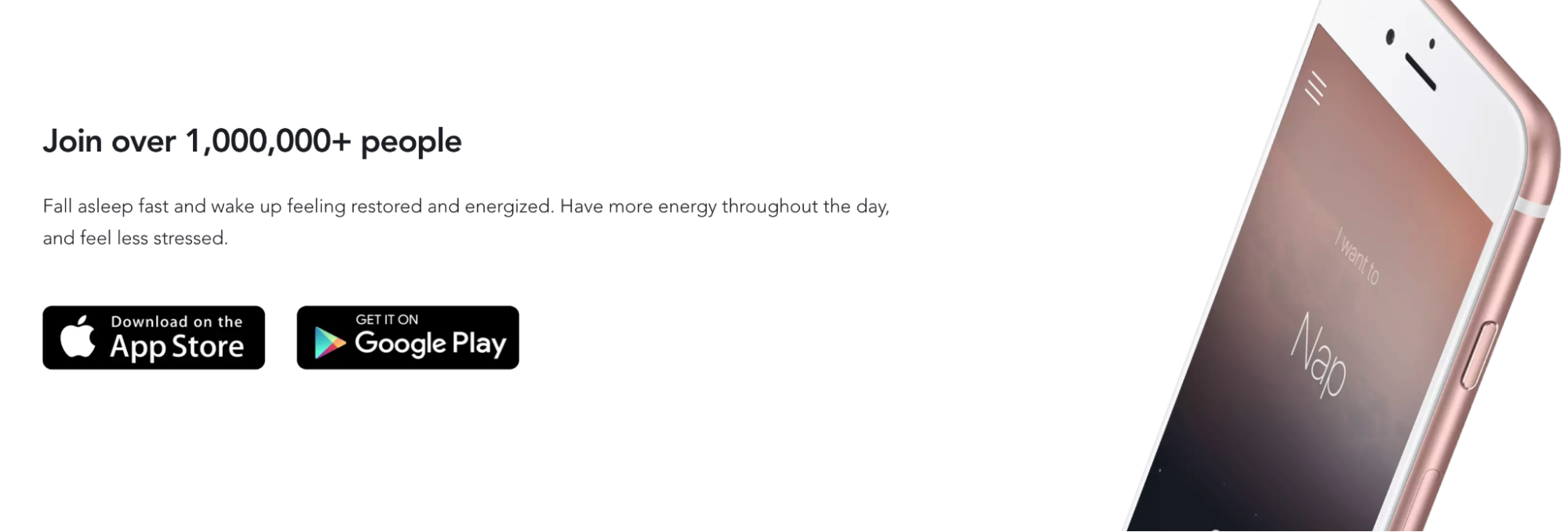

Pzizz knows that their potential customers want to know how the app looks and feels in real life, so they showcase screenshots of the actual app interface (though I’d love to see them show more), along with a hero shot of a woman sleeping to the dreamscapes provided by Pzizz.
Clear call-to-action (CTA)
Pzizz doesn’t just provide a link to the App Store or Google Play; they provide buttons that include action verbs like “Download on…” and “Get it on…”
Not the most enticing CTAs, but clear and present (and above the fold) nonetheless.
Keep reading: 31 Landing Page Best Practices Experts Never Ignore
17 app landing page examples and best practices
Think of the seven basic features we just explored as table stakes.
Without them, good luck converting visitors into app downloads.
It won’t happen.
The best app landing pages go far beyond the seven fundamental ingredients we just explored.
Which is why we’re going to explore 17 more examples of app landing pages.
For each example, we’ve spotlighted one aspect we love the most. And no two examples highlight the same feature.
Why?
Because the perfect app landing page is hard to find, but every landing page has at least one notable feature.
So instead of searching for the elusive “perfect” app landing page, we decided to curate features from 17 different landing pages that, when combined, form the perfect landing page.
If it worked for Frankenstein, it should work for us, right?
Right.
Without further ado, let’s dive in!
- Cash App
- Canva
- SLOWLY
- Nara Baby Tracker
- Doo
- Billi
- Weee!
- Gusto Wallet
- Simply Guitar
- Tangerine
- Breathwrk
- PocketGuard
- Must
- Public
- Android Auto
- Caria
- Donut
1. Cash App
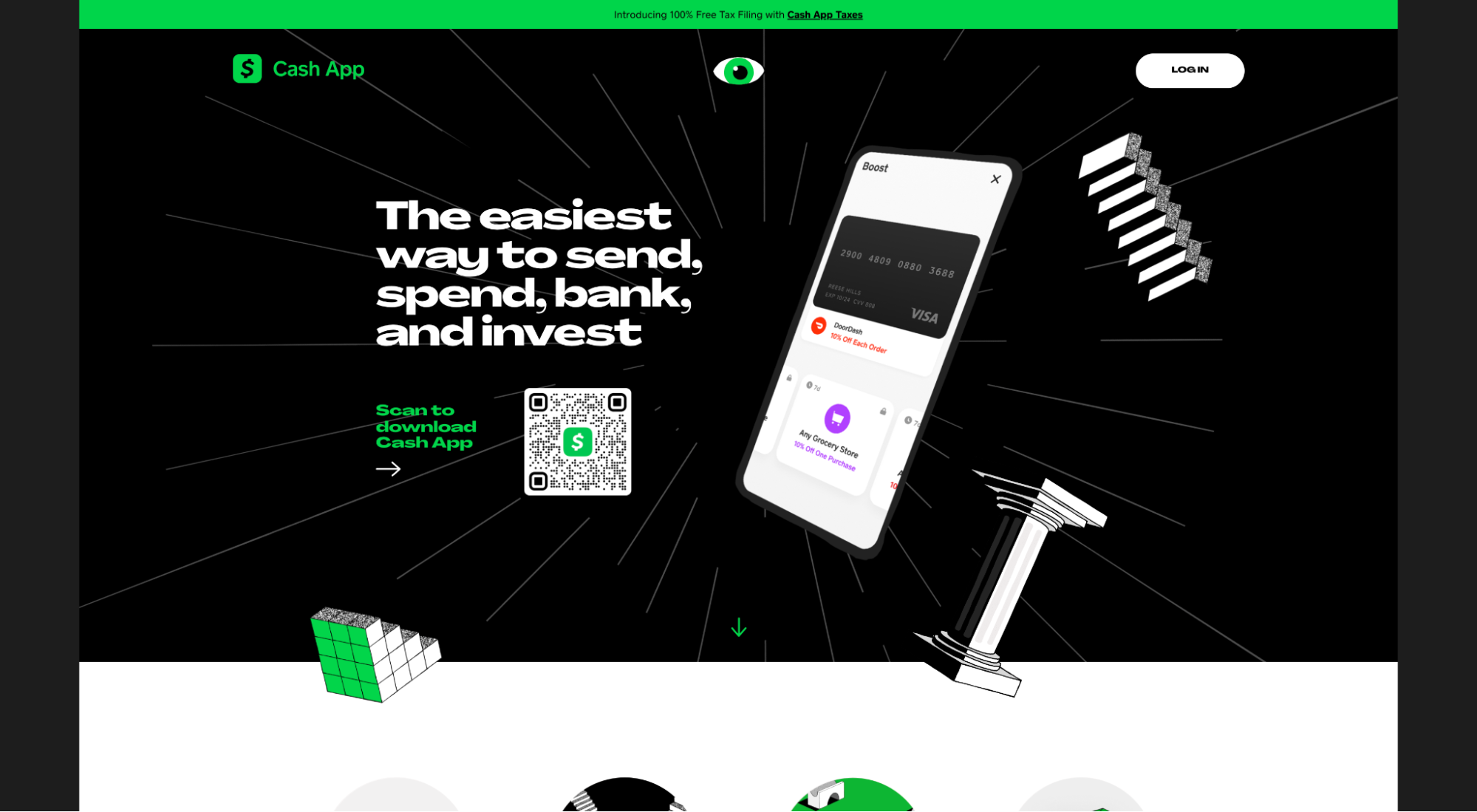
Cash App is a mobile payment service that lets you send, spend, bank and invest money.
What we love: Frictionless download (QR code)
Most app landing pages include either a link to the Apple (iOS) and Android app stores so you can download the app, or a phone number field so they can text a download link to your smartphone.
Direct links to app stores work great for mobile users (though they’re still hard to track). But for desktop users, little good app store links will do since you’ll need to download the app on your phone anyways. At best, you would need to text yourself the link, then open it on your mobile phone.
Which begs the question: Why doesn’t the landing page just ask for your phone number, then text you the link in the first place?
Texting the link works, but it’s still tedious: Submit your phone number, open your text, click on the link, download the app.
Cash App, on the other hand, makes the process frictionless by using a QR code for desktop users.
Simply scan the QR code with your phone’s camera, and the link that appears will take you directly to the app download page (on your phone). This removes the unnecessary step of texting yourself the link or submitting your phone number.
Plus, you can easily track QR code “clicks” unlike direct links to the app store (still doable, just more work).
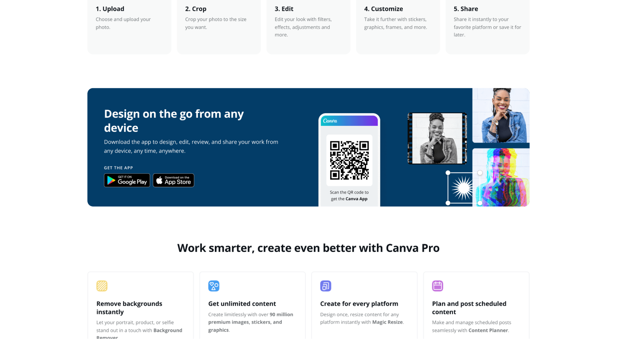
2. Canva
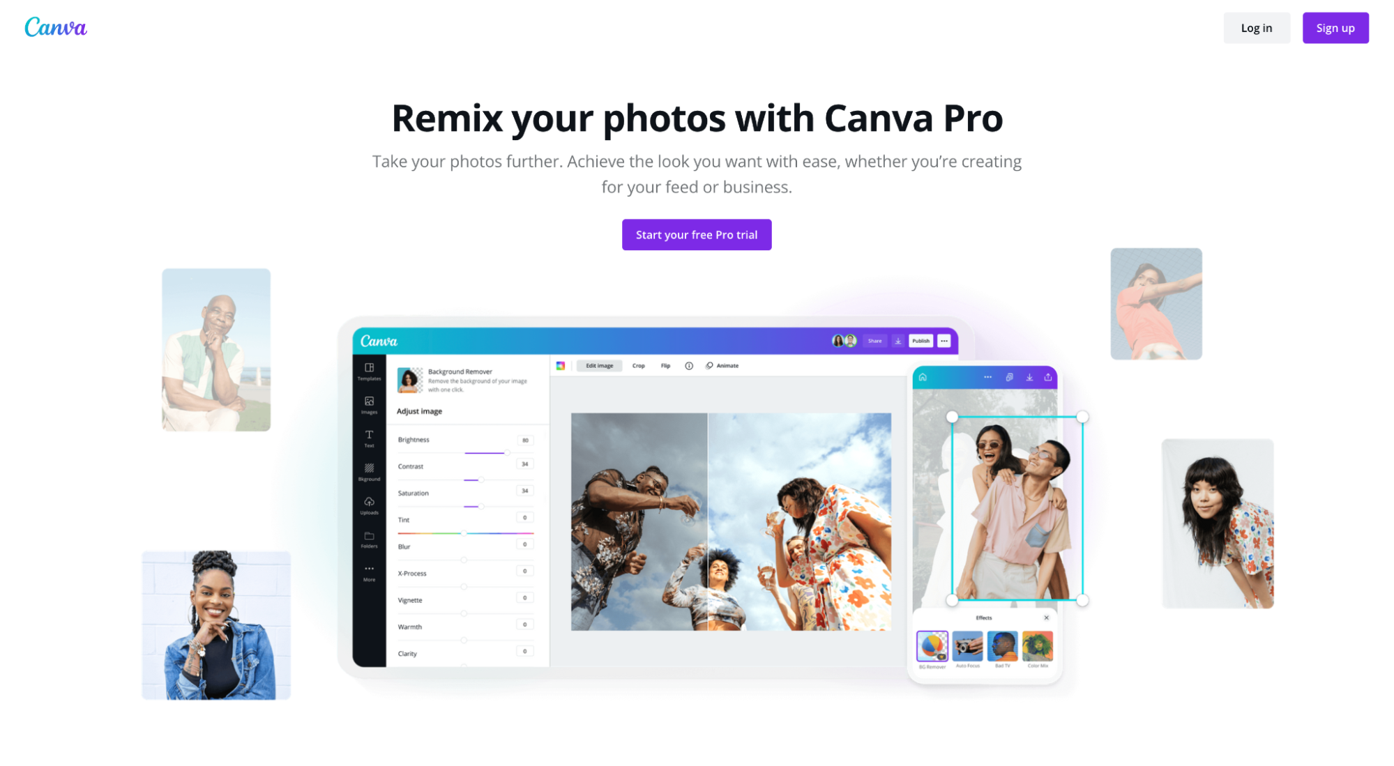
Canva is a user-friendly design, photo editing, and video editing app for non-designers. Like many mobile apps, Canva also has a desktop version: same app, different user experience.
What we love: Attention ratio
Attention ratio refers to the number of links on the page compared to the number of conversion goals.
The best app landing pages have a 1:1 attention ratio: One conversion goal, one link (the link to complete the conversion goal). No unnecessary header navigation, social media, or footer links.
Why? Because distractions kill conversions, and more than one conversion goal leads to lower conversion rates (see: distraction). Stay focused.
Aside from the necessary legal links in the footer and the homepage link in the logo, the only other links on Canva’s app landing page include a login link (for existing customers), a free trial link, and a link to download the mobile app.
That’s it.
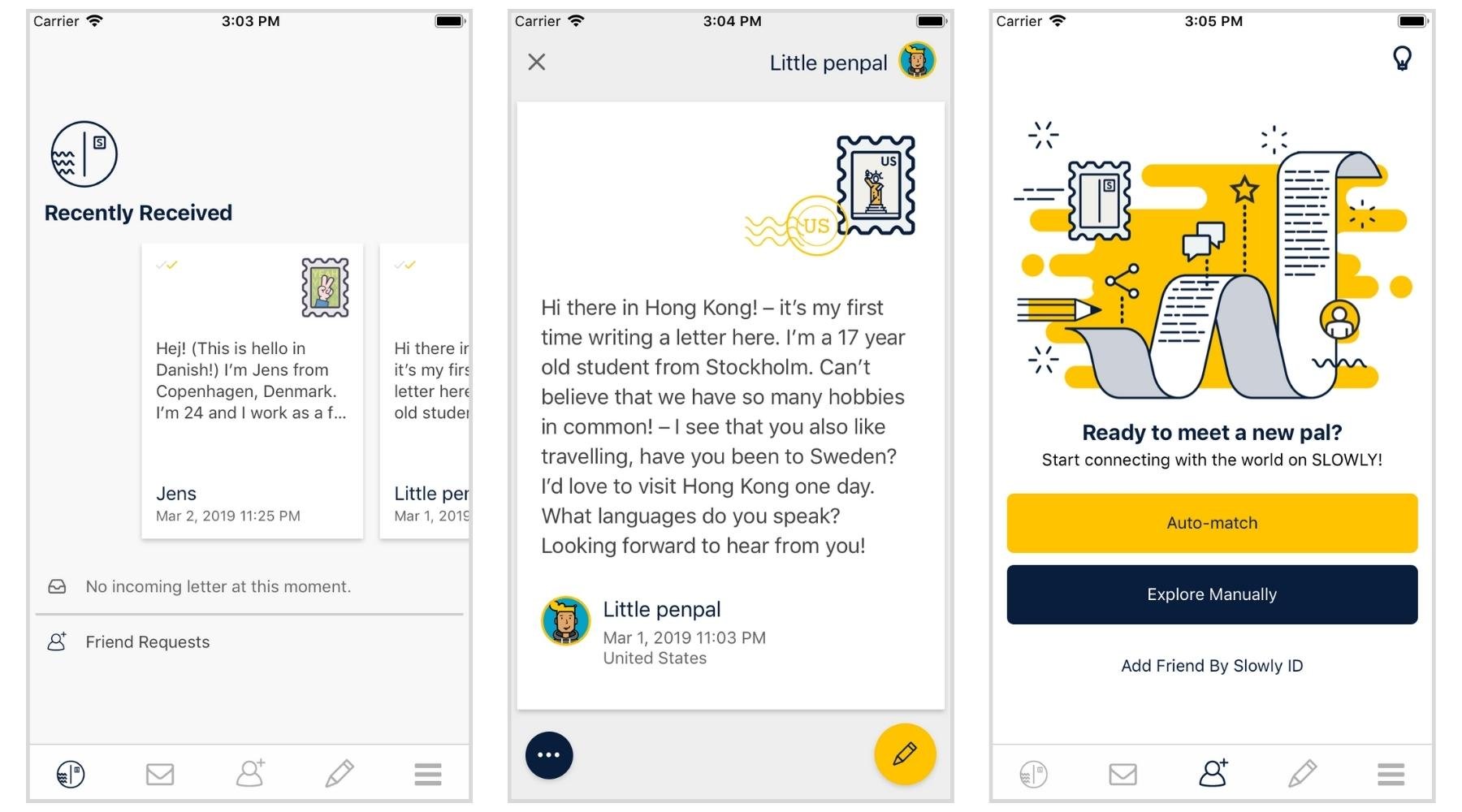
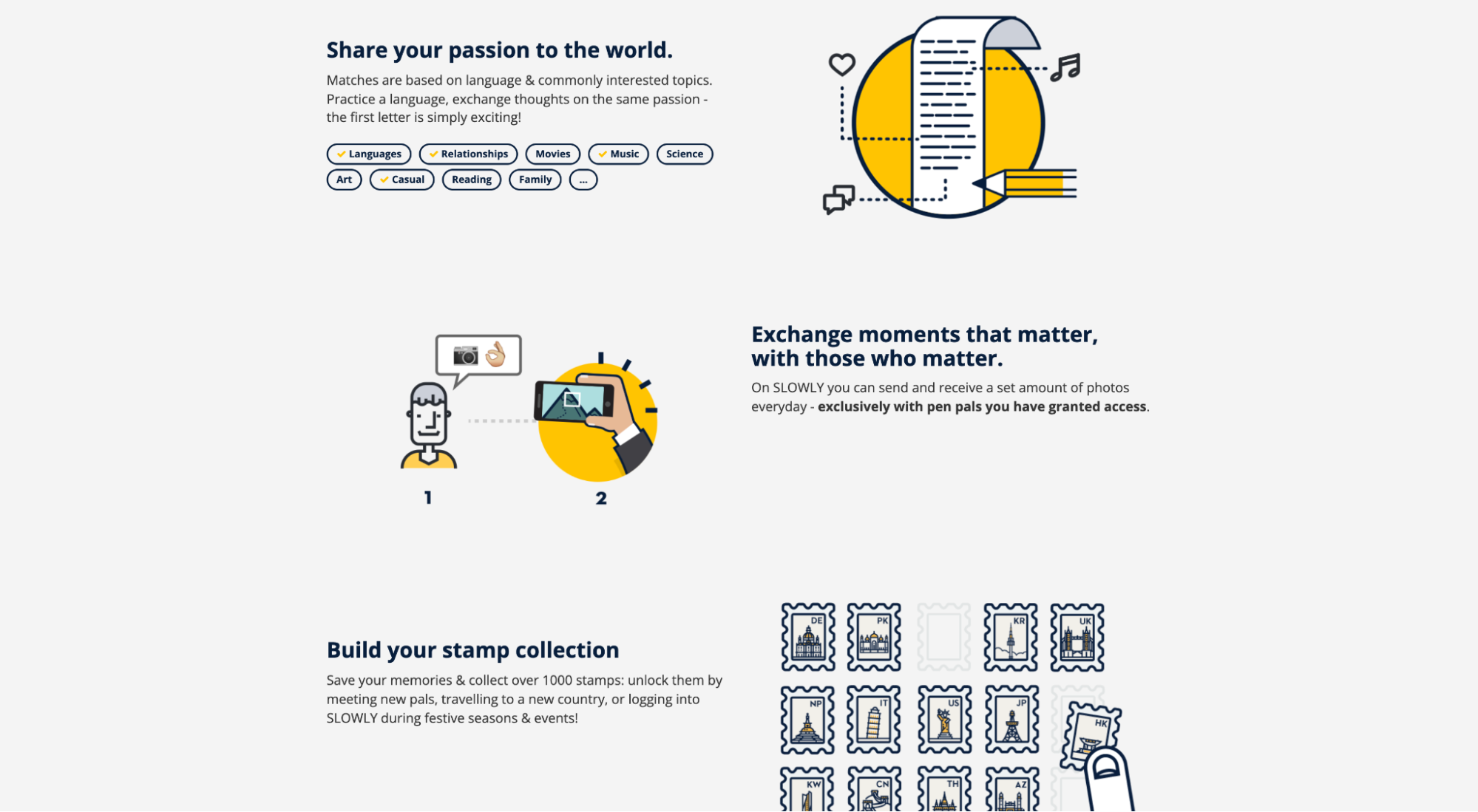
3. SLOWLY
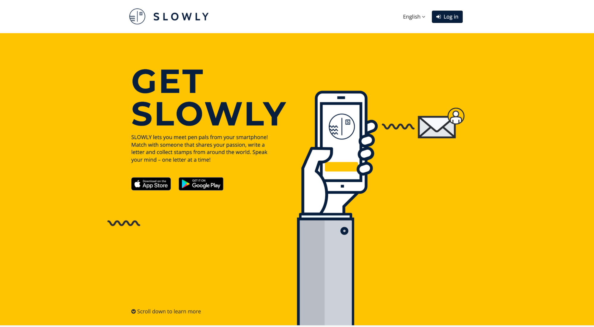
SLOWLY is a pen-pal app that lets you meet and message people from around the world.
What we love: Brand consistency
Consistency matters, especially when it comes to brand design.
Don’t use one design style for your app and a different design style for your marketing communications. Let the same brand style guide influence both.
For example, SLOWLY uses the same distinct brand codes and assets within their app interface as they do on their app landing page.
4. Nara Baby Tracker
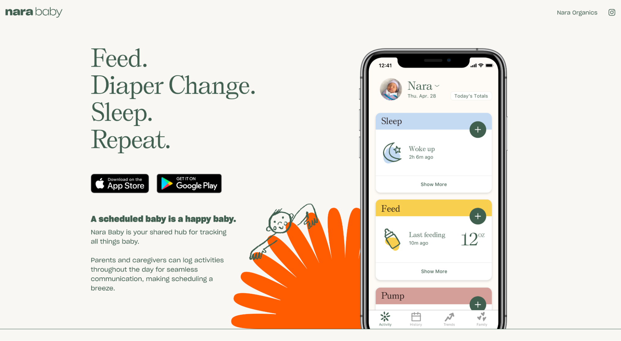
Nara Baby Tracker helps new moms and dads track their newborn’s sleeping and feeding schedules and mama’s pumping schedule all in one app.
What we love: Above the fold
Above the fold refers to the first section of the landing page every visitor sees before they scroll.
Every great above the fold section should include a captivating headline (what you do), your subheadline (explanation of how you’ll do it), a hero image that adds context to your offer, and a call-to-action (CTA).
Think of the above the fold section of your app landing page like its own ad: Though many visitors will keep scrolling to learn more, it provides everything you need to get started now.
Nara Baby Tracker checks all boxes:
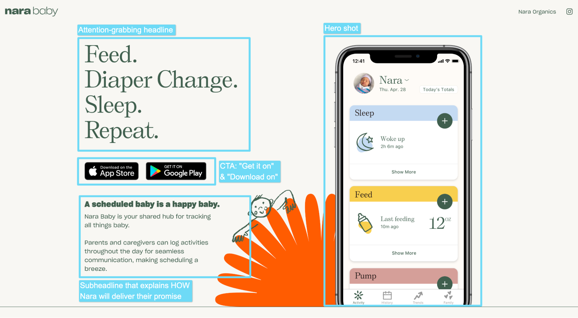
Bonus: Most app landing pages feature the App Store and Google Play download buttons. But Nara Baby Tracker adds an actual call-to-action to each button (“Download on the App Store” and “Get it on Google Play”).
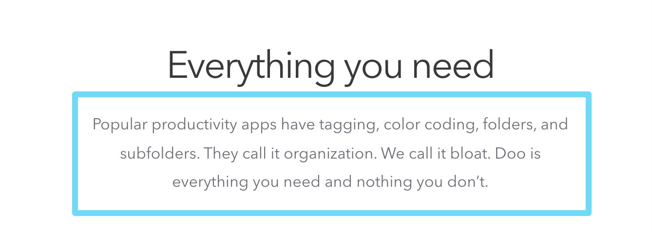
5. Doo
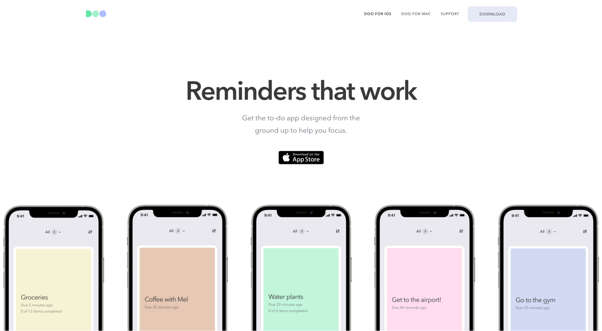
Doo is a to-do app that makes daily tasks easy to plan and remember.
What we love: Naming the enemy
Great copywriting names an enemy. Period.
Naming an enemy imbues your message with a strong point of view, triggers emotions, projects confidence, and positions your app as the best option in a new world (not a similar option for an old world).
Case in point: Doo points the finger at bloated to-do apps (their competitors) that are chock-full of unnecessary features.
Headline: “Reminders that work.” A subtle dig at bloated apps that don’t work.
Subheadline: “Popular productivity apps have staffing, color coding, folders, and subfolders. They call it organization. We call it bloat. Doo is everything you need and nothing you don’t.”
Beautiful.
6. Billi
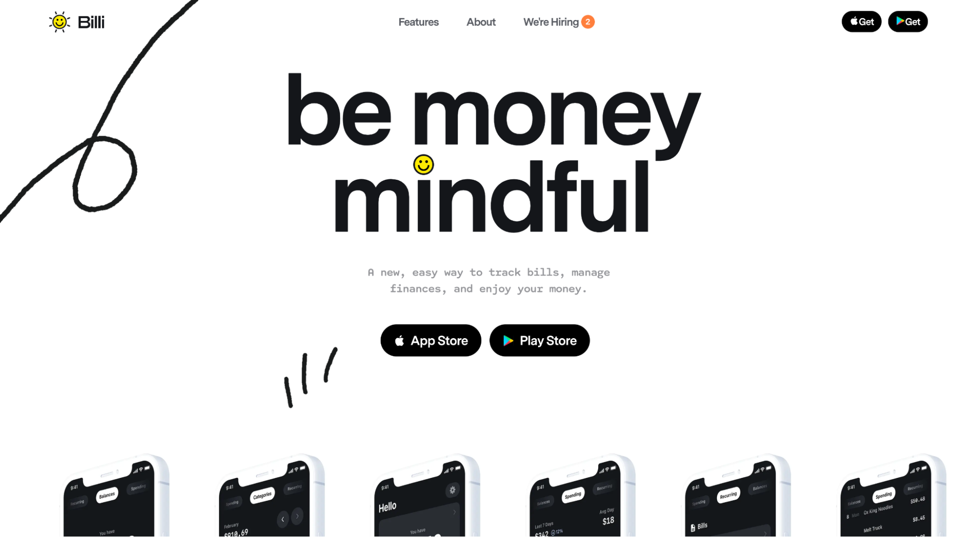
Billi is a bill tracking app that connects all your accounts and offers a bird’s-eye view of your spending habits.
What we love: Directional cues
Directional cues come in all shapes and sizes, namely explicit and implicit.
An example of an implicit directional cue is white space. White space creates distance between elements on a landing page and helps guide visitors’ eyes down the page.
An example of an explicit direction cue is an arrow, like in the Billi example below.
Arrows pointing to CTAs or other important elements on the page help guide the visitors' gaze.
Use directional cues on your own app landing pages to make your CTAs unmissable.
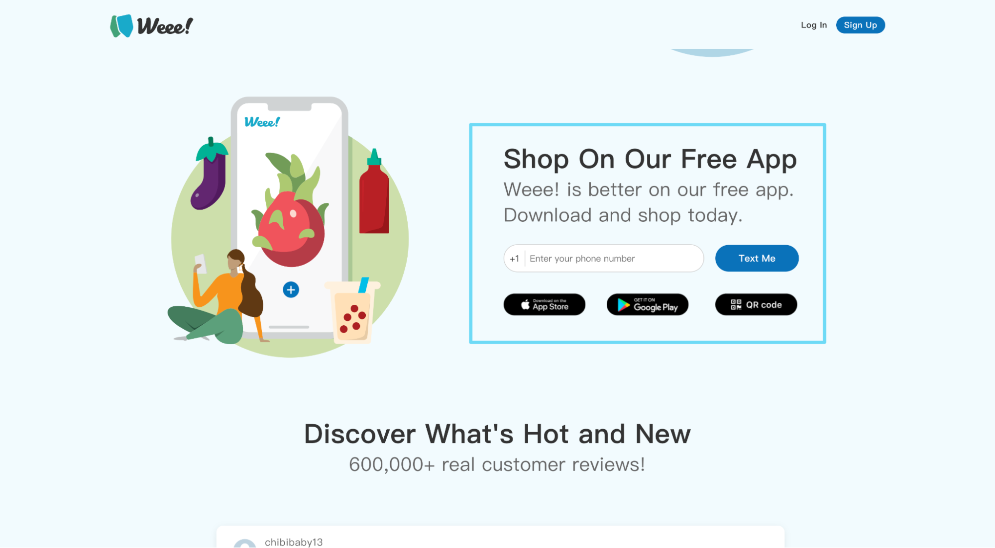
7. Weee!
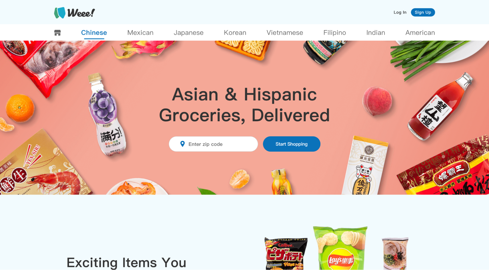
Weee! is a food delivery app that features mainstays of different cultures that aren’t easy to find in stores.
What we love: Multiple paths to conversion
We always recommend that each app landing page should have one conversion goal. But that doesn’t mean you can provide multiple ways of achieving that goal.
In fact, if you can, you should.
For example, Weee! not only offers a “Text Me” form field, but they also provide direct links to the App Store and Google Play, along with a QR code option.
Whether mobile or desktop, visitors can pick their conversion path.
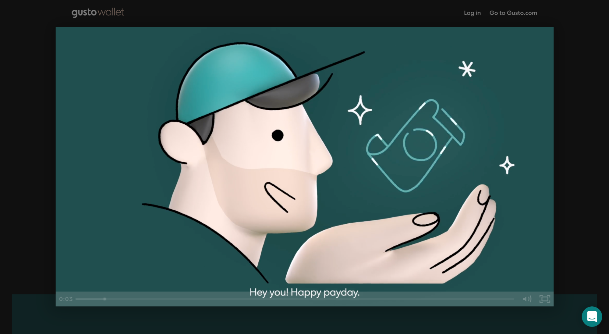
8. Gusto Wallet
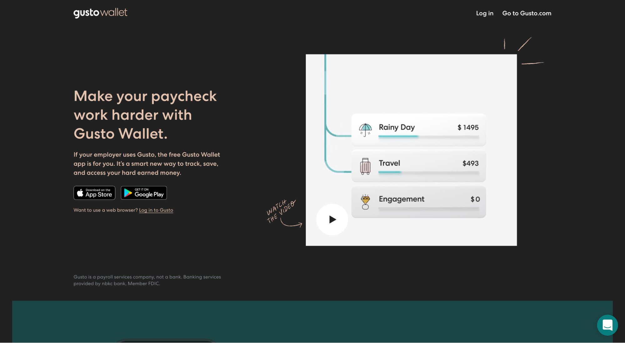
Gusto Wallet (brought to you by Gusto) is a debit card, but the accompanying app makes it easy for you to automatically divide up your paycheck into different buckets for savings, bills, travel, and more.
What we love: Landing page video
Videos work. Bottom line. In fact:
- 86% of people would like to see more videos from brands
- 68% of consumers prefer watching a video to learn about a product than reading an article
- 86% of marketers say that videos help them generate leads
Why do videos work so well?
Videos help your prospects better understand your app, how it works, what value it will bring, and whether or not it’s worth their time. And it does it visually and fast.
Gusto Wallet crushes their product video:
- 45 seconds (not too long, not too short)
- Branded (distinct and consistent)
- Visual (app screenshots, animated)
- Story (Gusto Wallet frames their product as the magic gift and the customer as the hero)
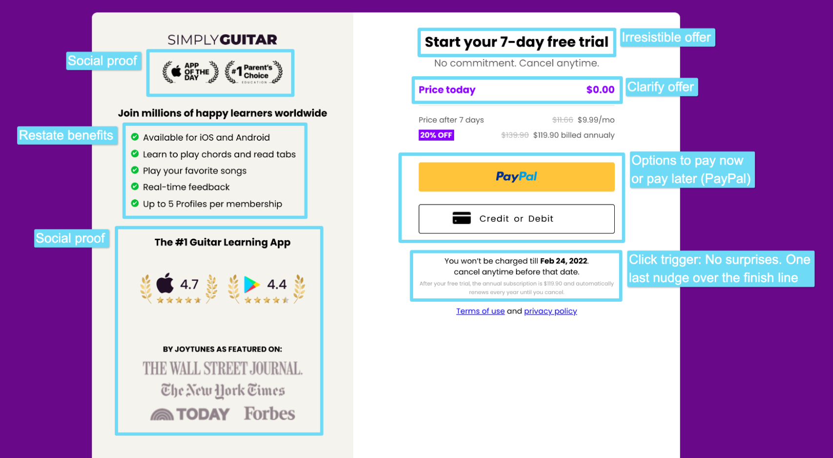
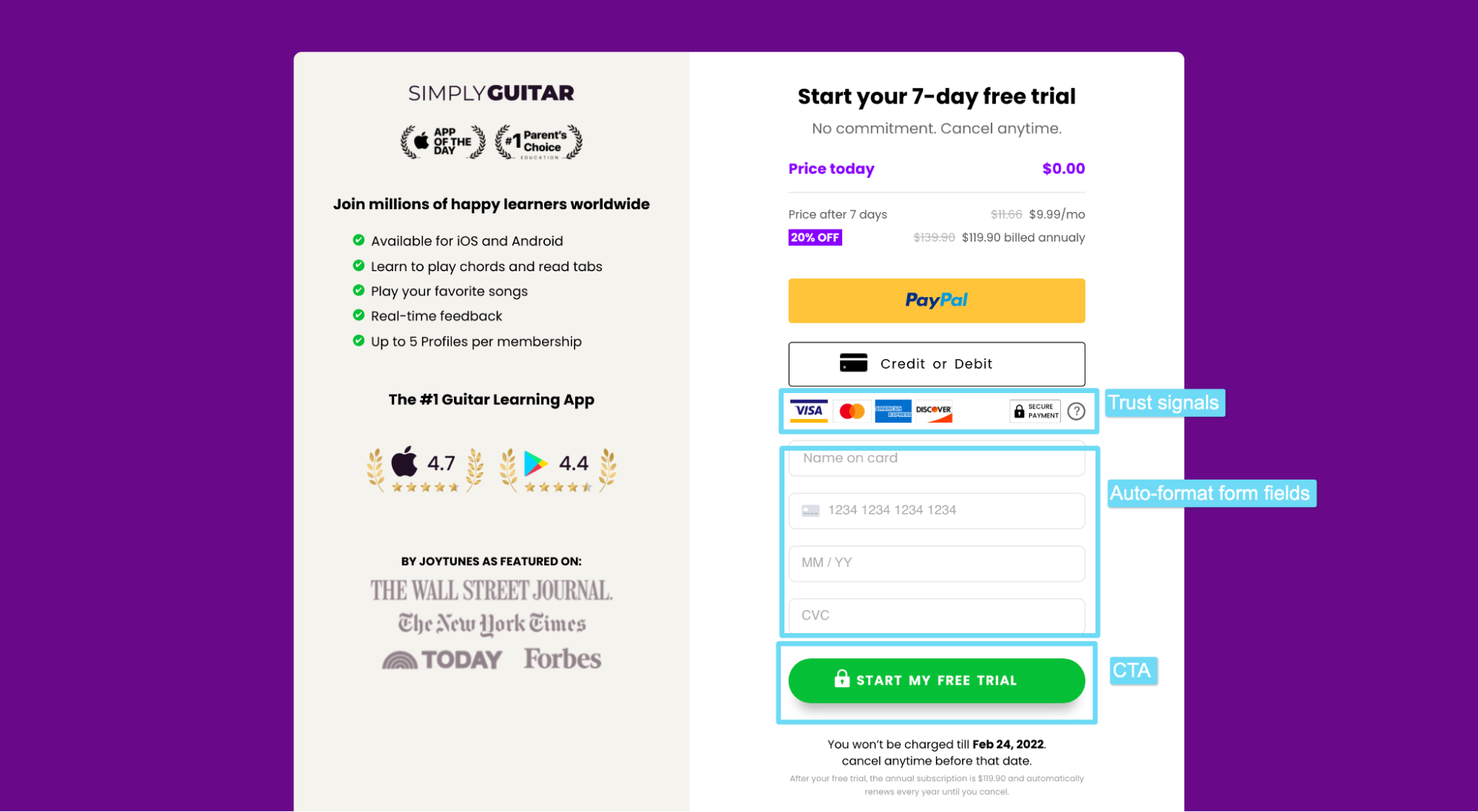
9. Simply Guitar
Simply Guitar is a mobile guitar lesson app.
What we love: Landing page form
Most mobile apps don’t require a paid subscription, but Simply Guitar does.
Therefore, their conversion form matters just as much as any other element on their landing page, if not more.
Lucky for them, they hit an absolute homerun:
- Social proof: awards badges, press mentions, star ratings
- Benefits: restate the value, one last time
- Irresistible offer: “7-day free trial”
- Objection handling: “No commitment. Cancel anytime.”
- Payment options: pay now (debit) or later (PayPal, credit)
- Click triggers: “You won’t be charged until Feb 24, 2022.”
- Trust signals: CC brand logos + secure payment badge
- Auto-format: form automatically formats card number and date
- Strong CTA: “Start my free trial”
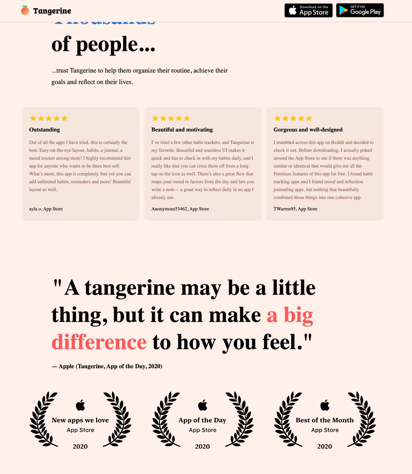
10. Tangerine
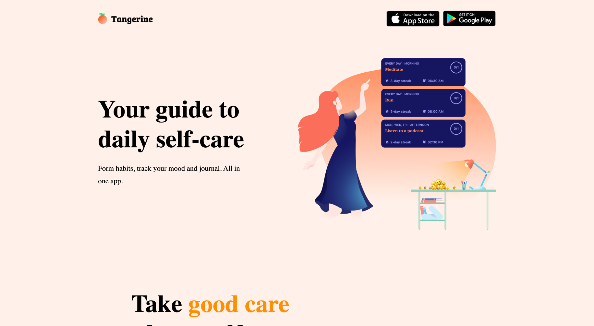
Tangerine is a self-care app that helps you prioritize yourself, track your mood, and build healthy habits.
What we love: Social proof
Social proof refers to third-party endorsements of your app, like customer testimonials, relevant awards or badges, or mentions from credible media publishers. And no app landing page is complete without a healthy dose of it.
Why is social proof so important?
Because when people are unsure about a decision, they look to see what decisions others in their position have already made, then follow suit.
Tangerine features social proof in the form of user reviews with star ratings, a testimonial from Apple, and three awards from Apple’s App store (new app we love, app of the day, app of the month).
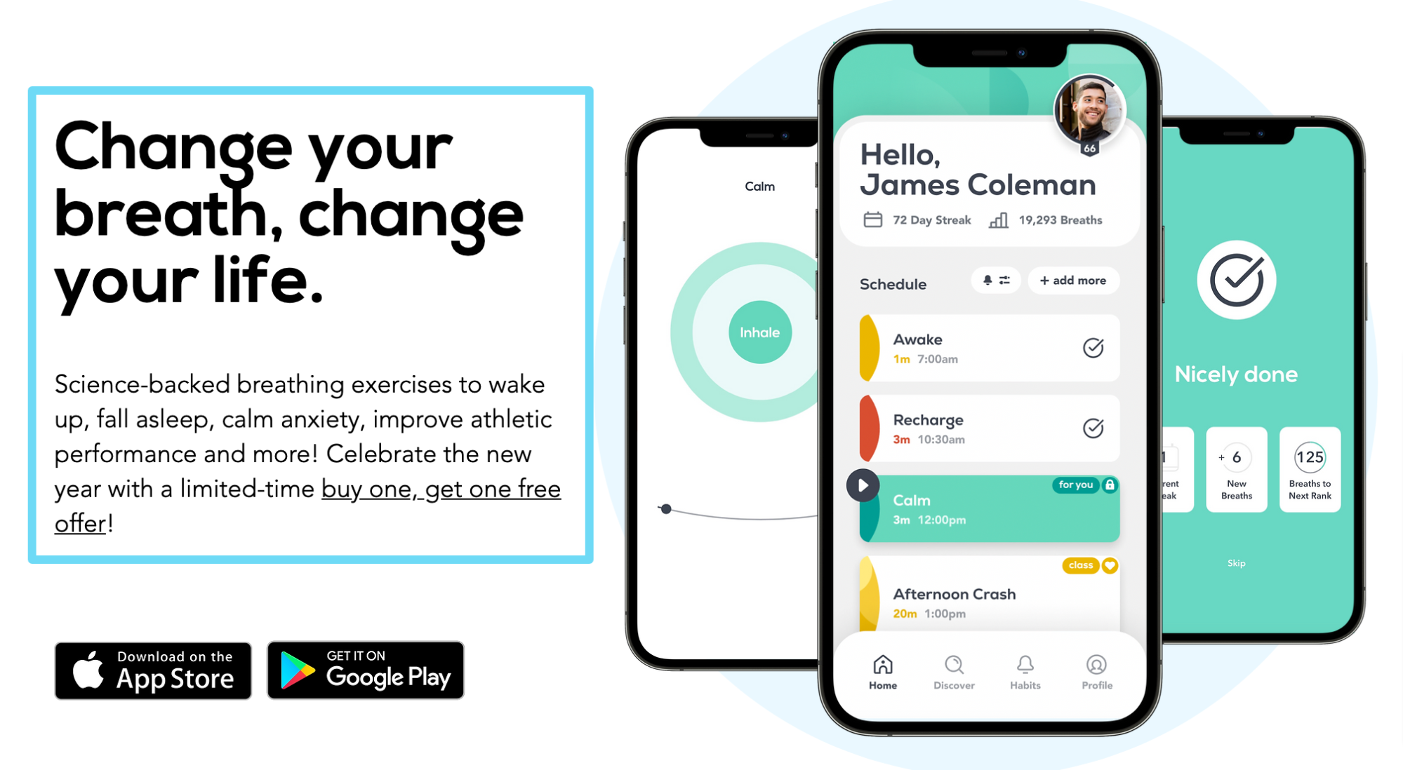
11. Breathwrk
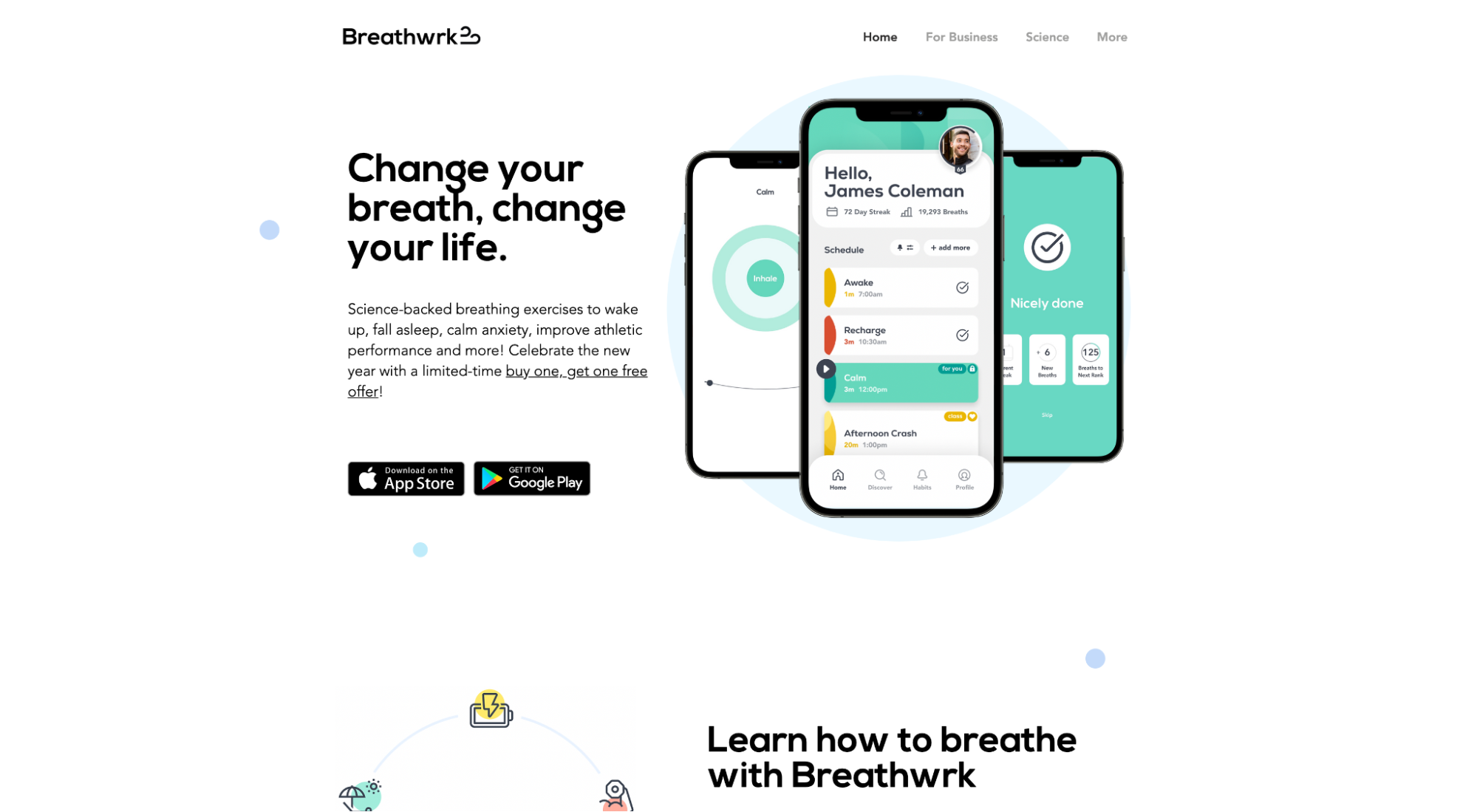
Breathwrk is a breathing exercise app that helps you fall asleep, calm anxiety, and improve athletic performance.
What we love: Headline + subheadline
Your headline and subheadline work together to grab attention, explain what you do, hook the reader, and introduce the product.
You can write a great headline in a thousand different ways. A few of our favorites:
- Explain what you do: If you’re in a category of your own, sometimes all you need to do is explain what your app does
- Handle objections: If you compete against many (likely), address the biggest pain point your app helps alleviate
- Own your specialization: Let prospects know you are the solution for their problem (not a solution, but the solution)
- Name an enemy: Say goodbye to Company XYZ, and hello to your app
When it comes to subheadlines, in as clear and specific of a way as possible, communicate how your product will deliver the promise you made in your headline.
Breathwrk does both masterfully:
Headline: “Change your breath, change your life”
Subheadline: “Science-backed breathing exercises to wake up, fall asleep, improve athletic performance, and more! Celebrate the new year with a limited-time buy one, get one free offer!”
Grabs attention? Check.
Introduces product? Check.
Explains what you do and how you’ll create value? Check.
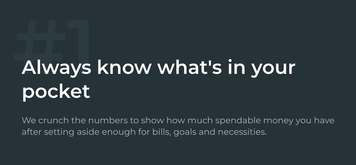
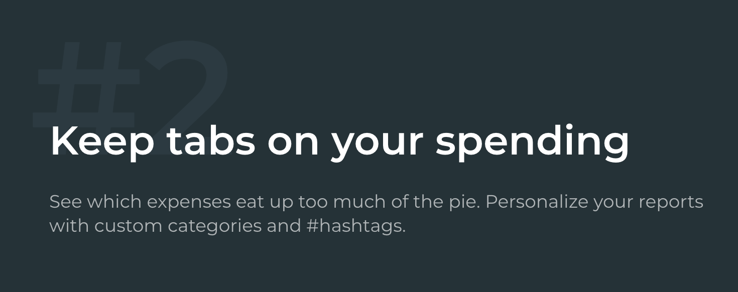
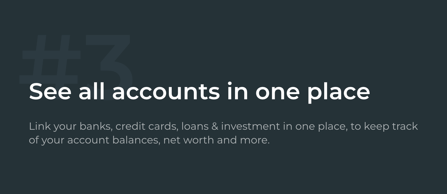
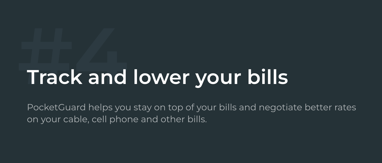
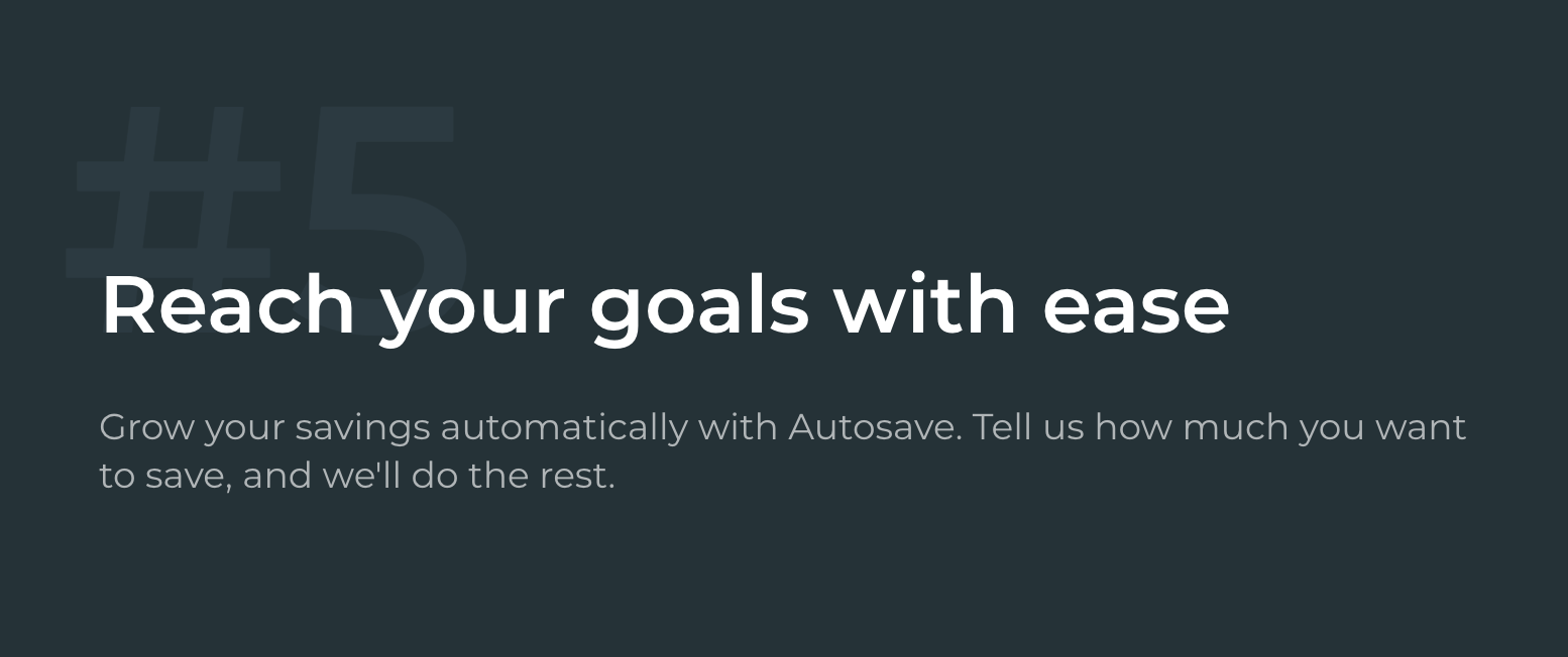
12. PocketGuard
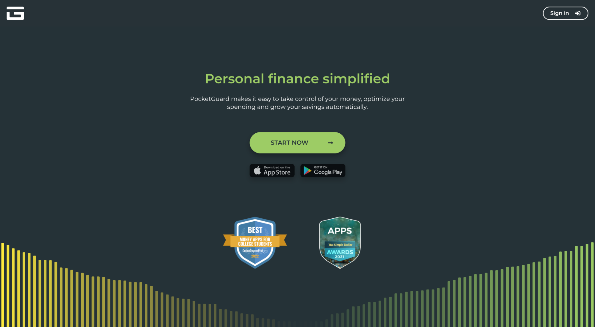
PocketGuard is a personal finance app that lets you monitor savings and spendings, track bills, and lower expenses all in one place.
What we love: Benefits
People only care about the features of your app as they relate to the outcomes they help achieve. Period.
PocketGuard knows this, which is why they don’t list features like their bill organizer, spending chart, spending tracker, goal tracker, or savings finder.
Instead, they lead with the benefits those features will help you achieve (and place them front and center in their own headlines).
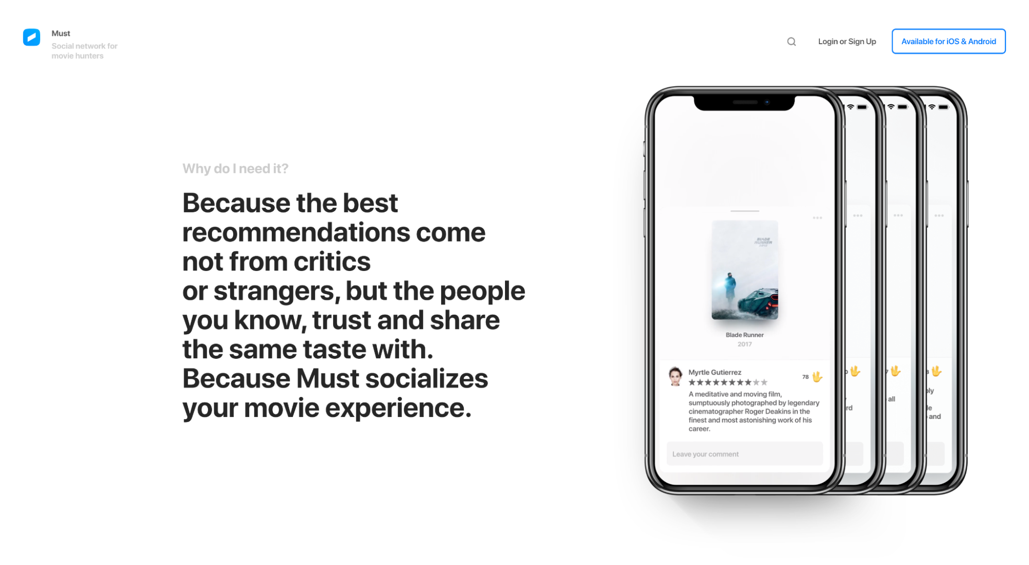
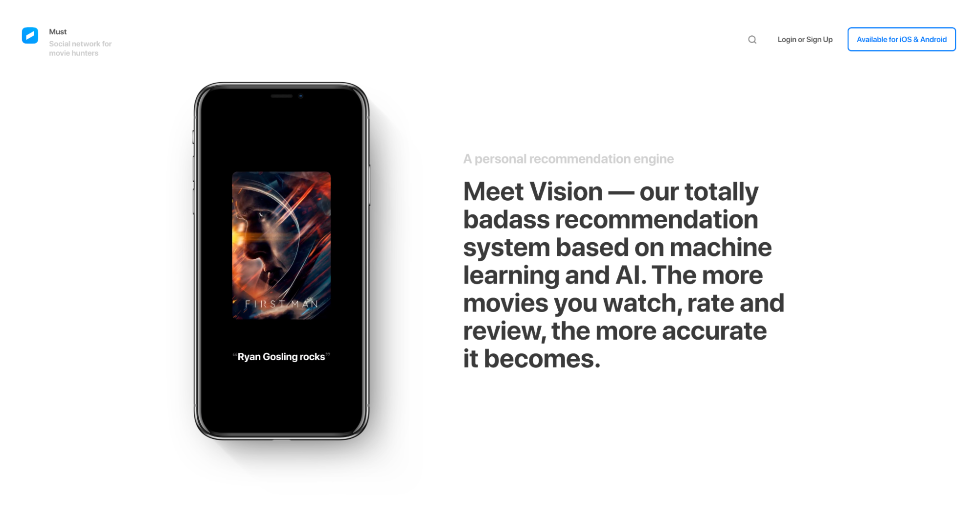
13. Must
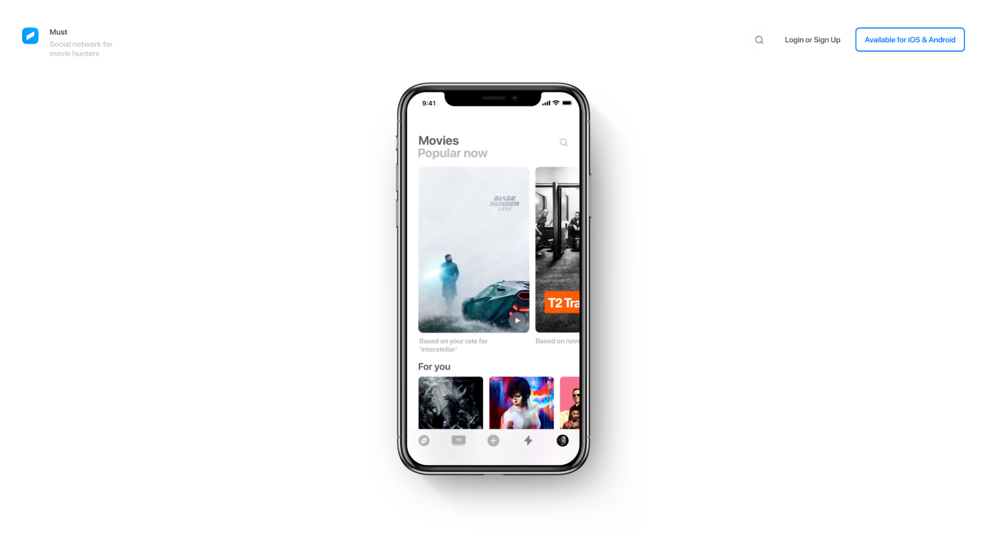
Must is a social network for movie hunters.
What we love: Visuals (Show, don’t tell)
There’s no better way to communicate the features and benefits of your product or app than by showing them in real life. Simple.
Must turns their landing page into a visual demonstration of their app, akin to a live demo, by placing interactive graphics and screen grabs next to each feature/benefit section.
Not only do these visuals provide context to the content, but they make the invisible visible. No guessing.
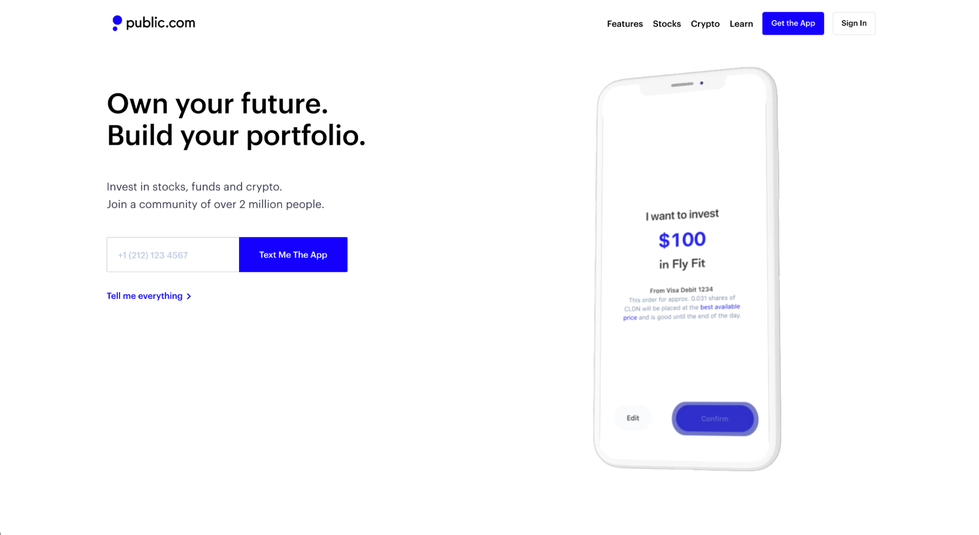
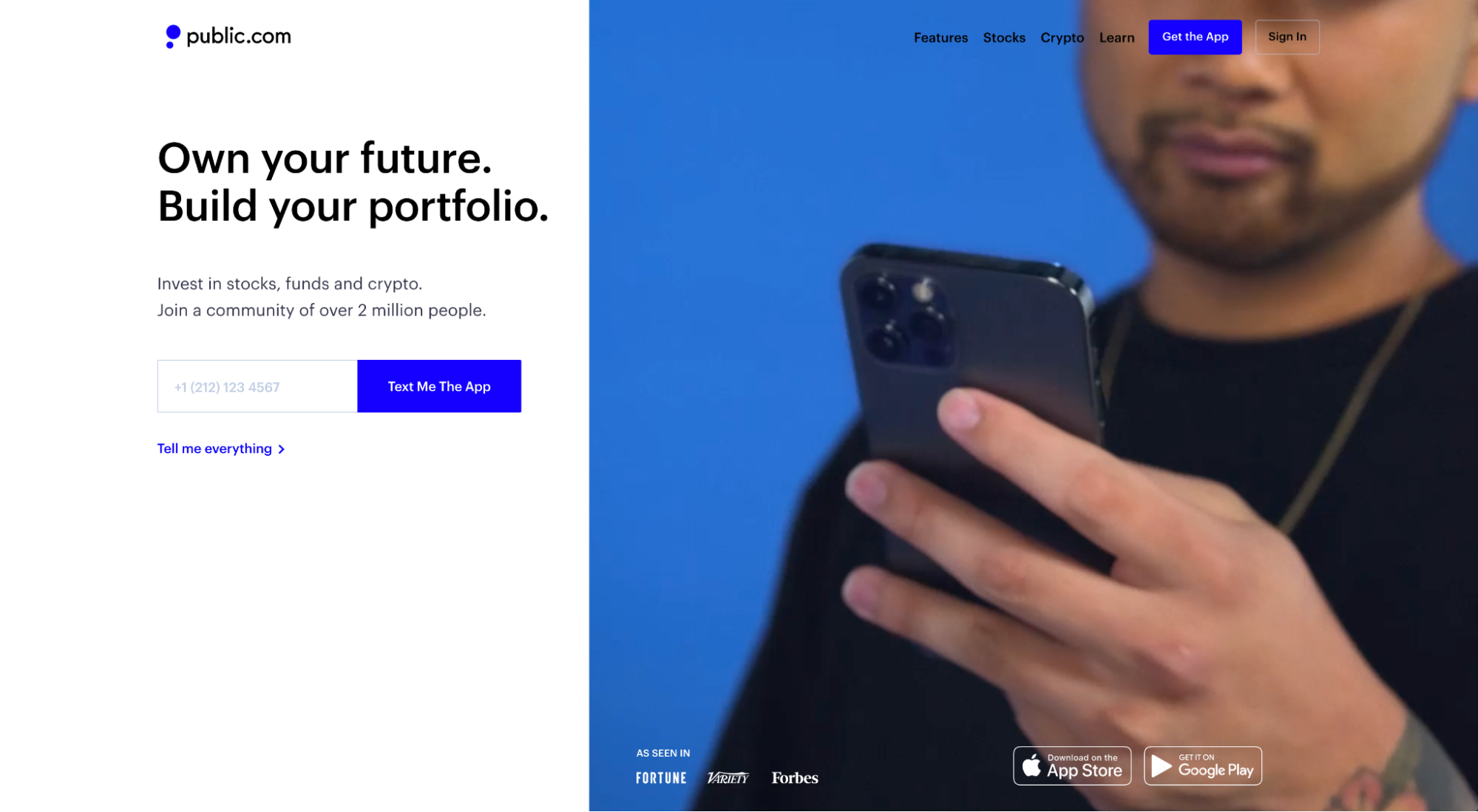
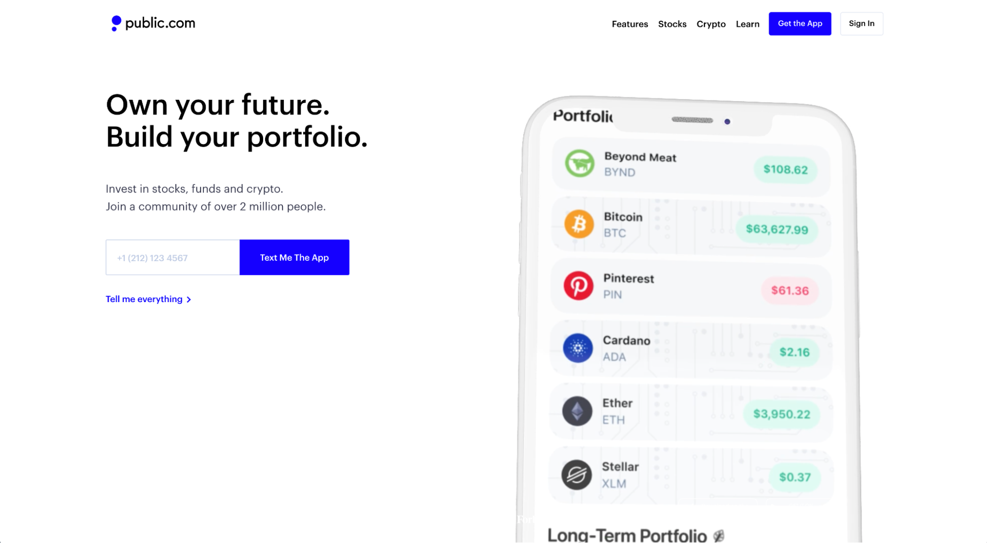
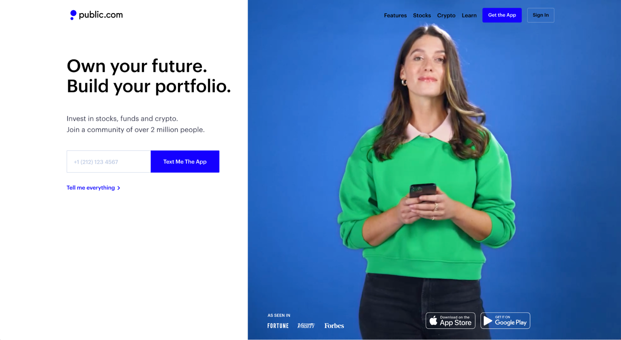
14. Public
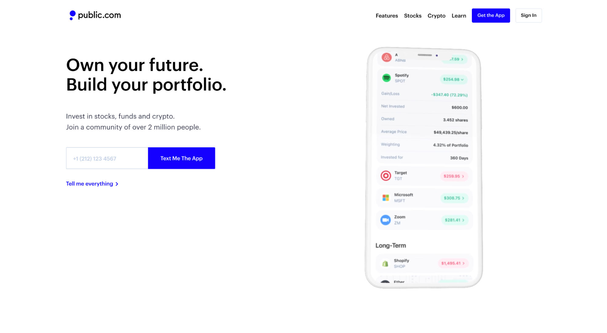
Public is an investment app that makes investing in stocks, funds, and crypto as easy as a swipe of the thumb.
What we love: Hero shot
A hero shot is the primary image or video that sits above the fold and to the right, left, or below the headline and subheadline.
A great hero shot captures attention, adds context to your headline and subheadline, and conveys positive emotions. That’s a lot of pressure for one image or video.
Public accomplishes all three by using an auto-play video featuring real customers using their app, along with real screen recordings of the app UX and UI. Talk about an indelible first impression.
15. Android Auto
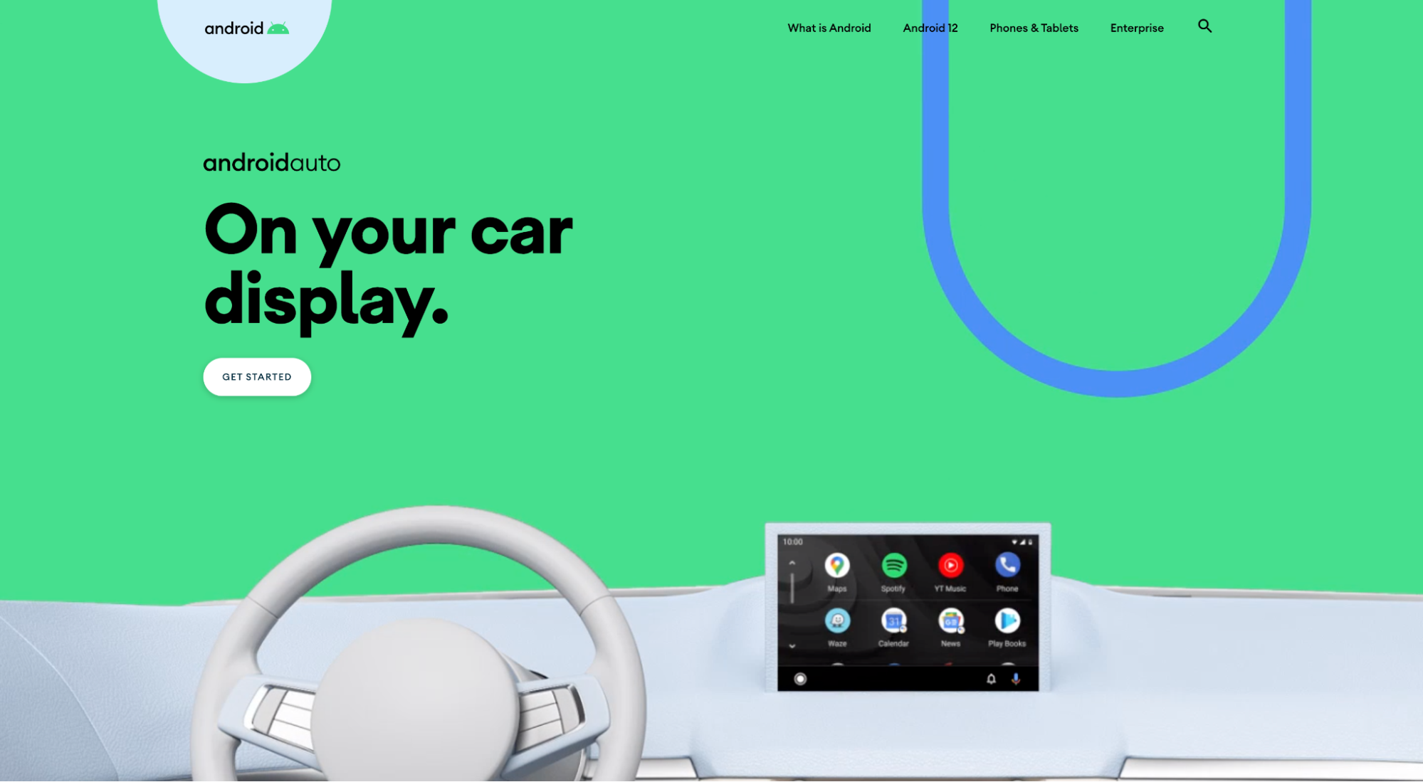
Android Auto is an app that lets you connect your Android phone to your car so you can use your car’s touchscreen as if it were your phone.
What we love: Information hierarchy
When it comes to structuring the information on your app landing page, we recommend three options:
- F- Shaped: Heatmap software consistently shows that website visitors read and navigate pages in the shape of an F, from left to right and back to left and down. F-shaped hierarchy works great for information-heavy pages with lots of reading.
- Z-Shaped: Heatmap software also shows that people are comfortable reading in a zig-zag pattern down the page. Z-shaped hierarchy works great for landing pages with more images than words.
- Vertical: Content that center-aligns from one section to the next. Think headline, subheading, image, repeat. Great for mobile-first designs.
Android Auto opts for an F-shaped hierarchy and executes brilliantly:
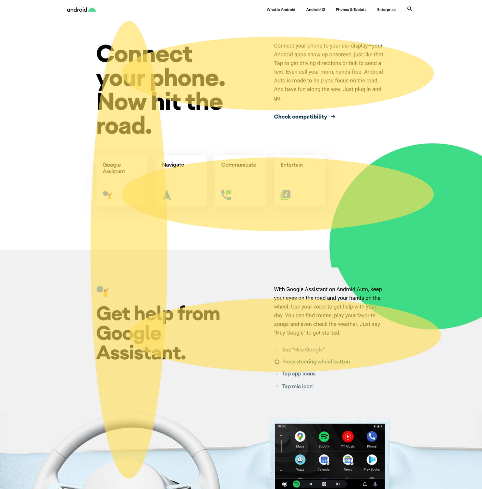
Notice how the landing page’s primary points land somewhere on the F?
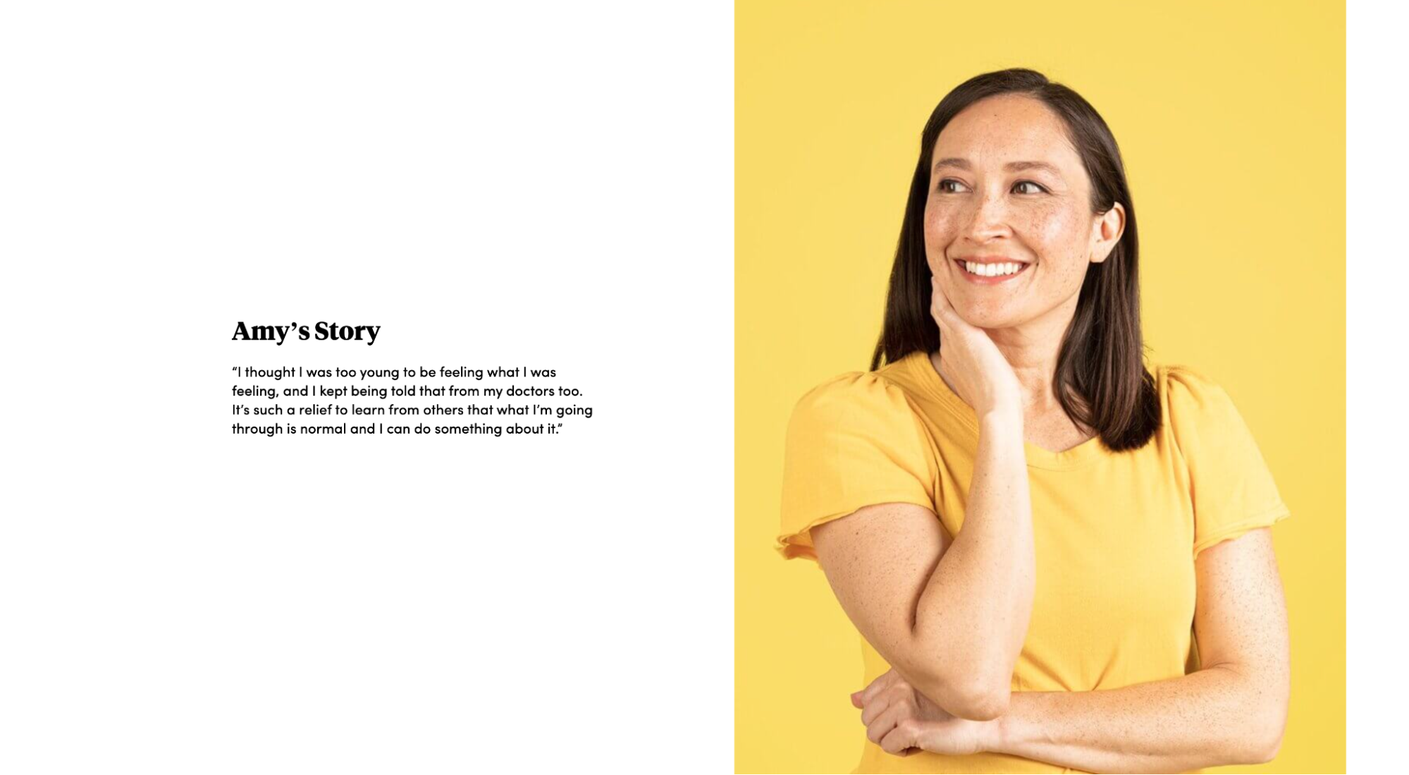
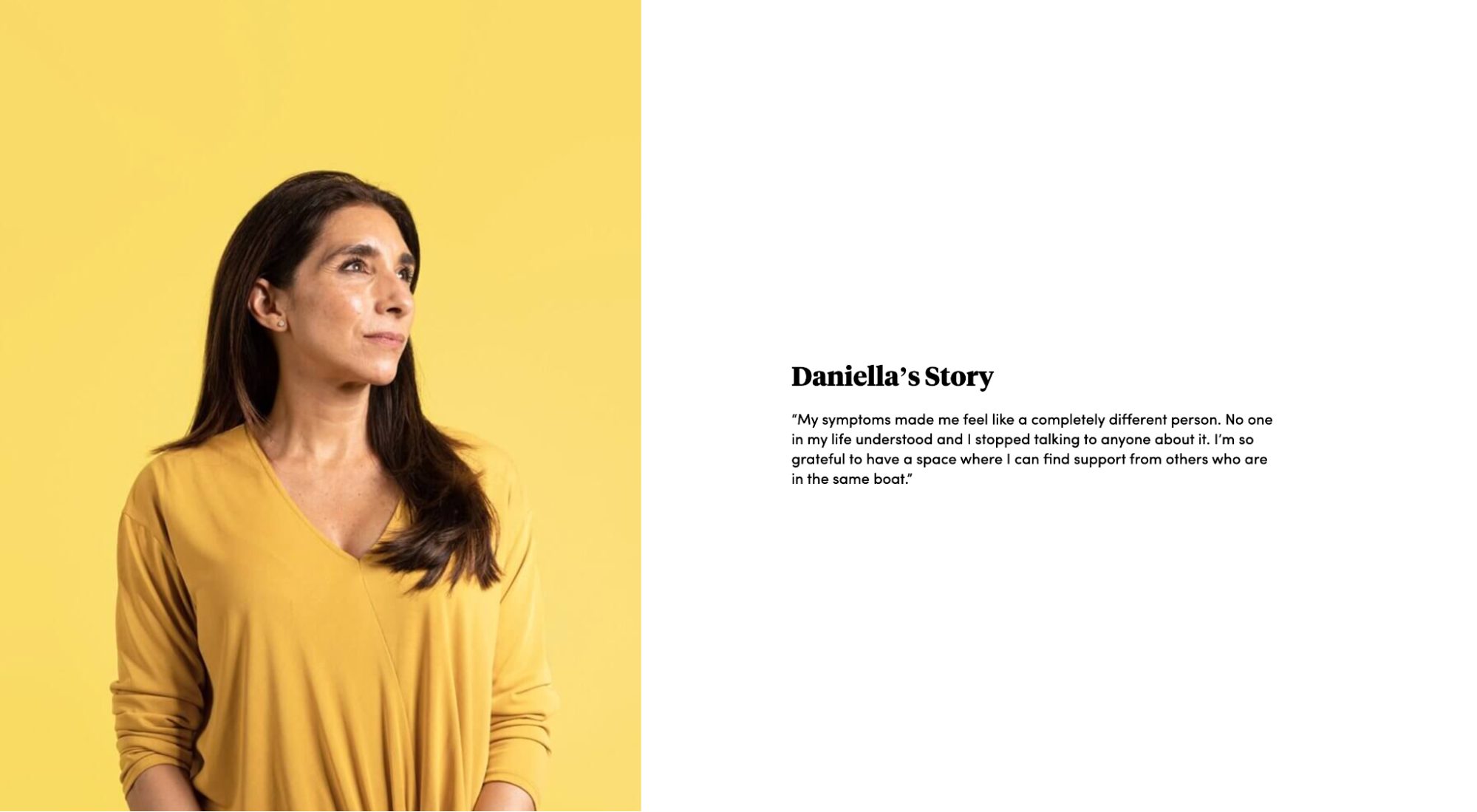
16. Caria
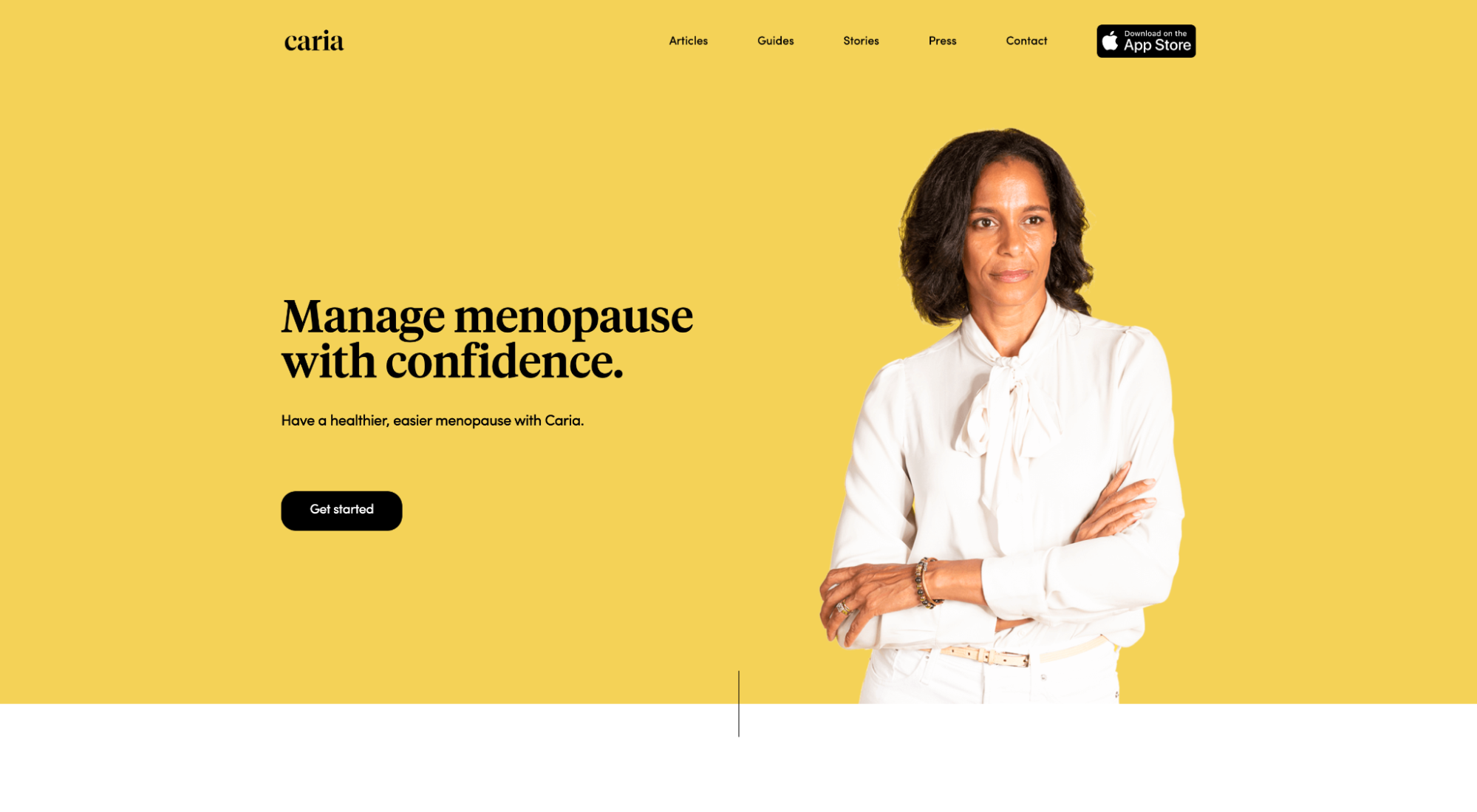
Caria is a support community that makes it easy for women navigating menopause to connect with other women and experts.
What we love: Real people, professional photography
Real customers beat stock photos every time, especially when you're selling a community like Caria’s.
With professional photos, Caria accomplishes the following:
- Brand consistency: With professional photography, you control the creative, right down to the colors and emotions. Caria keeps their imagery brand-consistent by using yellow backdrops and white and yellow clothes.
- Believable: No airbrushes. No photoshop. No ultra-soft lighting. Caria makes their app and offer feel genuine, authentic, and believable by using real women (not photoshopped models).
- Credibility: Testimonials work great. But when you pair testimonials with the names and images of the people who share them, they work even better. Caria’s brings their community to life, directly from their app landing page.

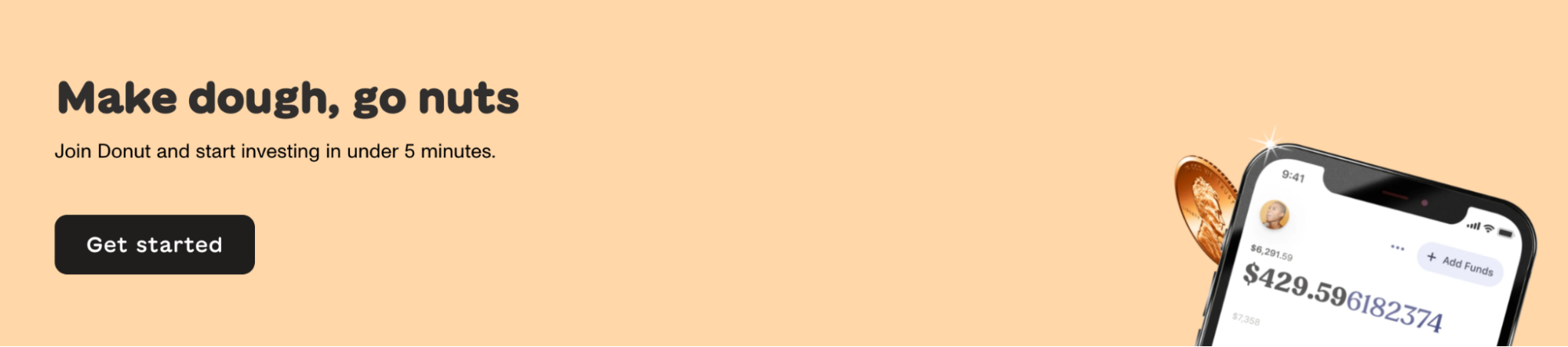
17. Donut
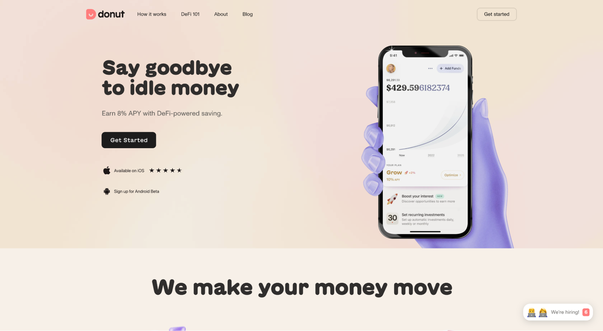
Donut is a finance app that lets you save much more % APY than a normal savings account by leveraging decentralized banking.
What we love: Second CTA
Your second (or final) CTA offers a chance to reiterate your value proposition, but in a different way.
Not only does Donut showcase their personality using the headline “Make dough, go nuts,” but they also handle objections regarding a lengthy signup process by adding “Start investing in under 5 minutes” to their subheading.
How to build a mobile app landing page
You can build an app lander from scratch (the hard way).
Or, you can build one using a landing page builder (the easy way).
Landing page builders come with mobile responsive app landing page templates, easy drag-and-drop design editors, conversion tracking, integrations, WP plugin, and A/B testing. All for affordable monthly pricing.
Lucky for you, we wrote an entire article reviewing the nine best landing page builders for every use case. So we won’t go deep here.
No matter which option you choose (custom or builder), we recommended starting with a template, then customizing from there.
Page builder mobile app landing page templates:
HTML mobile app landing page templates:
Closing thoughts on app landing pages
The perfect landing page doesn’t exi….
I mean, the perfect landing didn’t exist.
Hopefully, now it does.
What’s next?
Apply these best practices to your app landing page and watch conversions rise.
But seriously, if you want to create the best and most beautiful app landing page possible, remember the following:
- Headline
- Subheadline
- App features/benefits
- Strong visuals
- Professional photography
- Above the fold
- F-shaped or Z-shaped information hierarchy
- 1:1 attention ratio
- Hero shot
- Social proof
- Brand consistency
- Frictionless download
- Optimized form
- Name the enemy
- No stock photography
- CTA
- Second CTA (the same, but different)
Now go get those downloads.


