Post Updated: Sept 2020
While Looker has become my default option, you might consider Tableau, Mode, or Chart.io
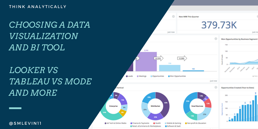
Data Viz tools can make or break the impact that a data team has on the organization. If your method of insight delivery is incompatible with your organization and team structure, you won’t have any success, no matter how clever your analysis.
So, after ingesting your data with one of the great data pipeline options, and choosing a data modeling tool, you need to figure out what data visualization or Business Intelligence tool to use.
I tend to operate faster in conjunction with a data visualization tool than in SQL alone, since it’s much easier to see trends and conclusions in visual formats than in a table. Additionally, simple dashboards can help reduce repetitive work and let you be more of an analyst and less of a data monkey.
Ok great, but what are the best data viz options for small-mid size teams?
1) Looker – The default premium option
Best for: Most data teams looking to put in place a solution that will work for both analysts and business users now and scale well later.
Pros: Looker has become my go-to choice for BI projects for companies that are far enough along to afford it. The key is that it’s flexible and powerful enough for analysts to use everyday, but just simple enough for savvy business users to help themselves. You can build standard dashboards, or interactive “explore” pages, and it even includes it’s own data modeling layer “LookML” to allow quick access to ETL functionality for a team that doesn’t have a robust Ingest->ETL/dimensional modeling->Visualization stack setup.
You’ll definitely benefit from a strong data team on the setup side, but several PM’s at Zapier have become power users (even to analyst/developer level) and a huge percentage of the team uses it occasionally.
If you read my blog regularly, you know I love working with the folks at Fishtown Analytics, and Tristan wrote a similar writeup with even stronger feelings than mine that Looker is the default choice.
For another example, Buffer seems to love looker, and I use it everyday at Zapier. So there’s definitely a loyal following among the young-tech crowd.
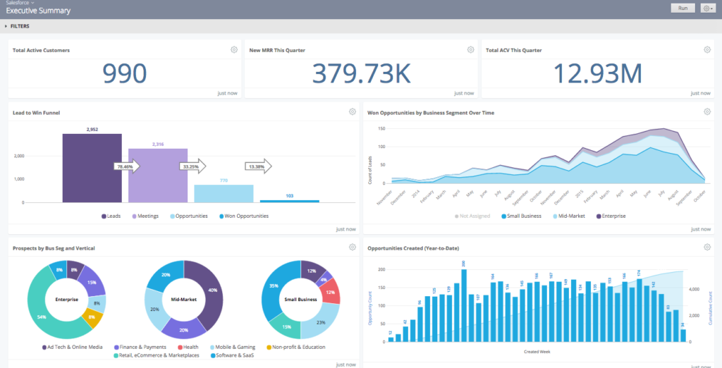
Cons: The visualization options are limited compared to a more robust offering like Tableau, but it does cover 90% of use cases. Something I wish it supported better out of the box is some generic conversion funnel-like views that Mixpanel and similar are based around. You can see the single example in the screenshot above, but it’s quite inflexible. A tool this expensive should replace most of your other viz tooling, but at Zapier we’re still having to build internal tools to cover a few gaps in conversion funnels and experiment reporting.
One additional point from Lukas Oldenburg on measure slack: “Looker didn’t allow for quick ad hoc data analyses with data from other sources, e.g. some csv file from some system whose data is not yet integrated into the data warehouse. This puts a huge load on the integration layer where any data source that anyone ever want to analyze with looker needs to be in that dwh, a status that we would have needed years to reach.” This is definitely a true statement. At Zapier, we ingest all of our google sheet data via matillion, but if you’re mostly doing adhoc csv analysis, your tool of choice is probably tableau.
Pricing: Compared to everything else on this list, Looker is expensive. With a standard entry point over $35k/year, it simply prices out a large portion of small-mid size teams. That said, if your business is growing quickly and needs a tool that you can start with now and won’t outgrow for years. Looker’s an amazing choice.
2) Tableau – An analyst’s best friend
Best for: teams who want to leverage the FAST analysis capabilities for analysts, and prefer stable, older products to the leading edge. In the “Data Viz for All” space, it’s hard to go wrong with Tableau.
Pros: In general, I’m a huge advocate for tableau. As an analytics guy, tableau is a terrifically powerful tool to dive into a data set, slice and dice, and come away with some pretty powerful conclusions. They’re the most established company here, and their feature set is likely the most powerful in the hands of a good analyst. Additionally, the Tableau community is large, vocal, and full of knowledge. You’re more likely to get a great answer on their forums than anywhere else. Plus, if you’re hiring junior folks, Tableau is likely the tool that they worked with in class or in school.
Tableau Prep gives them a competitor to more robust ETL tooling. This review from interworks can give you an idea of what to expect if you wanted to try relying on Tableau prep instead of a dedicated modeling layer. I wouldn’t recommend it (go DBT instead!), but it it is possible.
Tableau has the same type of benefits as Looker as far as business users go. You can develop a ton of self-sufficient usage among the company, even in relatively deep use cases. This is especially true given how good the help forums are.
Update Sept 2020: Why Tableau these days? Caitlin Moorman, head of Analytics at Trove, and formerly Sr. Dir. at Indiegogo had some more up-to-date thoughts:
Business users love Tableau because it’s super intuitive if you can use Excel. There’s much more flexibility on visualization, even with basic cross-tabs (more flexible pivots, drill paths that keep you within a workbook rather than popping you out of it, better subtotals, etc.). If you have the time and bandwidth to build beautiful viz, then you can do some really impactful work. If you use extracts it’s crazy-fast (though them limited on granularity), and though this is a silly thing, the ability to have multiple tabs within a dashboard allows for much more intuitive analysis/reporting workflows. The advent of dbt makes it much more manageable as a shared solution than it used to be, since it’s easier to keep most of your modeling out of Tableau and suffer less pain from the lack of version control / full UI-based modeling / etc.
That said, I migrated away from it both in 2015 and 2019 because it’s just a giant pain to maintain. Working in the UI is not fun, you need to bounce back and forth between Server and Web frequently, and lack of version control is painful. Looker may have only 80% of the viz capabilities, but my team can move so much faster (without breaking things), that we can still get many more insights out into the world with the same hours in the day.

Cons: Feels a little dated – you can feel that Tableau was designed before cloud-only SaaS applications ruled the space. Also, it pulls data into tableau data extract – because tableau was around before the redshift style cloud analytics databases, it’s predicated on pulling data into their proprietary engine. While that’s not a huge issue, it is obnoxious to have to pre-connect to each table individually, where every other tool is basically “connect all”.
Pricing The per seat licensing is frustrating for small-medium teams that want to use it honestly. “Who needs a seat?”-type questions arise regularly. That said, with their new SaaS pricing plans introduced in the last year, they now have one of the lowest entry-level price points with the seats at $70/month for the analysts and $15-42/month for others on the team.
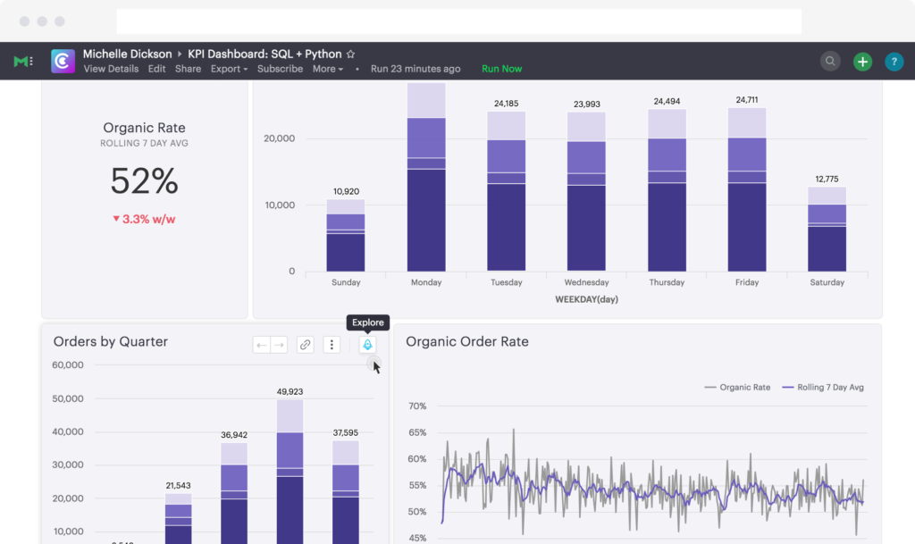
3) Mode Analytics – When your primary focus is productivity on the data team
Best For: Data Team collaboration and work, where business users don’t need much self service.
Pros: The data analyst / data scientist workflow combination is first class. Mode allows SQL Analysts and R/Python users to sit in the same tool and work side-by-side. No other tool does this effectively. Additionally, the shared workspaces and dashboards that the team can collaboate on are first class, if you often have multiple folks working on the same material.
Extra Shoutout – Mode offers free intro to SQL and intro to Python courses online. Combined with a terrific free level product for individuals, they are an amazing way for someone to break into the data space. They deserve special kudos for that.
Cons: To be a data-explorer level user in Mode you need to know SQL, Python or R. That means that it’s great if your analysts are always going to be developing reports and answering questions. However, if you want business users to be able to explore much from scratch, you’re likely to struggle.
Pricing: Mode recently stopped publishing their pricing, so as of Early 2018, they were charging $500/mo for most teams. Since mode is a team-based tool, they don’t upsell the seats, which is nice. You can collaborate and share effectively among the data team, and publish results for the business users to look at.
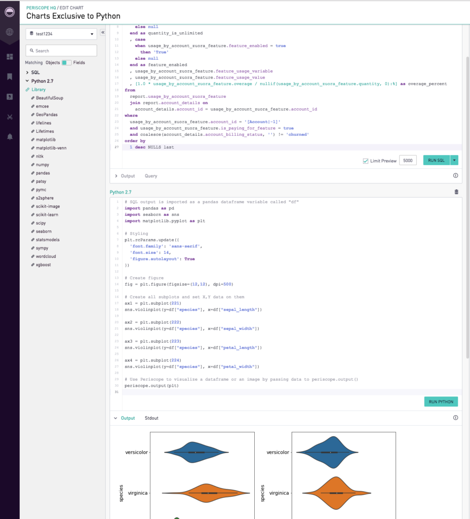
3a) Periscope Data – Honorable Mention
Pros: In the couple of years since I explored periscope last, they’ve invested in becoming a close competitor to Mode. That means the feature set is building out quite quickly.
Cons: I struggle to see when I would choose them over Mode given that they seem extremely similar, and I have Mode experience. YMMV
Update: Leon, the head of data at Periscope, reached out with a few comments that I thought were worth quoting here.
“Periscope Data offers much better performance and more advanced analytics capabilities, according to customers who evaluated us against Mode. These include our integrated Python/R editor in the product, more collaboration & sharing options, easier embedding and reporting capabilities, and an overall faster platform. More importantly, our new “data discovery” for business users helps non-technical users explore data via a drag & drop interface to find answers on their own.
We enable advanced data processing capabilities, powered by our Redshift cache. We automate the data migration into the cache, provide access to cross database joins, and even unlock last-mile data prep via materialized views. That really helps data teams to quickly establish a single source of truth across the entire organization, while improving load times by preprocessing heavyweight data transformations.”
Given the above, if you’re in the market for this type of data-team-based sql/code focused BI, get demos or a trial from each of them!
Pricing: $500-$5k/mo
4) Chart.io – Everyone in the company can learn
Best for: Teams where the only users are business users (no true data analysts)
Pros: Easy to use, for real – Most of these tools claim to be easy to use, but it’s typically only half true. I do think that chart.io’s step-by-step chart development procedure can make answering questions more straightforward than in tableau or looker, where you have to think through each step beforehand. Live Connection to Redshift – Updates info close to real time. Easily accessible team dashboards.
Cons: Ad-hoc analysis is a hassle. If you don’t know the exact question that you want to answer, the same step-by-step procedure that’s a benefit in some cases, can be a big hindrance in others. If you want to segment a chart by a different variable, you have to edit every step that you did to account for a new column. In any one case, this is only an extra few minutes, but a few minutes per analysis, every time, adds up to a ton of lost time. For example: Let’s look at LTV by plan, then by persona, then by gender, then by first course taken. In tableau each of those what-if’s are basically instant to swap back and forth, chart.io doesn’t make it nearly so easy.
I hope this series has helped you on your way to building a more data driven company. Check out more about data pipeline options, and choosing a data modeling tool, if you haven’t seen them. Don’t be afraid to reach out in the comments or contact me if you want to discuss specifics of your implementation.
[…] Data visualization is a critical step in data driven decision making. Get tool recommendations and justifications here! […]