Great Slide for Understanding Data Visualization
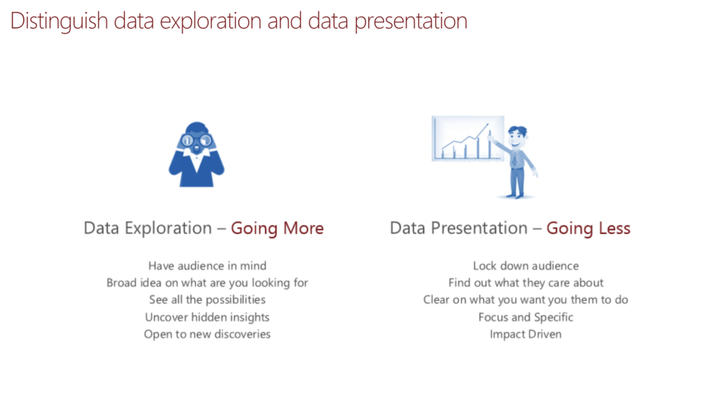
I recently attended a great Power BI session on Data Visualization by Miranda Li, The Data Visualization Lead by Microsoft. I was expecting to see some cool tools in Power BI that would further my knowledge. It turns out I was in a for a complete surprise in that, we actually focused on the planning behind Data Exploration and Data Presentation. Never heard data represented this way before but this slide below stuck in by head and made a lot of sense of the issues we face with customers, and how they do not properly define their reporting requirements, or even understand these methods.
So we have a choice to make when designing reports. In one way a report maybe a raw data file that you can drill down, slide and dice data that’s not in a any particular format other than the source layout or GOING MORE. The other way is Data Presentation which is what most of consider a report today to be today or GOING LESS. This has confirmed my suspicions all long when building complex reports. Reports should be focused, locked down, provide instant impact to the area of focus with visualizations color coded to bring your attention to them.
In the community, I help and work with many consultants with different skillsets and roles, and everyone is trying to add way to much into the core reports. I hope this slide helps you as it did for me, and opens the door for more research into the topic to help better deliver results for our customers and employers. I will continue to post articles about the topic moving forward as Data Science is an exciting topic for me! Enjoy!
