So far, 2018 has been a remarkable year for web design trends. We’re seeing years of design evolution finally come to fruition in trends like Design Systems and Tactile Design, as well as fun and energetic styles like the return of retro. Now more than ever it’s crucial to reflect on what’s happening with web design, and what will continue into the future.
In this article, we discuss the 6 web design trends that are influencing 2018 the most, starting with one that’s shaping up to be a new design necessity.
1. Component-Based Design Systems
If your company hasn’t implemented a design system yet, chances are you will in the next few years. According to the most recent 2017-18 Enterprise UX Industry Report, 67% of those surveyed are now currently building theirs, if they don’t have one already.
There’s a good reason for their success, too. Design systems are the natural progression of style guides and pattern libraries, but with so much more to satisfy the needs of modern companies.
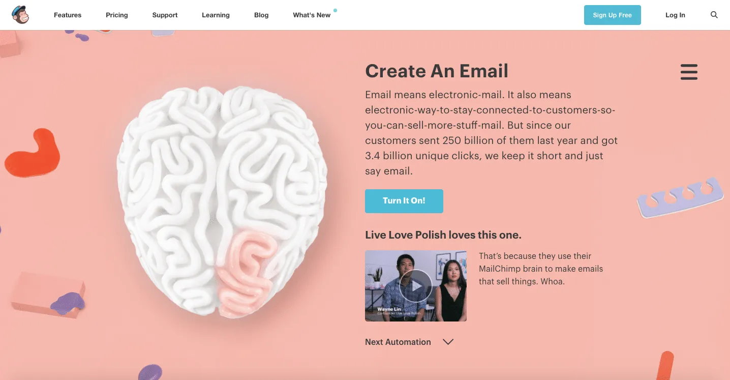
MailChimp, built according to MailChimp Design System.
What is a design system?
A design system includes design standards, documentation, and — one of its central advantages — a UI toolkit with patterns and codes. Design systems aim to ensure consistency across each of an organization’s products, and even within individual products themselves, and to use the optimal design solutions in any given situation.
As Nathan Curtis says, a “design system isn’t a project, it’s a product, serving products”.
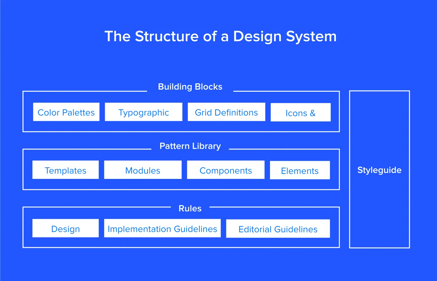
Because some of these areas can change, a design system is a “living document,” constantly updating itself whenever new or better solutions reveal themselves.
What does a design do in practical terms? Let’s look at the Polaris Design System, used by Shopify. They break their design system into four areas:
Product principles: Mission statements and approaches to product design, such as putting the merchant first and an emphasis on accessibility.
Written content: A style guide for all written content, including grammar/spelling choices, voice & tone, and general guidelines like target reading levels.
Visual properties: All things visual: color, typography, image guidelines, icons, chart presentation, etc..
Components: The nitty-gritty, covering design patterns, their usage rules, and quick-copy code.
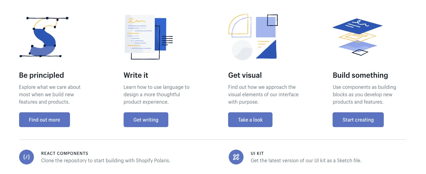
Shopify’s Polaris Design System.
How to Create a Design System
You can create your own design system by following these 7 steps from our free ebook Creating a Design System: The 100-Point Process Checklist.
- Create the UI inventory: Go through all your products/websites and list all the design patterns used. Rectify any inconsistencies you come across.
- Get support of the organization: Present your findings to get everyone else on board. It helps to estimate the number of design and engineering hours wasted on redundant work, plus mention how more streamlined products can improve NPS scores.
- Establish design principles: What are the principles that govern your company? Consolidate answers into a master list.
- Build the color palette: Standardize your color palette using precise color codes and agree on a universal naming convention
- Build the typographic scale: Fine tune your font sizes, weights, line-height, etc. and establish concrete rules for displaying text.
- Implement icons library and other styles: Revisit your initial UI inventory and carry over select icons and design choices.
- Start building your first patterns: Audit your pattern library to select the ones that best reflect your company, your products, and your customers.
Keep in mind, a design system is never fully finished. Update periodically and keep an eye out for areas that can be improved.
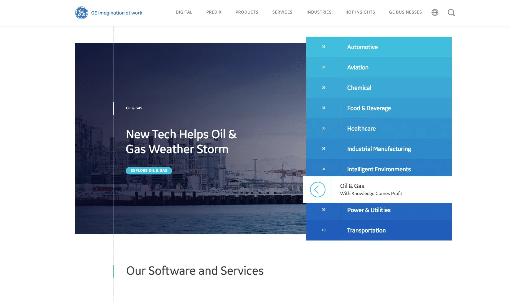
GE Digital, built according to Predix design system.
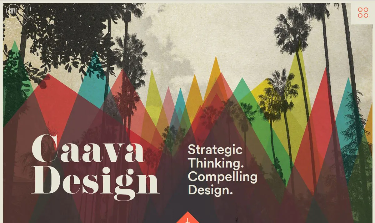
2. Polygonal Shapes and Geometric Layers
One of the most distinct web design trends of 2018 focuses on geometric themes, specifically polygons and layered shapes. Chances are you recognize this style when you see it, but to put a precise definition on it, a polygon is any closed-off shape with straight lines, typically 3-5 sides. This trend includes every floating triangle and square you see, but also original shapes that fit the definition.
The style essentially centers around geometry, either with shapes (both regular and irregular) or basic geometric patterns (grids, planes). Let’s break down its specific components:
Simple geometry
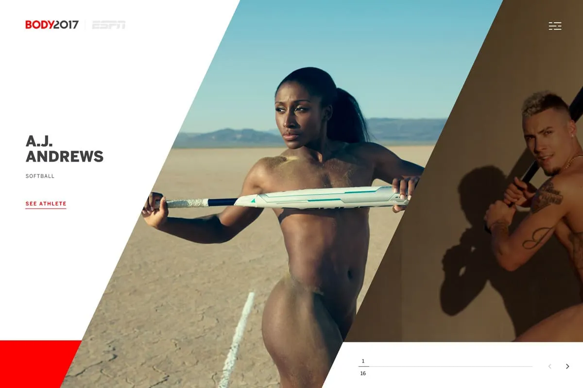
http://www.espn.com/espn/feature/story/_/id/19742921/espn-body-issue-2017
Rather than filling the entire screen, many companies like ESPN above opt instead for more original, but simple, shapes. This can bring other subtler benefits; for example, ESPN’s slanted shapes above influence the natural visual flow, creating a more dynamic screen overall.
Bold Lines to Grab Attention
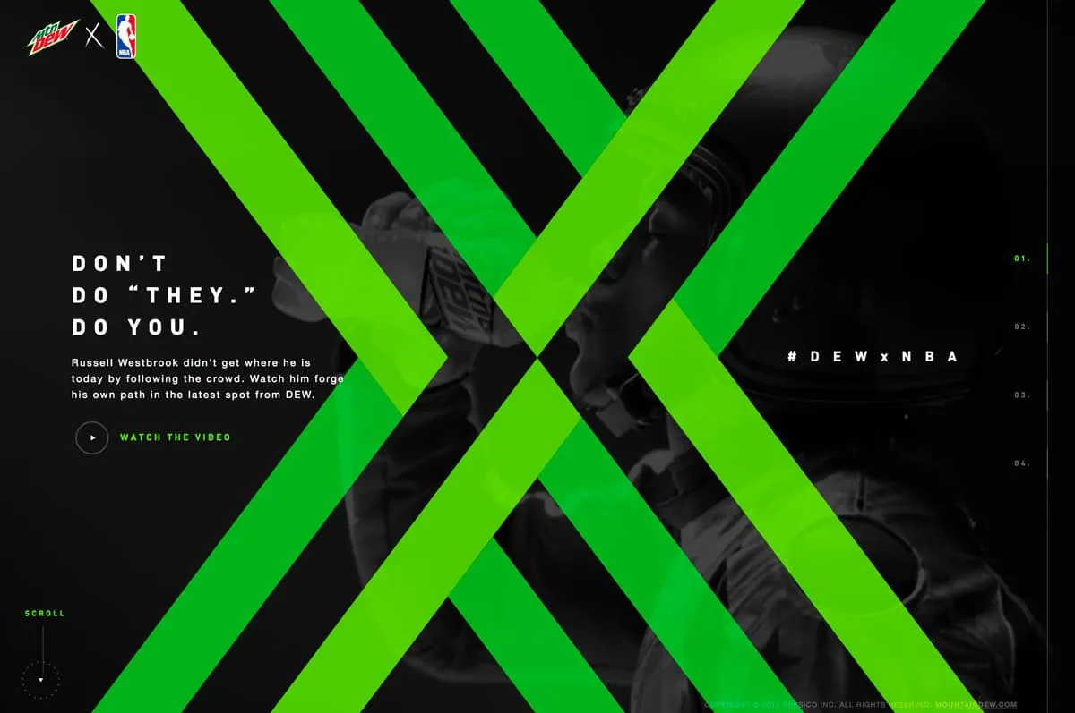
http://www.mountaindew.com/nba/
Lines are geometry too, so highlighting them fits this style as well. When used correctly, big, bold lines can visually carry a screen, or draw attention to the complementary image.
When using thick lines, you want to pay attention to both color and intersection points. Color will determine where the user’s attention goes, whether drawing attention to or away from the lines. Intersection points inherently become focal points, so use them to your advantage.
Detailing
If you don’t want to commit to a full geometric aesthetic, you can also use this trend for detailings. Polygons and geometric layers are visually interesting at any size, and so they make great secondary graphics or even button icons.
3. Tactile Design
Tactile Design has an interesting origin: it grew from the principles of Material Design, but at the same time it modernized the old skeuomorphism trends from the early 2010s.
In a nutshell, Tactile Design makes objects appear real in a digital space. In the words of Google’s Material Design guidelines, “the material is grounded in tactile reality, inspired by the study of paper and ink, yet technologically advanced and open to imagination and magic.”
Tactile design is hard to pin down with words, but like the geometric trends, you know it when you see it. Let’s take a look at its common components:
No Borders
Like the real world, there are no borders or windows; everything is taken in altogether. Certain elements — particularly text — cross over from one element or screen to the next. For this to work, designers make a good use of space so that users know what they can click on and where it will take them. That’s why you often see ample negative space (white space).
Multilayer Design
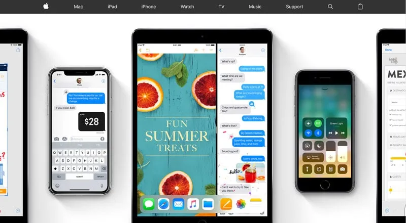
https://www.apple.com/ios/ios-11/
Just like Material Design, Tactile Design incorporates multiple layers to create a more realistic look. That means lots of drop shadows to distinguish layers and instill a little more realism.
Purposeful Motion and Animation
Tactile Design prefers meaningful motion over more complicated animations just for fun. Moving elements like hover states and transition animations don’t just improve the visuals, they also serve a purpose and improve usability.
Detailed Photography
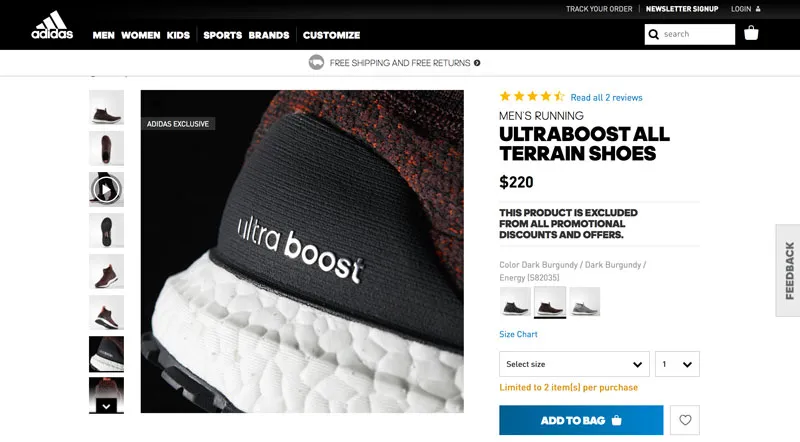
https://www.adidas.com/us/ultraboost-all-terrain-shoes/S82036.html
Again because of the importance of realism, Tactile Design uses highly detailed photography, a mixture of HD quality and close-up angles. This is doubly beneficial to ecommerce sites, since detailed photos give shoppers a better understanding of what they’re buying.
Grab design ebooks created by best designers
All for free
Do you want to know more about UI Design?
Download 'Creating a Design System: The 100-Point Process Checklist' FOR FREE!
Download e-book for free4. Complex Desktop/Simple Mobile
The desktop vs. mobile rivalry has been around since the rise of smartphones, but what we’re coming to realize is that they’re not rivals at all. They actually work together. According to a GO-Gulf study, around 90% of users complete the same task on multiple devices, across all age ranges.
Recently, we’re seeing a differentiation between mobile and desktop interfaces of a site. Rather than cramming a complex system into a mobile device or moving a simplistic system as-is to desktop, companies are designing more device-specific variations of the same product, site, or app.
The trouble is knowing what needs to be changed, and how. Below, we’ve collected some top pointers on how to best use mobile device’s individuality instead of just translating a desktop system:
Mobile Alternatives for Complex Interactions
- Replace header videos with stills from the video. If you need to include a video on your mobile site, use a link to YouTube.
- Don’t use hover effects. Instead, tappable buttons or gesture controls can hide/show information.
- Simplify animated effects. They just don’t work as well on mobile. For example, Coach replaces its desktop slider-animation combination graphic with an animated gif on mobile.
- Replace dropdown menus with hamburger menus. Love them or hate them, hamburger menus are an established pattern that everyone already knows how to use.
- Implement voice activation when you can. This is becoming increasing popular, and may be the new norm in a couple years.
- Reevaluate colors and backgrounds. Mobile devices sometimes require more contrast to maintain readability.
5. Modern Retro Design
Even the New York Times admitted that web design is currently in an age of nostalgia. Today, designs are borrowing more and more from the distinct tastes of the 90s, 80s, and 70s. Let’s look at what each of these eras is bringing to the table:
- 90s: A time when designers where exploring what digital platforms could do. Lots of animation, colors, and moving parts, or else stripped-down designs of pure information.
- 80s: The pixelation from the budding video game industry mixes with the bright neon culture from period fashion and early MTV.
- 70s: Muted colors and bold typography — particularly psychedelic fonts — from when print media was still strong.
Using retro styles in modern times requires picking-and-choosing the best elements to use. After all, certain design styles are best left in the past. Below are our suggestions on what to keep:
Old-School Typography
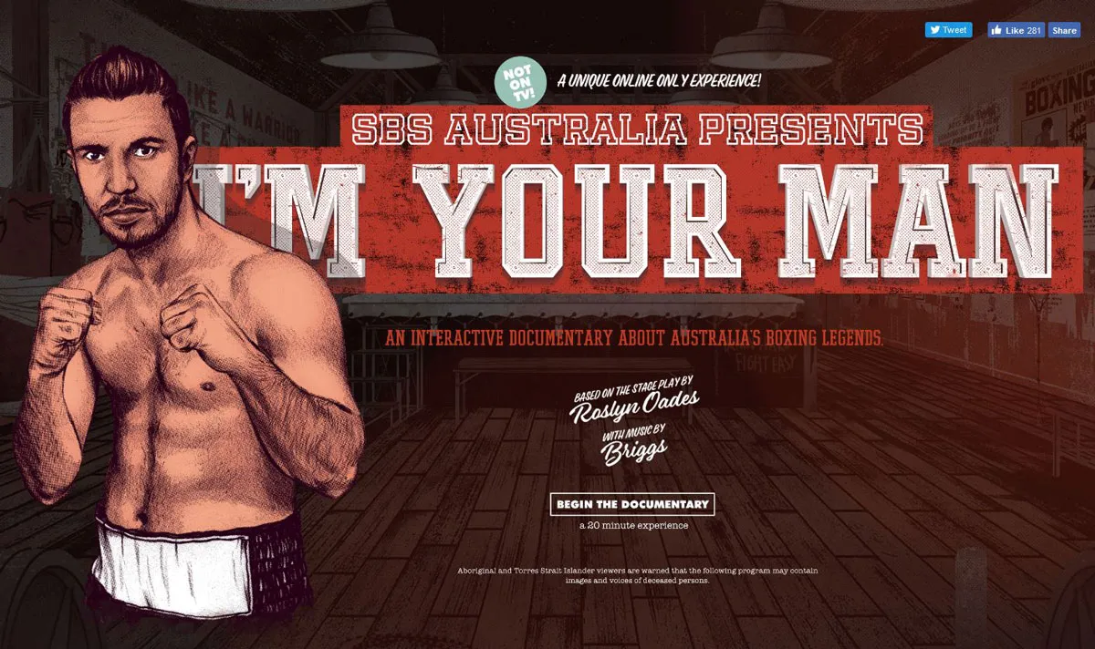
http://www.sbs.com.au/imyourman/
We see a resurgence of not just big and bold text, but also the fonts themselves. Fonts with elaborate strokes, thick cursive, and/or rough edges are becoming popular again, as are fonts reminiscent of old movie posters.
The key to using such “loud” fonts effectively is moderation. Big and bold typography is ideal for titles and headlines, but can be distracting for secondary information or body text. It’s best to pair loud fonts with a simpler and subtler font for normal copy.
Extreme Colors
Whether using muted colors or bright colors, modern web design pays extra attention to color. Color overlays are common, and so is using matching colors to accent other images and illustrations.
Texture and Gradients
Like colors, texture and gradients are commonly seen in extremes. Some organizations put plenty of texture to give their sites a more realistic feel, while others are stripping away such effects for a stark minimalism.
Video-game Style
Pixelation, mimicking the original Nintendo console, is a popular style even for non-gaming sites. The juxtaposition of low and high fidelity allows for a interesting aesthetic both older and younger generations love, not to mention how easily it stands out.
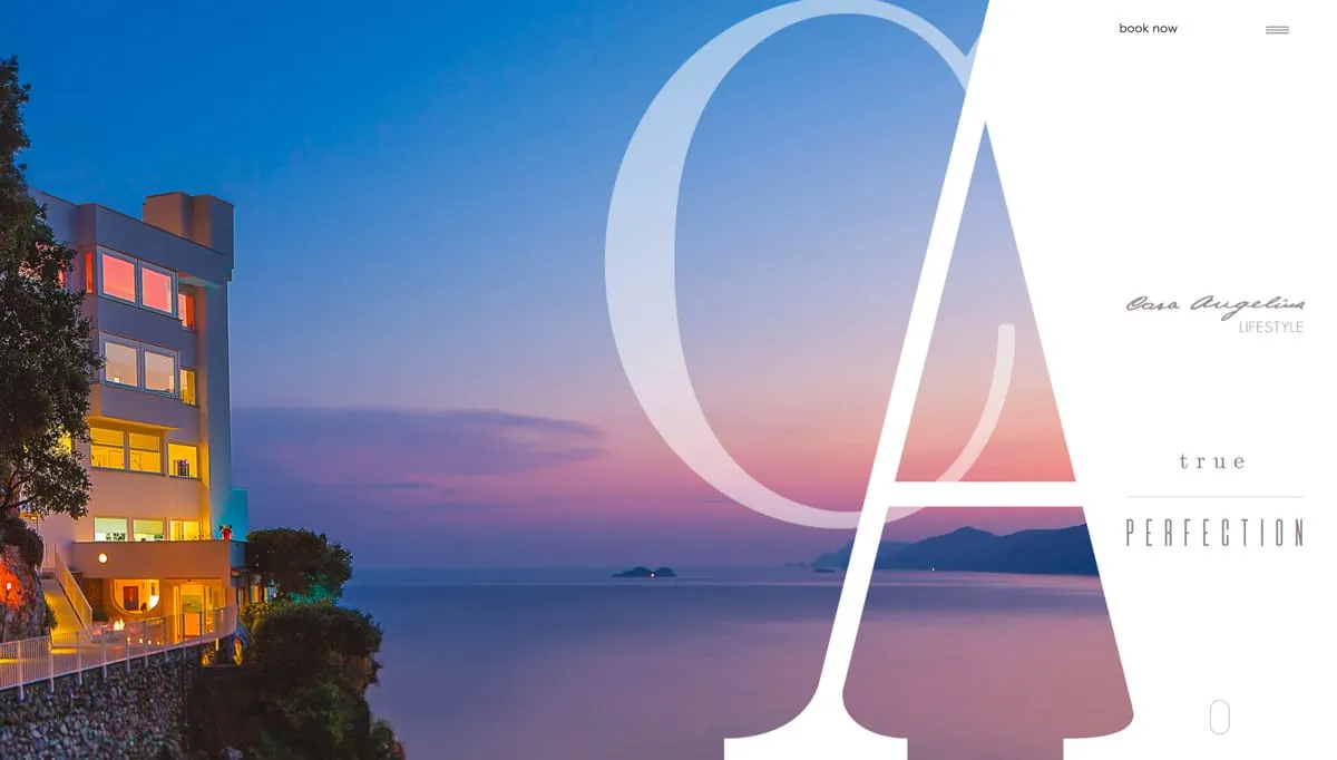
6. Simple Homepages
Last, a return back to basics. Homepage trends have come and gone over the years, but now we’re seeing simpler home pages that work more as a gateway than a source of information.
This trend actually emcompasses a variety of other trends. So to get a homepage that looks modern, you can utilize any number of the trends below.
Minimalism
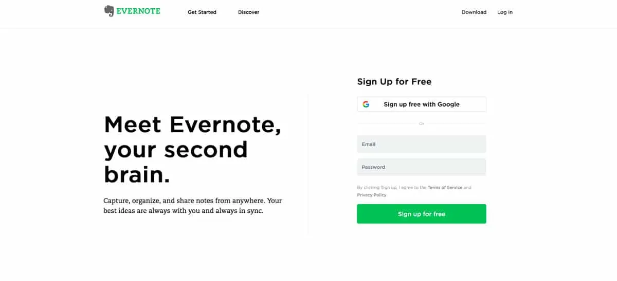
The go-to style for simple and easy-to-use interfaces. You can identify minimalism by its abundant negative space (white space), big & bold typography, and colorful accents. For homepages, color works best to draw attention to your main call-to-action, as with Evernote above.
Flat Design Family
Flat, Almost Flat, and Flat 2.0 — similar but with distinct differences — all work well for simplifying homepages. Like minimalism, they reduce distractions and take advantage of color flourishes, but flat design is more forgiving of detailed visuals like an HD hero image.
Subtle Animations
https://www.roystonlabels.co.uk/
Animations can improve both usability and user enjoyment, but they can also distract from your main elements. Lately homepage animations have become more subdued, limited mostly to:
- automated animations that move on a fixed schedule
- trigger-based animations that move when the user clicks or scrolls
These more subtle animations retain the benefits of movement, but without losing the simplicity that modern homepages are going for.
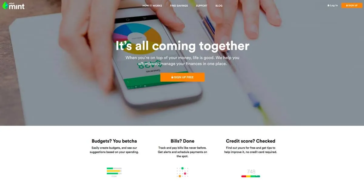
Beautiful Photography and Videography
As long as you leave out other attention-stealing imagery, using a solid hero image or video background still can make a simple homepage. It allows the user to focus solely on the subject of the visual, which can have a powerful effect when done well.
Prioritize Readability
Particularly popular with long-form content sites, homepages are seeing a renewed appreciation for readability. If you want to highlight your homepage copy, make it more legible by using:
- above-average text size (>16 pt. for body copy).
- exaggerated leading or line heights (1.75x text size).
- oversized gutters.
- text color contrasted with background.
- centered images and callouts so line lengths remain equal.
Conclusion
Web design in 2018 is making huge advancements, perhaps more than in any preceding year. That makes this year one of change and transition, where fields like mobile design and component-based systems are coming into their own, while older styles like busy pages are retiring.
Now more than ever it’s time to reevaluate your design strategies and catch up on everything that’s been coming to light over the last few months and years.
For more advice and dozens of examples, download the full 78-page free ebook Web Design Trends 2018.