Last week Uber unveiled a new logo and identity. Repositioning their brand for a new era, the company might have finally cured their controversial and confusing circular icon for a simple, modern wordmark as part of its rebrand.
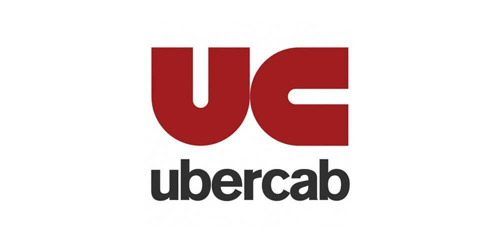
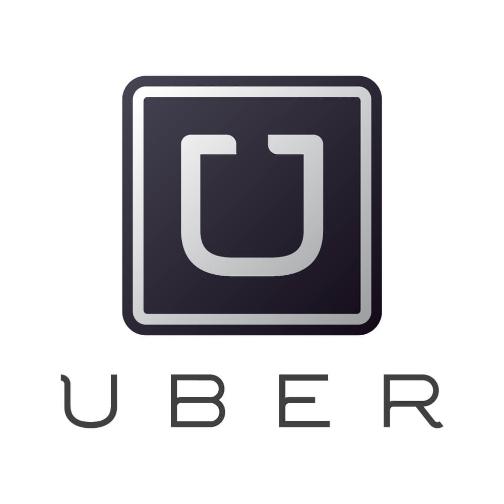
Uber was founded by Garrett Camp and Travis Kalanic in 2009 as a small start up company in San Francisco. Its first logo was a red magnet which followed to their well-known greyscale "U" in 2011.
2010 Logo |
2015 Logo |
2016 Identity
Let's begin when Uber introduced their 2016 identity - the random circle logo. There was so much back lash due to its lack of continuity from its previous two identities where each have a recognizable 'U'.
 2016 Uber Logo
The result was a new color palette to replace the old black and white icons. The designer community had mixed reactions to the new logomark - we thought it looked like a Pacman wearing earmuffs, others were more crude.
2018 New Identity
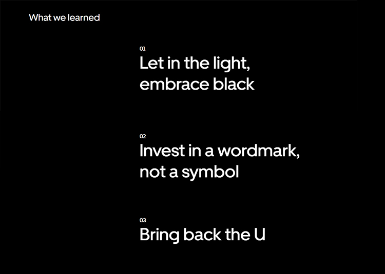
When you first look at the identity you probably don't even recognize it. What's the big deal? It's just a white font with a black background. Uber's new logo is part of a growing font trend in wordmark logos also known as a name logo or a font logo - and thank goodness! It's really helped with Uber.
The brand team gathered information from Uber's audience, building off why they became iconic:
 Uber's Key Points
The new logo therefore encompasses the company name, written in white and set against a black background. Creating a modern custom typeface called "Uber Move". The thinking is to stay similar to sans serif fonts used for transportation signage around the world.
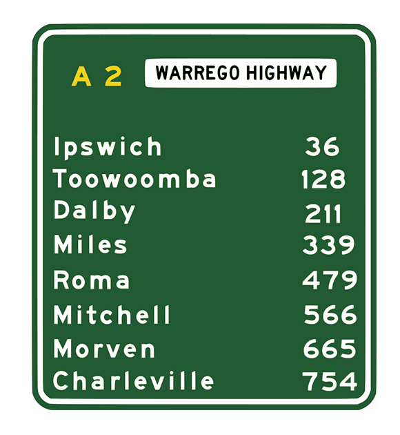 Transportation Sign
In compositions for digital and print advertising emphasises on the letter U. Defined by a grid based logo making it easy to understand.
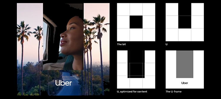 Uber's 2018 Brand Identity
The key for this brand is simplicity and flexibility and we're loving Uber's new image.
Why are wordmark logos making a big come back?
For all companies it's crucial to maintain the three R's - relationships, results, and reputation - to be successful. The most critical factors for this success is branding. Companies need to uphold a credible image. Here a few reasons why wordmark logo should be your go-to:
- A wordmark logo is a distinct text-only typographic treatment of the name of a company or product that comes to be a visual symbol for the company or product. Think Coca Cola's timeless logo.
- No brand confusion - wordmarks have the benefit of containing the name of the brand the of the company.
- Wordmark logos (also known as a logotype) can be registered as part of a company's intellectual property
- It's the new icon
- You can play with font height,lineweights and kerning
- Wordmarks are more identifiable
- Simple to use
- Timeless with few variations required
Here are some unique and straightforward wordmarks made on BrandCrowd!
How to create a wordmark logo for your business
Are you launching a business or service and need a striking wordmark logo to represent your company? We have two recommendations for you.
01. Hire a professional logo designer. DesignCrowd's community of talented graphic designer specializes in logo design. Trusted by 100,000 businesses for their design needs, it takes only a few minutes to launch a logo design brief. You have the option of working with one professional logo designer or work with a crowd of designers through a logo contest.
Simply describe your requirements (your business name, target market etc), launch your design project and our designers will generate hundreds of custom wordmark logos tailored for you. Shortlist your favorite designs, run a poll with friends and pick the winning design. Logo contests run for about five days, but you can choose the duration when you order your design.
When you hire a designer, you leave it up to professional designers to develop the visual design for your brand. Freelance design contests allow you to draw on design professionals from around the world and receive varied and diverse logo design ideas.
02. Use a logo maker. Try BrandCrowd's online logo maker to create a fantastic logo for your business or event. The AI-powered logo maker can generate hundreds of wordmark logo ideas in a range of styles, from handwritten to modern, traditional to funky text.
The name logo generator customizes the logos you select. Play with colors and fonts to get the perfect logo tailored for your business. The pros of a professional logo maker (like BrandCrowd) are you get to see all the potential designs on offer before you buy, and you retain control of the result.
Your business starts with an amazing logo. Today, we've shown you two ways you can create your new logo that is better, cheaper, faster and more creative.
Want more?
When Should You Consider a Rebrand for Your Business
Logo, Logomark, Logotype - What's The Difference And What Do You Need?
Where To Use Handwritten Fonts
The Best Lettermark Logo Creator
How To Turn Your Handwriting Into A Font
Written by Divya Abe on Monday, September 17, 2018
Divya Abe is an expert graphic designer ready to share her knowledge with the crowd. Besides spending quality time on the internet she enjoys anything to do with cats. Get in touch via Google+.
