
Last week, I bought a great new Bluetooth headset — then, sadly, proceeded to spend over an hour on a frustrating quest to connect it to my computer. Despite the promises made by both the headset manual and the computer-support site, the headset did not automatically connect to the computer. After re-reading the instructions, checking to make sure both devices were on, scouring the headset reviews to confirm it was compatible with my computer, and even testing the headset by syncing it to a different computer, I was just about ready to give up and return the darn thing when I found a random help page (from a completely different hardware manufacturer), which changed everything.
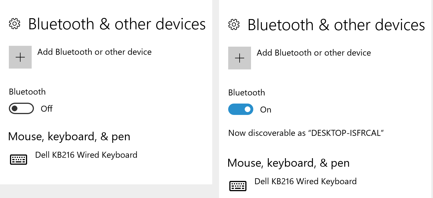
This new help page showed an actual screenshot of what the Windows 10 Bluetooth settings switch looks like when it is turned on. Looking at this screenshot, I instantly realized my mistake: the Bluetooth settings screen I’d been staring at for the past hour was actually showing me that Bluetooth was off on my computer.
I felt pretty dumb when I realized my mistake. But my failure to understand the current state of the device is actually an extremely common usability problem — so common that visibility of system status is the very first in Jakob Nielsen’s famous 10 Usability Heuristics.
Looking at this design, it’s clear that the creators knew it was important to make the status visible: they even included an explicit status label, Off, next to the control switch.
So what went wrong? To understand, we need to dig deeper.
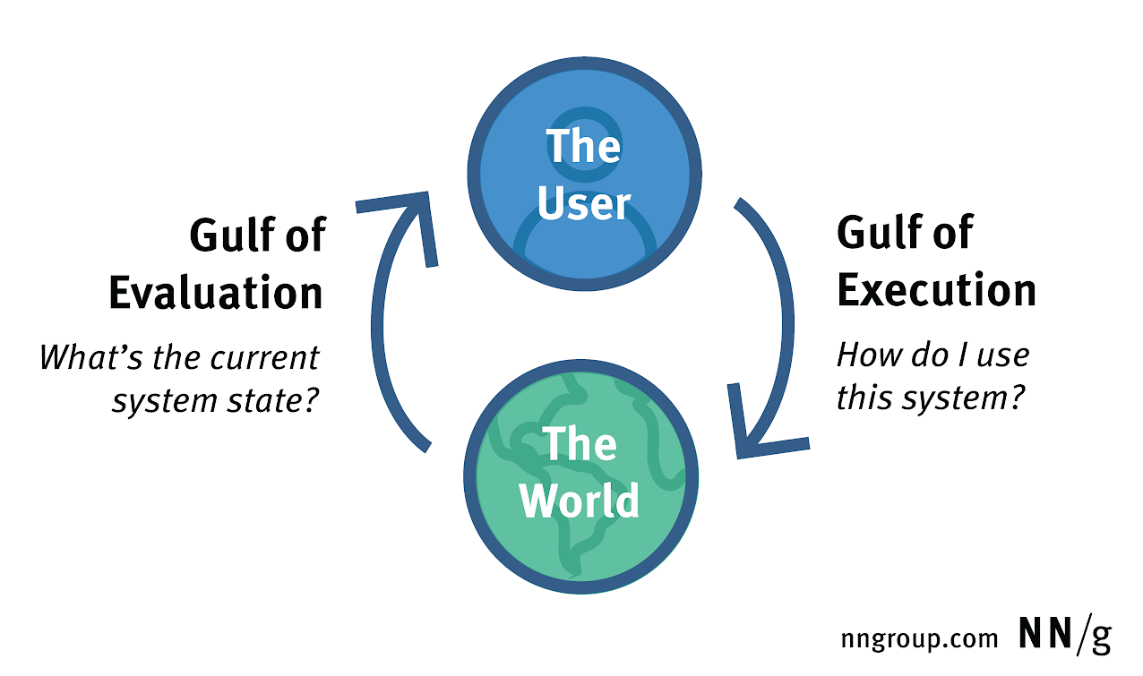
The Gulf of Evaluation and the Gulf of Execution
Two of the many challenges people must overcome to successfully interact with technology are:
- Evaluation: Understanding the state of the system
- Execution: Taking action to accomplish a specific goal
These challenges are described as the “gulf of evaluation” and the “gulf of execution” because, without effective design elements to support users, they can become insurmountable barriers between users and their goals.
The terms gulf of evaluation and gulf of execution were invented in 1986 by Ed Hutchins, Jim Hollan, and Don Norman, when they wrote about the virtues of direct manipulation in helping users bridge these gulfs. (Their work was published in the book “User Centered System Design,” edited by Norman and Draper, which was the first use of the term ‘user-centered design’, long before Don joined Jakob Nielsen to establish the Nielsen Norman Group). Don’s book, “The Design of Everyday Things,” tells the story of the gulfs and details their importance in the design process. Thirty years later, the two gulfs are still essential concepts in our field.
Furthermore, both of these challenges are composed of subtasks which users must accomplish. For example, successful evaluation requires not just perceiving the system-status indicator, but also interpreting what it means. Similarly, execution requires both planning an action based on an understanding how the controls work, and actually manipulating the controls. This type of granular, specific analysis of the interaction is important because success at one subtask doesn’t necessarily mean success at the others.
Determining whether something is on or off is a classic example of the gulf of evaluation; for this Bluetooth switch, it was easy to see both the switch and the label, but the visibility of these items did not necessarily mean they could be correctly interpreted.
Execution and Evaluation Are Interdependent
Successful execution usually depends on correct evaluation. In this Bluetooth example, as soon as I corrected my evaluation of the current state, I instantly knew how to enable Bluetooth by clicking the switch. It was easy to formulate an action plan to use the system, but any plan based on faulty evaluation is doomed to failure.
This interdependence affects many real-world interactions; for example, in many flat designs users have problems navigating. It’s not because they don’t know how to click a link, but because they fail to understand that a link is presented to them.
Bridging the Gulfs with Mental Models
Interpretation requires effort, and most people try to minimize this effort by relying on a mental model to understand a system. A mental model is a theory of how a system works, what its signals mean, and what the outcomes of different user actions will be. To save time, most people rely on their past experiences to quickly build mental models for new systems.
Designers can leverage this natural tendency by deliberately including design elements that help users build effective mental models. This requires:
- Identifying a relevant design which users are already familiar with
- Creating visual similarities between the new design and the familiar design
- Creating functional similarities between the new design and the familiar design
Both physical and digital experiences can work as the basis for the mental model for a system; the important thing is that the visual signals suggest a model which actually matches the system functionality, at least well enough to let the user correctly interpret the system’s state indicators and predict outcomes.
Coming back to the initial Bluetooth example, there are several different possible models for how an on/off switch can work. Some switches use no labels at all, and use positions or different background colors to distinguish different states. Others have labels outside the switch, and work by pushing the switch towards the label that describes the desired state. For example, the switch on the speaker shown below is currently OFF; to turn it on, you push the switch towards the word ON.

The Bluetooth switch shown at the beginning of this article incorporates a label which visually resembles the labeled slider switch; but does not work the same way. On the Bluetooth switch, pushing the switch towards the label Off changes the switch status to On, which is the opposite of how the physical, labeled slider switch works.
This Windows 10 switch design is much easier to understand when you can see multiple switches in different states; the background color makes it obvious which switches are Off vs. On, and since both of these labels appear to the right of the switch, it’s clear that they describe the current selected state rather than just one end of the switch.

But, across a complex menu of settings, it would be difficult to guarantee that an Offswitch is always accompanied by another switch in the On position just to make sure people understand it. An alternative, better design would use a checkbox, which also relies on a mental model drawn from the physical world. Checkboxes originated on paper forms: a box with a mark would indicate that an option was selected, while no mark meant it was not. This was the model used for enabling Bluetooth in Windows 7; and, without the complications of label position and reliance on color, it posed a much lower evaluation burden on the user than its Windows 10 counterpart.

Why the Gulfs Are Important
Don Norman first described his model of interaction decades ago, but difficulties with evaluation and execution still plague today’s interfaces. Understanding these gulfs and incorporating them into UX design is important for two reasons.
First, the challenges of evaluation and execution transcend interaction styles and device types. Regardless of whether you’re designing for a laptop, a watch, a smart speaker, or a refrigerator, people will still have to deal with these gulfs, and this framework is flexible enough to be applied effectively to novel design contexts.
Second, when it comes to solving design problems, the granularity of breaking down evaluation and execution into specific subtasks sheds light on the detailed reasons why designs fail, because it adopts a user-centered perspective. Heuristics like ‘make the system status visible’ tell you what a good design should do, but they don’t necessarily explain how to do it. Pinpointing whether a problem lies with visibility or interpretation gives you a better starting point for brainstorming solutions.
Users must bridge the gulfs of evaluation and execution to successfully interact with a design, but the challenge becomes much easier when the system’s creators are aware of these gulfs, and build in cues to send users down the right path.
Learn more in our full-day course, User Interface Principles Every Designer Must Know.
References
Hutchins, E., J., Hollan, J., & Norman, D. A. (1986). Direct Manipulation Interfaces. In A. N. Donald & S. W. Draper (Eds.), User Centered System Design; New Perspectives on Human-Computer Interaction (pp. 339-352). Mahwah, NJ: Lawrence Erlbaum Associates.
Norman, D. (2013). The Design of Everyday Things: Revised and Expanded Edition. New York, NY: Basic Books.


