

Minimal websites have grown to become really popular over the last few years. They allow you to focus on giving your visitors a fresh and clean feeling when navigating. The minimal web design style is influenced by the Scandinavian interior design style. You’ve surely seen pictures of Scandinavian living rooms all over the internet. By reducing the furniture and using mostly white or gray colors, light and serenity are free to enter the room. That’s exactly what minimal websites do as well. They’re focused on giving your visitors a calm feeling so that they can focus on the content you bring without being overwhelmed.
This is a second post in the post series where we’ll handle 4 different website styles and how to achieve them using Divi:
- Clean & Abstract
- Minimal
- Flat
- Bold & Colorful
Let’s get to it!
- 1 1. Less is More
- 2 2. Margin and Padding are Your Best Friends
- 3 3. Use One Accent Color
- 4 4. Either Images or Illustrations – Not Both
- 5 5. Consider Using Text Modules Instead of Button Modules for CTAs
- 6 6. Dividers Can Help Balance Whitespace
- 7 7. Use Simple and Subtle Shapes
- 8 8. Use Subtle Animations (If They’re Needed at All)
- 9 Preview
- 10 Let’s Start Creating: Add a New Standard Section
-
11
Add a Second Standard Section
- 11.1 Section Settings
- 11.2 Add a New Row
- 11.3 Add Image Module to Column 1
- 11.4 Clone Button Text Module & Place Below Image Module
- 11.5 Clone First Text Module in First Section & Place in Column 2
- 11.6 Clone Title Text Module & Place in Column 2
- 11.7 Add Description Text Module
- 11.8 Add Divider Module #1
- 11.9 Add Divider Module #2
- 12 Preview
- 13 Final Thoughts
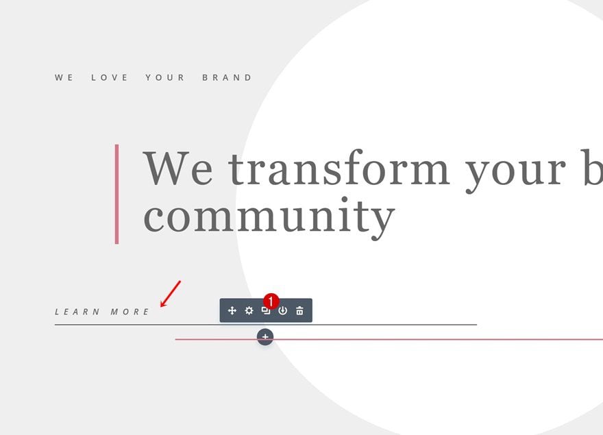
1. Less is More
The first thing you’ll need to keep in mind when creating a minimal website is trying to reduce the design elements you use on your website. Rather than using more, try to get the best out of the few elements you use.
You’d be surprised how much you can get out of your design by fine-tuning your design elements in a way that they become complementary. Using fewer elements on your website also allows you to keep an overview and deliver your message in a more consistent and clear way.
2. Margin and Padding are Your Best Friends
Minimal websites usually have a lot of whitespace. Whitespace on your pages and posts kind of allows visitors to breathe throughout their visit on your website. They give a sense of serenity and allow you to focus on the content you want to share.
The best way to add whitespace to your website is by using white and/or light gray background colors in combination with extra padding and/or margin. Don’t be afraid to play around with the different values to see what result comes forth from it.
3. Use One Accent Color
If you want to keep your website as minimal as possible, then you should also avoid using too many different colors. Go as neutral as possible by using a lot of white and gray. Use darker colors for your written content. And to make your design a bit more edgy, choose one accent color. This color is usually going to be the same one you use in your logo.
4. Either Images or Illustrations – Not Both
In general, it is recommended to choose between real-life images or illustrations when you build your website. Using both at the same time can really complicate your website and mix up different website styles, which is something you definitely want to avoid.
There’s one exception though. Feel free to use images in combination with icon illustrations in your Blurb Modules for instance. If they are minimal and support the content on your page, you’re good to go.
Have you ever tried using a Text Module instead of a Button Module? You definitely should. Although Button Modules provide you with most options you’re used to in the Visual Builder, it has the tendency to add borders to all sides of your button. With a Text Module, you can avoid that. You can simply make your copy clickable and add a bottom border as you can see in the print screen below.
6. Dividers Can Help Balance Whitespace
If you want to add a modern touch to your website, you should definitely try using multiple dividers on your website and style them to match with the rest of your layout.
They tend to connect different design elements to one another and create a coherent result.
7. Use Simple and Subtle Shapes
This is one of my favorite ones. Sometimes, we tend to neglect the features we’re used to the most, such as gradient backgrounds. Sure, using a background image has its charm but have you ever tried to use a radial gradient background in a subtle way? It allows your visitors to focus on your headlines and it helps you trigger action.
8. Use Subtle Animations (If They’re Needed at All)
Last but not least, a minimal website usually gets even better when using subtle animations. And when we say subtle, we mean really subtle. You’d be surprised how smooth an effect can turn out to look by just reducing the Animation Intensity drastically. As long as the animation is subtle, you can add it to any element and it won’t affect the readability and user experience of your website.
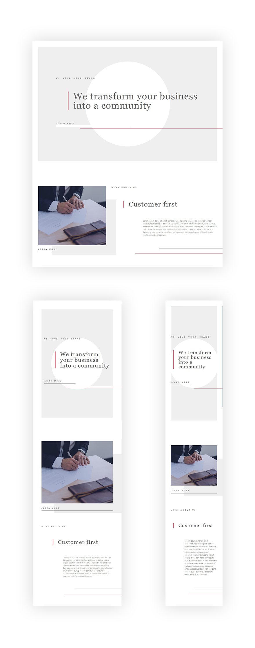
Preview
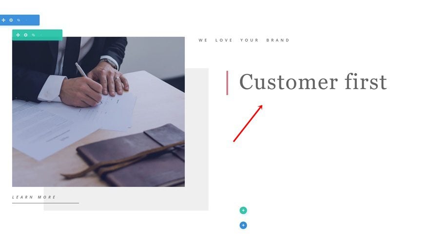
Now that we’ve gone through all techniques, let’s start putting them into practice. We’re going to recreate the following example step by step:
Let’s Start Creating: Add a New Standard Section
Section Settings
Spacing
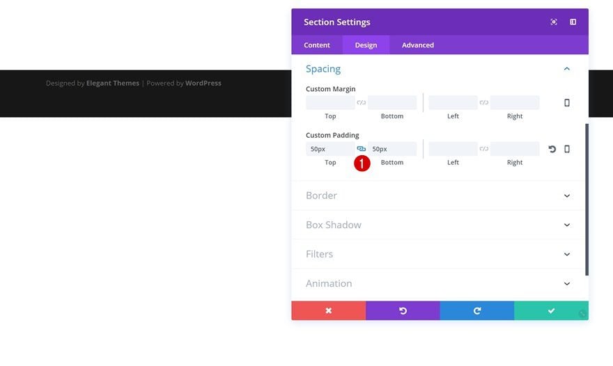
To create the example above, we’ll need two sections in total. Let’s start off by adding the first one to a new or existing page and adding the following Spacing to it:
- Top & Bottom Padding: 50px
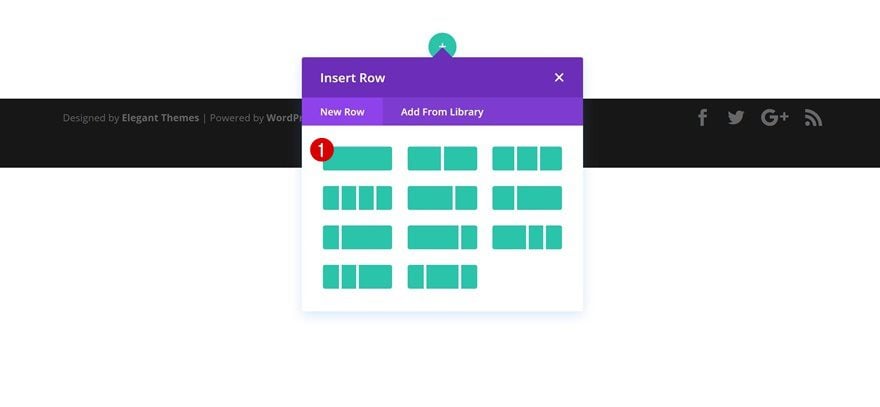
Add a New Row
Column Structure
Continue by adding a new row containing one column.
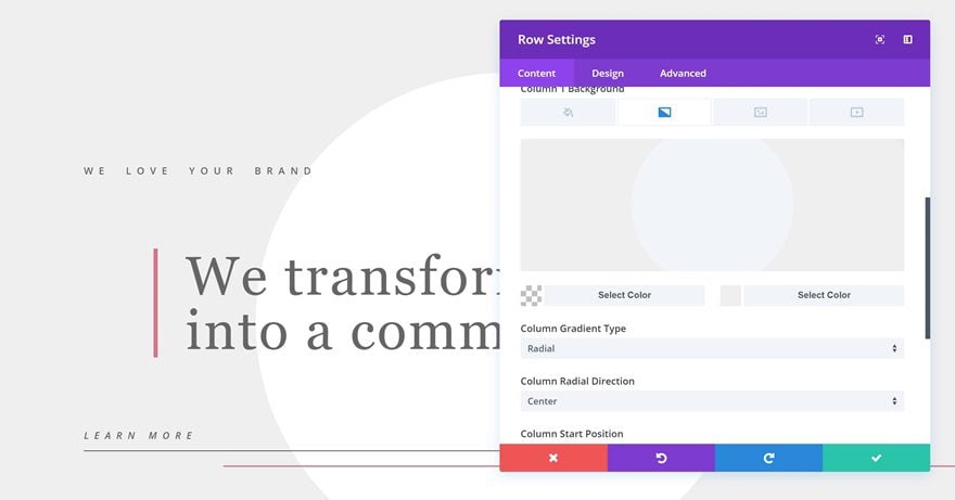
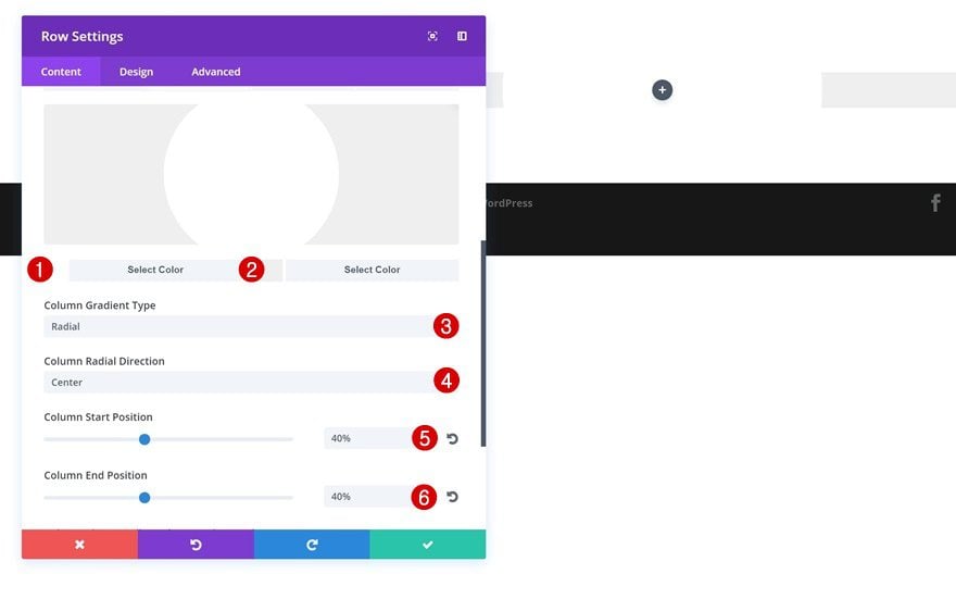
Column Gradient Background
Open this row’s settings and add the following column gradient background to it:
- Color #1: #ffffff
- Color #2: #efefef
- Column Gradient Type: Radial
- Column Radial Direction: Center
- Column Start Position: 40%
- Column End Position: 40%
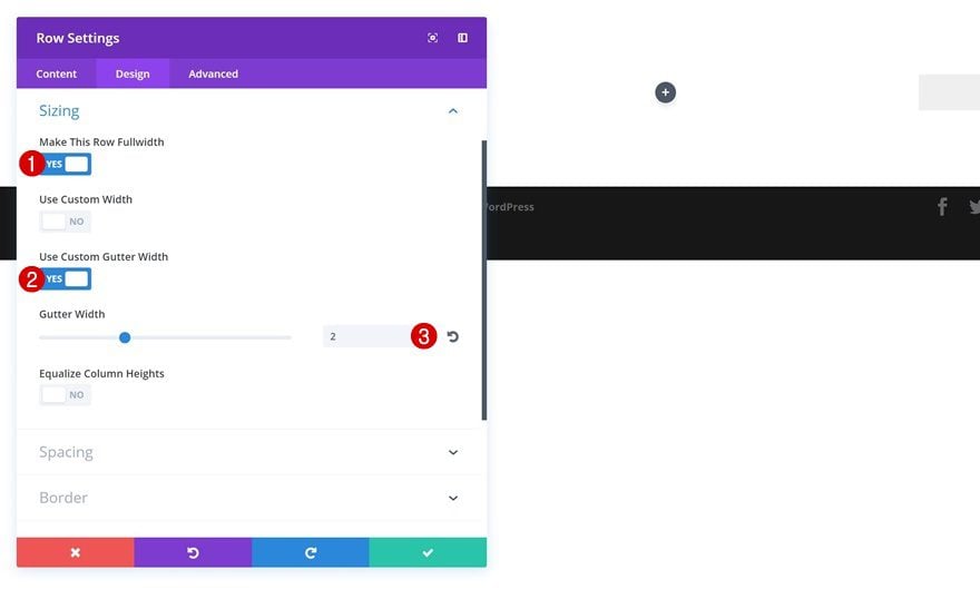
Sizing
Then, increase the width of the row by making the following changes to the Sizing settings:
- Make This Row Fullwidth: Yes
- Use Custom Gutter Width: Yes
- Gutter Width: 2
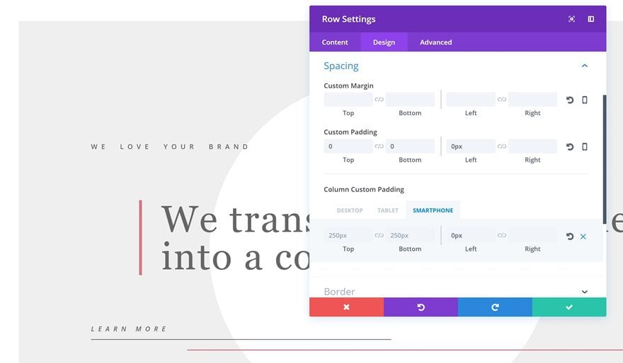
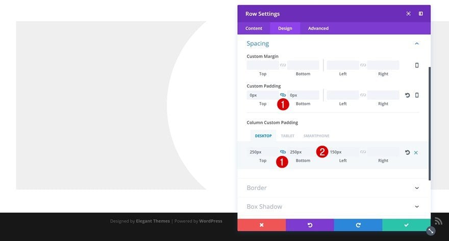
Spacing
Lastly, add the following Spacing to your row as well:
- Top & Bottom Padding: 0px
- Column Top & Bottom Padding: 250px
- Column Left Padding: 150px (Desktop), 20px (Tablet), 0px (Phone)
First Text Module
Text Settings
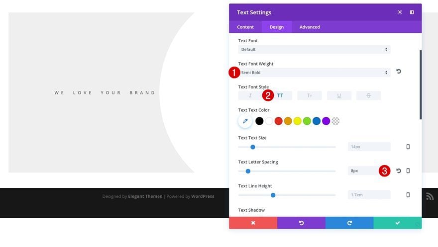
Once you’ve modified your row settings, you can start adding the modules you need. We’ll start with a short description Text Module using the following text settings:
- Text Font Weight: Semi Bold
- Text Font Style: Uppercase
- Text Letter Spacing: 8px
Animation
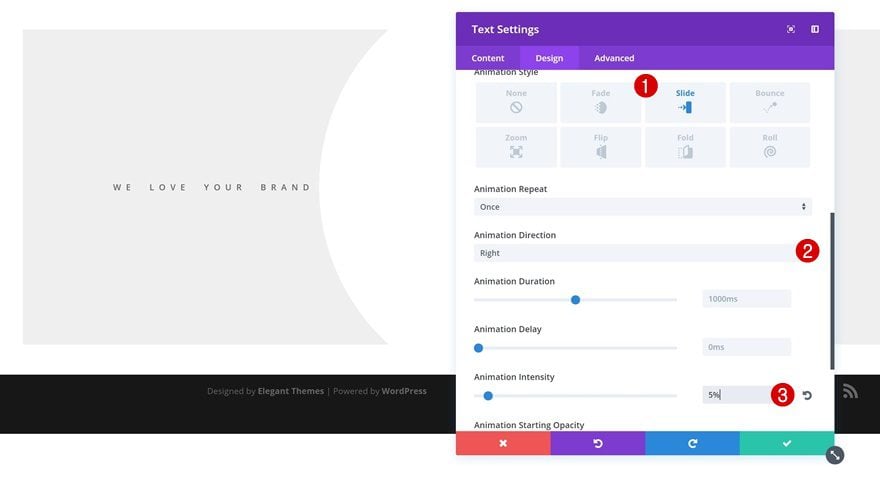
We’re adding very subtle animations to this layout as well, starting with this Text Module. Open the Animation settings and add the following animation:
- Animation Style: Slide
- Animation Direction: Right
- Animation Intensity: 5%
Second Text Module
H1 Text Settings
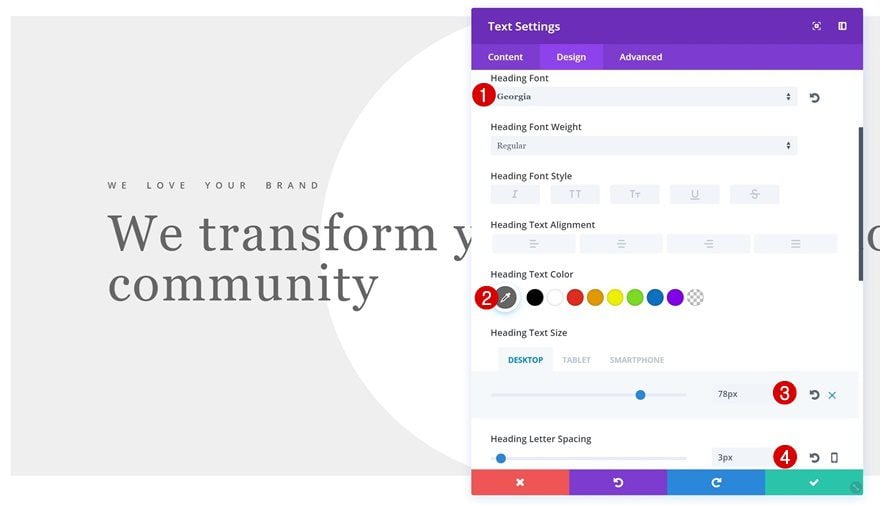
Right below the previous Text Module, go ahead and add an H1 Text Module containing the following H2 text settings:
- Heading Font: Georgia
- Heading Text Color: #666666
- Heading Text Size: 78px (Desktop), 50px (Tablet), 40px (Phone)
- Heading Letter Spacing: 3px
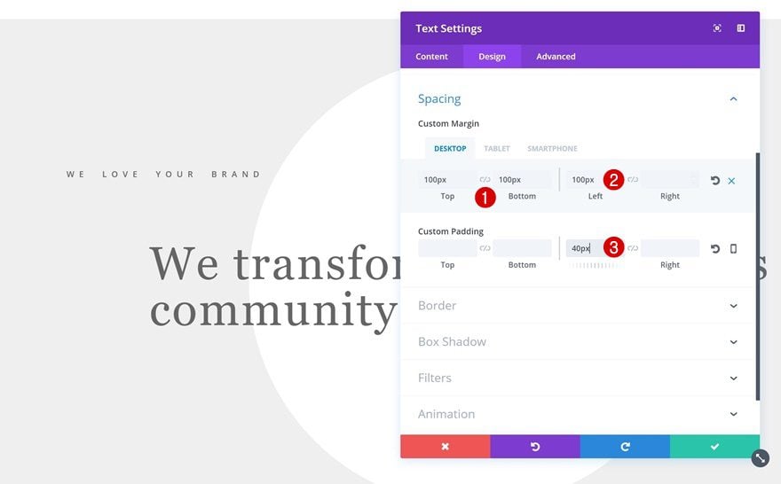
Spacing
We’re going to create the space around this module by using the following Spacing settings:
- Top & Bottom Margin: 100px
- Left Margin: 100px (Desktop & Tablet), 20px (Phone)
- Left Padding: 40px
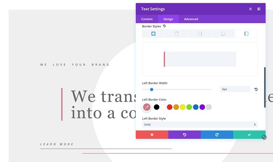
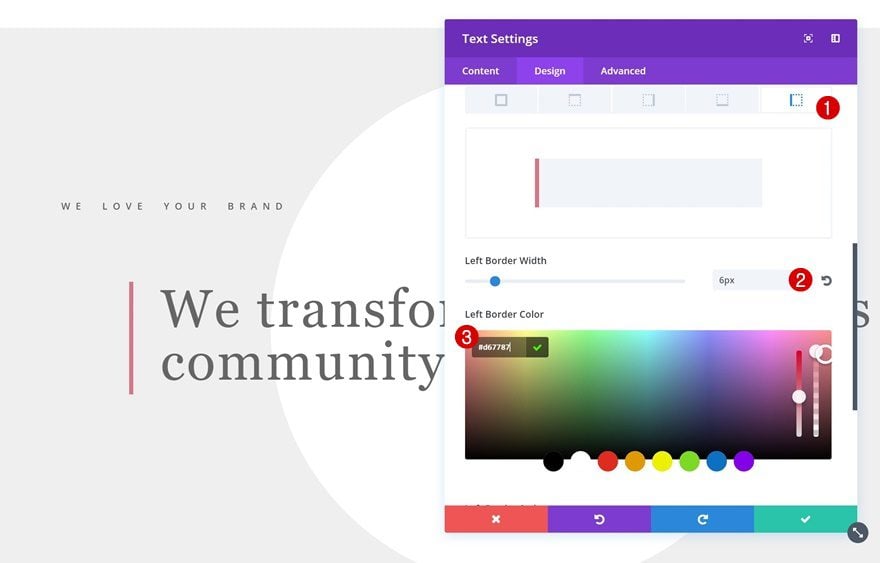
Border
We’ll also need a left border so go ahead and add a left border with the following settings:
- Left Border Width: 6px
- Left Border Color: #d67787
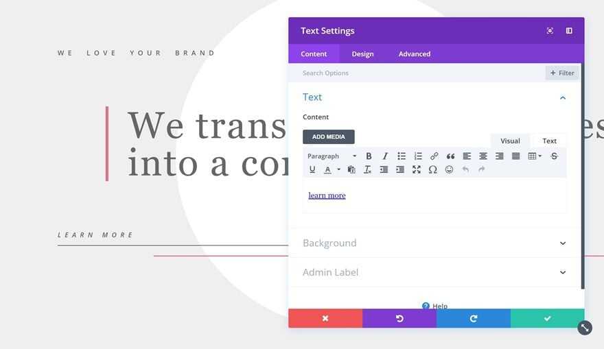
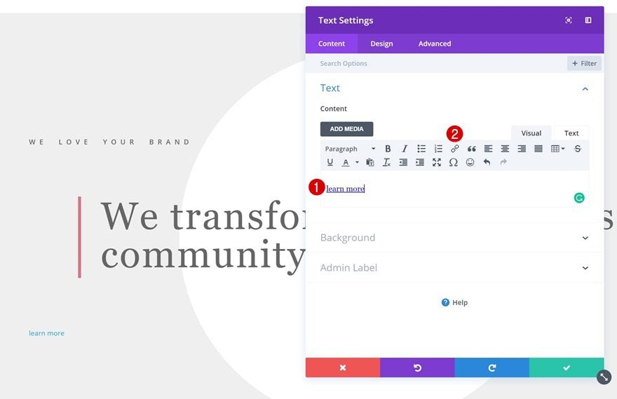
Add Link
Instead of using a Button Module, we’re using a Text Module that we’ll add a link to. Add your CTA and link within the Content box.
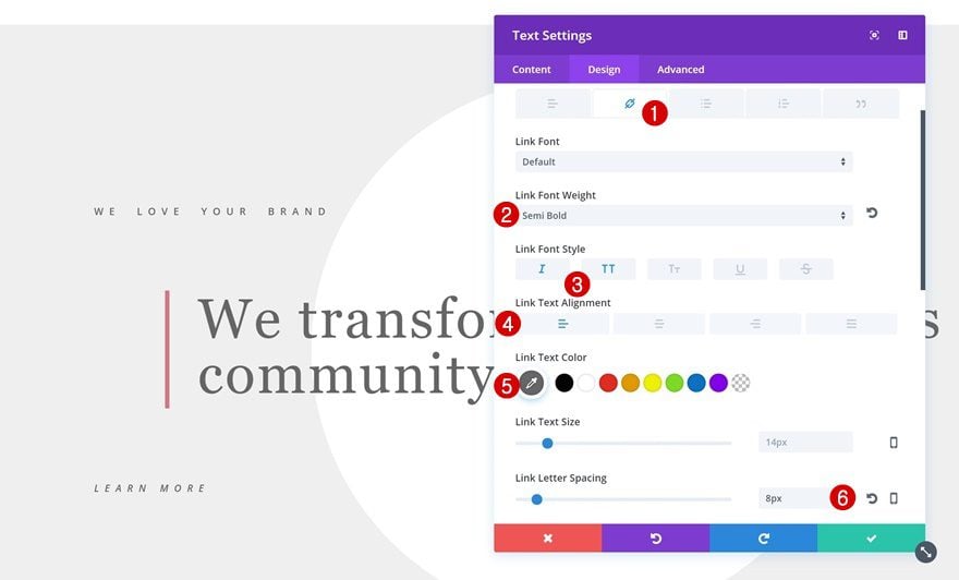
Link Text Settings
Then, apply the following Link text settings to your Text Module:
- Link Font Weight: Semi Bold
- Link Font Style: Italic & Uppercase
- Link Text Alignment: Left
- Link Text Color: #666666
- Link Letter Spacing: 8px
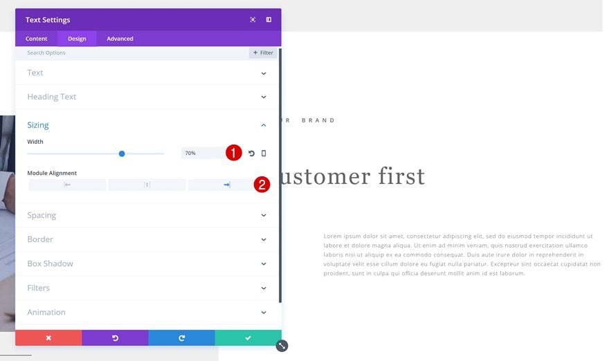
Sizing
Since we’ll be using a bottom border, later on, we’ll reduce the Width of this Text Module as well:
- Width: 46%
- Module Alignment: Left
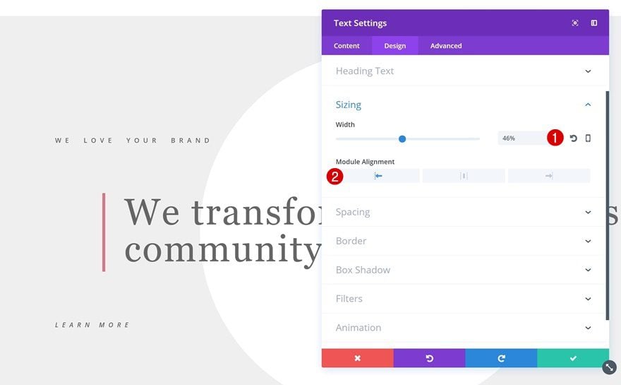
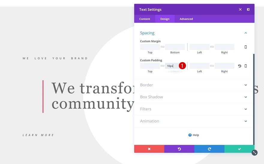
Spacing
And to make sure the bottom border isn’t too close to our text, we’ll add ’10px’ bottom padding as well.
- Bottom Padding: 10px
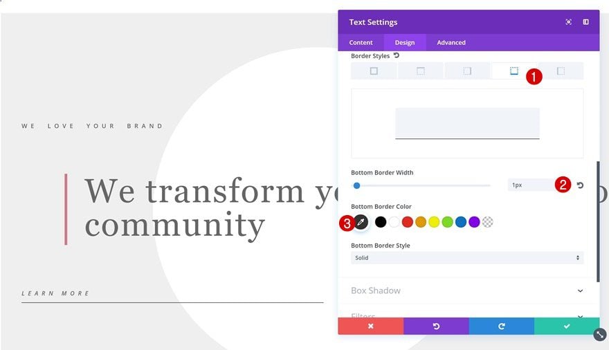
Border
Now we can proceed with adding a bottom border using the following settings:
- Bottom Border Width: 1px
- Bottom Border Color: #666666
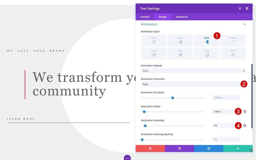
Animation
We’re adding a subtle animation as well:
- Animation Style: Slide
- Animation Direction: Right
- Animation Delay: 100ms
- Animation Intensity: 5%
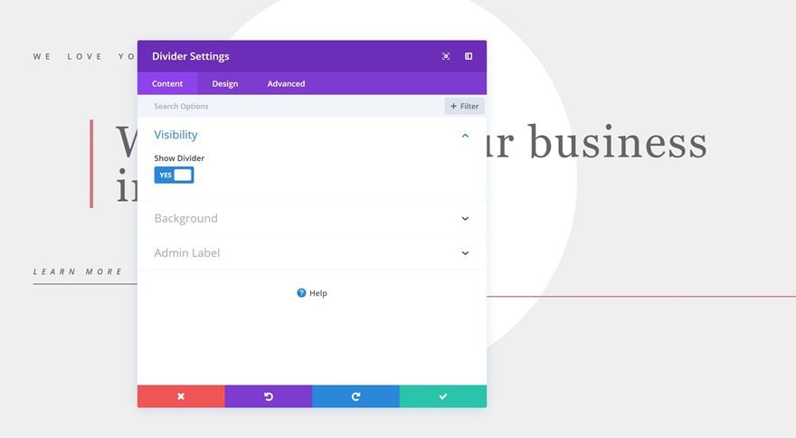
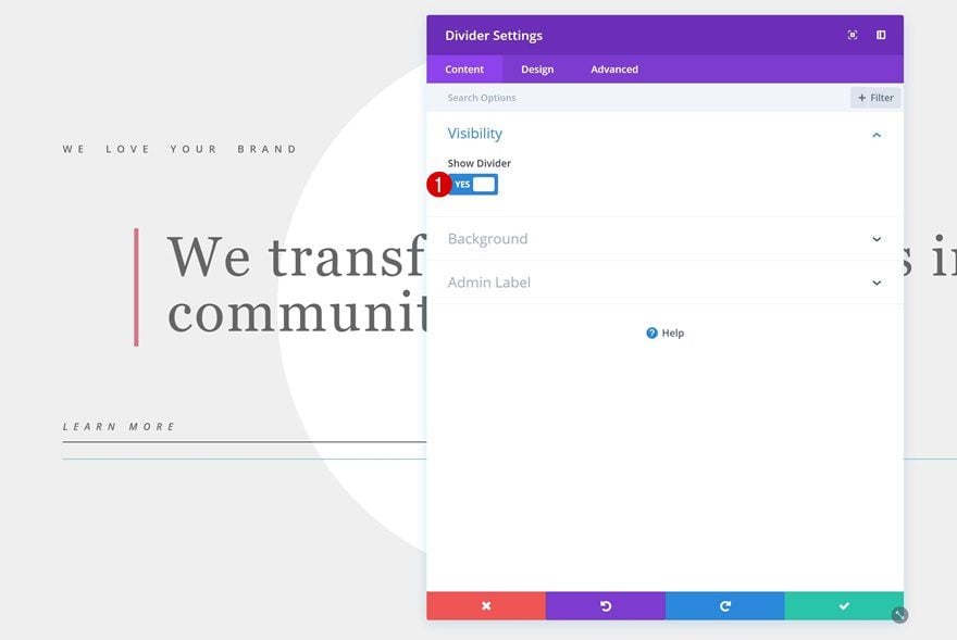
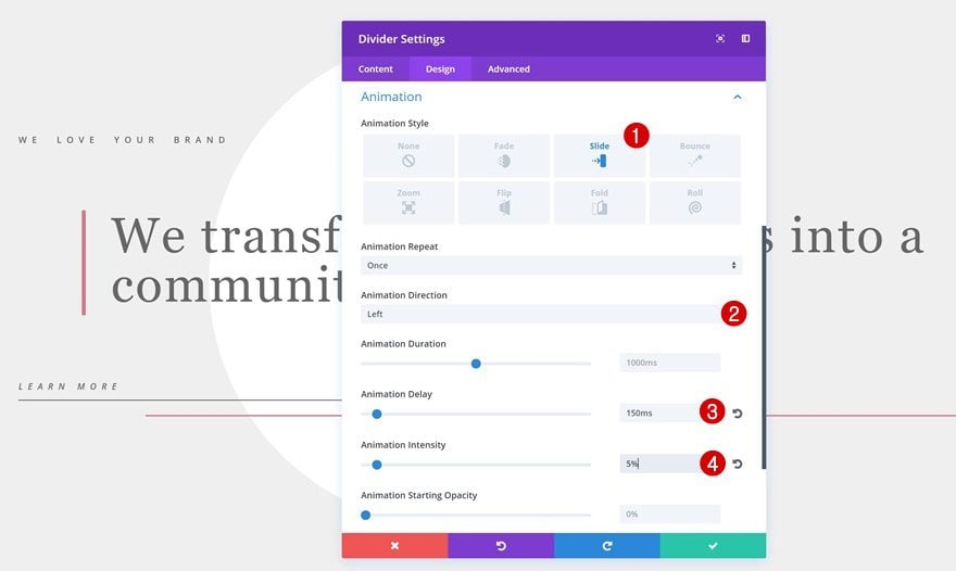
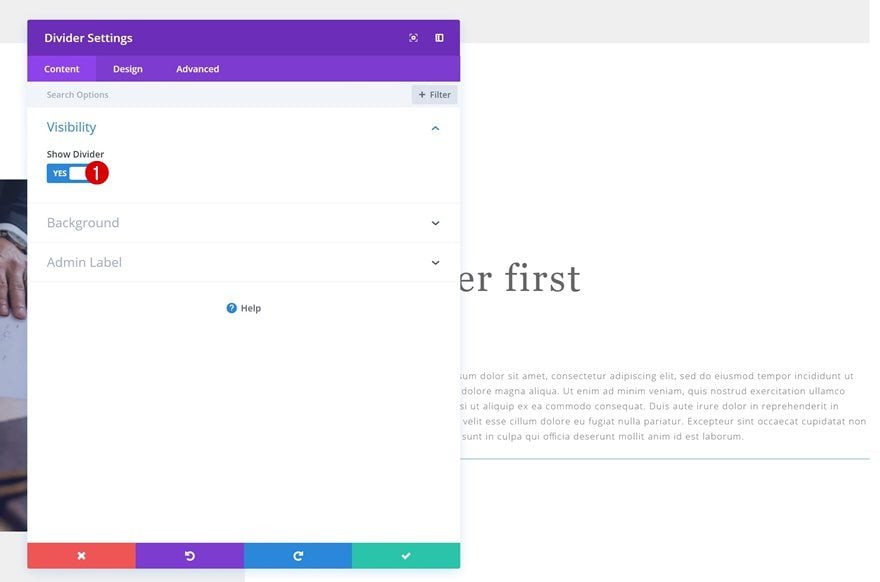
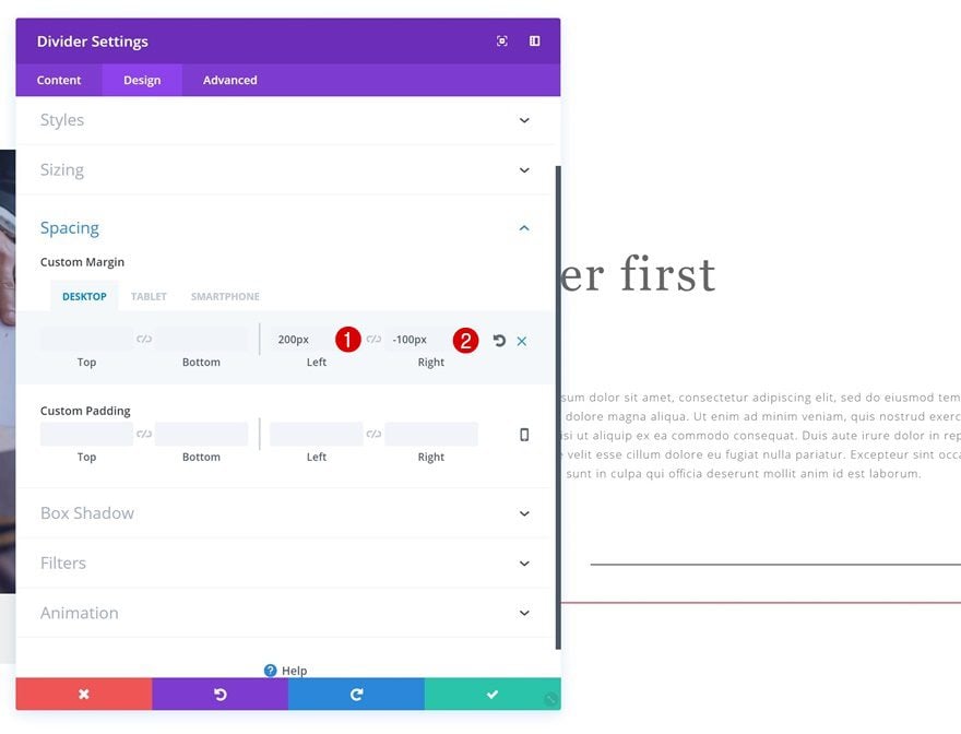
Add Divider Module
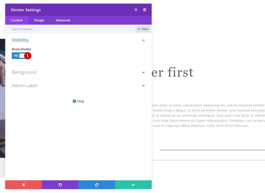
Visibility
The last module we’ll need in this row is a Divider Module. Make sure you leave the ‘Show Divider’ option enabled.
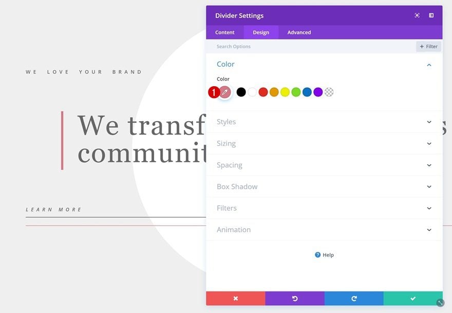
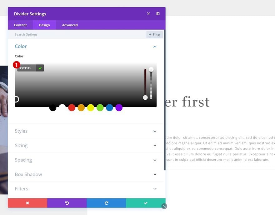
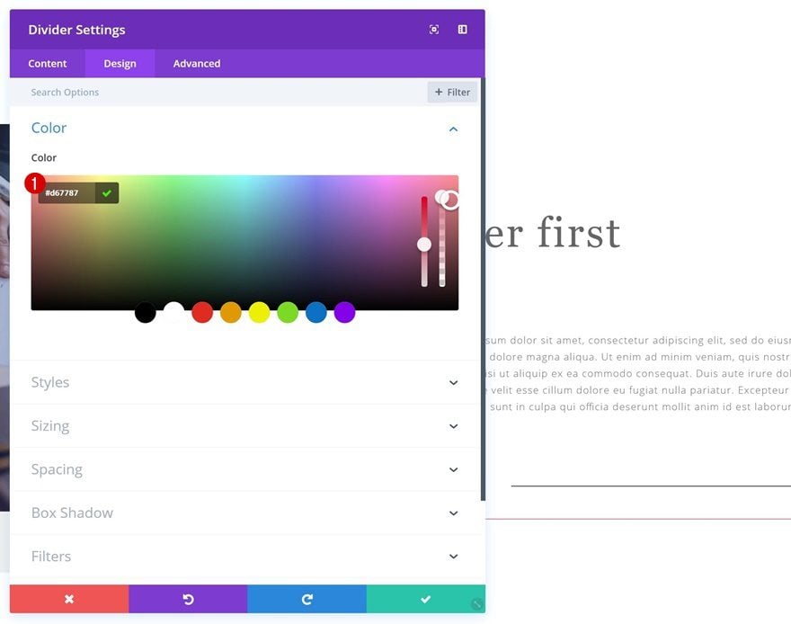
Color
We’re using the same color for this divider as we did for the left border of the title Text Module: ‘#d67787’.
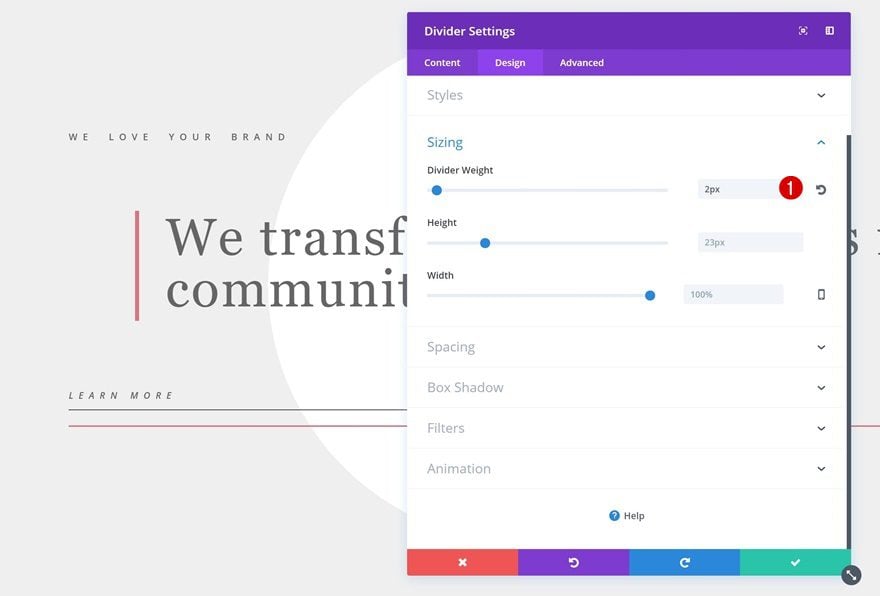
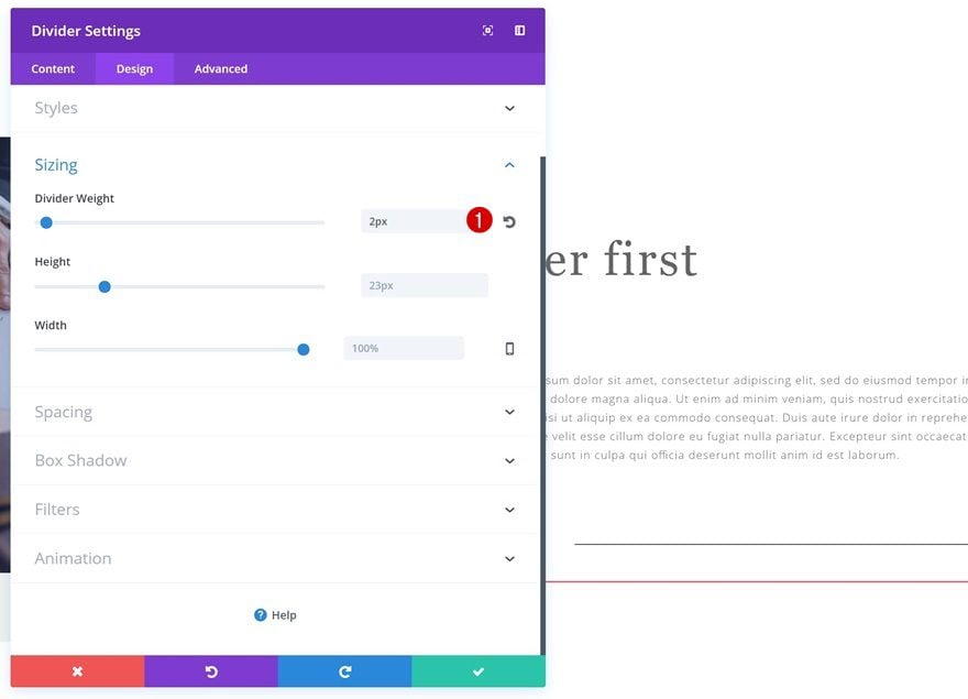
Sizing
Open the Sizing settings next and change the Divider Weight into ‘2px’.
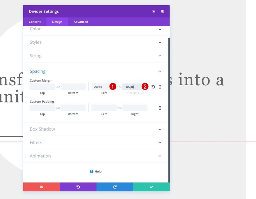
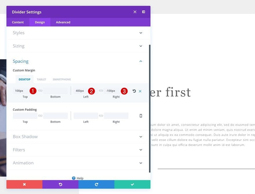
Spacing
We’ll push the Divider Module to the right using the following Spacing settings:
- Left Margin: 200px
- Right Margin: -100px
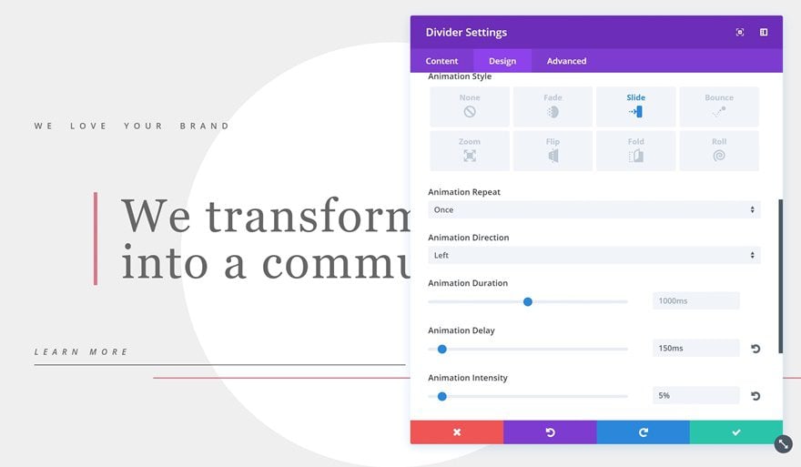
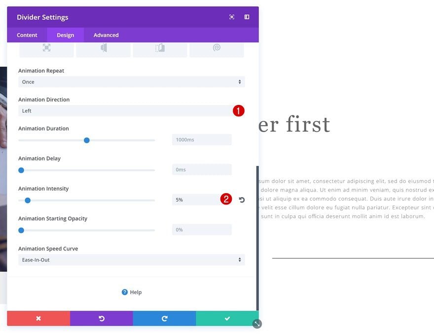
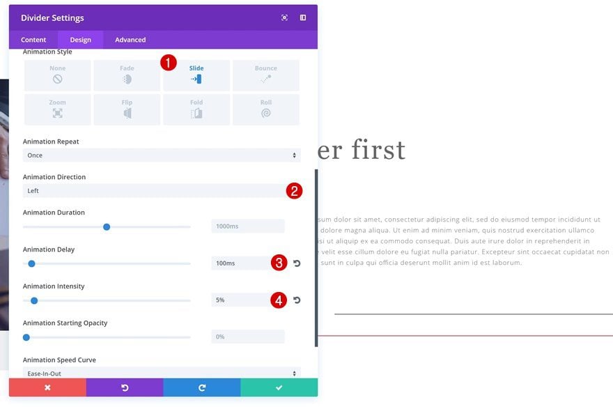
Animation
Last but not least, we’ll include the following Animation:
- Animation Style: Slide
- Animation Direction: Left
- Animation Delay: 150ms
- Animation Intensity: 5%
Add a Second Standard Section
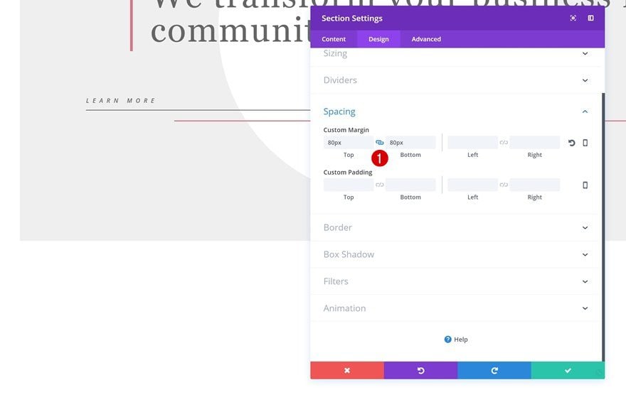
Section Settings
Spacing
We’re done with the first section so we can now go ahead and add a new section right below the previous one. Open the section settings and add the following margin to it:
- Top & Bottom Margin: 80px
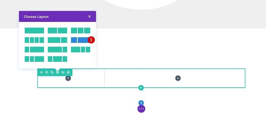
Add a New Row
Column Structure
Continue by adding a row with the following column structure:
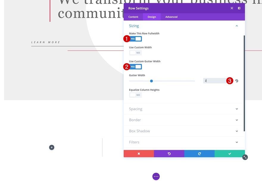
Sizing
Then, open the row settings and increase the width of your row using the following settings:
- Make This Row Fullwidth: Yes
- Use Custom Gutter Width: Yes
- Gutter Width: 2
Spacing
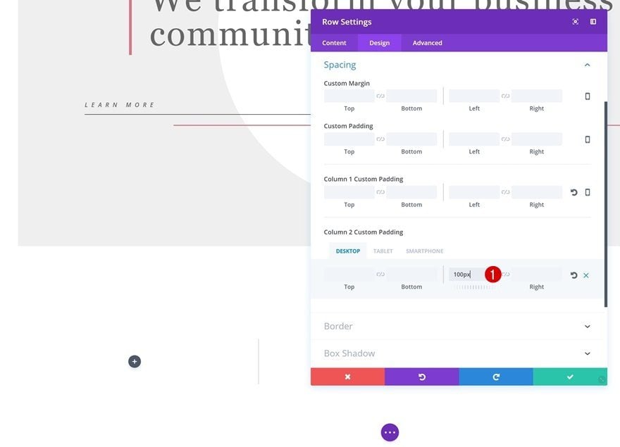
We’ll need to add some column 2 padding as well:
- Column 2 Left Padding: 100px (Desktop), 0px (Tablet & Phone)
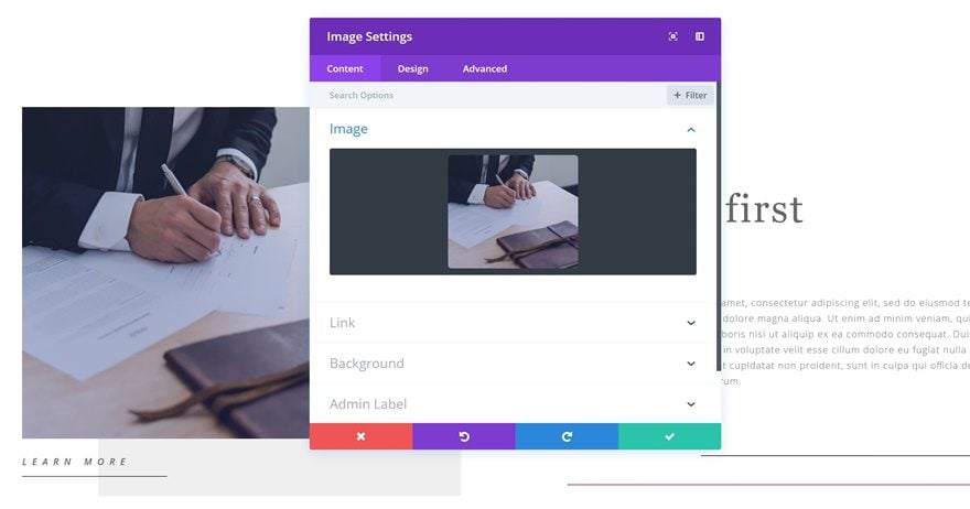
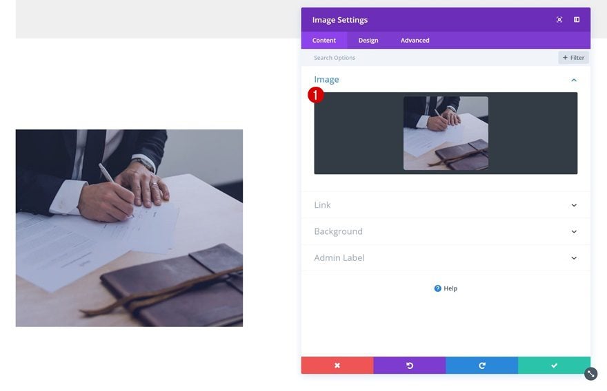
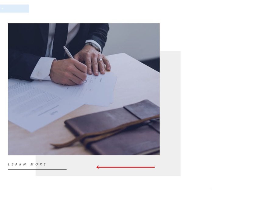
Add Image Module to Column 1
Upload Image
We can now start adding modules to our two columns. Start by adding an Image Module to your first column and upload an image of choice.
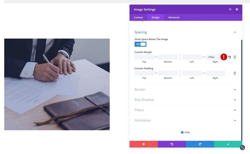
Spacing
We’ll increase the width of the Image Module by adding a negative right margin:
- Right Margin: -100px
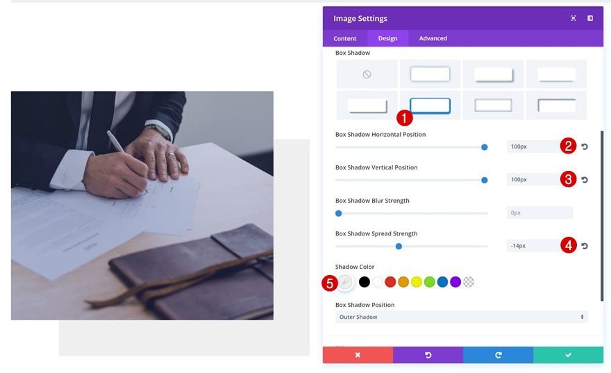
Box Shadow
We’ll also use the following box shadow to create an extra design element on the page:
- Box Shadow Horizontal Position: 100px
- Box Shadow Vertical Position: 100px
- Box Shadow Spread Strength: -14px
- Shadow Color: #efefef
Locate & Clone Button Text Module
We’re going to reuse all three Text Modules of the first section starting with the button Text Module. Go ahead and clone it.
Place Below Image
Then, place it right below the Image Module in the first column.
Clone First Text Module in First Section & Place in Column 2
Locate & Clone Text Module
The next Text Module we’ll need is the one is the first one in our section. Go ahead and clone this one as well.

Place in Column 2
Instead of placing it in the first column, drop it in the second one.
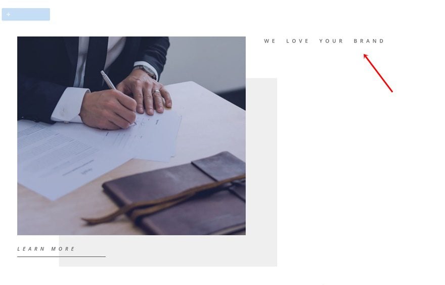
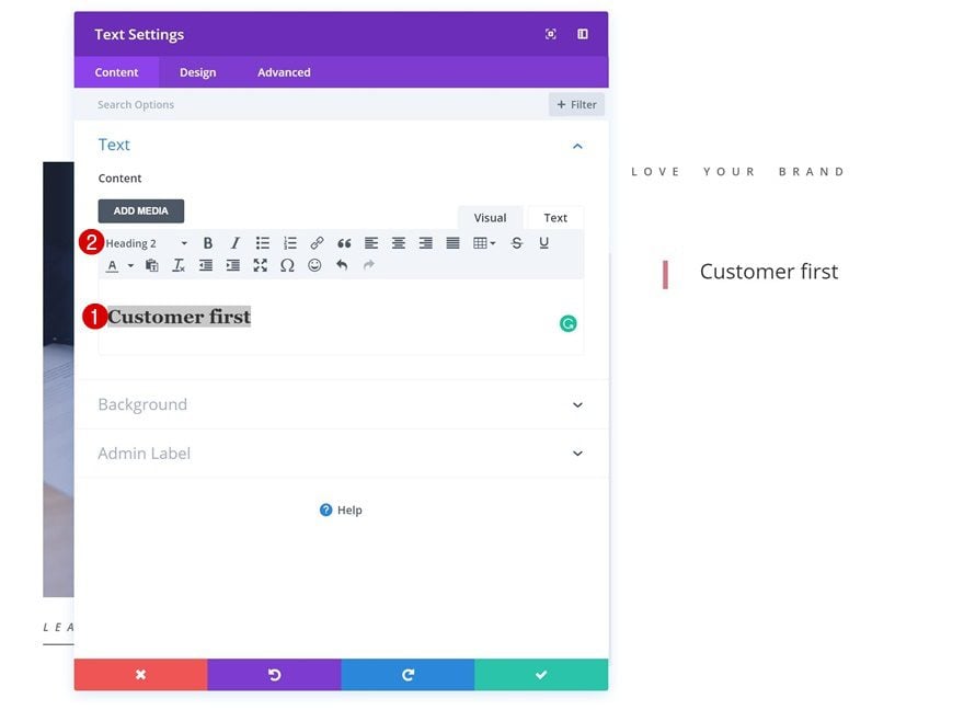
Clone Title Text Module & Place in Column 2
Locate & Clone Text Module
Lastly, we’re going to reuse the title Text Module as well.
Place in Column 2
After you’ve cloned it, place it in the second column of your new row.
Change Content into H2
Change the content in your content box into H2.
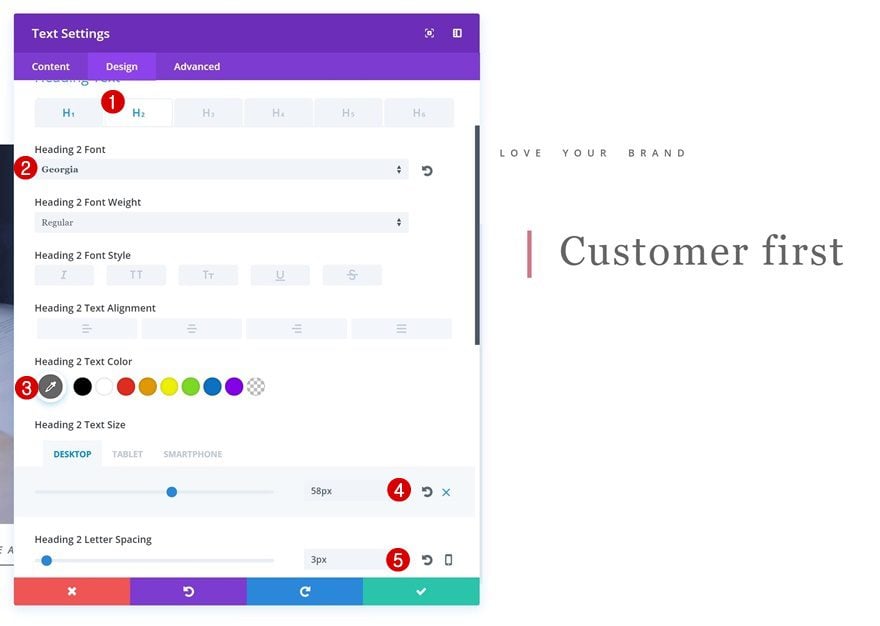
H2 Text Settings
Then, add the following settings to your H2 text settings:
- Heading 2 Font: Georgia
- Heading 2 Text Color: #666666
- Heading 2 Text Size: 58px
- Heading 2 Letter Spacing: 3px
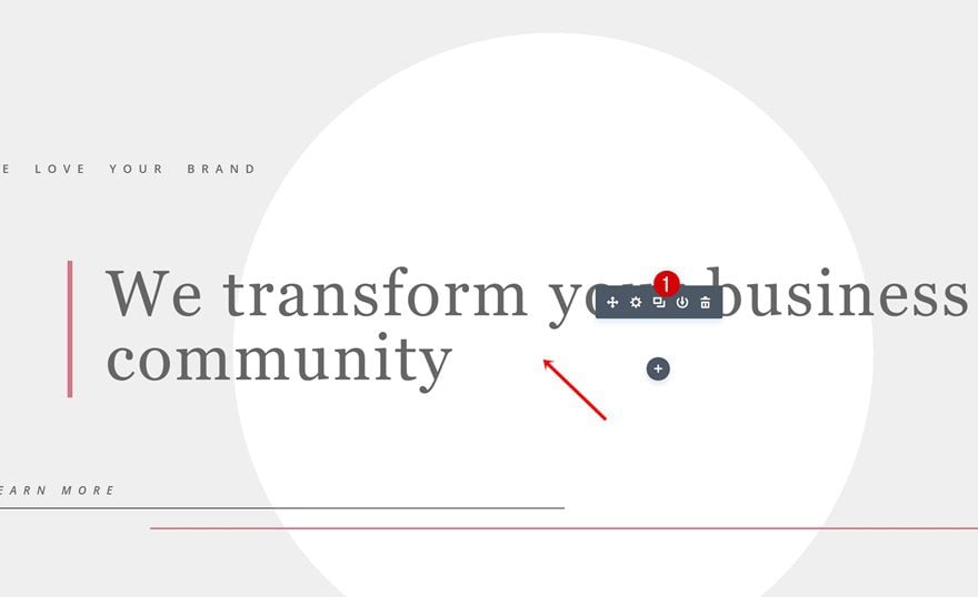
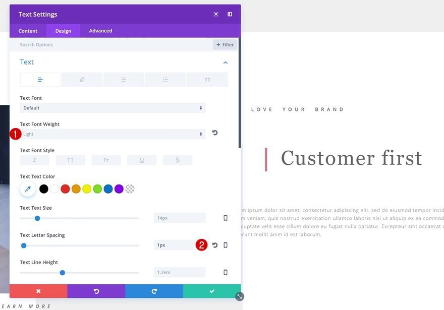
Add Description Text Module
Text Settings
Below the title Text Module, we’re going to add a description Text Module with the following text settings:
- Text Font Weight: Light
- Text Letter Spacing: 1px
Sizing
Go ahead and change the Sizing of this Text Module:
- Width: 70%
- Module Alignment: Right
Add Divider Module #1
Visibility
The next module we’ll need is a Divider Module. Make sure the Show Divider option is enabled.
Color
Change the color of your divider into ‘#666666’.
Spacing
Add some Spacing next:
- Top Margin: 100px
- Left Margin: 400px (Desktop), 300px (Tablet), 200px (Phone)
- Right Margin: -100px
Animation
And of course, we’re also going to use a subtle animation:
- Animation Style: Slide
- Animation Direction: Left
- Animation Intensity: 5%
Add Divider Module #2
Visibility
Last but not least, we’re going to add another Divider Module. Again, make sure the Show Divider option is enabled.
Color
Change the color of your divider into ‘#d67787’.
Sizing
Use ‘2px’ for the Divider Weight.
Spacing
And add the following Spacing settings:
- Left Margin: 200px (Desktop & Tablet), 150px (Phone)
- Right Margin: -100px
Animation
To finish off, add a subtle animation to your divider:
- Animation Style: Slide
- Animation Direction: Left
- Animation Delay: 100ms
- Animation Intensity: 5%
Preview
Now that we’ve gone through all steps, let’s take a final look at the result on different screen sizes.
Final Thoughts
In this post, we’ve shown you some great Divi techniques on how to create minimal websites. This is the second post of the series on how to make beautiful design styles happen using your creativity and some of Divi’s finest built-in options. In the next posts, we’ll share techniques on how to achieve more stunning design styles. If you have any questions or suggestions, make sure you leave a comment section below!


Once again you show us the creative side of Divi. Thank you.
It’s my pleasure, Jade! Thanks for the comment 🙂
Divi Will Always Be As Top Notched As It Has Always Been…. Very Clean And Intuitive. Thanks For The Tutorial!
Good to hear and you’re welcome! 🙂
Great tutorial, as always. Thanks a lot, Mak!
Super Donjete.
Can you show us the flexibility of Divi modules out of the box.
Thanks,
Kiran
Nice article Donjete.
Can you show us the flexibility of Divi modules out of the box.
Thanks,
Kiran
Thanks, Kiran! Check out the other Divi resources on our blog, there are a ton of out-of-the-box Divi posts we’ve already created and we’ll keep creating them!
Wow thanks Donjete,
That was another great tutorial showing us a few “out of the box” ideas for using Divi. So simple really, thanks again for showing what is possible.
The possibilities with Divi are truly endless! Thanks for the comment, Greg 🙂
I like your blog page a lot, its well thought out and looks great
Great work! How can you put music on your site with just an on and off button?
Thanks again, this is awesome work. I love the flow of Divi!
You’re welcome, Larry! Happy you like it 🙂
Thanks great article I’m a less is more person too and let the visitor see the content they’ve come to see. On my site it’s just one colour and all the titles are h1 tags which I’ve resized and the site works great and makes sales you gotta love the power of Divi 🙂
Great approach, Mark! Thanks for the comment 🙂