

CRUX
CRUX takes home the award for commitment to a concept. They work a lot with video, so they went and applied the timeline concept to the navigation on their one-pager. We’ve seen this once before in a previous portfolio article, but CRUX takes a less minimalist approach to the concept.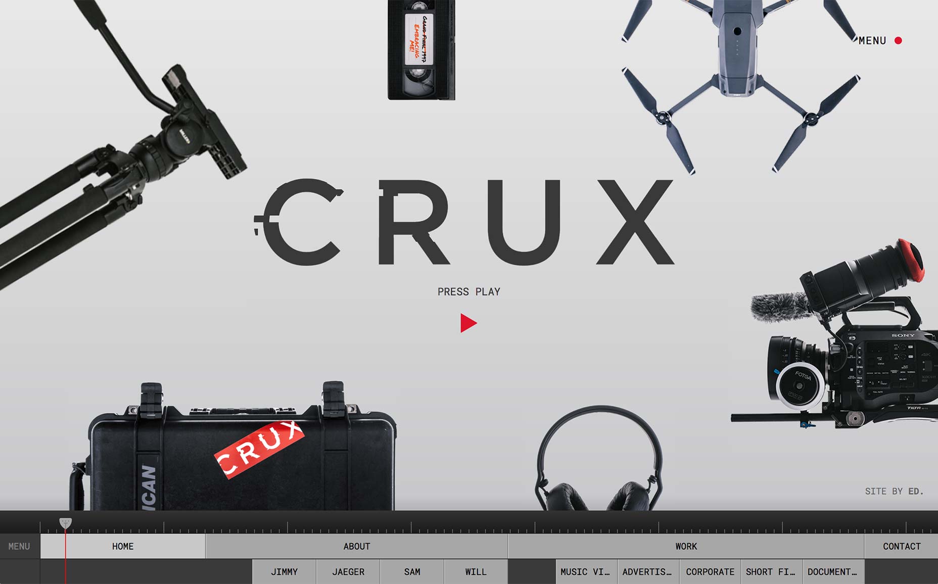
Fons Hickmann
Fons Hickmann’s portfolio is a shiny new example of what I’m calling the “Brutal Powerpoint” style of design. (W000! My first made-up trend name of 2018 has just happened, people! And no one has told me to stop yet.) It’s all about mixing elements of minimalism, brutalism, and presentation-style sites to create something that feels like it was torn from two completely different design manuals.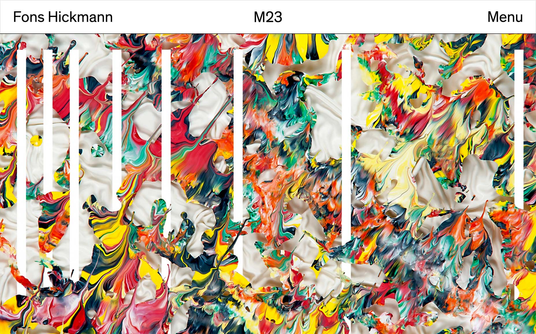
Ben Mingo
Ben Mingo’s portfolio is classically minimalist, spiced up with animation. It’s on this list primarily because its layout and typographical elements are just that lovely. My only peeve would be that I can’t use my scroll wheel on the home page. Drag-to-navigate is a normal interaction on mobile, but it seems clunky and inefficient on the desktop.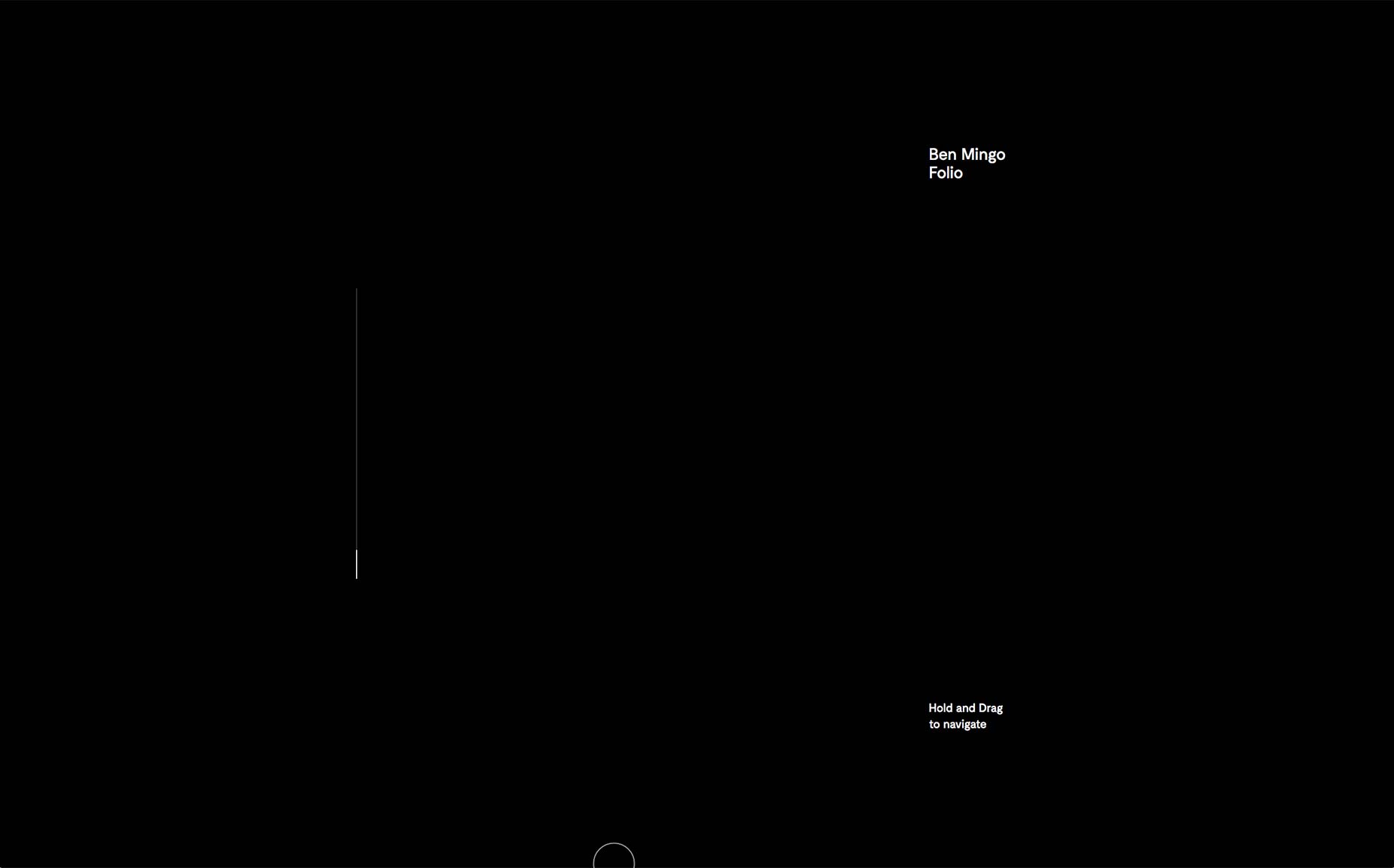
Zero
Zero uses a moderately stylized form of minimalism for its agency site. That balance between style and classic minimalism results in a site that is easy enough to navigate, but is still loaded with personality and potential.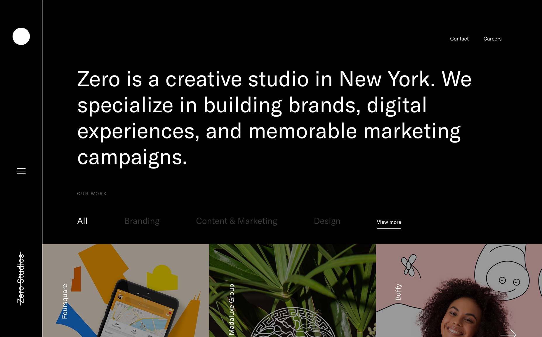
Adoratorio
Adoratorio is a slick-yet-simple example of minimalism gone animated. It’s clean, it’s pretty. I’m actually kind of impressed by the way they implemented that slideshow on the home page. I’m still not sure slideshows are the best thing ever, but I like the way this one was done.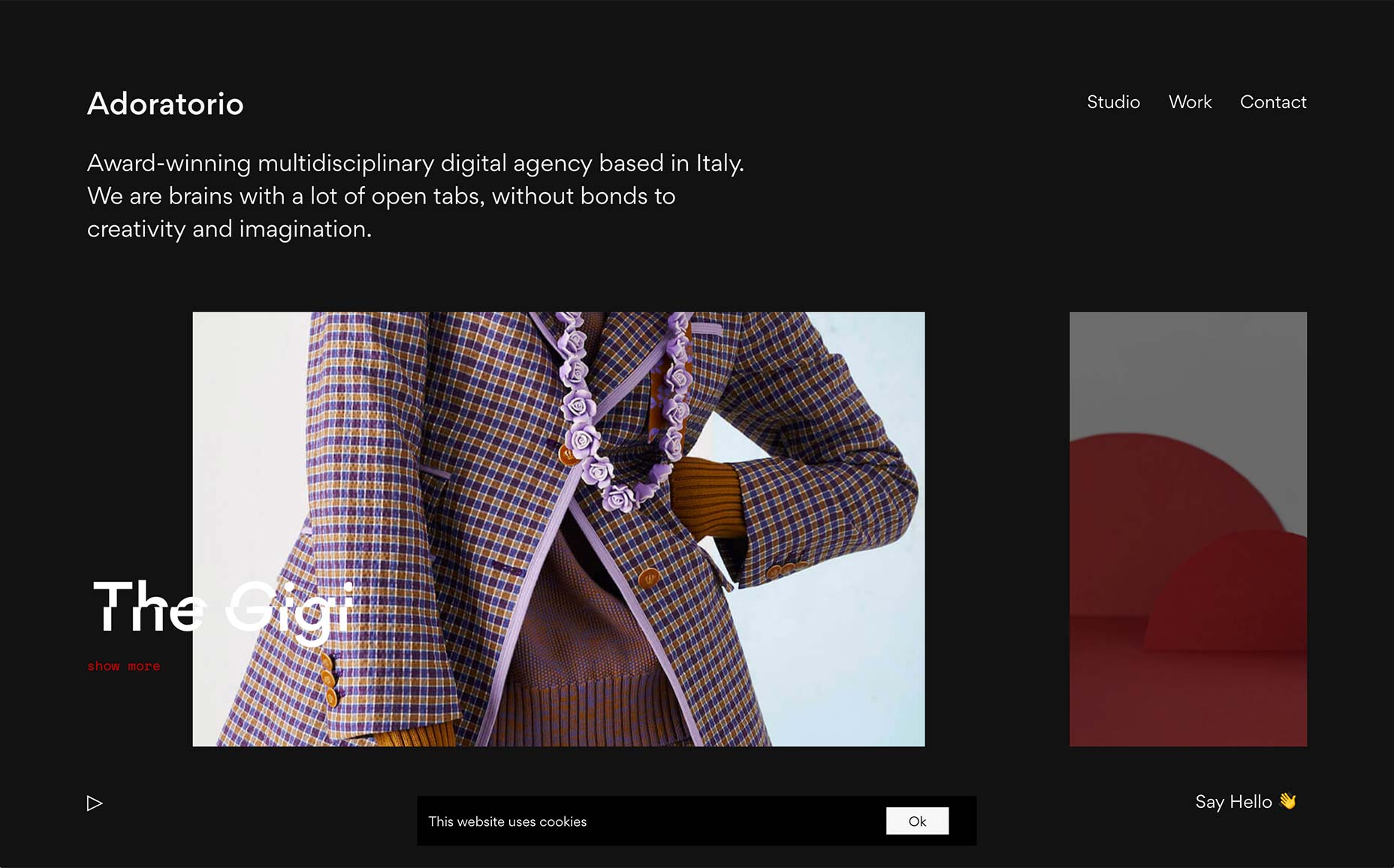
Root Studio
Root Studio is here because it uses yellow in a perfectly pleasant way. It’s here because the typography is lovely and very, very readable. And because I turned off the JavaScript and everything worked perfectly. Ugh, I told myself I was gonna get off that particular high horse for a while, but I still love it when I find a site that degrades gracefully. Whatever. Root Studio = good. Go look at it.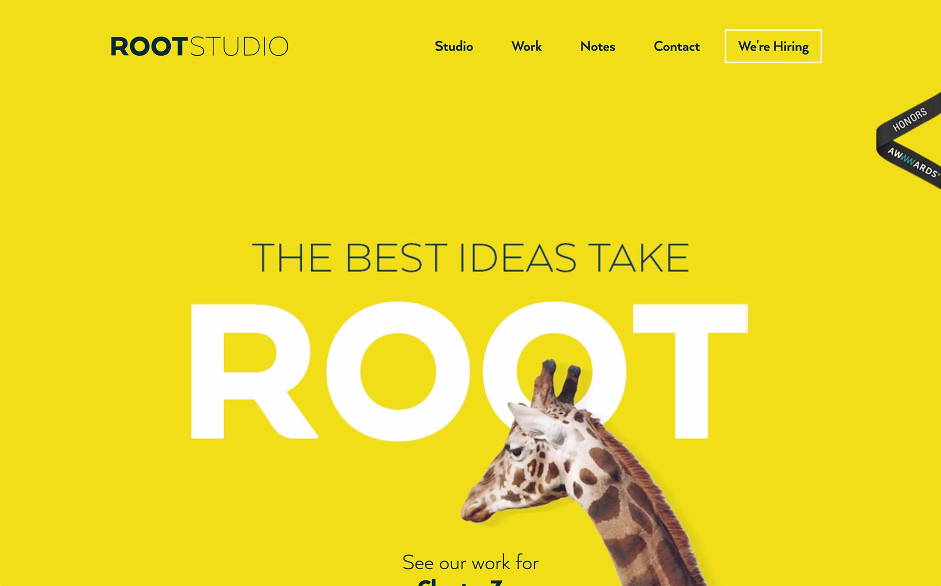
The Glyph Studio
The Glyph Studio uses a highly presentational design. Considering one of their clients is Wix, I’m assuming that’s what they were going for. While highly animated, everything is tasteful and, dare I say, elegant. They obviously had an art director working on their case studies.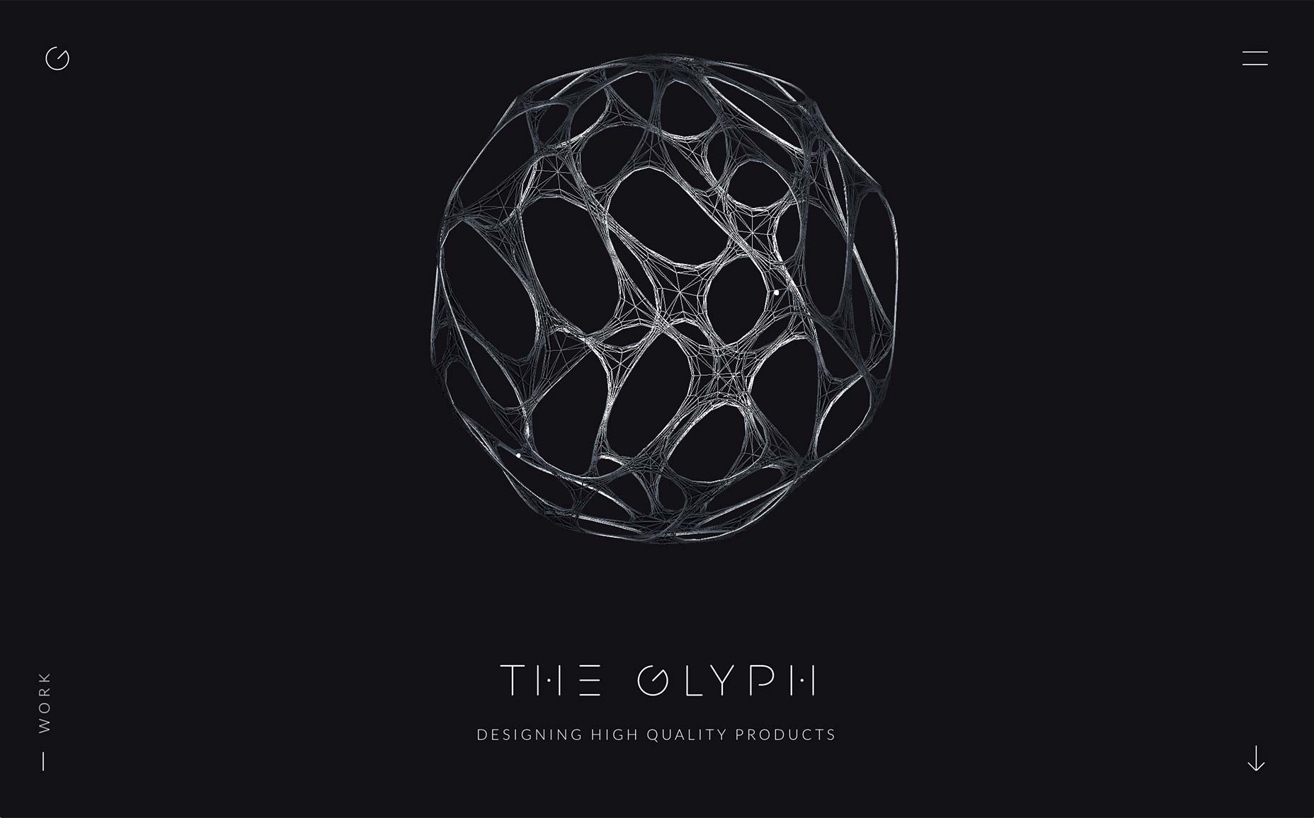
Gabe Abadilla
I’d just like to give credit to Gabe Abadilla for embracing the inevitable nickname/meme and buying "gabadilla.com". He’s a good sport. He’s also got a lovely one-page portfolio. It’s nothing too experimental, or out of the ordinary. It just looks good and works better. I would define the design aesthetic as aggressively pleasant, more than anything else.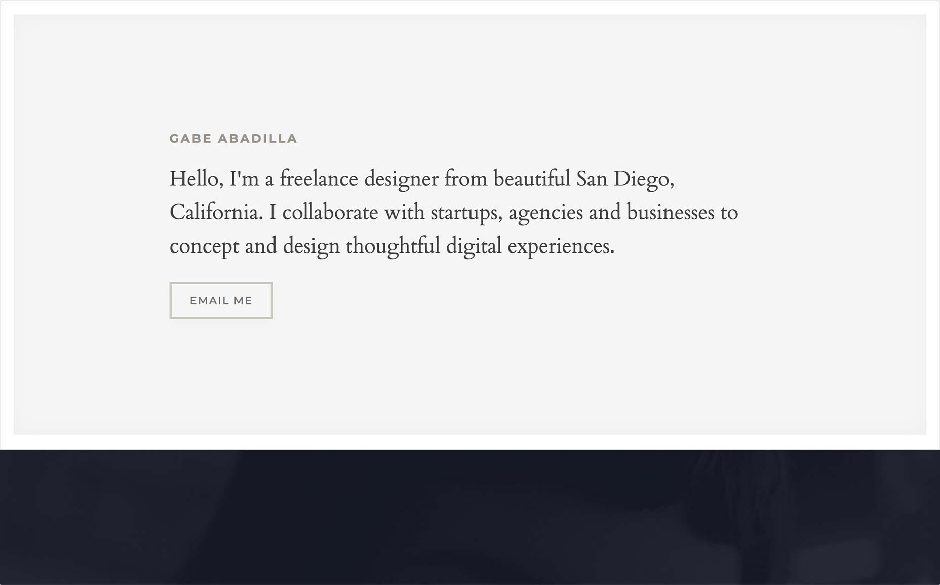
Jake Stangel
Jake Stangel combines pastels, minimalism, and background video to create a simple experience that just gets the point across. I do feel some of the text could use a bit more contrast, but the presentation of the imagery stands out more than enough to make up for it.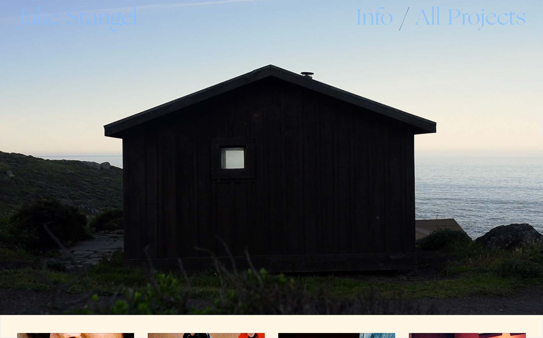
Ben Wegscheider
This one is on the list just for the “odd” factor. From the get-go, this portfolio hits you with animated effects straight out of that old ’70s sci-fi movie you have on VHS. And it doesn’t really stop. To counter the somewhat distracting animation, the rest of the site is dead simple, with large typography that mostly stays readable, even over everything else that’s going on.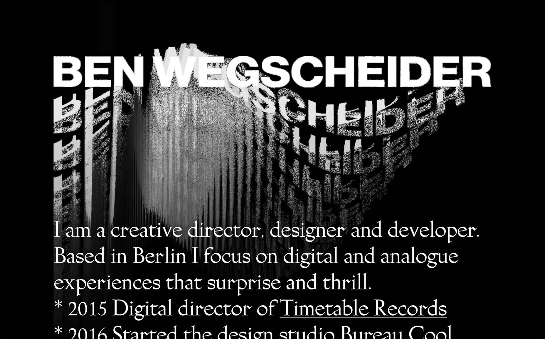
Wibicom
Wibicom’s presentation-style portfolio is pretty standard, as these things go. I do find it interested that scrolling down on the home page takes you straight to the navigation menu. No intro content, no frills beyond a bit of background animation. They just throw you straight into the browsing. The trend continues throughout the site, as they seem to depend more on their imagery to do the talking.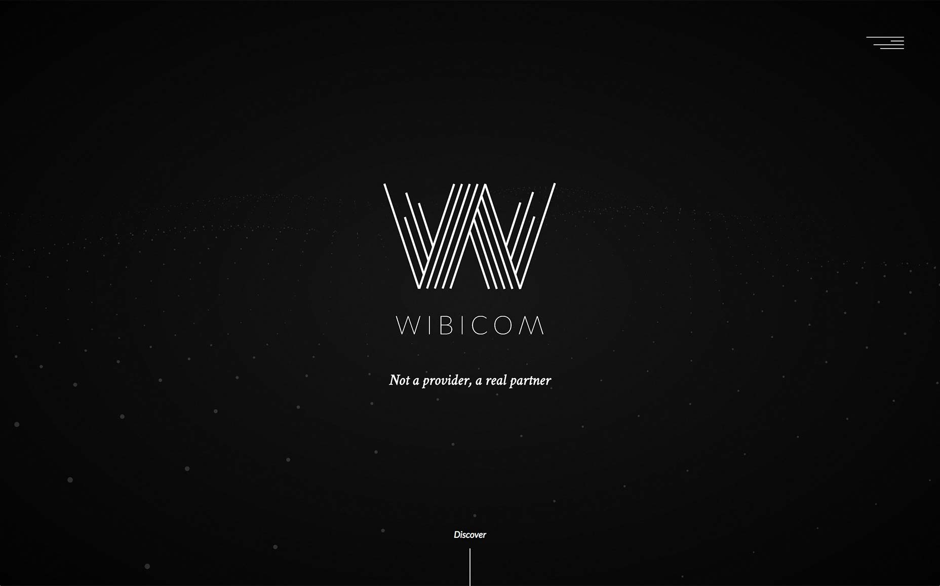
Sympozium
Sympozium is a French design agency with a lovely site that looks classically professional while incorporating a couple more modern trends like asymmetry. It’s clear that every page has a bit of art direction to it, which is mostly evident in the layout.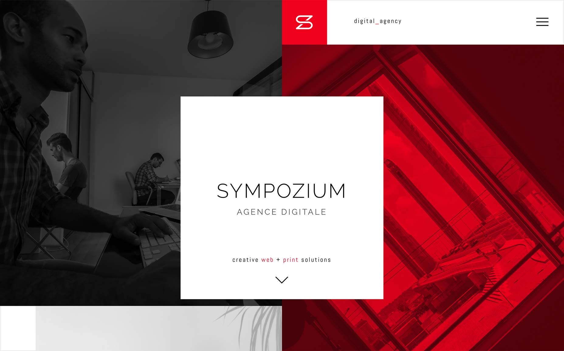
Round
Round uses a style of minimalism that almost feels like the old days, now. It brings back the simple grid, the thick lines and almost thicker type. It also splits the navigation in an interesting way. The actual portfolio part of the site is organized as an almost separate entity, and browsing that part of the site will display portfolio-specific navigation. Head to the part of the site that tells you all about the studio, and the main palette changes, along with the primary navigation. The experiences are similar enough that the transition doesn’t feel too jarring; but they clearly design the portfolio experience to focus on browsing through their work, and the rest for the user who’s ready to get serious.
Tao Tajima
Tao Tajima is a filmmaker, and his website features his work by pretty much constantly being in motion. Animation and background video (as well as embedded video) are pretty heavily featured.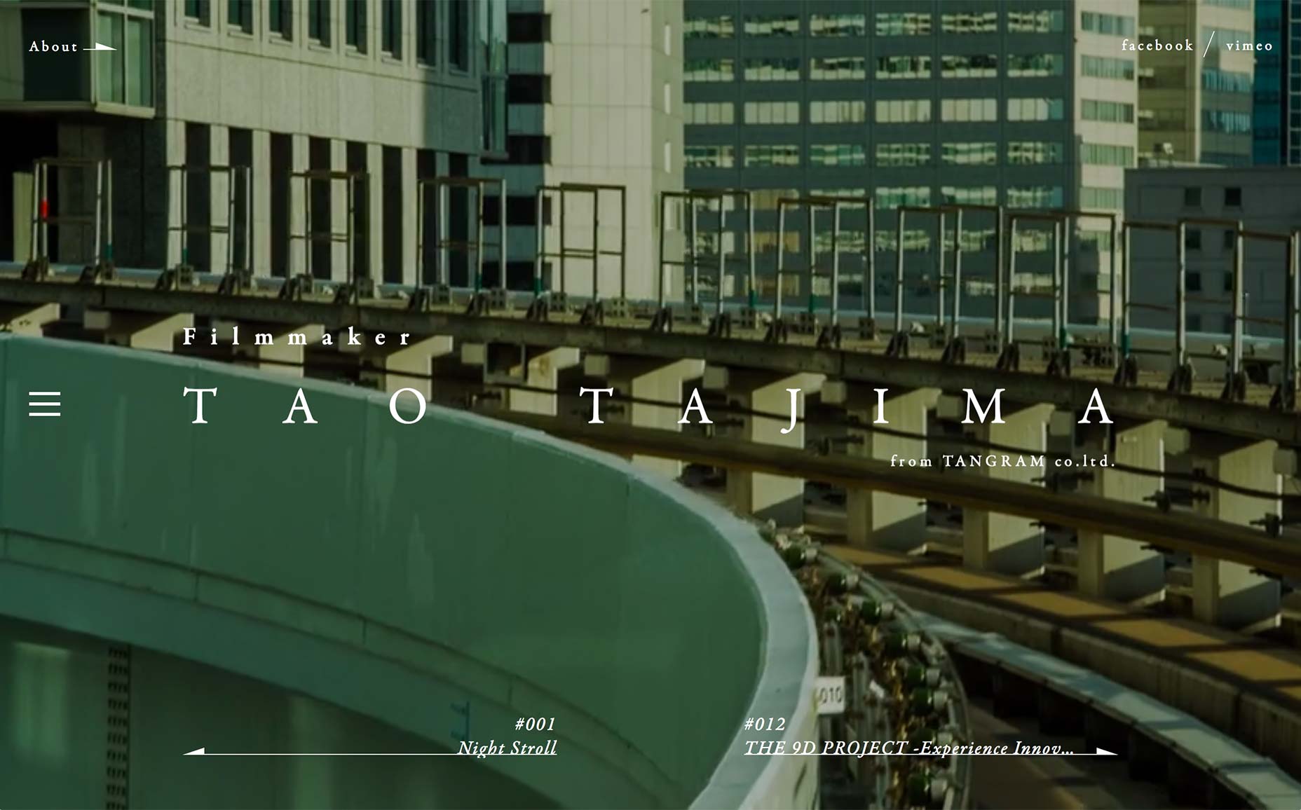
IPG Mediabrands
It’s been a while since I’ve reviewed a site that was as corporate-sounding as IPG Mediabrands. Their site is (who could have possibly guessed?) very visually corporate as well. It’s like the bank brochures I read as a child — while waiting for the adults to get done with the bank stuff already — grew up and turned into websites. And none of that is criticism. Take one look at their list of clients, and you’ll get why they went with the corporate look. Plus, they use yellow really well.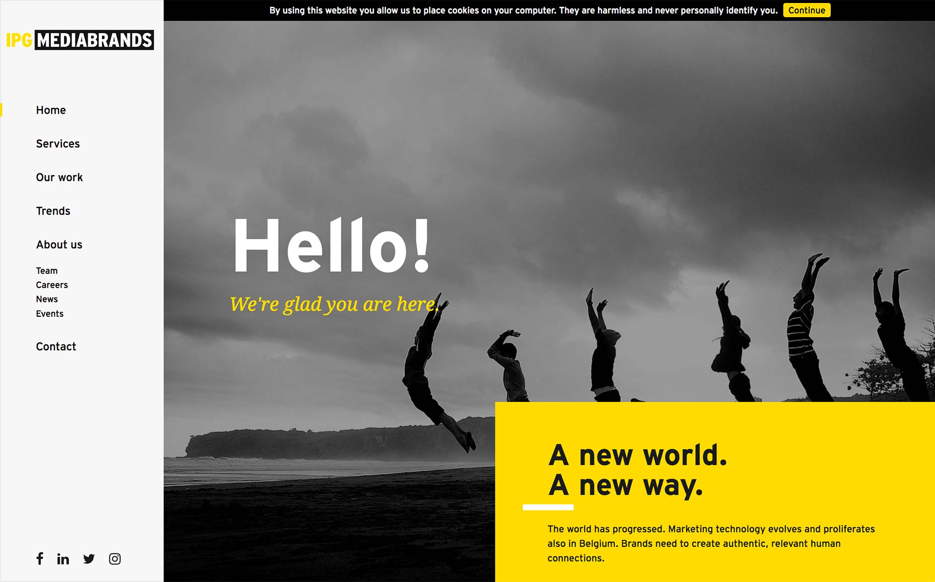
Contemple
Contemple went as wild with their design and animation as they did with their URL. And hey, if you’re going to make your site look like an advanced PowerPoint, why not go all out? There’s a lot of animation, but it’s pretty good animation.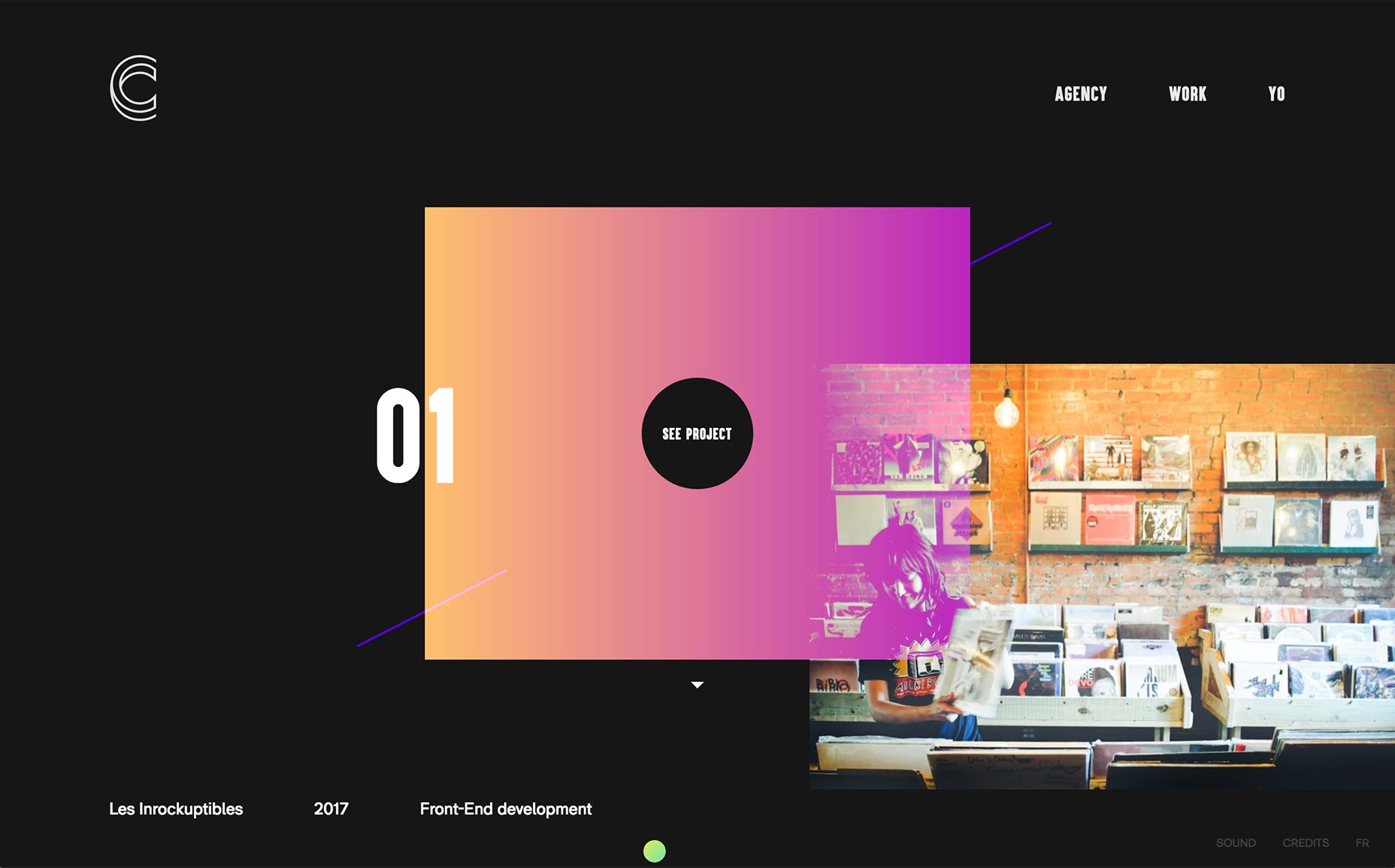
Pierre Georges
Pierre Georges’ portfolio won’t blow any minds with weirdness. It’s just a clean, pleasant portfolio with big text, and much bigger images. Enjoy.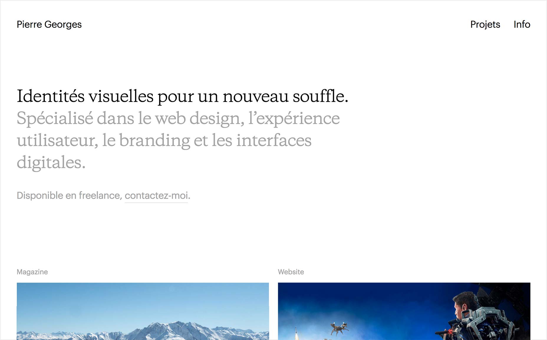
Jessica Chabot
Jessica Chabot’s portfolio takes a dead-simple, and makes it stand out with a few simple flourishes. That white space at the right, the white space in general. The site feels “feature-complete”, even with a bare minimum of content. I’m not sure about that disappearing logotype, but hey. Can’t win ’em all.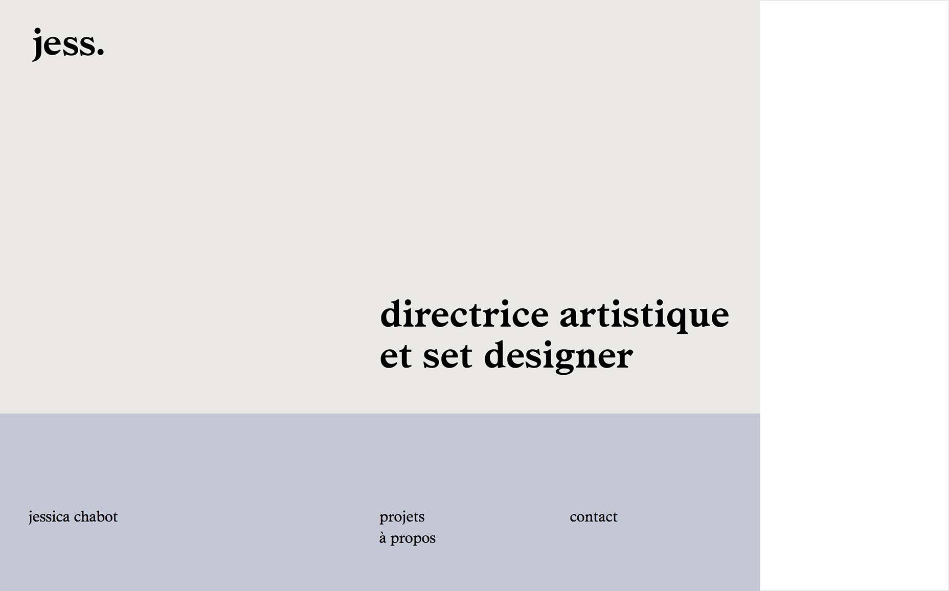
Brad Geiger
Brad Geiger’s portfolio is an example of how post-minimalism is starting to trend back toward classic minimalism. We’ve got the now-familiar asymmetrical and staggered layout combined with the thick sans type and monochromatic tendencies of yesteryear. Well, they do say life is about achieving balance. I think this site pulls it off.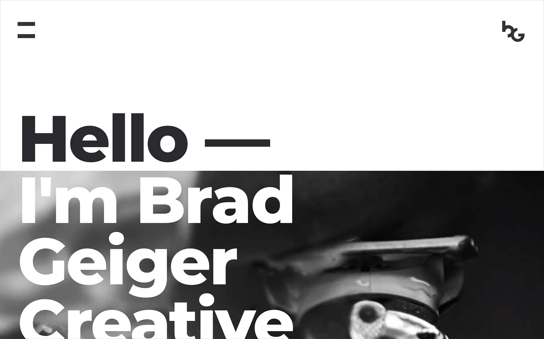
Bibliothèque
Bibliothèque brings us a pretty-if-simple portfolio built around masonry layouts. Given this central concept, it’s pretty much all images. Just one giant image gallery, and some contact info. And it works.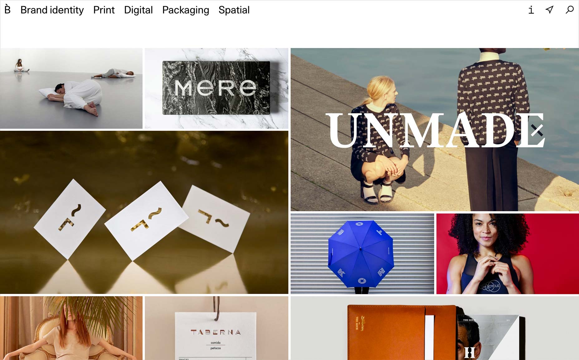
Ezequiel Bruni
Ezequiel Bruni is a web/UX designer, blogger, and aspiring photographer living in Mexico. When he’s not up to his finely-chiselled ears in wire-frames and front-end code, or ranting about the same, he indulges in beer, pizza, fantasy novels, and stand-up comedy.


Read Next

3 Essential Design Trends, May 2024
Integrated navigation elements, interactive typography, and digital overprints are three website design trends making…

How to Write World-Beating Web Content
Writing for the web is different from all other formats. We typically do not read to any real depth on the web; we…
By Louise North

20 Best New Websites, April 2024
Welcome to our sites of the month for April. With some websites, the details make all the difference, while in others,…

Exciting New Tools for Designers, April 2024
Welcome to our April tools collection. There are no practical jokes here, just practical gadgets, services, and apps to…

How Web Designers Can Stay Relevant in the Age of AI
The digital landscape is evolving rapidly. With the advent of AI, every sector is witnessing a revolution, including…
By Louise North

14 Top UX Tools for Designers in 2024
User Experience (UX) is one of the most important fields of design, so it should come as no surprise that there are a…
By Simon Sterne

What Negative Effects Does a Bad Website Design Have On My Business?
Consumer expectations for a responsive, immersive, and visually appealing website experience have never been higher. In…

10+ Best Resources & Tools for Web Designers (2024 update)
Is searching for the best web design tools to suit your needs akin to having a recurring bad dream? Does each…
By WDD Staff

3 Essential Design Trends, April 2024
Ready to jump into some amazing new design ideas for Spring? Our roundup has everything from UX to color trends…

How to Plan Your First Successful Website
Planning a new website can be exciting and — if you’re anything like me — a little daunting. Whether you’re an…
By Simon Sterne

15 Best New Fonts, March 2024
Welcome to March’s edition of our roundup of the best new fonts for designers. This month’s compilation includes…
By Ben Moss

LimeWire Developer APIs Herald a New Era of AI Integration
Generative AI is a fascinating technology. Far from the design killer some people feared, it is an empowering and…
By WDD Staff