Back to all posts

Dropdown alternatives for better (mobile) forms

Using dropdown menus in forms might seem a no-brainer: they don’t take much space on the UI, they automatically validate the input, all browsers and platforms support them, they’re easy and cheap to implement, and the users know them well enough.

At the same time, though, dropdown (or select) menus are one of the most frequently misused form patterns and “should be the UI of last resort”, according to Luke Wroblewski and many others.

Let’s look at some of the limitations and concerns:

  • In a dropdown, the available options are not visibleuntil you click or tap to open it. Also, the length of the list is hidden at first sight, that is, users can’t predict if a dropdown menu would contain 2 or 50 elements.
  • Selecting an option from a dropdown list (especially on mobile) is amulti-step process: you have to tap on the dropdown to open the list of options, then scroll and scan through the items to select one, and then close the dropdown.
  • Dropdown menus might make designers lazy: it’s super easy to just add all the possible options to a dropdown list without any prioritization (which makes it really similar to the hamburger menu, by the way).
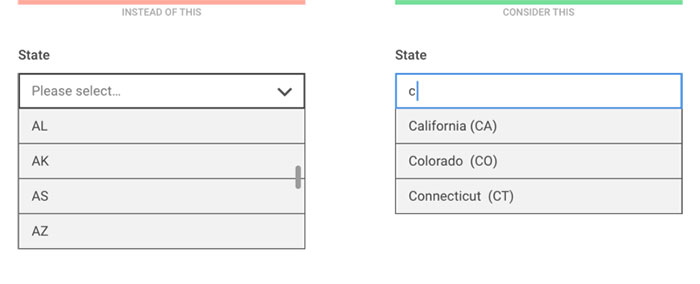
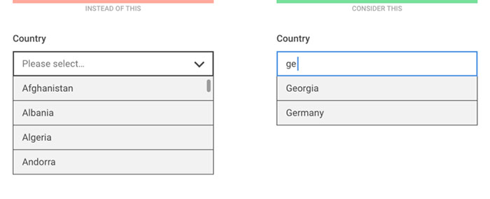
  • Longer dropdowns, such as a country selector can be a nightmare to scan through, especially on mobile where keyboard search is usually not available.
  • Scrolling through the options might be painful on some mobile screens where the visible and scrollable area of the list is small:

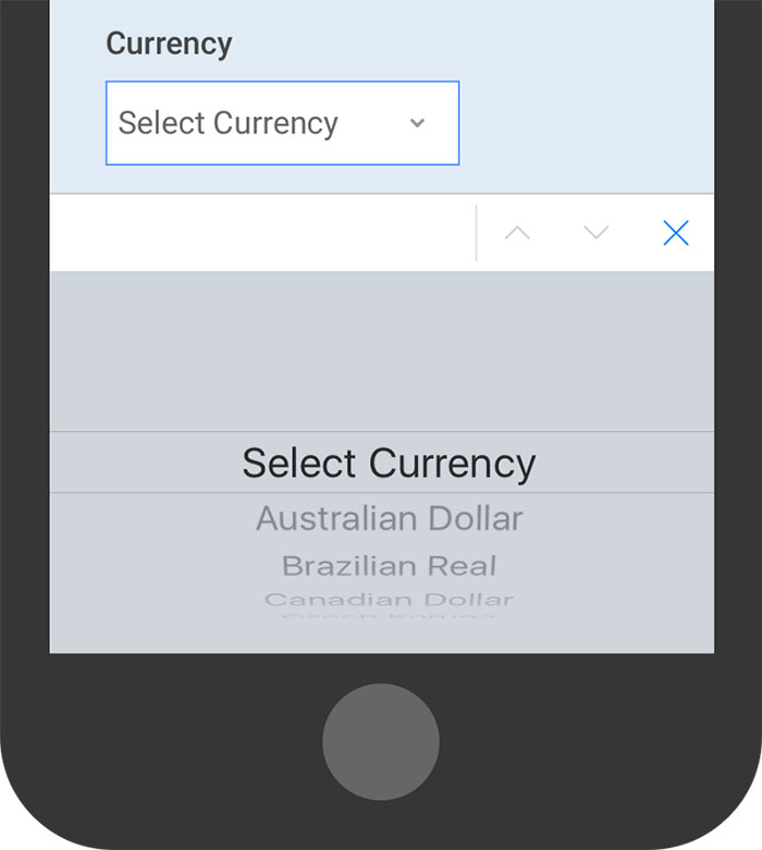
On iOS, the number of visible options might be surprisingly low at first sight

The good news is that there are plenty of alternative input controls that will work better for you in many cases.

Consider the number of options

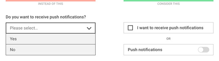
For binary (on/off) decisions, the dropdown menu is a really bad choice. What you need is a checkbox or a toggle switch.

If your dropdown only contains Yes/No or On/Off options, use a simpler switch instead


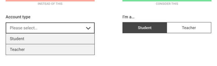
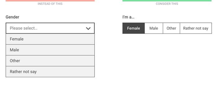
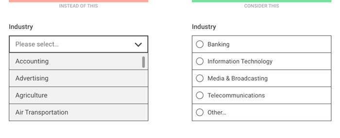
For a small number of mutually exclusive options, radio buttons or segmented controls are recommended so that all available options are visible at once, without having to open the list.

Segmented controls show the selected and the alternative option(s) at once
The number of visible options depend on the screen width and the length of the option labels but having more than 5 items is not recommended


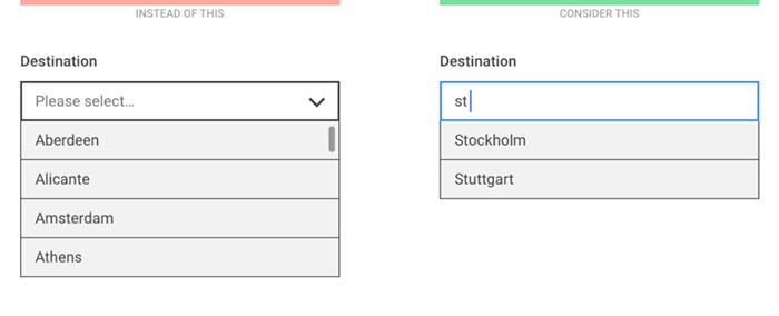
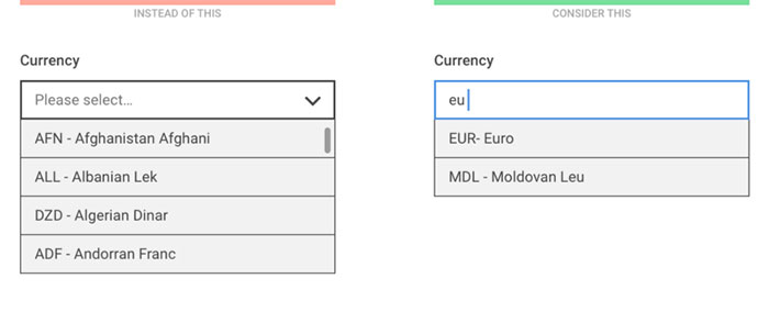
For a large number of well specified options, when users know exactly what they’re looking for, consider a “start typing…” solution where the list of filtered options is displayed after the first one or two letters.

Instead of scrolling through the list, let the users start typing and only show the filtered options


For large and diverse lists, try to use existing user data to prioritize the options and only list the first few most popular choices to the user. This way there’s a chance that 90% of the users will find their preference instantly and only 10% have to select Other and then specify it in the next question.

Although “Other” is not an elegant solution, such prioritization might improve the user experience for the majority of users


Consider the expected input

One of the benefits of a dropdown list is that users don’t have to type much. However, if the expected input is not too long and is frequently asked (such as personal data) it’s usually easier to type in rather than select it from a list:

Entering a birth year on a mobil device is easier with a numeric keyboard than by scrolling through a long list


In general, entering a numeric value on a mobile is usually more efficient with a number pad.

Even though the sorting order of a numeric dropdown is clear, it might still be easier to type than scroll


If it’s important to validate the user’s input, the “start typing…” approach might be useful where the input field is used to filter down the available options.

When listing the states of the USA, typing only one letter filters down the list well


The ability to search in the list of options is especially helpful when the sorting order of the elements is not clear.

The sorting order for currencies might be unclear to users so make sure they can search in name and currency code, too


The same technique should be applied for the good old country list: instead of listing 200+ items, let users start typing and filter the results as soon as possible.


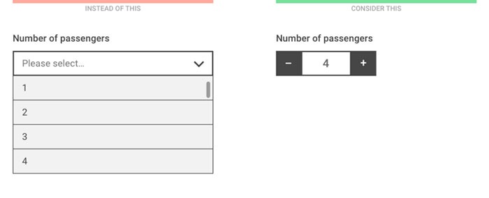
For discrete values representing quantity (such as the number of passengers or the number of items in a shopping cart), a stepper allows the users to quickly increase or decrease the number with one click or tap.


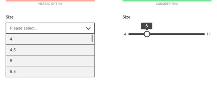
For non-discrete values or values that are located on a scale, consider using a slider.

Showing the minimum and maximum value of the scale might help the understanding of the context


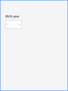
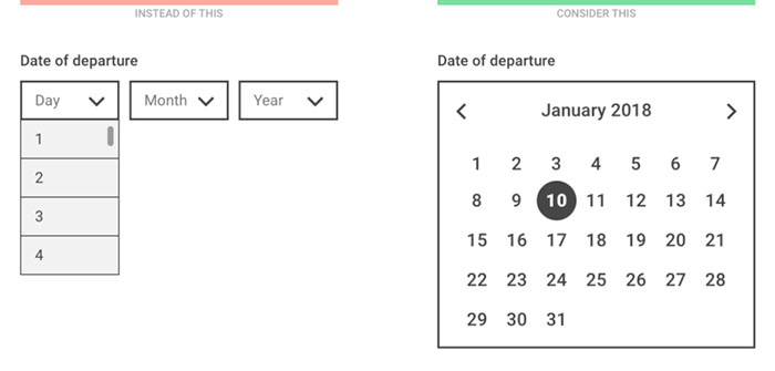
Picking a date with multiple select menus can be a really painful experience so for entering nearby dates, always use a date picker. (But never use it for entering birth dates!)


Consider designing smarter dropdowns

It goes without saying that dropdown menus should not be always avoided. You’ll find cases when a select menu is the most appropriate input control and that’s fine, just try to make it as user friendly as possible.

  • Use a meaningful label: the menu label or description should be clear and available even when the list is open. Inside the select menu, use a descriptive label that tells the users what they’re selecting (that is, “Select type” instead of “Please select”).
  • Sort items in a sensible way: based on user data, try putting the most popular choices on top of the list. Or, even pre-select the most popular one by default.
  • Use smart defaults: phones and browsers knows the user’s location, the date, and tons of other information. Use that data to pre-select the most probable option for every user.
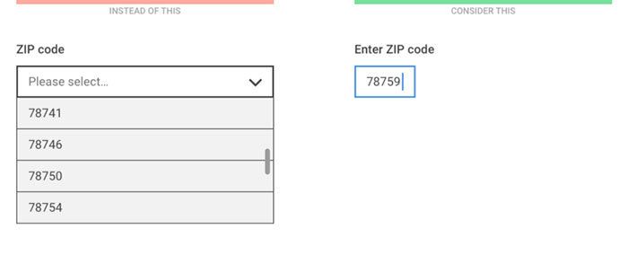
  • Decrease the number of fields and let the computer do the work: if a user enters a ZIP code, the computer could already know the city and state — no need to ask. If a user enters a credit card number, the computer could already know it’s a MasterCard — no need to ask.
  • Consider using APIs: signing up with a Facebook Connect button is easier than filling out a registration form. Paying with Paypal is easier than having to type in your credit card data.

If you want to learn more about designing dropdowns, check out the brilliant SXSW Keynote by Golden Krishna and Eric Campbell:

This article was originally posted at:
http://www.designyourway.net/blog/user-experience/dropdown-alternatives-better-mobile-forms/

Can we take you from stuck to unstuck?

We'd love to hear from you

Product Design

The ‘Product’ is the website, service, application, interactive thing being worked on by the business. The practice of Product Design is similar in a lot of ways to UX Design. It involves the coming together of many specific design disciplines...

Call to action (CTA)

A call to action is a marketing term that refers to a prompt that invokes a response leading to a sale. When referring to a call to action (CTA) in the digital design world we usually mean the interactive element that leads to the next step in the experience - something that needs to be clicked or tapped.

User testing

User testing refers to a technique used in the design process to evaluate a product, feature or prototype with real users. There are several reasons why you might want to undergo usability testing, the most common is that it allows the design team to identify friction in a user experience they are designing, so that it can be addressed before being built or deployed.

WYSIWYG

WYSIWYG (pronounced WIZ-ee-wig) is an acronym for "What You See Is What You Get". It helps identify an an interface that allows user input resulting in an output that is rendered in a similar way. For example; a word processor application interface might resemble a piece of paper,so when printed the user can see how the output will appear.

Content Management System

A content management system (CMS) is an tool that allows a website editor/administrator to manage the content that is displayed. Websites are made of HTML and CSS to create pages. Pages can be hard-coded but would require technical development skills to make changes. A CMS usually allows a person without coding knowledge to amend existing and add new content to a website using a WYSIWYG interface.

Responsive Web Design

Responsive web design refers to a web page that dynamically adapts its layout to fit the size and orientation of the device on which it is viewed. A responsive design allows for a more optimised user experience across desktop and laptop computers as well as smartphones and tablets of varying sizes.

User Stories

User stories allow the functionality of a product or service to be expressed as written descriptions of an experience as seen from the users perspective. The writing of user stories creates a list of design and development tasks to complete in order to create any required functionality.

User Interface

A user interface (UI) is a conduit between human and computer interaction - the space where a user will interact with a computer or machine to complete tasks. The purpose of a UI is to enable a user to effectively control a computer or machine they are interacting with, and for feedback to be received in order to communicate effective completion of tasks.

Personas

A persona in UX Design is the characterisation of a user who represents a segment of your target audience. On a project you might create any number of personas to be representative of a range of user needs and desires. The solutions you design must answer these needs in order to deliver value to your target audience.

Card sorting

A great, reliable, inexpensive method for discovering patterns in how users would expect to find content or functionality. Card sorting is used to test the taxonomy of data with a group of subjects, usually to help inform the creation of the information architecture, user flow, or menu structure on a project.

Brainstorming

A technique used to generate ideas around a specific topic. Often done in groups, but can be done individuals. The process usually involves writing down all ideas around a topic onto paper, a whiteboard or stickies often implying some kind of association.

Minimum Viable Product

An MVP is a product that has the minimum set of features to prove the most essential hypothesis for a product. Businesses building a new product can create a Minimum Viable Product to prove that an idea is viable and warrants further investment. A further benefit being that the next stage of development can be informed by feedback obtained from testing that MVP.

Sitemap

A sitemap is a diagrammatic representation of a hierarchical system. It usually depicts the parent-sibling relationship between pages in a website, showing how sub pages might be arranged underneath their parent groupings. This arrangement forms a map of the site.

User journey

A user journey represents a sequence of events or experiences a user might encounter while using a product or service. A user journey can be mapped or designed to show the steps and choices presented as interactions, and the resulting actions.

Prototype

A prototype is draft representation built to test ideas for layout, behaviour and flow in a system. Prototypes are an indispensable tool for resolving a large number of potential issues in a concept or business before too many resources are deployed to put a design into production.

Wireframes

A Wireframe is a visual schematic that conveys a basic level of communication, structure and behaviour during the design of a system. Wireframes are low-fidelity designs that bypass including a detailed user interface or visual design, conveying just enough to get across the core idea.

Usability

To say something is usable is a qualitative statement about how easy that thing is to use. Usability is an assessment of how learnable a system is and how easy a user finds it to use. The usability of a system or product is a key factor in determining whether the user experience is a good one.

Information Architecture

Information architecture is the design and organisation of content, pages and data into a structure that aids users understanding of a system. A more organised system enables users to more easily find the information they require and complete the intended tasks.

UI Design

User Interface Design is the discipline of designing software interfaces for devices, ideally with a focus on maximising efficiency, responsiveness and aesthetics to foster a good user experience.

UX Design

The practice of User Experience (UX) Design is the coming together of many specific design related disciplines to improve the usability, responsiveness, uptake and aesthetics of a product or service.

User Experience

A general term that covers all aspects of a user's participation while engaging with something that has been designed. Usually when talking about User Experience in the digital design field it refers to the interactions, reactions, emotions and perceptions while using an app, service, website or product.