The key is to create exceptional and distinguished Facebook Ads can be seen by the 15 best Facebook ad examples we’ve curated for you. These Facebook Ad examples stand out from the rest; they stop users mid-scroll; they are fully optimized for mobile devices; and direct traffic to landing pages.
Essentially, it all boils down to one critical question: How do you make the best Facebook ad?
Before we dig into what characteristics and techniques make the best Facebook Ads, let’s briefly review.
What’s a Facebook ad?
Facebook ads are paid advertisements displayed in a user’s news feed, in the right-side margin, or in the Facebook mobile app, displayed natively in the user’s newsfeed like this: (placement outlined in blue)
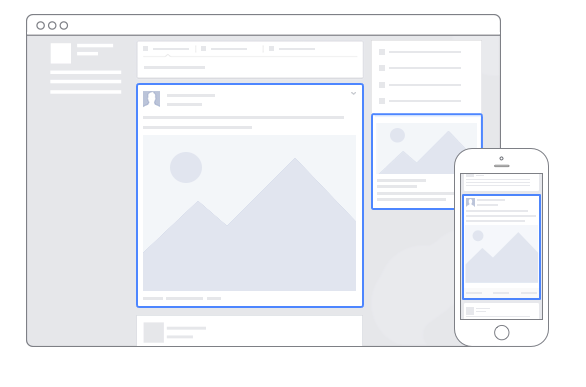
Margin ads are more traditional of the two because they were the first type of advertising that Facebook introduced. Although they offer more cost-efficient clicks and conversions, newsfeed ads tend to get higher engagement rates because they’re a form of native advertising.
With all Facebook Ads, you can target audiences by age, gender, location, interests, and more. You can also choose to run your ads continually, or on a set schedule, based on when they perform best. Facebook analytics allow you to see how your ads are performing, giving you a chance to make them even better by A/B testing different variations.
Let’s dive deeper into the specific elements that must be optimized to make your ad worthy of being considered the best and most likely to generate the most leads. Each Facebook Ad example below is categorized based on the headline, stock photo, illustration, and copy.
Elements that make up the best Facebook Ads
Headline
To convince visitors to click your ad, you need an outstanding headline that highlights your unique value proposition. Including this in the ad headline immediately lets prospects know what’s different and special about your product or service compared to competitors. This leaves them feeling like they don’t have a choice — they have to click your ad.
According to AdEspresso, the average length for a Facebook ad headline is just five words:
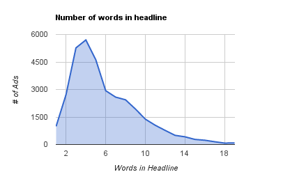
Headlines aren’t supposed to tell your entire story — they’re simply meant to grab visitors’ attention and make them want to click your ad to learn more. Making your headline too long could cause users to lose focus and attention, and you to miss out on ad clicks. Instead, aim for a headline around five words, making it clear, concise, and UVP-focused, and then include the remaining important information in the post text or link description.
Examples
Adjust has the right idea here:
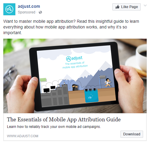
The headline is seven words long — not bad, but they may want to try removing “the” to make it even closer to 5 words to see if it performs better. It’s also very specific, so prospects know exactly what they’ll get by clicking the ad.
This is a lead ad, so when users click it, a popup window opens with a lead generation form for prospects to complete. While lead ads are one decent option for brands to generate leads directly on the platform, they don’t quite measure up to using landing pages to get the job done.
Here’s another example from Asana:
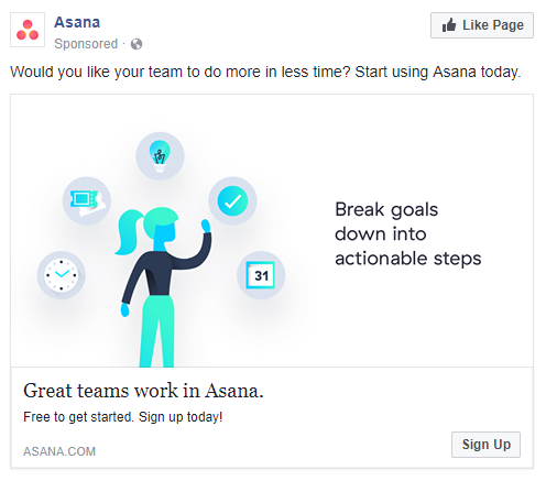
The headline is short, simple, and very matter-of-fact. If Facebook users were only to read the headline of this ad, they’d see that great teams work in Asana. Why wouldn’t they want to do the same?
Once they were drawn in by the headline, the image and image text highlight that one of the primary ways Asana helps business teams is by breaking large goals down into smaller, actionable steps.
If viewers continue reading the rest of the ad, they learn that their team could do more work in less time by using this software — what business wouldn’t want that? Finally, they’d read the link description and feel persuaded to sign up for an account because it’s free and instant.
UberConference uses a short and simple headline on their Facebook ad as well:
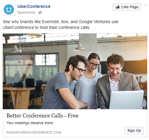
At only four words long, it does a great job of persuading people to sign up. Who could resist improving something that’s not working up to par for them? And for free!
Stock photo
Facebook image ads are one of the most popular types of ads because Facebook’s algorithm favors visual content over written content. Images are also much more shareable and memorable than textual content.
Since the image is the largest element of your ad, there’s a lot at stake when it comes to choosing the perfect one. Just like your headline, your ad image must quickly capture users’ attention, make them feel something, and make them want to learn more about your offer.
One option is to use a stock photo, and the other is to use an illustration photo.
In August 2013, Facebook collaborated with Shutterstock — the world leader in stock image downloads — to offer 25 million free stock photos to advertisers on Facebook. These high-quality, engaging photos are perfect for boosting ad performance levels and can be used in all Facebook ad formats.
Examples
Here’s one that Practical Social Media users in their Facebook newsfeed ad:
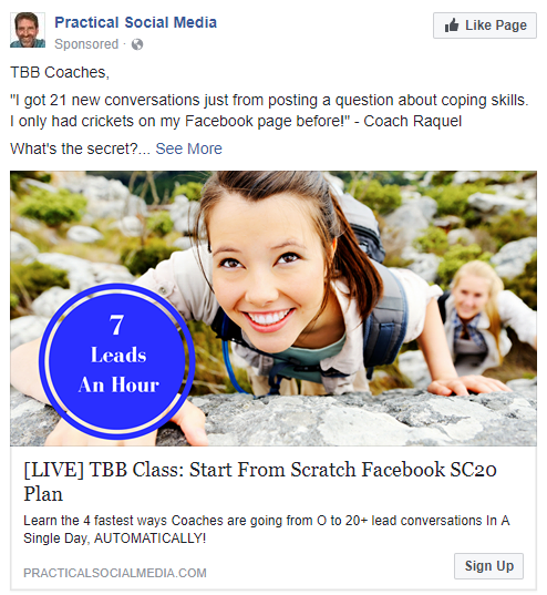
Take note of how crisp and clear the image is. The photo’s vibrancy and brightness are likely to grab users’ attention as they’re scrolling, and the large, blue “7 Leads An Hour” circle entices them to keep reading.
Also, people tend to connect more with images containing smiling faces over those without, due to emotional marketing principles.
Lastly, the ad link sends traffic to a landing page, which is great. The problem, though, is that the landing page looks and “feels” nothing like the ad. There’s no message match, which may leave visitors feeling confused and disappointed, and could result in fewer conversions.
This image on this South Carolina Connections Academy ad caught my attention as I was scrolling through the Facebook mobile app:

The image is bright, clear, and gives off an overall soft, happy vibe, and the smiling, relaxed woman helps build a human connection with users.
Again, this ad leads prospects to a high-converting landing page where they can learn more about the opportunity being offered and request a free program guide.
Adobe
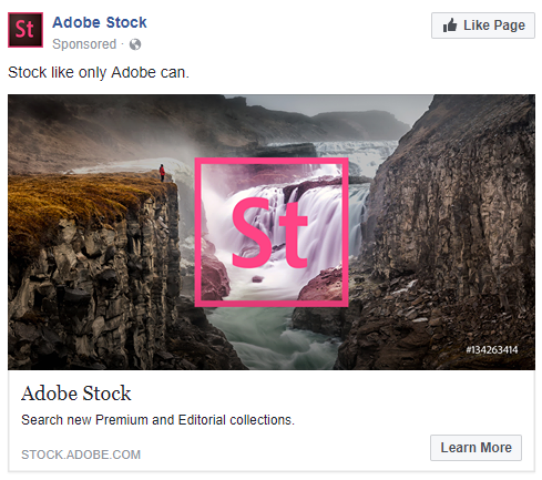
They use one of their own stock photos to advertise their stock photo collection! The image itself is aesthetically pleasing and likely to grab users’ attention with the pink Stock logo. The copy could be improved by making it more personalized to the audience, such as “Design made easy: high-quality premium and editorial stock photos from Adobe.”
Illustration
The other image option is to use an illustration photo — or any image that’s not a stock photo.
Comcast chose not to use a stock photo in their Facebook ad. Instead they used their own illustrated image:
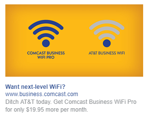
This was smart on their part because everyone hates seeing that dreaded weak-signal icon on their devices, and they use this feeling to their advantage. They show it on their ad, labeled with one of their competitors, and next to it, they display a strong-signal icon, labeled with their own service.
The Comcast Facebook Ad example uses the link description to make this point even further by bluntly telling people to “Ditch AT&T today.”
Once prospects click the ad, they are brought to a landing page where they can learn more about Comcast Business WiFi Pro, and sign up to receive a free service recommendation and price quote based on their own business needs.
Kate Farms
The service chose to surpass the stock photo option as well, and instead, staged a unique shot to use for their ad:
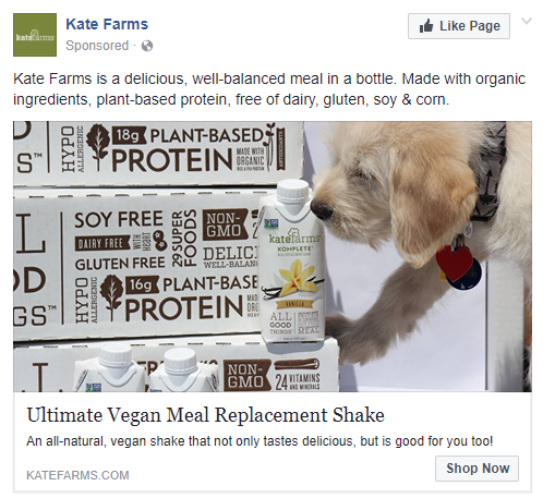
Along with smiling women, pets are another great addition to photos, as most people tend to think they’re adorable, and they tug at their heartstrings. Although the puppy might be what draws people in, there’s no missing the product, as it takes up more than half the image. Smart move, Kate Farms.
HelloFresh
They used this image post as one of their ads:
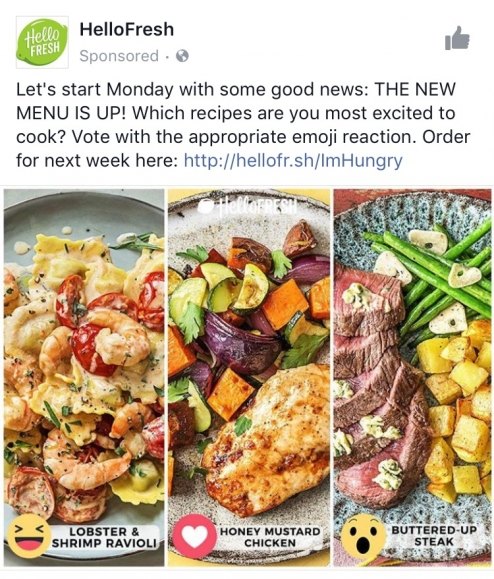
The collage of images adds even more vibrancy and contrast than if there was just one image, and all of the colors coordinate well together.
The post description includes an engaging call-to-action, asking viewers to comment with an emoji to vote for their favorite meal choice.
Tips to keep in mind
No matter what type of photo you use — stock or illustration — it’s important to keep a few tips in mind:
- Use a high level of contrast (complementary colors, bold fonts, white space, etc.) to make your ad eye-catching and visually appealing
- Incorporate branded colors as much as possible
- Ensure your images are high-quality, so people don’t question the quality of your product, service, or brand
It’s also a good idea to include multiple photos in your ads because Facebook will display different images for different users. You can then view your analytics to see which photo is producing the highest CTR.
Copy
Many advertisers on Facebook make the mistake of constantly reusing the same ad copy in all of their campaigns. Understandably, Facebook users are likely to get tired of reading the same thing over and over again, and consequentially, your CTR can drop.
When you test a variety of ad text, you’re able to see what works best for your campaigns and identify what’s making your targeted audience click.
When it comes to news feed Facebook Ads, there are two locations (aside from the headline) in which constructing the perfect copy is essential: the post copy (which is displayed above the ad itself) and the link description directly below the headline. In margin ads, there is no post copy, only a headline and link description.
In both cases, there are a few best practices to keep in mind when constructing your ad copy:
- Create a sense of urgency (“limited-time offer,” etc.)
- Incorporate compelling social proof
- Include action verbs (try, test, get, receive, etc.)
- Use emojis (but not too many)
Relevance
Relevance is critical to the success of your Facebook Ads as well. In February 2015, Facebook introduced an advertising feature in which ads are rated with a relevance score.
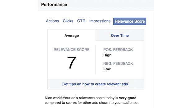
The more relevant your ad is to your target audience, the higher your 1-10 score will be, and Facebook will treat your ad more favorably. (This is similar to Ad Rank in Google Ads.)
Zenreach
This is one company that truly understands the importance of having compelling ad copy in both their post copy and link description — and even their headline:
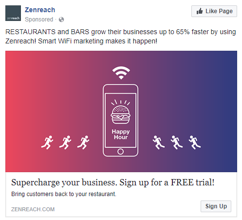
Notice how the post copy uses specific, numerical social proof to convince prospects to click the ad.
Also, there are certain persuasive words you should incorporate into your ad copy to subconsciously encourage users to click your ad, including “you” (or “your”), “free”, “new,” and “instantly” (or “now”). Zenreach uses two of these words in their ad — “your” in the headline and link description, and “free” in the headline.
Green Blender
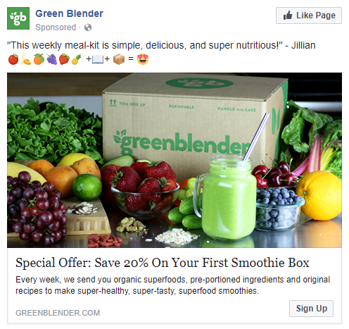
Remember those four best practices for writing your ad copy we mentioned above? This ad incorporated all four of them!
The headline conveys a sense of urgency, stating “Special Offer,” and uses the action verb, “Save.” The post copy then uses social proof (a customer testimonial) to increase trust in prospects and emojis to draw attention and increase engagement.
The copy, the image is colorful, vibrant, and both the product and is clearly pictured.
DexYP
The service promoted their Thryv services with this ad — and look at all of the compelling copy they used:
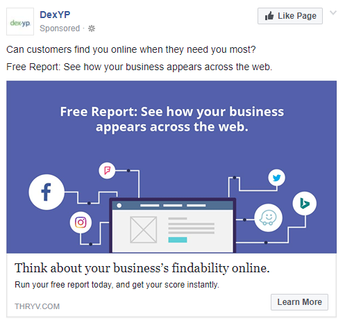
The headline likely does exactly as intended; it entices people. This is extremely important for business owners with an online presence. The post text elaborates on this thought, asking prospects if their customers can find them online. By adding “when they need you most,” the company does a great job of playing off of people’s emotions.
Several compelling keywords are included in the ad copy, like “free” and “instantly”, and there are many action verbs in every section of the ad — “see” in the post text and image text, “think” in the headline, and “run” and “get” in the link description.
What’s more is that this ad sends prospects to a Thryv landing page where they can submit their information and receive their free report.
Facebook Ad examples and landing pages
Along with everything above, here are three final fundamental points to take away from this article:
- Facebook ads should always promote something specific — not just your website or your brand as a whole.
- The ads should always target a specific audience, and your offer should be unique and personalized to that audience.
- Your ad link should always direct traffic to a dedicated landing page page.
Creating a high-converting landing page for your Facebook traffic to visit is integral to the success of your Facebook ad campaigns. AdEspresso shows us that most Facebook advertisers understand this, as 69% of Facebook ads take prospects to a dedicated landing page:
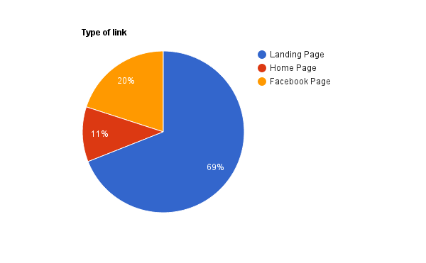
Unfortunately, 11% of marketers miss out on lead generation from landing pages. Because they send interested visitors to a homepage instead. Furthermore, 20% of Facebook Ads simply direct traffic to another Facebook page.
Just like your Facebook ad copy needs to be relevant to your target audience. It also needs to be relevant to your landing page. Whether you have a free trial or an ebook download, your landing page should match your Facebook ad.
Examples
ThriveHive got the landing page part right, but the campaign could use some message match improvement. Here’s the Facebook ad:
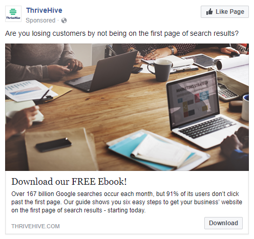
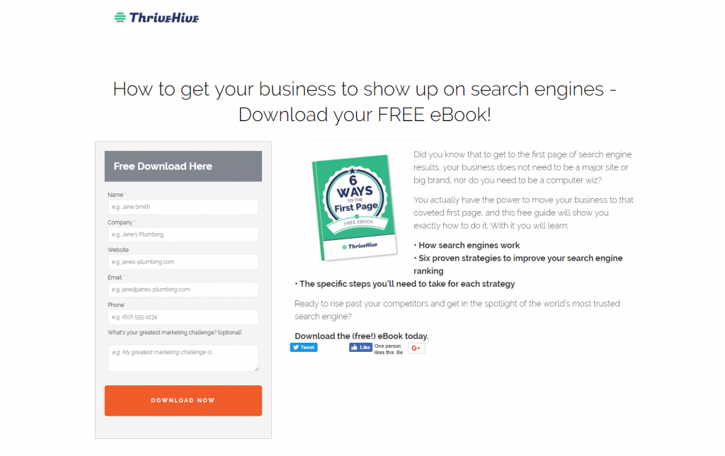
See how there’s not much in common? The message itself is the same, but there are no obvious visual similarities. The images are different; the copy is varied. The headlines don’t match — one says “our,” one says “your,” and the capitalization in “ebook” varies.
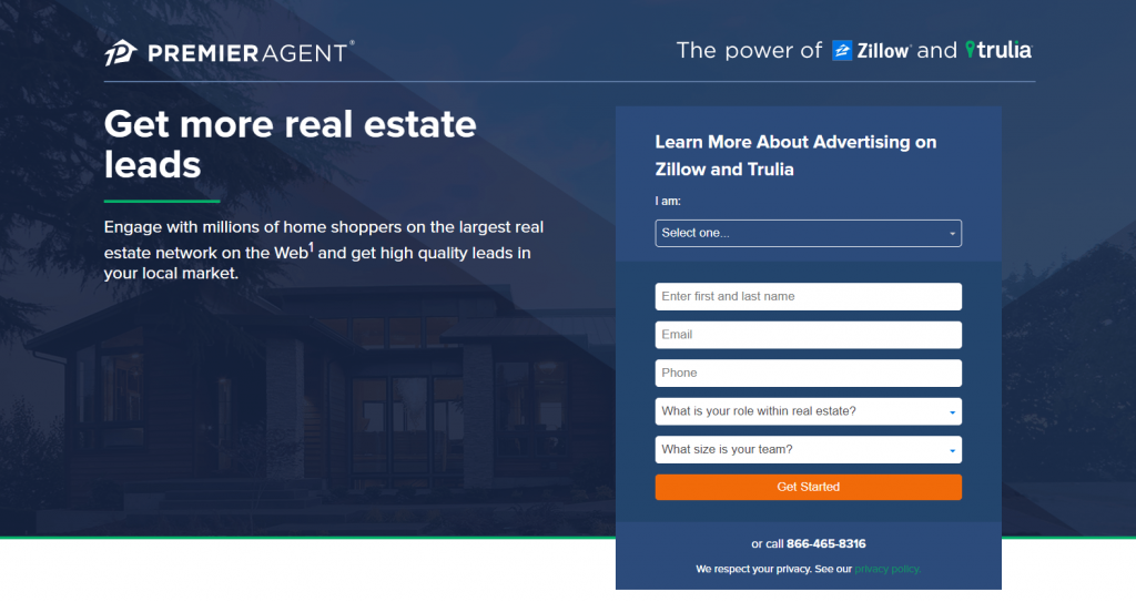
Conversely, here’s an aesthetic pleasing Facebook ad that Zillow created to promote their Premier Agent advertising:
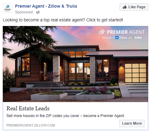
When prospects click the ad, they’re brought to this landing page, which uses message match — in both the image and copy:
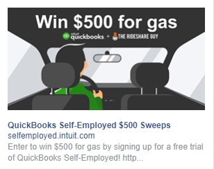
QuickBooks uses relevance and message match through both copy and imagery as well. Here’s their Facebook ad:
And here’s the attached landing page:
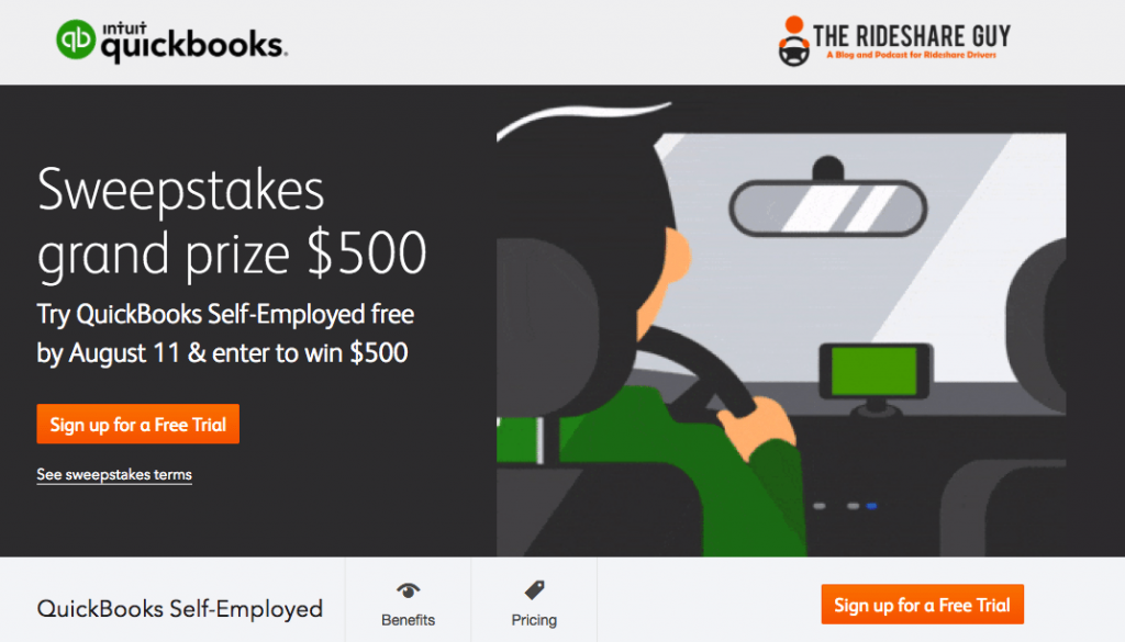
There’s no mistaking that this is the same company and the exact same offer in both places.
Create your best Facebook ad
Hopefully, these Facebook Ad examples will inspire you to create and improve your own. Especially if the campaigns you’ve been running haven’t been working as well as you’d hoped.
Remember to include a unique value proposition in your headline, an engaging visual, short, and convincing copy. And always link to dedicated landing pages. With Instapage, you can create professional landing pages with our 100% customizable templates and designer-friendly platform that is sure to increase your ROI from Facebook ads.
