


There are three good principles to consider when designing your community site.
1) Minimize effort and maximize reward. If members have to scroll past large banners or find useful information among static content, that’s bad. Minimise the static material to show the latest activity. Deliver the maximum value for the minimum amount of effort.
2) Prioritise by popularity. Don’t prioritise alphabetically, prioritise the display of topics/categories, content, features, and navigation options by what’s most popular in the community. If you don’t have a community yet, prioritise by use cases.
3) Keep social density high, but not too high. If you’re launching with multiple features (Q&A, ideas, groups, etc…) and a dozen topics/discussion categories, you’re doing it wrong. You need to keep activity high, but not so high it’s impossible to follow what’s happening.
One of my simpler, but favourite, community designs is the Basecamp community by Kony.
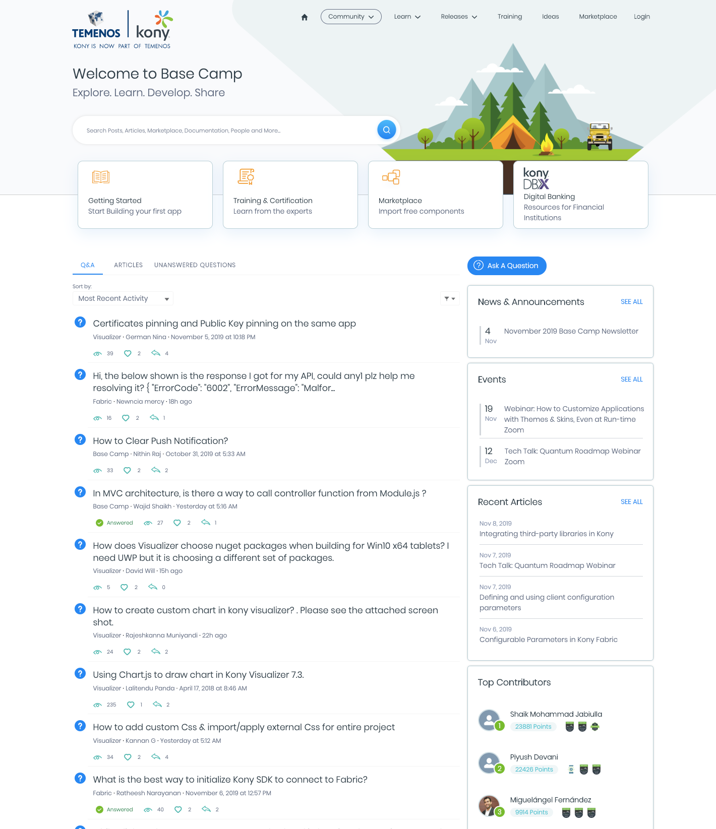
(if image doesn’t show, click here)
It’s clean, simple, shows activity above the fold, displays navigation options clearly, and is probably the best implementation of Salesforce Community Cloud I’ve seen in years.
Tableau and (to a slightly less extent) Alteryx are also good options to study.
Developing the community experience isn’t easy, but if you follow the core three principles you will probably be ok.
p.s. Learn the principles of a great community design for free.


