Hey Everyone,
I hope you’re all doing well! I’m trying to get organised before I go on holiday to Mallorca in a week. I have a list of things to do that just keeps growing every day, no matter how much I seem to get done! I have lots of exciting content scheduled to go up for you guys whilst I’m on holiday so if you aren’t subscribed, make sure that you are so that you get notified with every new post! At the end of every post, I link all of my social media so that you can see what I’m up to in-between posts, I’d love it if you gave me a follow – come and say hey!
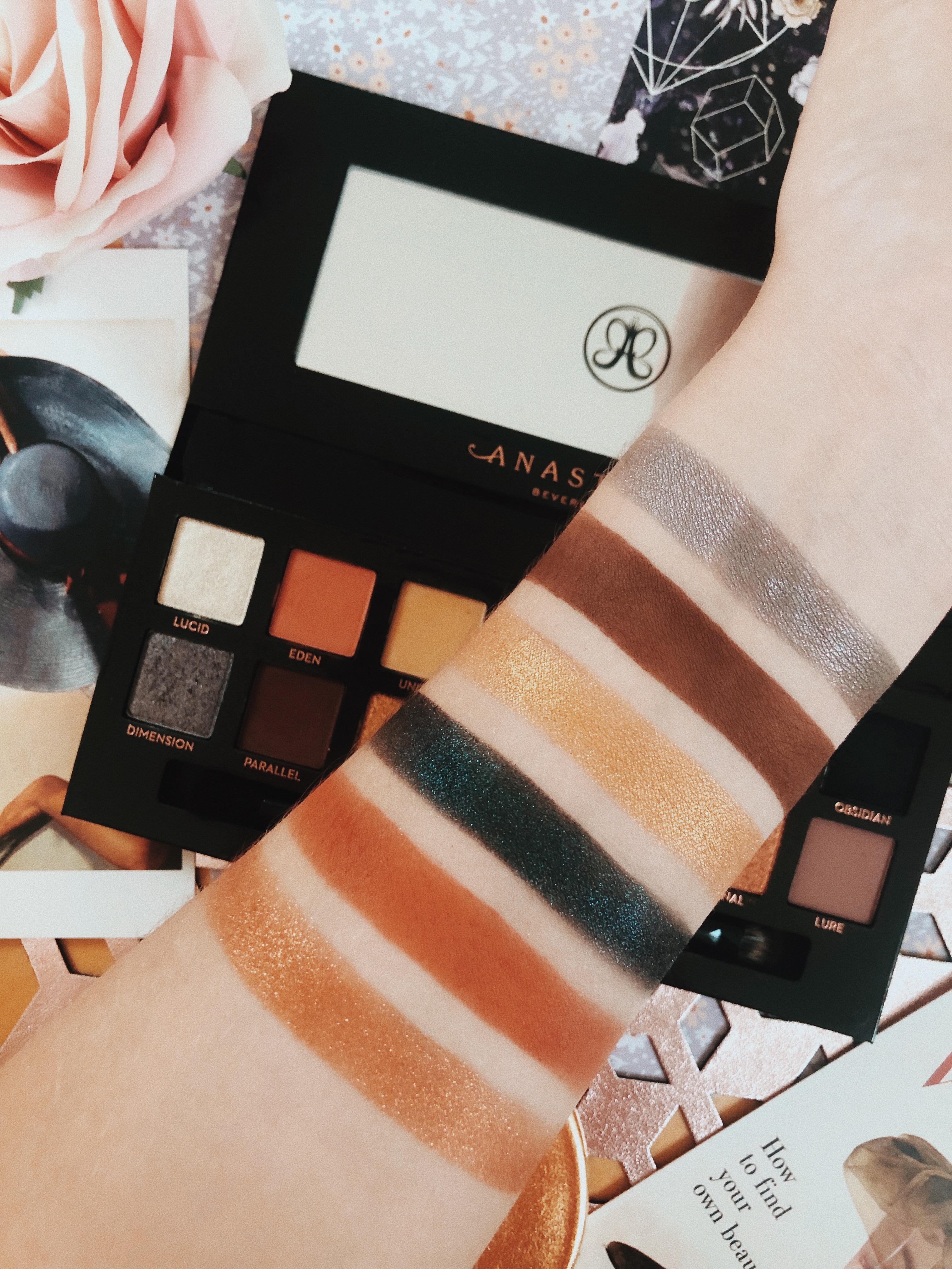
Today I’m going to be reviewing the Anastasia Beverly Hills Prism palette! I know some of you will be thinking “didn’t this come out last year?” and you’d be right in thinking that! It did come out ages ago, however, I only just caved and bought it so I thought I would post a review! There’s just something so collectable about the ABH palettes, I feel like I need them all. I know lots of you are makeup lovers too, so if any of you are considering purchasing the palette, keep reading!
This post contains affiliate links
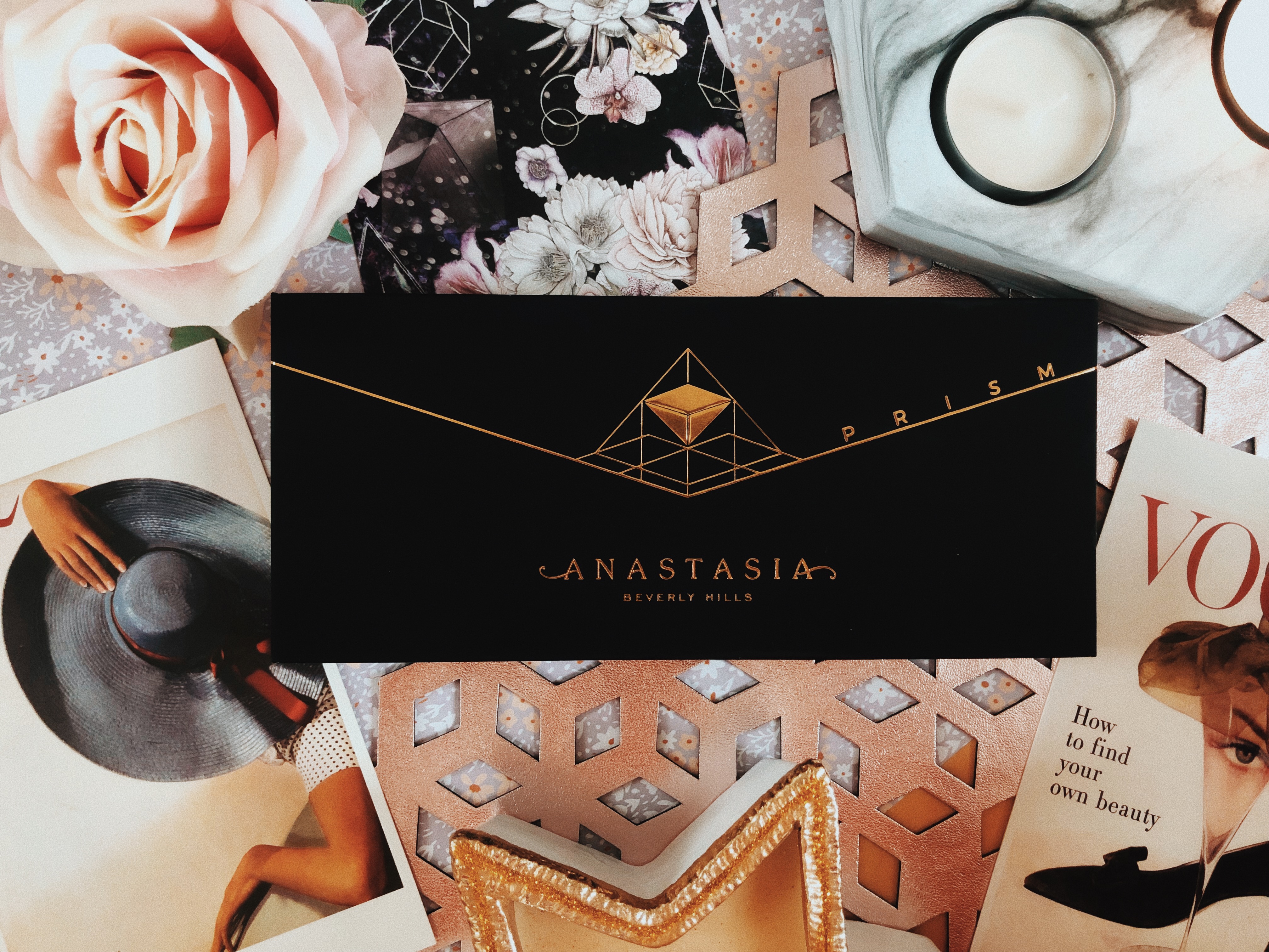
I already own two ABH palettes (Modern Renaissance & Subculture) so I reckon I have some knowledge about the quality of their eyeshadows and what to expect. You may be familiar with the high price tags, however for those that aren’t, they usually retail at £43. Just like the others, the Prism palette is covered in a beautiful crushed velvet material featuring a gold geometric design. There’s something so luxurious about this packaging, it partially justifies that price tag.

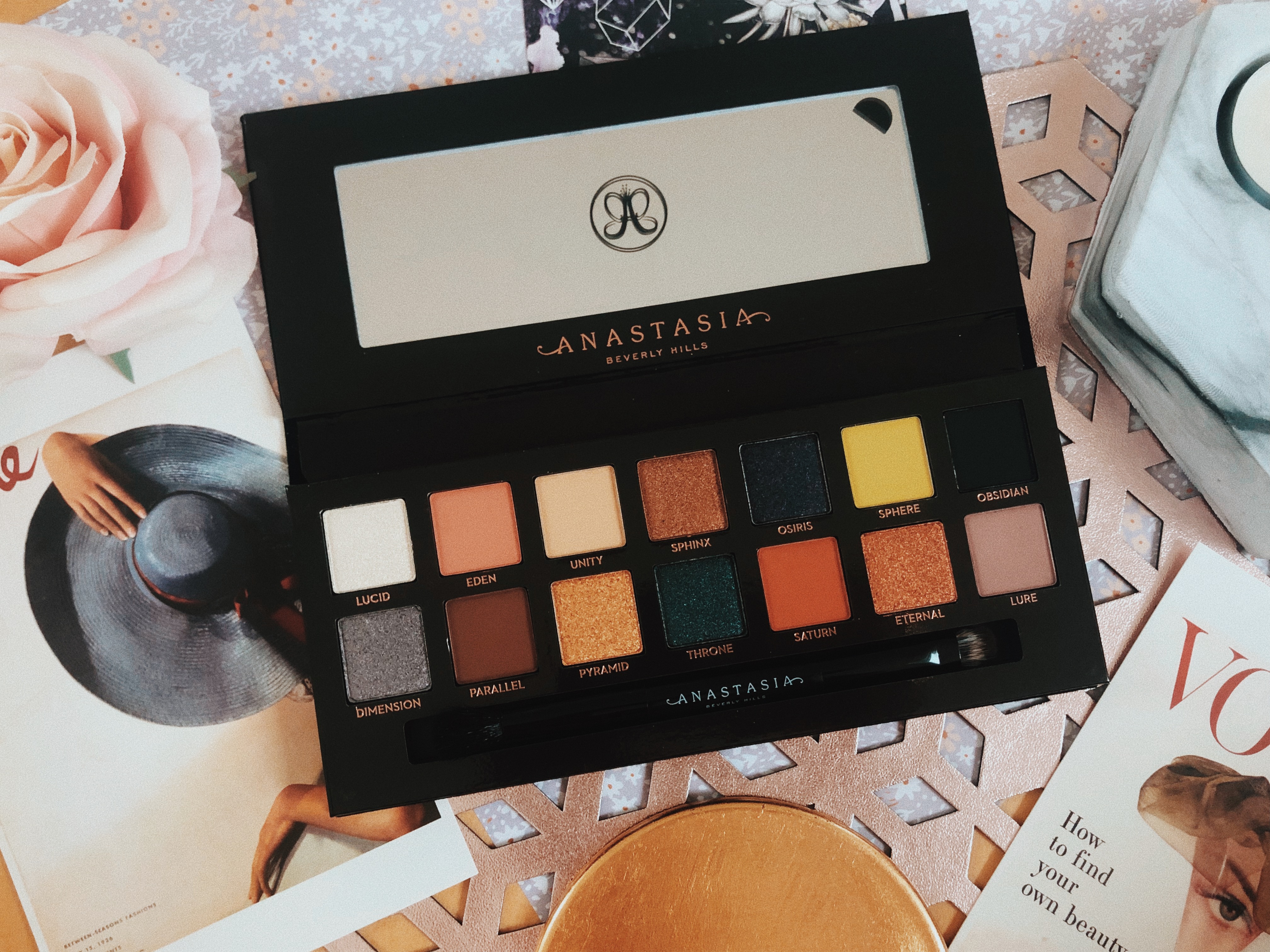
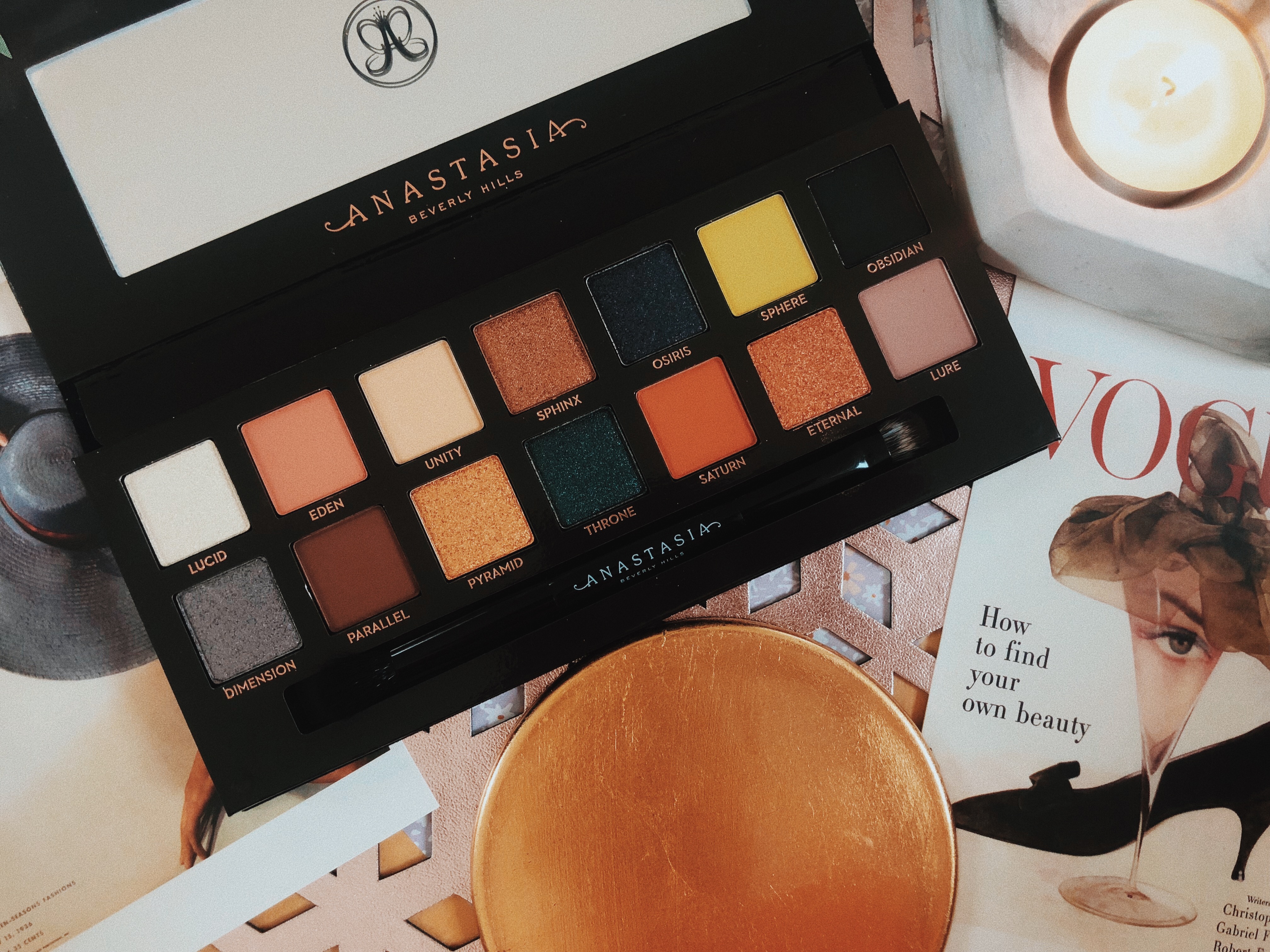
The Prism palette contains 14 shades including some ultra-matte, duo chrome and metallic pigments. It’s definitely a palette for those that enjoy experimenting with bold and bright colours! I bought it purely because of the variety that it offers – think of how many unique looks that can be created from these 14 shades! The palette comes with a dual-ended soft blending brush which actually does a fab job. There’s a generously sized mirror for on-the-go use which makes it perfect for travelling with. It’s also the kind of palette that can work all year round for lots of different occasions. For example, we’ve got bright pops of colour for Spring and Summer and the darker neutrals and shimmers for Autumn and Winter. Just looking at it makes me want to be creative! I love that the shades are all labelled too as I always lose this flimsy sheets that some palettes come with. Want to see some swatches? Keep reading…
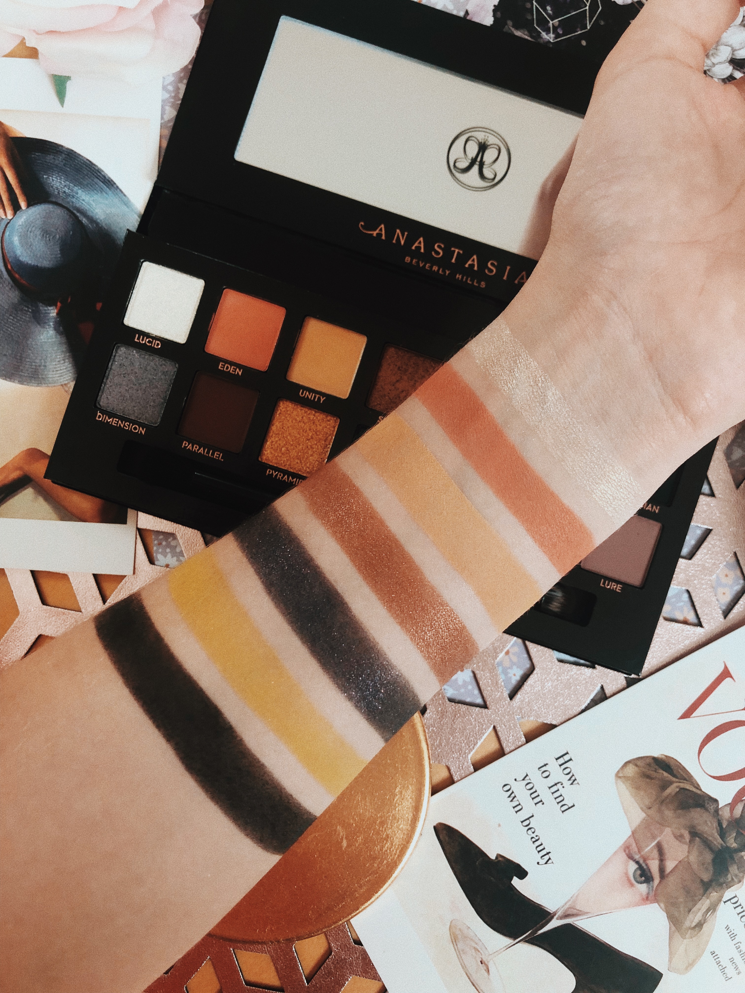
Lucid – A duo chrome with warm gold undertones and flecks of pink- I love using this as a brow highlight or for my inner corners. It can sheer out on the lid so I’d recommend applying and building it with setting spray on your brush.
Eden – A pink/coral matte with warm orange undertones – Very pigmented. It’s almost fluffy to touch! So smooth and easy to apply.
Unity – A light beige/nude matte – Slightly too dark to use as a base shade for me but I use this if I want to add a really natural bit of depth added to my eye makeup. I’m usually not that fussed about these kind of shades, they’re not the most interesting but handy to have in a palette. It’s also pretty pigmented and it swatched beautifully.
Sphinx – A metallic bronze with warm orange undertones – This is a pigmented shadow however I’ve used better. I like my bronze and golds to be blinding and this takes a few applications to achieve that. It’s not sheer but it’s also not full coverage.
Osiris – A midnight blue/purple shimmer with flecks of silver – It’s nice to have a cool shimmer shadow within the palette, which is what I meant when I talked about the variety that this palette has to offer. This shade was very easy to swatch and blend out as it’s very buttery and soft.
Sphere – A bright yellow matte with green undertones– I was really excited about this shade when I first saw it. I love using bright colours in my inner corners to add some drama so this seemed like the perfect shade (I know it looks like a mustard yellow but it’s much brighter than that). It’s not the most pigmented and it can sort of blend into a sheer base on the lid which isn’t what I was hoping for. It’s buildable but I was hoping for a more pigmented matte. I’ve been using it to blend warm shades together and I reckon I’ll get some more use out of it during the Autumn months.
Obsidian – A deep black matte – I’m just not a fan of this shade, it’s my least favourite in the palette. It was difficult to move around when swatching and on the lid, plus it was semi-sheer and patchy in some places. For the price of the palette, this should’ve been much better than it was.
Dimension – Duo chrome grey/silver shimmer with pink flecks – I love this shade. It’s so pigmented! It blends like a dream and it barely takes any effort to achieve full coverage. I like how unique this shade is too, it’s unlike any other shadow that I’ve come across, so I’m happy to pay a little extra for something new in my collection. It was quite dry which made fallout a slight issue when applying. I tend to use setting spray when applying shimmer shadows as not only do they apply better but they last longer too!
Parallel – A warm and dark chocolate brown matte – Everyone needs a shade like this in their life. They’re so handy for making any look smokey and dramatic. I use this shade all the time to darken any look for some nighttime glam! It’s pigmented and blends out pretty well for such a dark shade.
Pyramid – A metallic yellow gold – Now we’re talking. This shade is fab! I love using this all over my lid – it’s too pretty to only use a tiny bit of it so I go all out! It’s also the kind of gold that works all year round for any occasion so you definitely get your money’s worth.
Throne – Metallic dark blue with flecks of green – I’m unsure about this shade. It’s pigmented and it looks pretty but I think it’s a bit too dark and it just doesn’t look very flattering on me. If it was a little bit lighter I reckon I’d use it all the time.
Saturn – Terracotta Matte – I’m a big fan of warm shades pretty much all year round. I use them almost every day as I find they’re the most flattering for my skin tone. This shade is exactly what I look for in every palette I buy – I get so much use out of it!
Eternal – Metallic Copper – My favourite shimmer shadow in this palette! I just love a copper shade and although I have a stupid amount of them, it’s always nice to get a new one every once in a while. It’s so creamy and buttery that it blends beautifully across the lid.
Lure – Ashy lilac matte – I’ve somehow managed to forget to swatch this shade – I’m so sorry! However, I have been wearing it so I can still review it for you, there just isn’t a swatch photo! I wear lots of pinks and purples so I’m always looking for new shades to create these looks. This lilac is so beautiful! I was worried it would be powdery after feeling the texture of it in the pan however it’s nicely pigmented and it looks beautiful on the lid or in the crease.
There we have it ladies and gents – the Anastasia Beverly Hills Prism palette! The packaging is gorgeous, I love the dramatic combo of black and gold as well as how the box itself is more matte than the others in the series. It feels so luxurious and I guess that’s one reason why I’m happy paying more than usual. The range of colours included is amazing! I like paying for palettes that are different from the rest and the Prism palette really stands out in that sense. So many different looks can be created from these fourteen shades. The shadows themselves are very nice quality. There are one or two that I would tweak and I think that the price should be lower if there are going to be shades lacking in pigment. However a majority of the shades are extremely pigmented and apply beautifully. I would really recommend this palette to anyone that is looking to be creative with their eye makeup. It’s definitely a palette for those that aren’t afraid to experiment with colour however if you’re looking for something more subtle, this probably isn’t the one for you! What do you think of this palette? Let me know in the comments below! Want to see what I’m up to in-between posts? Check out my social media below! I’ve also put links below to my reviews of the other palettes in this series!
READ MY REVIEW OF THE MODERN RENAISSANCE PALETTE
READ MY REVIEW OF THE SUBCULTURE PALETTE
TWITTER | FACEBOOK | INSTAGRAM | PINTEREST
N xxxx


The shades in this palette are so gorgeous and so perfect for winter! x
Han | lifewithhan.blog
I know! They’re so gorgeous! I can’t wait to use them for parties x
Some lovely shades in there. I have a few ABH singles but I don’t have an eyeshadow palette from them x
It’s amazing! I highly recommend it if you want to get a new palette x
The mix of shades in this palette is so different to any other that I’ve seen before. They’re SO earthy and beautifully pigmented xxx
It’s so different isn’t it? I love it x
I don’t wear make up but that palette is something else – that dark green is absolutely stunning!
Isn’t it? The fact that it even appeals to people that don’t wear makeup says something in itself! x
Oh, wow! This is a stunning palette. I never thought I’d be able to wear Anastacia Beverey Hills, but these shades are actually right up my street 🙂
Louise x
I’m sure you would love this palette! It’s got some amazing shades in it and they’re all so pigmented!
When I first saw your pics of the palette I though, they look breathtaking in the packaging, but do they have pigment? Wow, they sure do! I really want to try them now!
Awww thank you! It’s a gorgeous palette isn’t it? They’re so pigmented too – I can’t wait to see what they do next!
This is a pretty palette! I have never tried this brand before
I really love this palette! I use it all the time – it’s really good x