Jakob Nielsen first wrote about how PDF files should never be read online in 1996 — only three years after PDFs were invented. Over 20 years later, our research continues to prove that PDFs are just as problematic for users. Despite the evidence, they’re still used far too often to present content online.
PDFs are typically large masses of text and images. The format is intended and optimized for print. It’s inherently inaccessible, unpleasant to read, and cumbersome to navigate online. Neither time nor changes in user behavior have softened our evidence-based stance on this subject. Even 20 years later, PDFs are still unfit for human consumption in the digital space. Do not use PDFs to present digital content that could and should otherwise be a web page.
PDF Usability Issues
The usability problems that PDF files cause on websites or intranets are plentiful:
1. Linear and limiting. PDF files are typically converted from documents that were planned for print or created in print-focused software platforms. When creating PDFs in these tools, it’s unlikely that authors will follow proper guidelines for web writing or accessibility. If they knew these, they’d probably just create a web page in the first-place, not a PDF. As a result, users get stuck with a long, noninclusive mass of text and images that takes up many screens, is unusable for finding a quick answer, and boring to read. There’s more work involved in creating a well-written, accessible PDF than simply exporting it straight from a word processing or presentation platform. Factors such as the use of color, contrast, document structure, tags, and much more must be intentionally addressed.
2. Jarring user experience. PDFs look completely different from typical web pages. They take users out of a familiar context and into one that is outdated and clunky. Even if your PDF looks slick and you think users will be able to navigate with shortcuts like Control or Command + F to find information, think again. The most polished PDFs still look out of place in a web browser and not all users know keyboard shortcuts. We’ve repeatedly observed advanced users get stuck in PDFs and fail to find information this way.
3. Slow to load. While the risk of crashing a user’s browser or computer by serving up a PDF is lower than in years past, PDFs can be excruciatingly slow to load both on desktop and mobile. In one recent study, a cafeteria menu housed in a PDF on an intranet took almost 3 minutes to download. Before giving up on the task, the user said,
“And we’re waiting…we’re waiting… At about this time I’d say, I really don’t care what’s for lunch.”
Additionally, if users are forced to download a hefty PDF using cellular data instead of WiFi, they won’t be happy if they incur extra charges, as a result.
4. Stuffed with fluff. PDFs tend to lack real substance, compared to regular web pages. When you’re building out a web page, you can visibly see how long it’s getting and how far users will have to scroll to consume the content. Methods of structuring and formatting digital content such as chunking, using bullets, subheadlines, anchor links, and accordions help users efficiently skim and scan sections that may contain the answers they seek amid long-form copy. However, in PDFs, those techniques aren’t always used and content creators tend to favor quantity of content over quality and formatting. This leads to overwhelmingly long and inane PDFs.
5. Cause disorientation. Because PDFs aren’t web pages, they don’t show a standard navigation like a website would. Users often struggle to stay oriented with where they are, and how to get back to where they were before. If PDFs open in a new browser tab or window, and users don’t notice, they’ll wonder why the browser’s back button doesn’t work and how to get back. Or, if the PDF opens in the same browser window or tab and the user doesn’t notice, they close the window or tab assuming it did in fact open in a new one. They’ll then have to start their session all over again. On mobile this problem is exacerbated, as it’s much more cumbersome to close a browser window to get back to the previous screen you were on. The best case scenario for opening a new tab or window is that the user notices and closes out of the window, or moves to the other tab to get back. The best case scenario for keeping users in the same tab or window is that they notice the back button remains active, and use it to get back to the previous page. Since we can’t rely on best case scenarios, it’s best to not take users to a PDF within a browser at all. If you must, do contextual research to understand if your users get stuck in PDFs or separate applications when new tabs or windows open.
6. Unnavigable content masses. Most PDF files have no internal navigation; their mini IA is completely hidden and people have no quick way of (1) understanding the type of content available in the PDF; and (2) getting to the interesting bits without scrolling through everything that comes before them. Many proponents of posting PDFs instead of creating web pages, think that a clickable table of contents will solve this issue, but it doesn’t. Users have to spend much time and effort scanning the table of contents for those keywords that match their task or information need. Even if users find a promising word, it may be misleading. We’ve observed users jump to a section of a PDF, only to find it doesn’t contain the information they needed or they miss the answer in all the fluff. The users are then forced to scroll 75-pages back to the table of contents to try again.
7. Sized for paper, not screens. PDF layouts are often optimized for a printed sheet of paper, which never aligns with the size and scale of the user's browser window. Regardless of whether they’re viewing the PDF on desktop or mobile, users can say “so long” to smooth scrolling and hello to tiny, unreadable fonts. Not to mention having to pinch, zoom, squint, and scroll around out of context to navigate a PDF on mobile. Users also demonstrate trial-and-error behavior with PDFs in browser windows. They try to click on items that look clickable, only to disappointedly find out they’re not.
Users Strongly Dislike PDFs
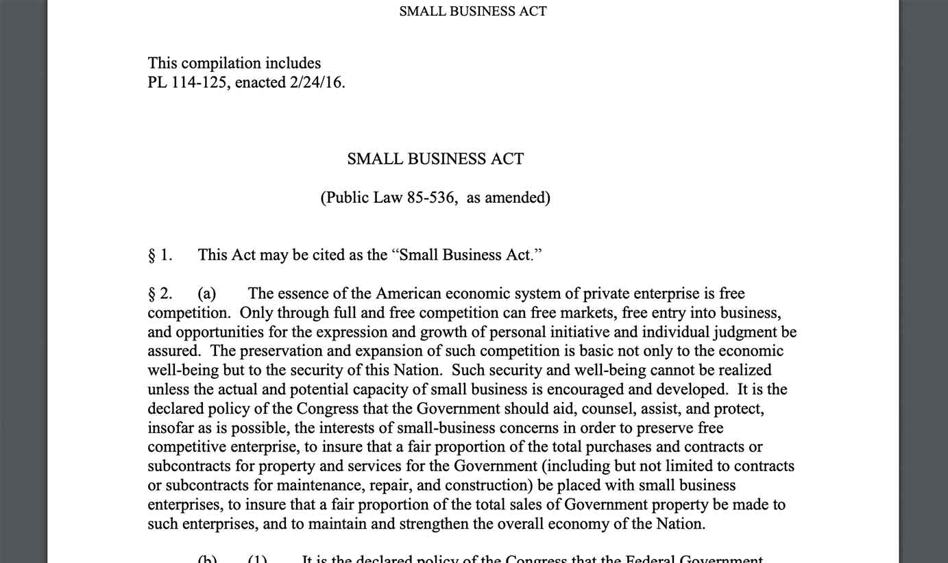
Burying information in PDFs means that most people won’t read it. Participants in several of our recent usability studies on corporate websites and intranets did not appreciate PDFs and skipped right over them. They complained woefully whenever they encountered PDF files and many who opened PDFs quickly abandoned them. Following are behaviors and quotes from business professionals testing the About Us areas of corporate websites. One user looking for information on the Small Business Administration’s website got stuck in a PDF. While she was trying to figure out what exactly the administration did, she said,
“I expect it to talk more about what they can do for me. If the print was bigger, that would be really helpful. Now, I’m stuck in a PDF.”
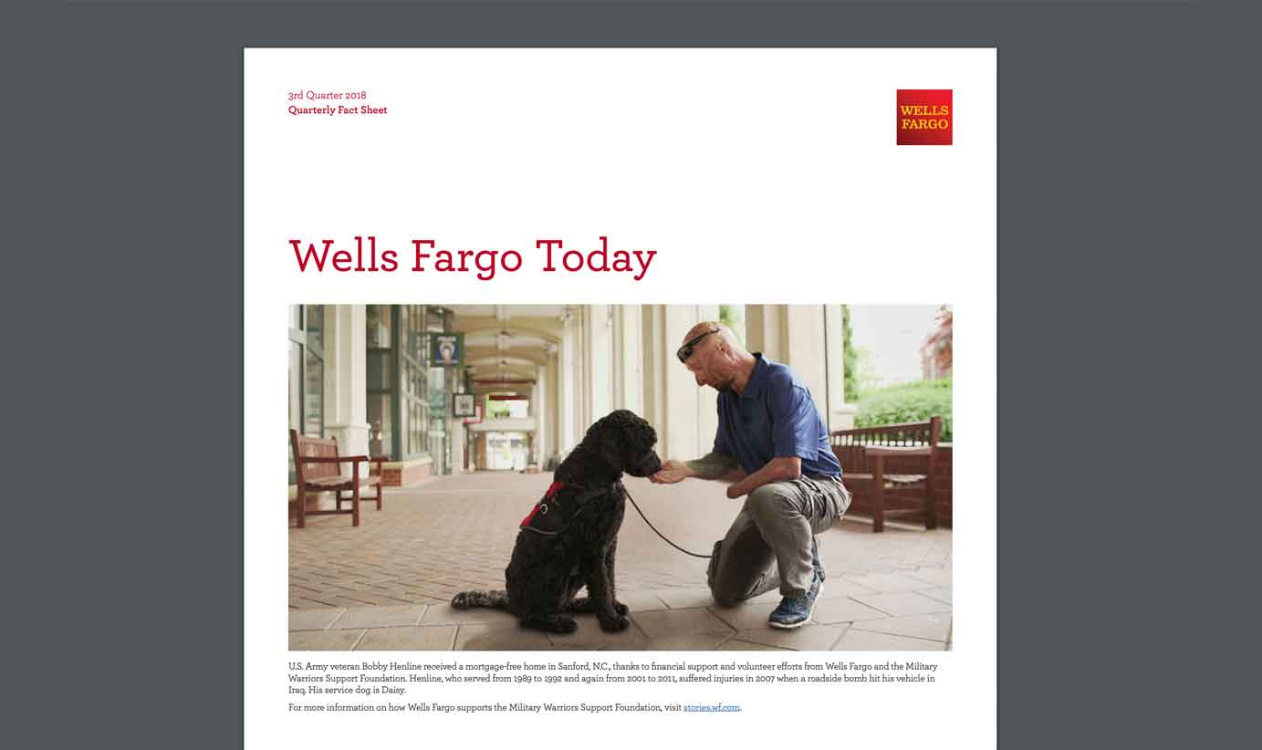
Another user was looking for information about where Wells Fargo was headquartered and got stuck in a PDF. He said, “I expected to see it at the bottom of the contact us page; it’s not there.” The user proceeded to use site search to try to find the headquarters location. After typing in headquarters, he was taken to the history section of the website. He clicked on a link that said, Wells Fargo Today, and said,
“Maybe it’s in Wells Fargo today. All of a sudden that downloads a PDF, ew! At this point, I would just Google it.”
The following user quotes are from several employees testing different intranets:
“I can’t stand that the PDFs open in a different window. It should open in the same browser.”
“Every time you click, it opens a new window or PDF. I am frustrated because nurses always click the Back button and we want to go back to the previous web page.”
“Information is outdated in those PDFs. So you’re getting stuff that isn’t current. They just haven’t taken those links off.”
“I don’t know if they [a PDF with email-signature templates] are updated. I can’t confidently share it. Sometimes there are multiple versions of PDFs.”
“All of the PDFs are horrible. There are so many old forms and version control is so difficult. We’re starting to move them into a database but first have to audit them and track down people to ask them if they still need the form. We’re taking the top-used forms and tackling those first.”
“Again, it seems to be taking me to a lot of PDF documents...I was hoping the info would just be at the top of the search results.”
“I was overwhelmed by the 41-page PDF of policy procedures.”
“It’s a SharePoint PDF. I would much rather see all of this in a regular webpage format.”
“I don’t know if it’s common, but when I’m looking for content, I find it hidden in a PDF. I prefer to see that on a web page itself rather than going into PDFs. It’s the way I prefer the content rather than switching mediums.”
“I didn’t think it would be a PDF document. Oh, oh, goodness.”
“We’ve come across problems with PDF forms. Others have to download the form in order to use it the way we want them to use it. You have to download it to get the features to work, so we always have to specify at the top of our documents that our partners are using these and they might not have the latest PDF readers.”
“For our documentation, we use PDFs, but people need a searchable page or an article. We’ve been doing PDFs for 10 years and now we’re wondering how we can make this information more usable and searchable on the site. We get questions every day about documentation and 99% of the time, we have the answer, but it’s buried in a PDF and people don’t want to have to look for it in there. Or, if they search for something we have, it doesn’t come up in search results because it’s in a PDF.”
We've had similar reactions from users in many other studies, including tests of B2B and ecommerce websites where users complained about sites that presented product specs or customer success stories in PDF instead of on web pages. Here's a quote from a customer who shunned the parts of the site that were in PDF:
"It looks like I'm going to have to go to PDF, which I'm dreading."
Use HTML Gateway Pages Instead of PDFs
Given PDFs poor usability for online reading, user-experience designers should either avoid using PDFs altogether in favor of presenting content on web pages, or, in cases where a printable PDF is needed, use an HTML gateway page. Gateway pages are web pages that summarize the key points and critical information from a PDF, and then they offer users the option to download the full PDF without having to open it in a browser window, where it’s unfit for consumption. The PDF file size should be as small as possible to preserve quality, while allowing it to download quickly. Site search and public-facing search engines should index and link to the gateway page, never the PDF directly. Unfortunately, through our continued research and content work with clients, it’s become clear that HTML gateway pages still aren’t used nearly enough to help users avoid or circumvent the issues caused by PDFs.
Findings From Earlier Studies in 2001 and 2010 Still Hold True
Jakob’s Alertbox article from June 2001, Avoid PDF for On-Screen Reading, provides an earlier analysis of PDFs based on the studies we did almost 20 years ago, as does our original 2003 assessment that PDF is unfit for human consumption. Surprisingly, the difference between then and now is not much. Yes, there are fewer browser and computer crashes as a result of serving up PDFs, but just as much if not more user hostility toward PDF. People have ever-increasing expectations and more experience with the usability problems associated with PDFs — not only on desktop, but now on mobile too. Another update to this article in 2010 found similar problems with PDFs as those uncovered in both 2001 and in our most recent rounds of research over the past few years. Our new studies keep finding the same problems with PDFs in online interfaces. It’s time to put an end to problematic PDFs, once and for all.
Learn more about how to address problematic PDFs and how to craft effective digital content in our full-day course, Writing Compelling Digital Copy. Additionally, a brand new, in-depth eyetracking report, How People Read Online: The Eyetracking Evidence is available now.