26 Essential Graphic Design Terms for Non-Designers
Chances are, if you’ve spent any time reading about web or graphic design, you’ve stumbled across a design term that was unfamiliar to you.
Of course, unless you are deeply involved in the design of something, you may not need to know what kerning is or what skeuomorphism means.
However, there are some terms that come in really useful in order to effectively communicate with your designer.
In this post, we’ve defined 26 design terms in simple, non-jargony language.
With these terms under your belt, you can broadly speak about most essential design projects you’re involved in.
Branding Terminology
Branding is all about leaving a lasting impression, and design is a big part of that initial gut reaction.
From your company’s logo to the colors you use across your marketing materials, over time you become more and more recognizable.
Icon
An icon is a simple way to get an idea across to a viewer. Icons are used frequently to simplify and set apart text in web design, and are not to be confused with a logomark (see below).
![]()
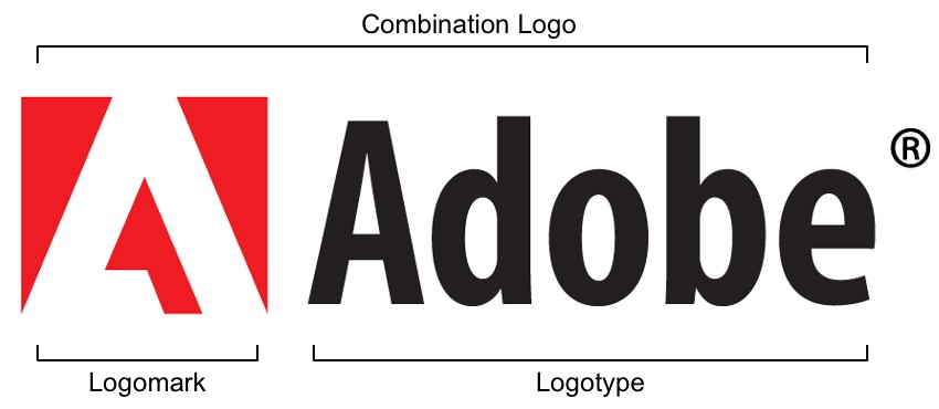
Logomark/Brandmark
A logomark, or brandmark, is a symbol representing a brand. Typically logomarks are abstract shapes or simplified representations of something, and they do not contain the name of the brand.
Logotype/Wordmark
A logotype, or wordmark, is the name of a brand stylized into a text-based logo. Logotypes combine the visual identity of a brand with the ease of recognition of the business name.
Combination Mark
A combination mark is a logo which combines both a logomark and a logotype.
Style Guide
A style guide is a place to define and enforce stylistic standards for your brand. Examples of information you may find in a style guide include brand colors, typefaces, image sizes, and more.
Color Terminology
Color Palette
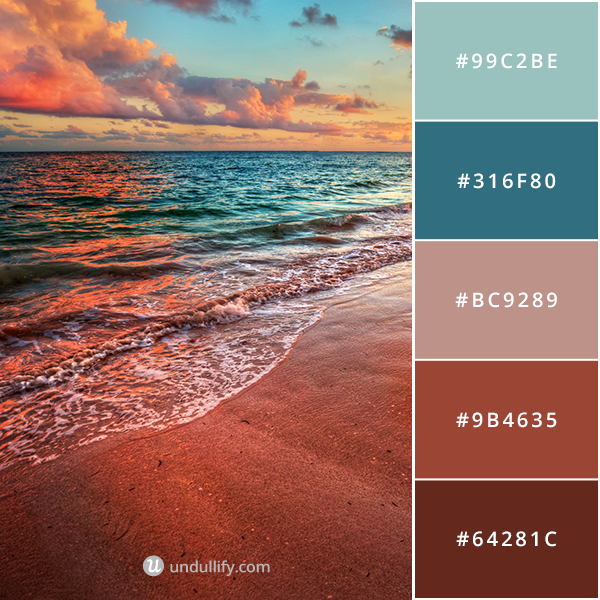
A color palette is a set of colors that complement one another, used to pull together elements of a design. Often, color palettes include 5 colors.
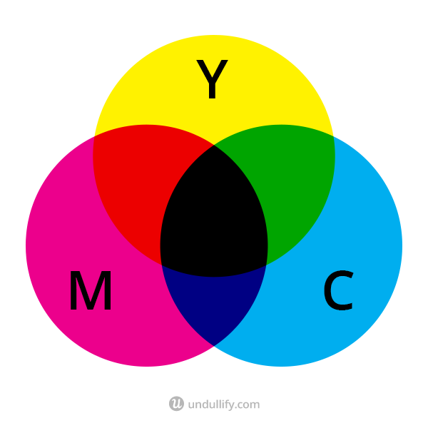
CMYK
CMYK stands for “Cyan, Magenta, Yellow, Key” and is a color model used for print.
It works by laying down tiny dots of cyan, magenta, yellow, and black, which when used in different combinations appear to show different colors.
If you add cyan, magenta, and yellow together in this model, you end up with black.
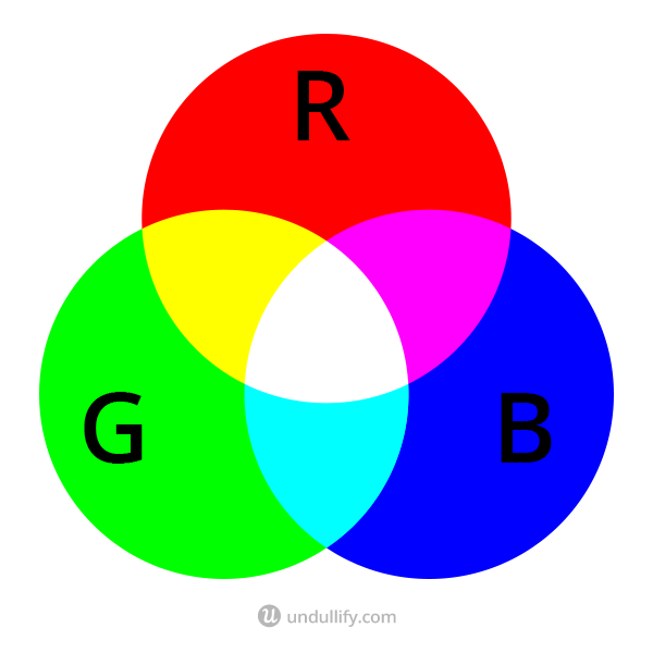
RGB
RGB is a color model used for screens, and stands for “Red, Green, Blue.” As you add colors in this model, you end up with white.
Graphic Design Terminology
Aspect Ratio
Aspect ratio refers to the shape of an image or video. It is a ratio of the width of an image to its height. For example, high definition video has a standard 16:9 aspect ratio.
Crop
Cropping an image removes parts of the edges of an image, in order to reframe it. Often, cropping changes an image’s aspect ratio.

Resize
Resizing an image does not remove any parts of the image like cropping does. The aspect ratio remains the same, though the width and height change proportionally to the original image.
Generally you resize an image to make it smaller; you lose image quality when you resize an image larger.
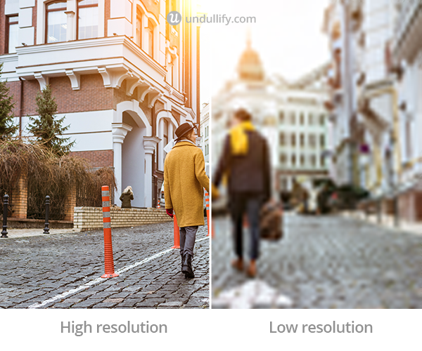
Resolution
Resolution is the amount of detail in an image. The higher the resolution, the crisper your images look; the lower the resolution, the blurrier they look.
Compression
Compressing an image reduces its filesize, often by slightly decreasing the quality of the image, which is called lossy compression. Lossless compression reduces filesize without lowering the quality of the image, often by cleaning up metadata rather than altering the image. Decreasing the size of your files for the web is very important; generally you should upload only the largest size image you plan to display on your site, nothing larger, and be sure to compress it for the web.
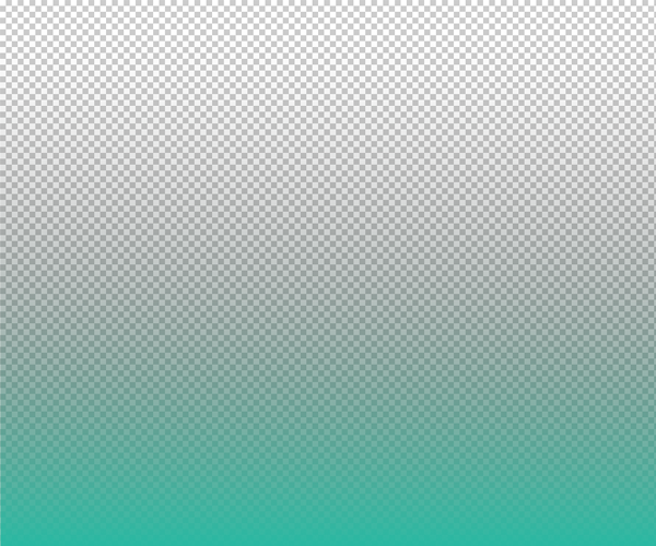
Gradient
A gradient is a smooth transition from one color to another, often with thousands of colors in between.
Opacity
Opacity refers to how transparent your image is. It is expressed as a percentage, with 0% being hidden and 100% being fully opaque.
Flat
Flat design is a style of design that favors solid blocks of color over textures, gradients, and 3D stylistic elements like shadows.

Vector
Vector graphics are created by mapping out shapes and paths on an X/Y axis, unlike more familiar raster graphics which are created by defining the colors of pixels. Since they use shapes and paths, vector graphics are infinitely resizable without losing quality.

Image Terminology
Stock Photo
If you don’t take original photos for your website, you might rely on stock photos, which are professionally-shot photographs available for purchase. While you can find high-quality free photos to use, you can’t just take any image off the web and use it on your website.
Creative Commons
Creative Commons (CC) is a media license that allows you to use a photo as long as you credit the creator. Creative Commons Zero (CC0) images are public domain images that are free to use without credit. You can read more about sourcing images legally in this post!
Layout Terminology
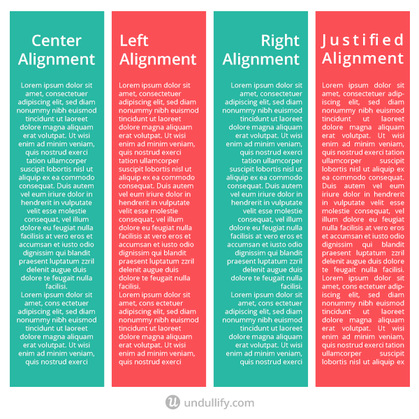
Alignment
Alignment refers to the position of text, images, or other design elements on your page. These elements can be centered on the page, or aligned to the left or the right, sometimes with text wrapped around it.
Lorem Ipsum
Lorem Ipsum is fake text used to fill in spaces of a design where text is intended to go, without distracting from the design with real text. It is generated from Latin words to look very similar to English words – until you attempt to read it, that is.
White Space
White space, or negative space, is the part of a design without content in it. White space is an important part of a design because it gives it room to breathe and makes it less overwhelming.
Typography Terminology
Typography
Typography refers to the stylistic arrangement of text. Text is important to many designs, and typography encompasses the alignment, positioning, and color of type, and the pairing of complementary typefaces.
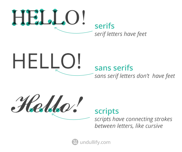
Serif
Serif fonts are those that feature small lines coming off the ends of the letterforms, called serifs. Traditionally, they are preferred for printed text but considered more difficult to read on screens.
Sans Serif
The “sans” in sans serif literally translates to “without” serifs. These typefaces are more modern and preferred for screen reading, because they require less pixels to display cleanly.
Script
Script fonts are more organic feeling than serif or sans serif fonts, and intended to mimic cursive handwriting, with connected letters.
Wrapping Up
There you have it – over two dozen design terms translated to plain English for the non-designers among us!
You can save this article to refer back to later so that you can better communicate your vision or feedback about a design with your designer.
Are there any terms that you would have liked to see on this list? Share them below and we’ll try to update the post to include them!