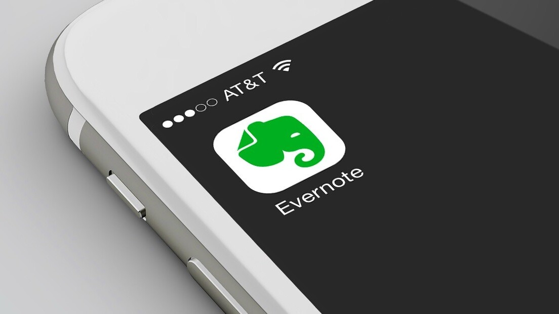
Evernote today rolled out a redesign, in which it swapped out its familiar colors for a refreshed look. It appears to be a relatively simple look, but when the Evernote team pulled back the curtain for us, it was anything but.
Specifically, Mads — Evernote’s elephant mascot — has morphed from a grey symbol on a green background to a green symbol on a white background. The company’s also upgraded its wordmark slightly.
Life is busier than ever. So we’ve evolved to help you focus on what matters most. pic.twitter.com/gkgP2SJ8Si
— Evernote (@evernote) August 14, 2018
It’s not a huge change, but considering the company hasn’t undergone a considerable change since its introduction to the app store in 2008. Andrew Malcolm, Evernote’s CMO, said the difference between users then and now is the emphasis on mobile access:
I think in 2008, this idea you could access information from anywhere because of mobility was different. That was something people suddenly realized the potential of. I think that’s different than now, in 2018, when mobile first is the expectation for everything.

The <3 of EU tech
The latest rumblings from the EU tech scene, a story from our wise ol' founder Boris, and some questionable AI art. It's free, every week, in your inbox. Sign up now!
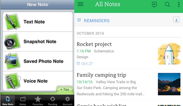
Evernote’s internal design as evolved from that original 2008 iPhone app, becoming sleeker over time. Remember when it had an option for a “Snapshot note?” In case you don’t, here’s what it looked like back in the day (and last year, for comparison):
As Malcolm observed, the app has evolved into something entirely different from what the original adopters needed. Chris O’Neill, Evernote’s CEO, also said in his announcement that the company needed the redesign because the users have changed:
The demands on people’s attention have changed. The ways they use our products have changed. And our brand no longer reflected the company it was built for.
Jonathan Woytek, Evernote’s executive creative director, said all the little details required extreme attention from the team:
Even the slight changes, like the trunk being formed from a spiral, which represents progress; the slope of the forehead of the elephant which gives a sense of forward momentum. Everything was something we talked about and debated and tweaked almost ad nauseum.
The team collaborated with Design Studio, a noted graphics design company that’s worked with Airbnb, Logitech, and Twitter. Ty Whittingham, the creative director at Design Studio who helped with the redesign, said lots of meetings and meaning were behind even the smallest tweaks to the redesign.
But to get there, he said his team did try to shock the Evernote team with the more radical ideas, such as dropping Mads the elephant entirely.
We told them, “We’re going to push you far. We’re going to do stuff that’s very comfortable and familiar, but we’re also going to make you feel very uncomfortable.” It’s only really through that process of seeing stuff pushed to extremes where you feel “This feels right. It’s not that far, but right in the middle.”
Woytek also mentioned Design Studio’s suggestion of getting rid of the elephant, adding, “We wanted them to scare us a little bit. And they scared us!”
Regardless, the Evernote team said the fussing and the scares were worth it. Francie Strong, vice president of Evernote’s brand and communications, said of the redesign, “We’re really proud of it, and I think it represents where Evernote has been and where we’re going as a company.”
If you want to see how several popular apps, Evernote included, have evolved over the years, check out our then-and-now article and prepare to be hit with some major nostalgia.
Get the TNW newsletter
Get the most important tech news in your inbox each week.