How to Create a Cinematic Lightroom Preset for Landscape Photos
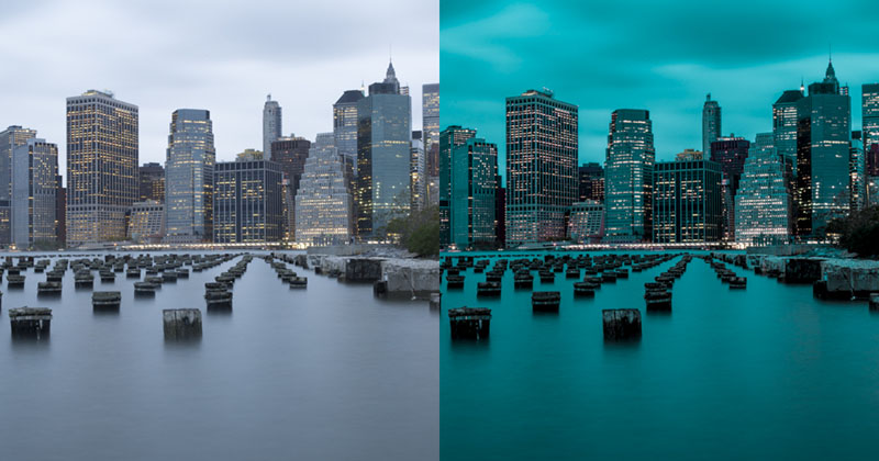
Lately, I’ve seen lots of cinematic looks on Instagram. There are mostly cold tones with a rare spark of a warm look. And so I have decided to have a look, do some magic, and produce a free Lightroom landscape preset for you. I know, there are lots of Lightroom presets for travel photography, but in reality, I couldn’t find anything usable that also came with an explanation. So, read on to learn how to create cinematic photography yourself.
I will show you the changes I did step by step and explain why. Typically, I use Photoshop’s Adobe Camera Raw and therefore the screenshots are from ACR. The controls in Lightroom are precisely the same (except for the Dehaze filter).
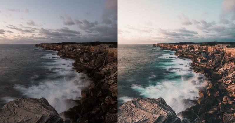
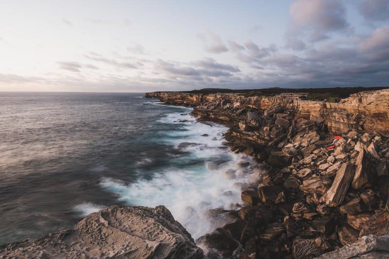
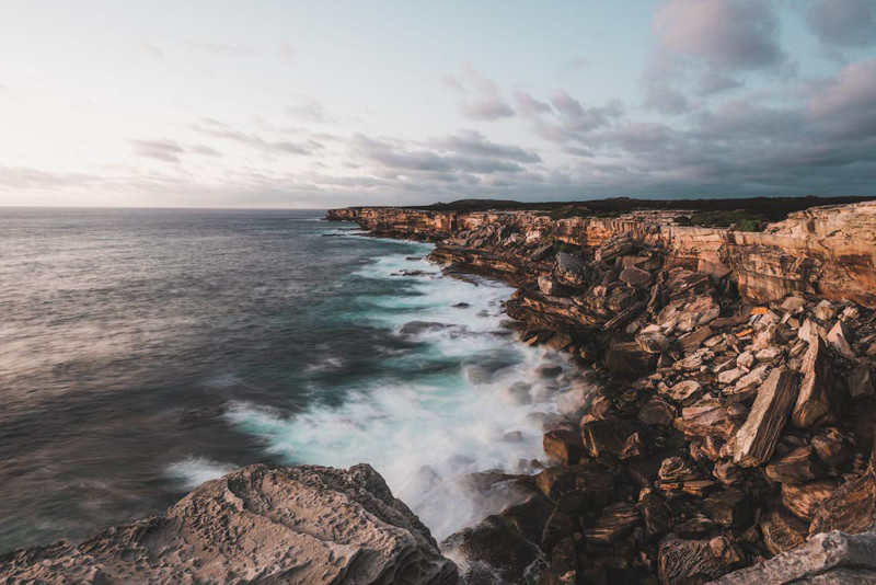
The Initial Seascape and Color Scheme
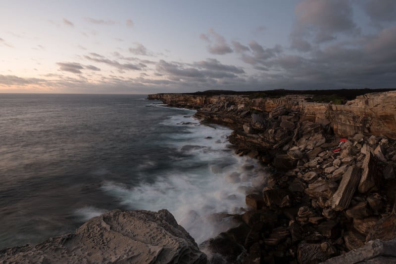
I shot this photo at the Cape Solander in Kamay National Park, New South Wales, Australia. The time is well before sunrise so there is not much light, so I used a relatively long exposure time. The most popular color scheme these days is either blue or blue-green. To me, they look very depressing (however, moody).
For this scene, I wanted something more positive and had decided to emphasize the existing colors and play around them to create a new cinematic color scheme. The sandstone is naturally orange and the sky is blue-ish. So, the final color combination is around this complementary orange-blue pair. The muted cinematic versions of the colors would be something like Teal Blue and Burning Sand colors. I figured the color names using this great little tool: Name That Color.
Basic Settings
Basic settings are essential. They provide the general look and feel of the photo, the exposure, the highlights and the shadows. My settings are as follows:
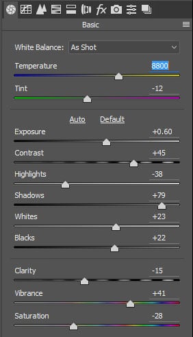
Let me explain. I’m pretty happy with the default White balance produced by the camera in this case.
- White Balance. For sunrise shots, Auto white balance doesn’t always do a good job.
- Exposure. The photo is slightly underexposed (to save the details in the sky), so I have increased the Exposure a bit.
- Contrast. For nearly every photo you need to increase contrast. Around +50 is an average for the low contrast conditions like I had before sunrise.
- Highlights. It is a general approach to shift the slider to the left to recover some details in highlights.
- Shadows. The same applies to the shadows – we need to recover details. Plus, for cinematic effect, we need to push this slider even more, sometimes even to the max.
- Whites. A little shift to the right will give us some brilliance and overall more positive look.
- Blacks. Usually, for landscape, I would shift it to the left and increase contrast, but for cinematic, we don’t need a lot of contrast, so with this change, I’m removing the black in the shadows making it gray.
- Clarity. I have a lot of rocks in this photo, and high clarity would produce too many distracting details.
- Vibrance. We need a better color separation, hence this rise.
- Saturation. Saturation is “heavier” than Vibrance, so to produce a muted palette we need to remove a bit of color.
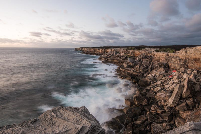
The result:
Curve Settings
The curve is one of the most critical tools Adobe has to offer. The cinematic effect editing is not an exclusion to this rule. We need something unique here to achieve a low contrast look while preserving the contrast in the mid tones.
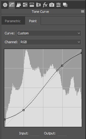
How to Edit for Cinematic Photography
- Open the Tone Curve tab
- Open the Point sub-tab
- Create a normal S-curve
- Raise the lower bottom end to remove the black shadows completely
- Lower the upper right end to make the highlights gray
The S-shape in the middle of the curve increases contrasts in the mid-tones, while the manipulations with the curve endings lower the contrast for the shadows and the highlights. This outlook is the well-known cinematic effect we see in many movies.
The result of this change:
We are getting closer to the desired look of the photo, but there are more steps to go. Read further for the actual color management.
Raw Pre-sharpening
Although sharpening is not related to our editing topic, I have decided to include it in the article and preset anyway.
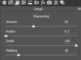
Famous photographers have different opinions on whether or not we should be doing pre-sharpening in RAW or do it as a last step after we finished all other edits. I prefer the first option – to sharpen in raw. Without going deeply into the theory, I tend to agree with Mark Metternich and his way to sharpen images.
How to Sharpen Raw Images
- Set Radius to the minimum (0.5)
- Set Details to the maximum (100)
- Zoom in (100%)
- Increase Amount gradually until it’s too much
- Go back by 5-10 points
The amount will differ for each camera or lens. For my Nikon D750 and Tamron 15-30, I need around +60.
HSL Color Management for Cinematic Photography
Hue
The Hue sliders part is the hardest one for me. This is where we manipulate the colors to achieve the colors we need. Here is what I have got:
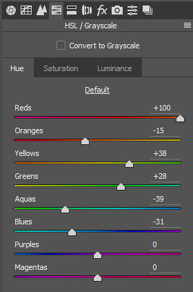
- Reds. The orange in the original photo was too reddish, and so I shifted it towards the orange hue.
- To make the orange less yellow I have shifted it a tad towards the reds – it stayed orange, just with less yellow tint.
- Yellows. For the same reason (to have less yellow in the orange) I shifted it towards greens. Although the change in yellows didn’t do much in this photo.
- Greens. I prefer to shift greens to the right when I have anything green. It makes the color look emerald. In this photo, the change had affected the forest on top of the cliff and colors in the water.
- Aquas and Blues. To make the water more cyan and less blue, I did these changes.
- Purples and Magentas. The image has no such colors, hence no change.
Saturation
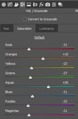
The idea is similar – emphasize Oranges and Aquas, mute all others. Simple.
Luminance
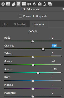
Keeping it simple! Make our main colors stronger and brighter, hence taking one extra step towards the final look.
Every photo is individual and may require some specific adjustments, but the changes I did concentrate on the Oranges and the Aquas because they are the primary colors in my scheme.
Split Toning
You have probably figured out – cinematic photography is mainly about the color. That is why we will need to use Split Toning. Split Toning allows us to tone highlights or shadows separately.
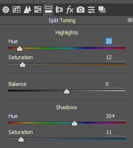
The first two sliders are for the highlights. In the normal conditions, we need to tone just a little bit, no more than 10-12 of the Saturation. But for the starters, we may shift the saturation to the right, then pick appropriate Hue and then move Saturation back. Also, holding Alt while changing the Hue will show the selected tone on the photo. I have chosen some orange color (hue 35) and some cyan color (hue 204) for the toning. The numbers may differ for each image.
The shadows in the current version are no longer orange; they have a cyan tint improving the color contrast. Keep reading, we are nearly done with our Lightroom landscape preset.
Camera Calibration
The last but not least step is the camera calibration. This step is also related to the color correction. In fact, it is the most core color correction available as it works on the level of the three channels of the whole image (red, green, blue). It allows changing the tone or the saturation of each channel.
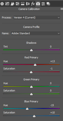
My changes mean that I made reds a little more orange and I made blues a bit more cyan and a little more saturated as a final touch.
Final Touches
For this particular photograph, I did one more step, which is not included in the preset. I made the sky a little warmer and a tad brighter on the top left. It is not in the files because every photo will have its composition and may not have Sun in it at all.
For this edit, I have selected two Radial Filters.
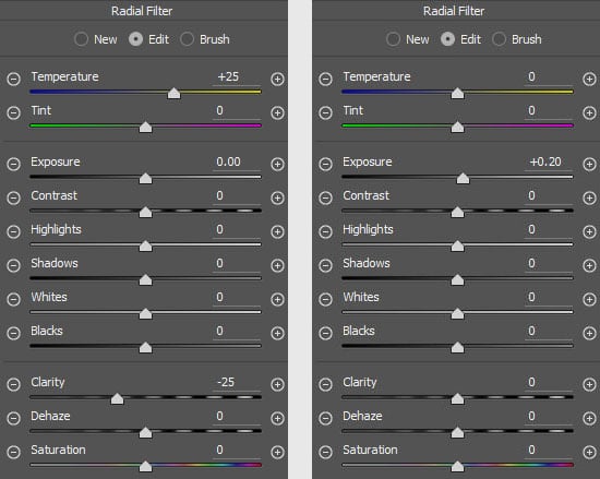
The first filter increases color temperature (makes it more orange) and decreases Clarity (as it usually happens when the light is beaming into the camera). The second filter just makes the sky a little brighter.
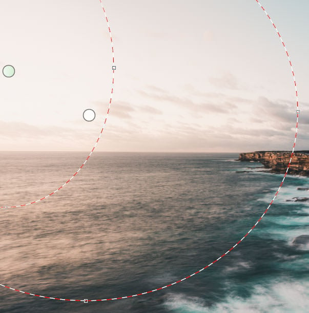
The outer filter is the warm one; the smaller is the bright one. A little trick making the image alive.
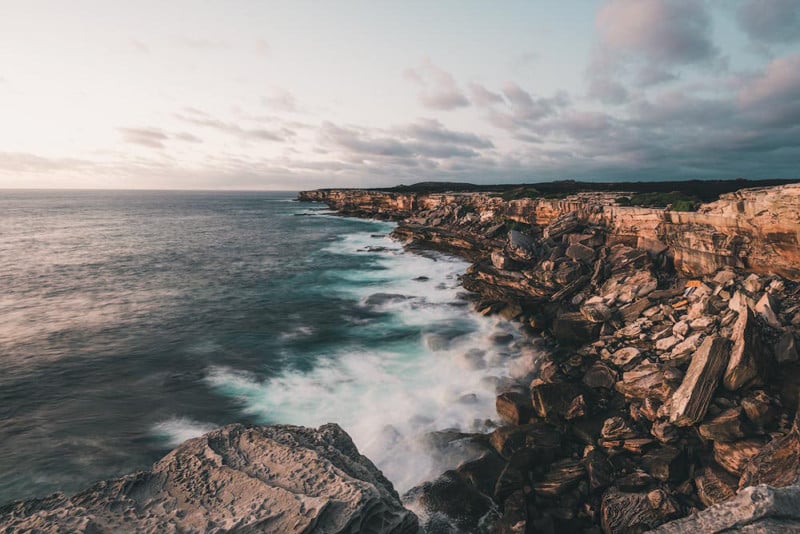
The Final Cinematic Photo
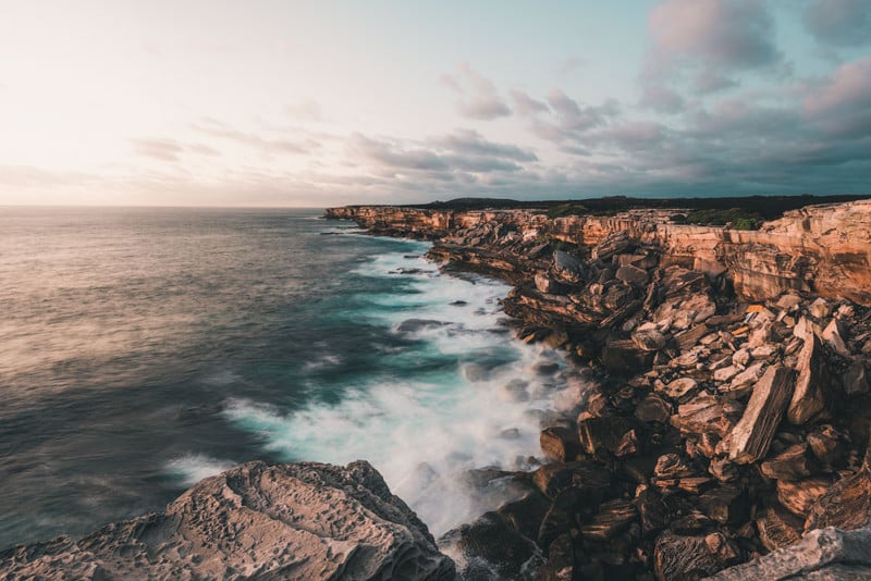
I have covered all aspects and settings of my Lightroom Landscape Preset for cinematic photos. And you should be able to adjust and modify it for your needs.
P.S. If you’d like to download the preset created in this tutorial and use it right away, you can download it for Lightroom and Adobe Camera Raw on my website (scroll down to the bottom of the article).
About the author: Anton Gorlin is a photographer based in Australia. The opinions expressed in this article are solely those of the author. You can find more of his work on his website, Instagram, and Facebook. This article was also published here.