

1. White and Light Color Schemes
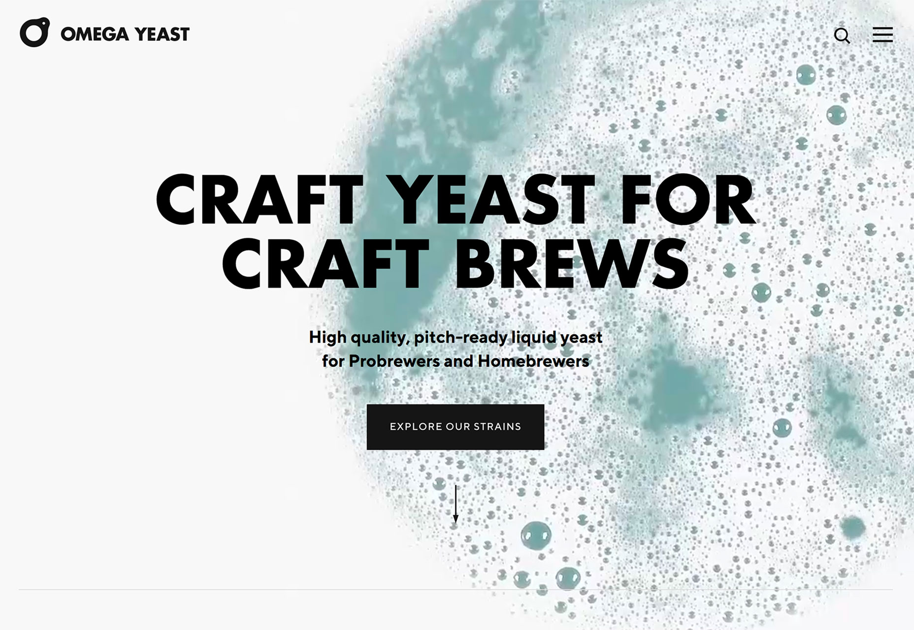
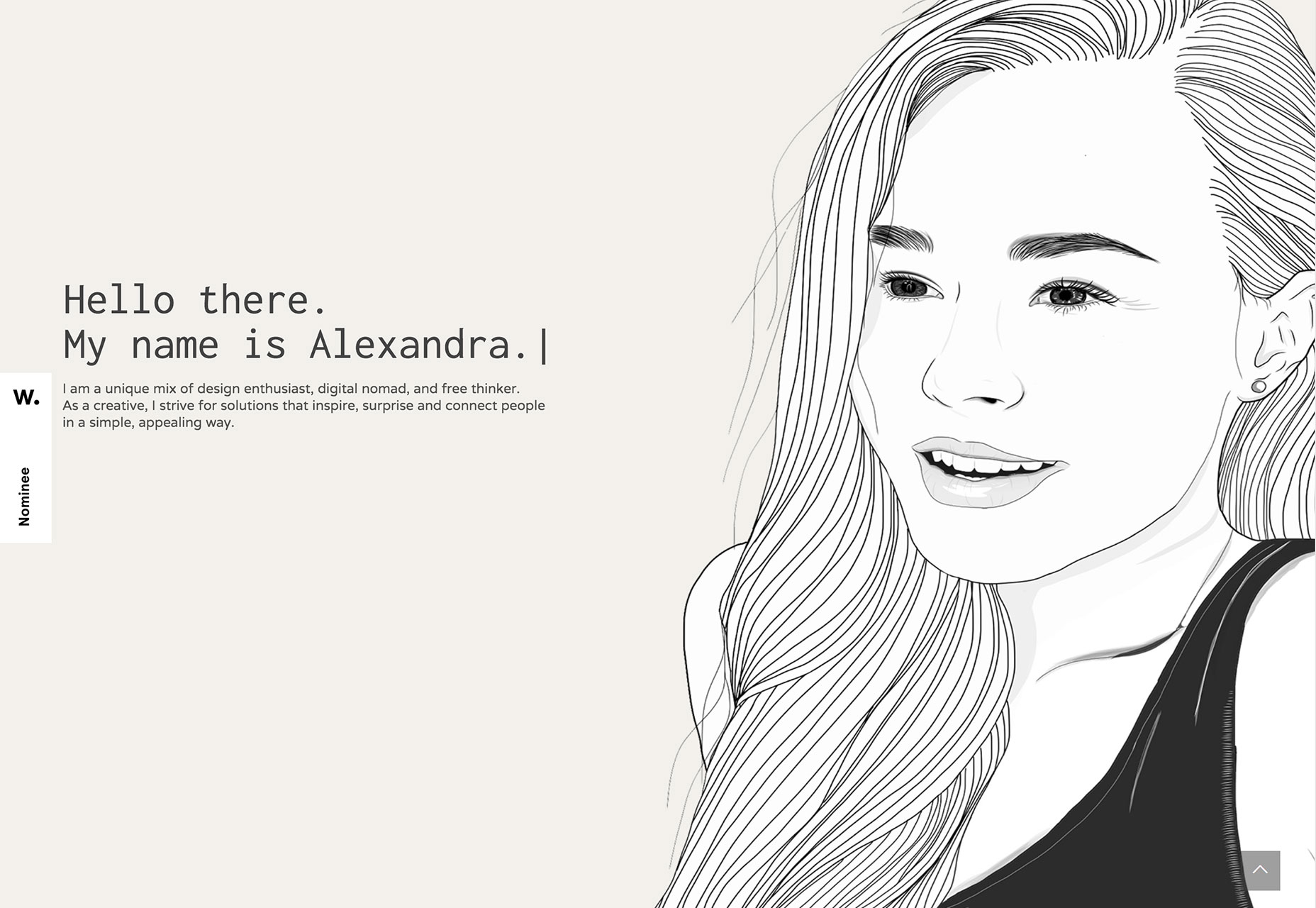
White and light color schemes seem to be popping up everywhere. (We could probably have dedicated an entire post to this design trend because there are so many designs featuring this color trend.) The main characteristic of this design trend is an aesthetic that uses a predominant white or light color scheme. This includes the background, images and even other foreground elements. While white is a popular option, color palettes featuring soft grays, cool cream tones, and even some hardly noticeable pastels are equally impressive. The trick to using this design technique is incorporating other elements so that you don’t just end up with a “plain” white background. Including imagery that also is light or features a lot of white can bring the design together pretty seamlessly, such as the example from Verho.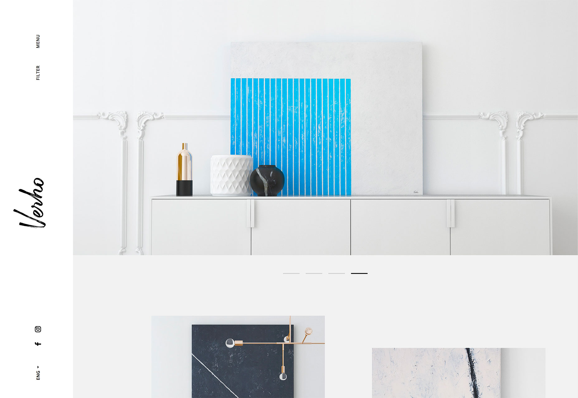 But there’s no rule that images are the only way to implement this design trend. Working with video (such as Omega Yeast) or an illustration (Alexandra Elisa) can be equally engaging.
 Use this design trend for a full website theme or opt for a section or page with a light to white design to add particular emphasis to that area. Just make sure to go with a dark text option so that lettering is easy to read.
Add an extra layer of emphasis with a bright colored button or single element so that users find the most important part of the design right away. Consider accent colors in the style of minimalism rather than full color options; a simple one-color concept can work amazingly well.
Use this design trend for a full website theme or opt for a section or page with a light to white design to add particular emphasis to that area. Just make sure to go with a dark text option so that lettering is easy to read.
Add an extra layer of emphasis with a bright colored button or single element so that users find the most important part of the design right away. Consider accent colors in the style of minimalism rather than full color options; a simple one-color concept can work amazingly well.
2. Data Visualization
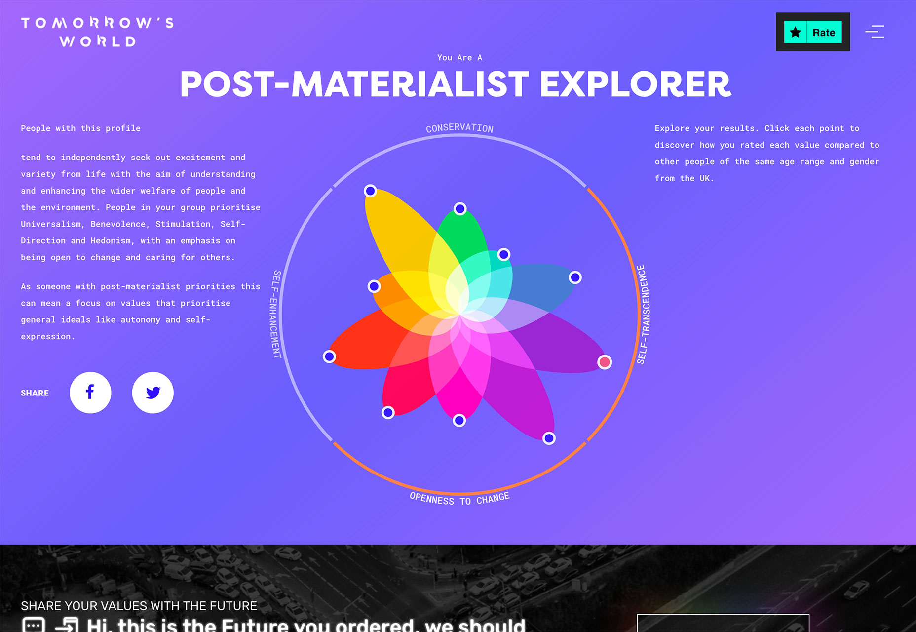
Data, data everywhere. Or that seems to be the case anyway. With such an emphasis on data and information gathering and delivery across industries to provide valuable and reliable information, it’s no real surprise that more designs are featuring large-scale data visualizations. From maps to charts to interactive animations, a solid data visualization can help a user better understand a topic or information and provide an engaging (and memorable) way to learn about something. The downside is that it can be a rather large undertaking to manage all that data. Look for a method that allows you to showcase information in an up-to-date manner without the stress of constant management. Automated tools can help. (Google Charts is simple and pretty powerful.) There are so many different ways to create, embed and include data visualizations in a website design. The most engaging websites using this trend have dynamic information presented in the most interactive formats. Tree Tree Tree starts by asking the user to enter the location they are interested in learning more about. The result shows the wind speed using a tree with boxes that “blow” as speed increases. Users can also engage using the map at the bottom of the screen. This is data that is begging to be interacted with.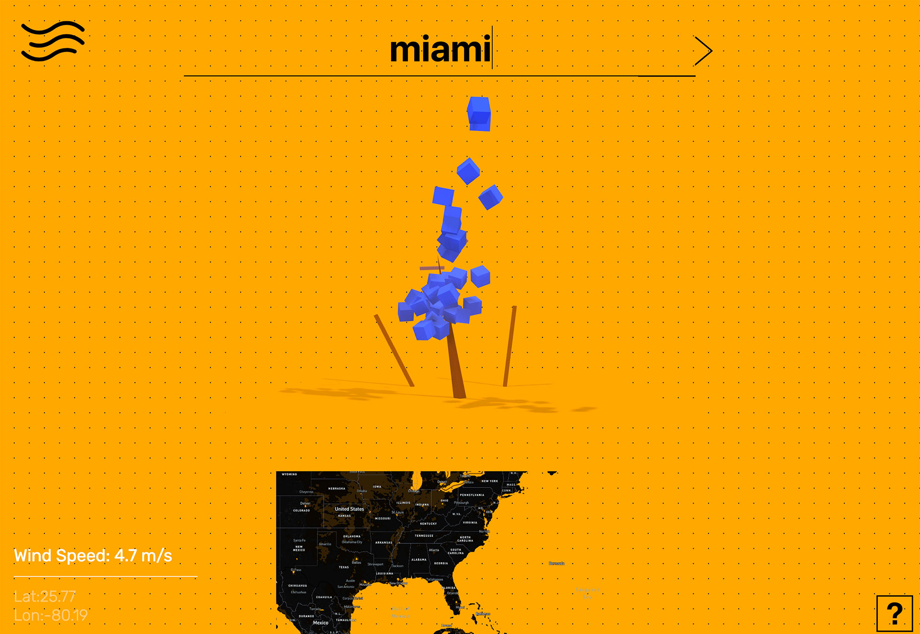 Tomorrow’s World starts with a survey that the user completes and ends with a cool visualization of how those answers compare to others. The data visualization is a tool to help the user learn about him/herself and the world around them.
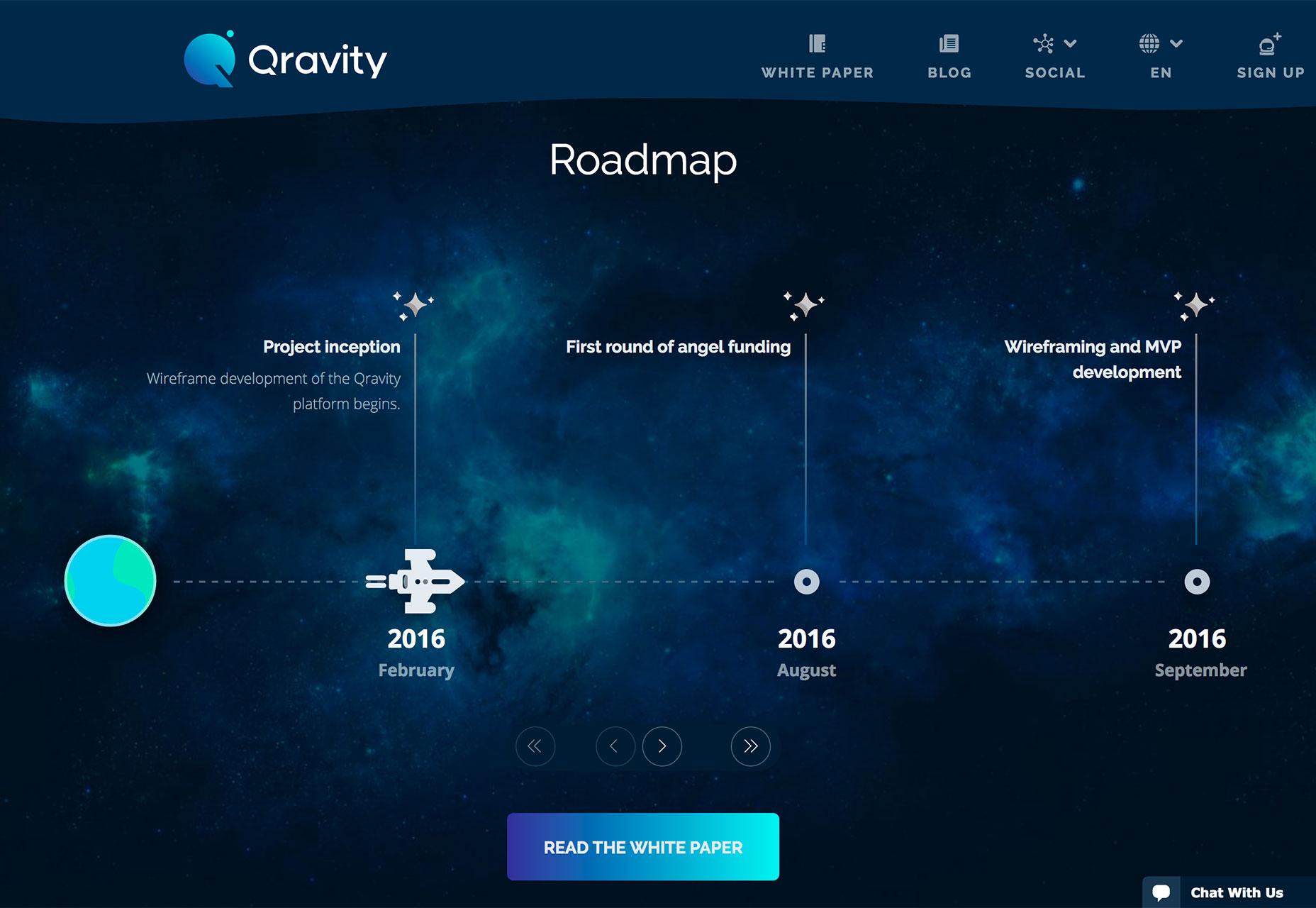
 Qravity has multiple points of data entry in its website design. One of the most interesting might be the animated timeline below the scroll. This method of organizing information (dates and events) in a visual way makes the information so much easier to understand than a simple list.
3. Polygons 2.0
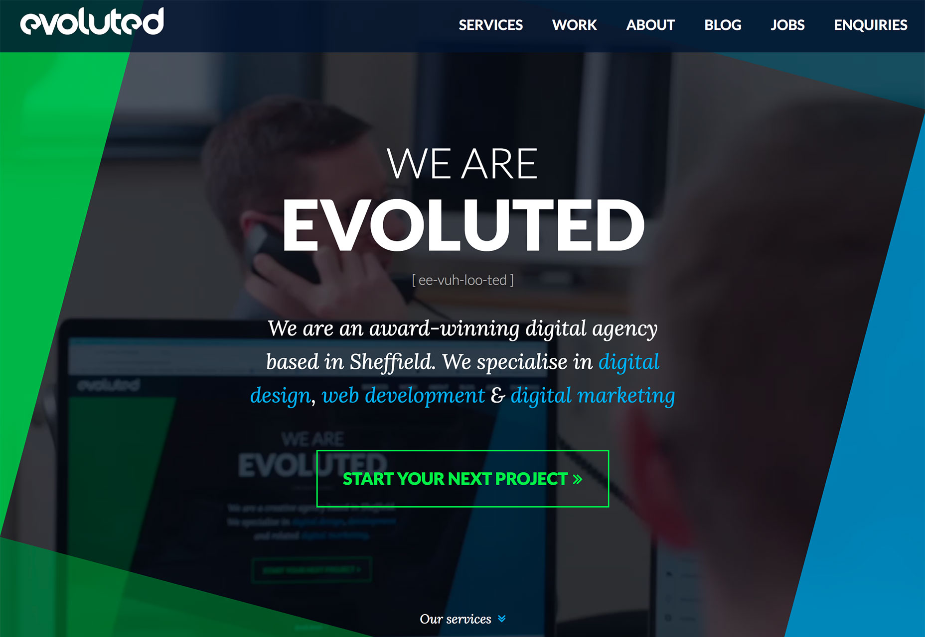
Polygon shapes in website design were everywhere in late 2017 and earlier this year. That trend continues but with a different look. Rather than piles of packed polygons to create backgrounds or other design elements, designers are picking a handful of polygons and supersizing them. These oversized shapes add a fun and funky design element that matches almost any style of project. They can be part of an overall design pattern, accent on a homepage or interesting shape container element for an image or text. What’s great about poly shapes is that they are a little different than the standard rectangles of circles that are more common and can immediate attract the attention of a user for that reason. These shapes also have a more modern feel because they are different. Polygons can feature shapes that have more distinct angles and sides such as the sharp animated triangle to the right side of The Alan Turing Institute website, simple lines that overlap for a more traditional poly feel (Evoluted) or simple shapes that help raw users into specific content (Iqor).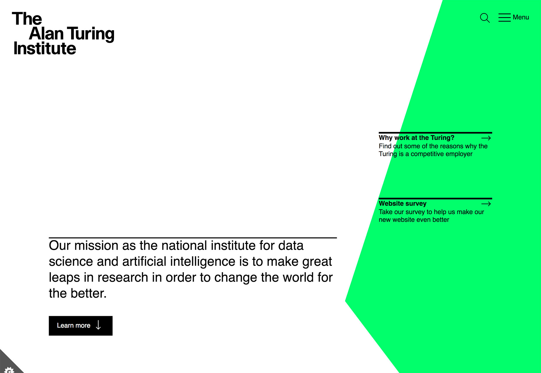
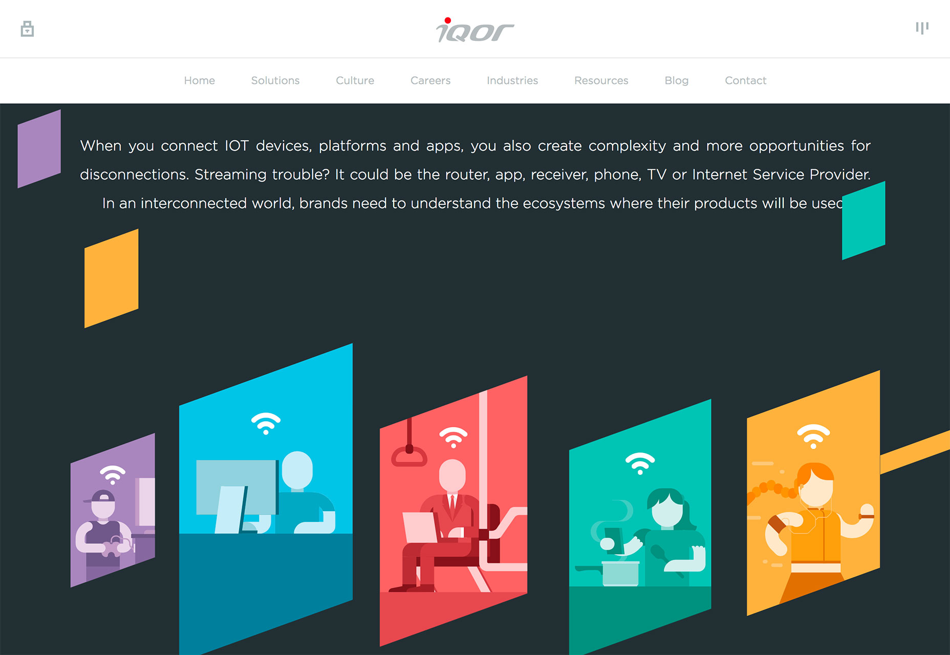 Because poly shapes are such a distinct design element, most projects feature them with bright color for even more emphasis. Just be wary of trying to fit elements inside of tilted or odd shape configurations; this can make elements to text difficult to read.
Polygons are best suited as a background or accent element, not necessarily as a home for messaging or key content items.
Because poly shapes are such a distinct design element, most projects feature them with bright color for even more emphasis. Just be wary of trying to fit elements inside of tilted or odd shape configurations; this can make elements to text difficult to read.
Polygons are best suited as a background or accent element, not necessarily as a home for messaging or key content items.
Conclusion
Personally, I love the white and bright design trend. With the heat of summer in full swing, these designs are appealing in so many ways. I like how versatile they are as well. A light color scheme is so readable with dark text and can work for almost any type of design project. What trends are you loving (or hating) right now? I’d love to see some of the websites that you are fascinated with. Drop me a link on Twitter; I’d love to hear from you.Carrie Cousins
Carrie Cousins is a freelance writer with more than 10 years of experience in the communications industry, including writing for print and online publications, and design and editing. You can connect with Carrie on Twitter @carriecousins.


Read Next

3 Essential Design Trends, May 2024
Integrated navigation elements, interactive typography, and digital overprints are three website design trends making…

20 Best New Websites, April 2024
Welcome to our sites of the month for April. With some websites, the details make all the difference, while in others,…

Exciting New Tools for Designers, April 2024
Welcome to our April tools collection. There are no practical jokes here, just practical gadgets, services, and apps to…

14 Top UX Tools for Designers in 2024
User Experience (UX) is one of the most important fields of design, so it should come as no surprise that there are a…
By Simon Sterne

What Negative Effects Does a Bad Website Design Have On My Business?
Consumer expectations for a responsive, immersive, and visually appealing website experience have never been higher. In…

10+ Best Resources & Tools for Web Designers (2024 update)
Is searching for the best web design tools to suit your needs akin to having a recurring bad dream? Does each…
By WDD Staff

3 Essential Design Trends, April 2024
Ready to jump into some amazing new design ideas for Spring? Our roundup has everything from UX to color trends…

How to Plan Your First Successful Website
Planning a new website can be exciting and — if you’re anything like me — a little daunting. Whether you’re an…
By Simon Sterne

15 Best New Fonts, March 2024
Welcome to March’s edition of our roundup of the best new fonts for designers. This month’s compilation includes…
By Ben Moss

LimeWire Developer APIs Herald a New Era of AI Integration
Generative AI is a fascinating technology. Far from the design killer some people feared, it is an empowering and…
By WDD Staff

20 Best New Websites, March 2024
Welcome to our pick of sites for March. This month’s collection tends towards the simple and clean, which goes to show…

Exciting New Tools for Designers, March 2024
The fast-paced world of design never stops turning, and staying ahead of the curve is essential for creatives. As…