
7 techniques you can use immediately
There are lots of ways Google Analytics can help you analyze how people experience your website. There are reports for understanding the devices people are using, how long your pages take to load and if people engage with elements within your pages (like watching videos, clicking promotions and even scrolling your content). And when you’re ready to take things a step further, you can even use Google Analytics to understand people’s navigation paths, allowing you to answer questions like...
Where do people go after viewing a blog post?
How many people use my contact form after viewing a product page?
What pages do people view before they convert?
Is my website’s navigation correctly structured?
I’m going to walk you through seven reports that will help you answer these questions using the data that’s already available in Google Analytics. Let’s get started!
1. Navigation Summary
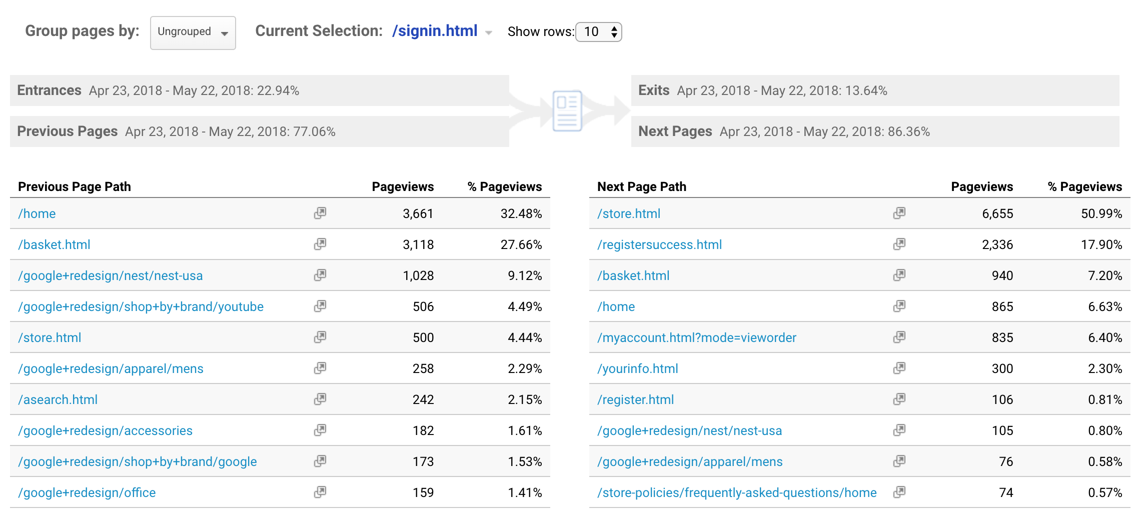
The Navigation Summary report allows you to select a particular page to then see how people find that page and where people travel to next on your website. It gives you a ‘before’ and ‘after’ snapshot of your content.
It’s not complicated which makes it easy to interpret and you can quickly switch between the pages you want to analyze. However, the simplicity of the report also means its focus is narrow, the data is presented in isolation, so you will probably want to complement this report with the Users Flow report which we’ll look at next.
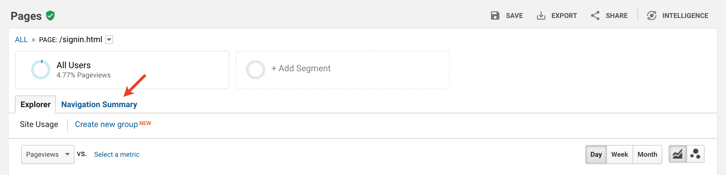
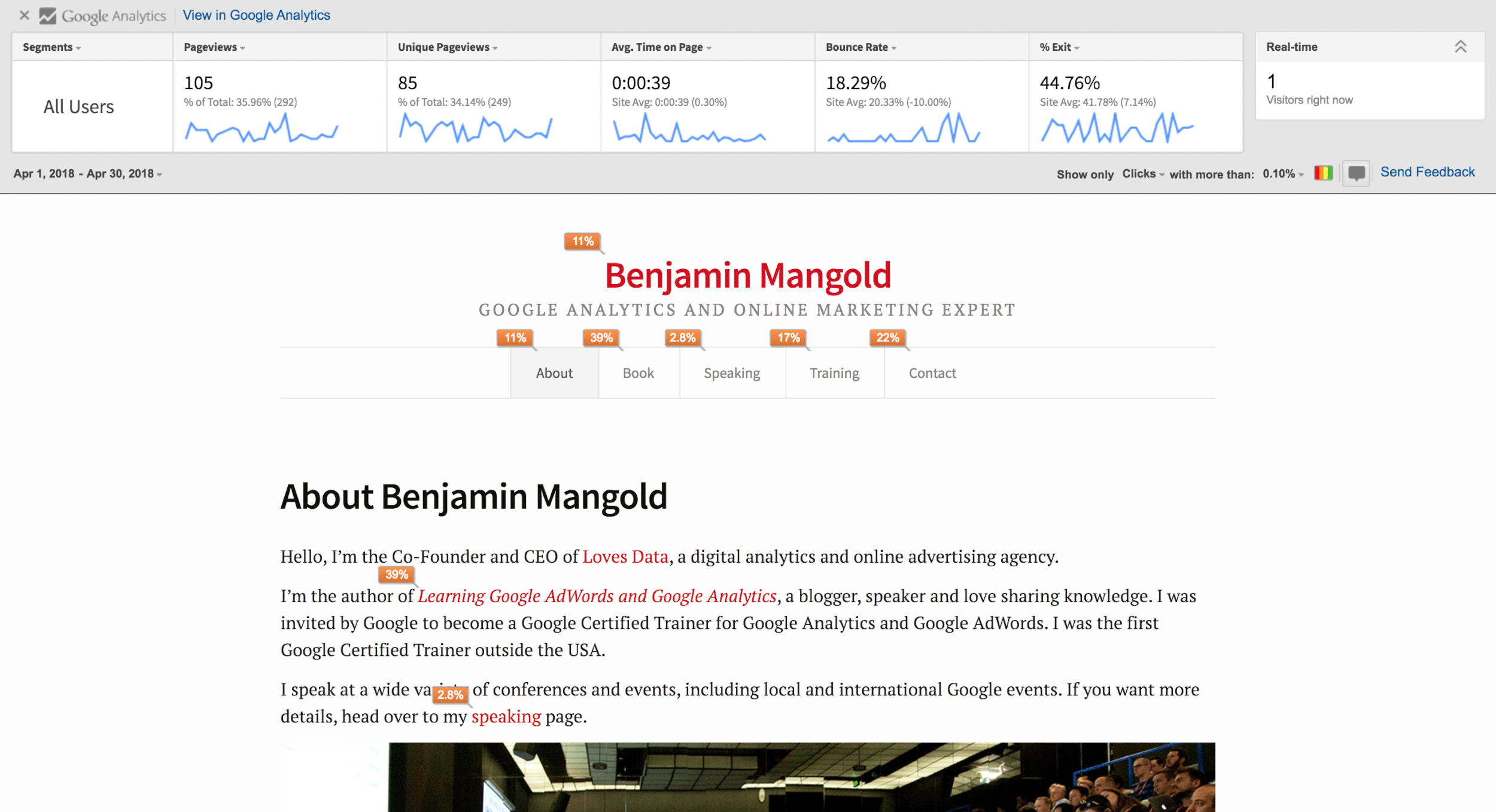
So how do you get to the Navigation Summary?
Great question! First, you navigate to the All Pages report by selecting ‘Behavior’, then ‘Site Content’ and ‘All Pages’. Then you need to select the individual page you want to analyze and after you’ve selected a page click the ‘Navigation Summary’ tab at the top of the report.
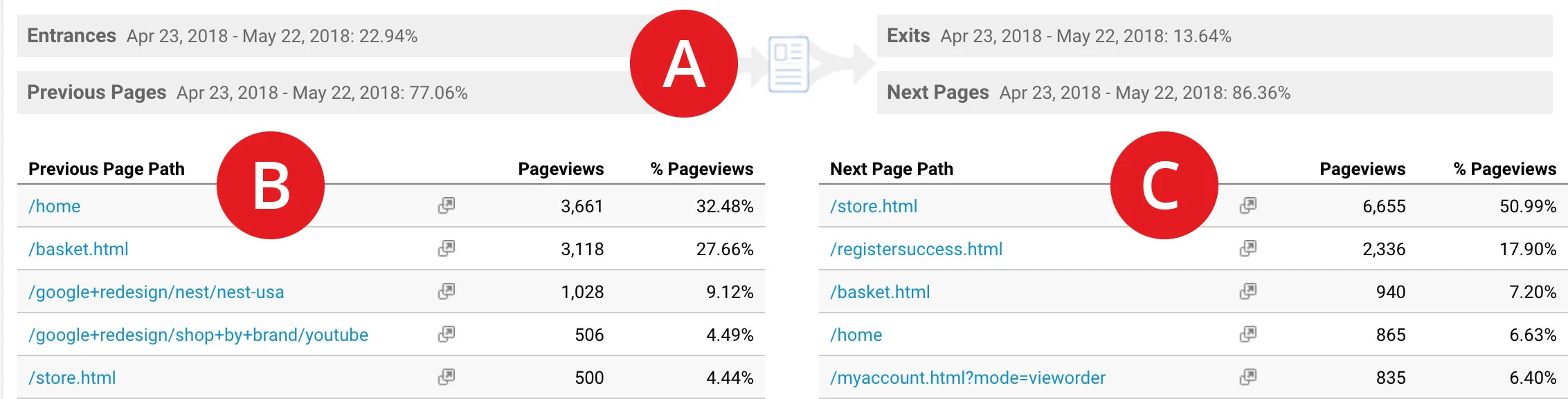
The page you’ve selected will be represented by a small icon (A) in the center of the report (below the graph). To the left you will see the pages people viewed before the page you’re analyzing (B) along with the percentage of entrances. To the right you’ll see where people traveled to next (C), along with the percentage of exits from the page.
You can click on any pages you see in the report (on the left or right) to then analyze that page – the report will update. You also have the option to click on the name of the page you’re currently analyzing (just above the icon in the center) and then search for another page. That’s it! It’s a great report to begin understanding navigation paths people take through the pages on your website.
2. Users Flow
The Users Flow report takes navigation path analysis to the next level. It’s a visualization of the different ways people travel through your content.
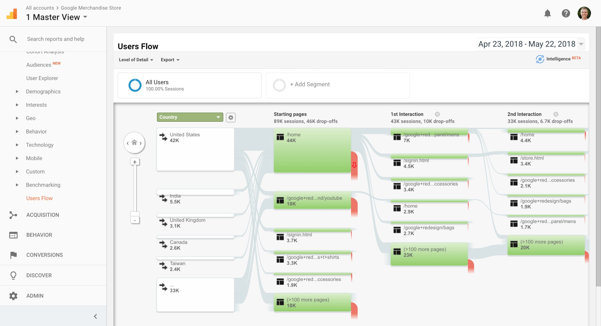
The visualization is made up of ‘nodes’ – the pages and other elements you see in the report, and ‘connections’ – the paths linking the nodes together.
The nice thing about the way your data is visualized is that everything is related to everything else in the report. In other words, the sizes of the nodes and connections show you how many people view particular pages and take particular paths.
It’s also interactive; allowing you to highlight different navigation paths to see the flow for those sections without losing sight of the overall navigation picture.
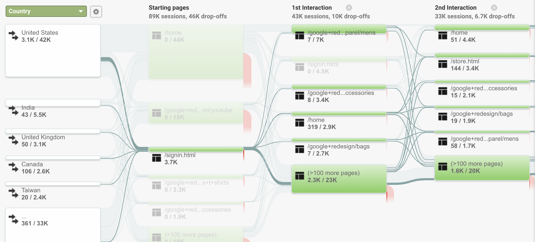
And the Users Flow report also displays percentages of traffic traveling between pages as well as the number of sessions.
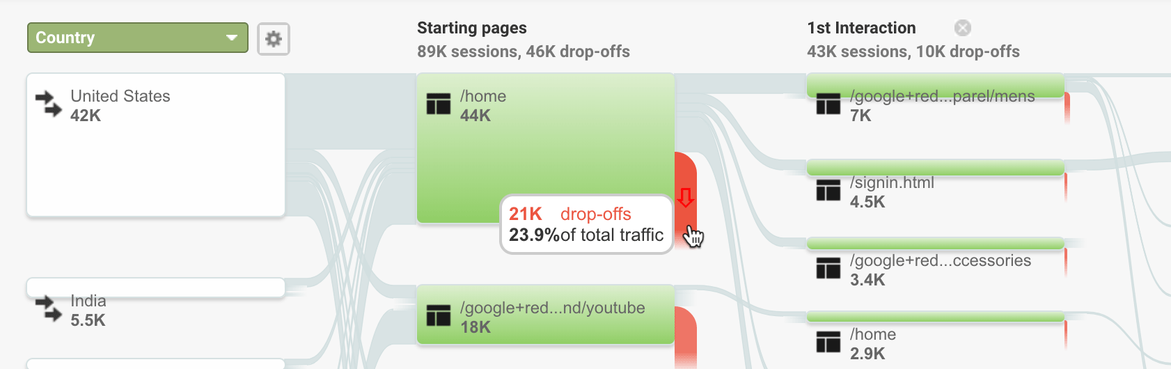
This allows you to see if people are exiting at particular points.
3. Page Analytics
There was a report that was previously available inside the Google Analytics interface called In-Page Analytics. It overlayed data from your reports directly onto your website which allowed you to browse your website and see details about how people engaged with your content.
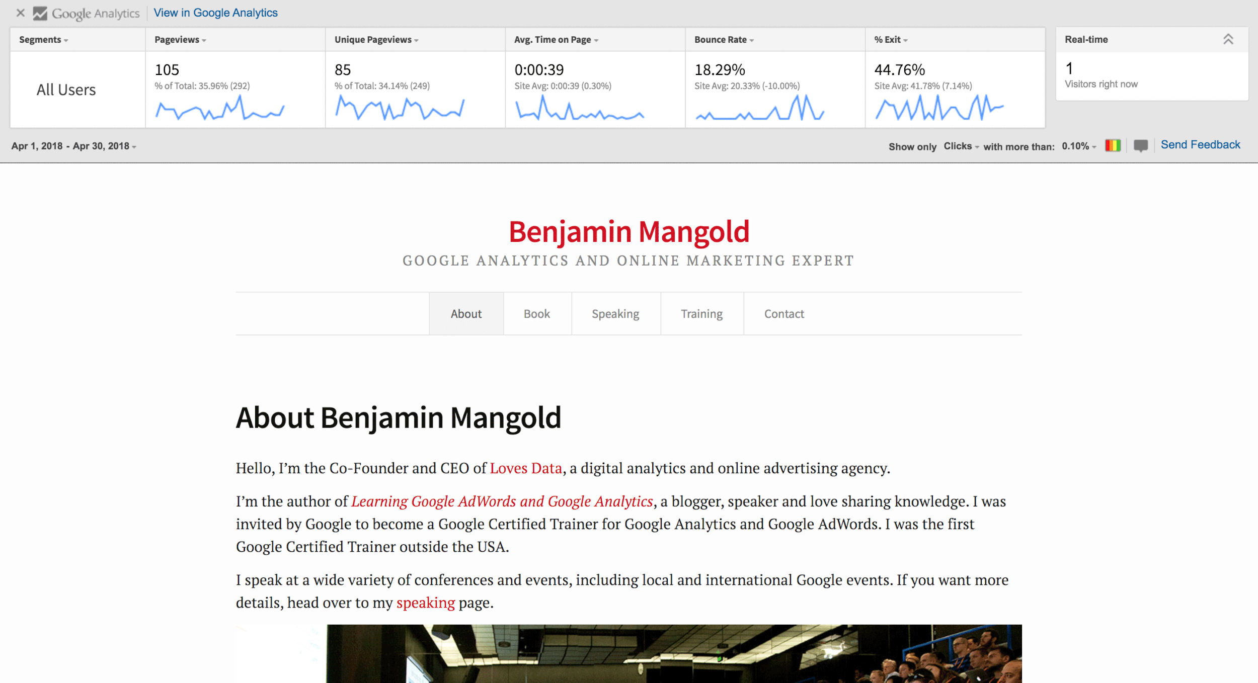
Well, the report still exists, but it’s just not available inside Google Analytics. You need to install an extension in Chrome which then overlays data as you browse your website.
Once you’ve installed the extension you’ll need to make sure you’re only logged into a single Google account (multiple accounts are not supported and you’ll see a bunch of zeros).
Then it’s just a matter of navigating to your website to see data for the current page you’re viewing overlaid from Google Analytics.
I recommend clicking the small speech bubble icon at the bottom of Page Analytics.
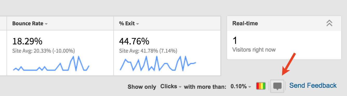
This allows you to understand where people navigate to next from the page you’re currently viewing.
I’ve used this report to help restructure navigation on pages. By the way, this isn’t a heatmap report; this tells you the next pages people viewed overlaid on the relevant links within a page.
4. User Explorer
The User Explorer report provides a user-by-user view of the navigation paths people take. While the other reports we’ve looked at all provide aggregate data, this report allows you to see how individual users experience your website.
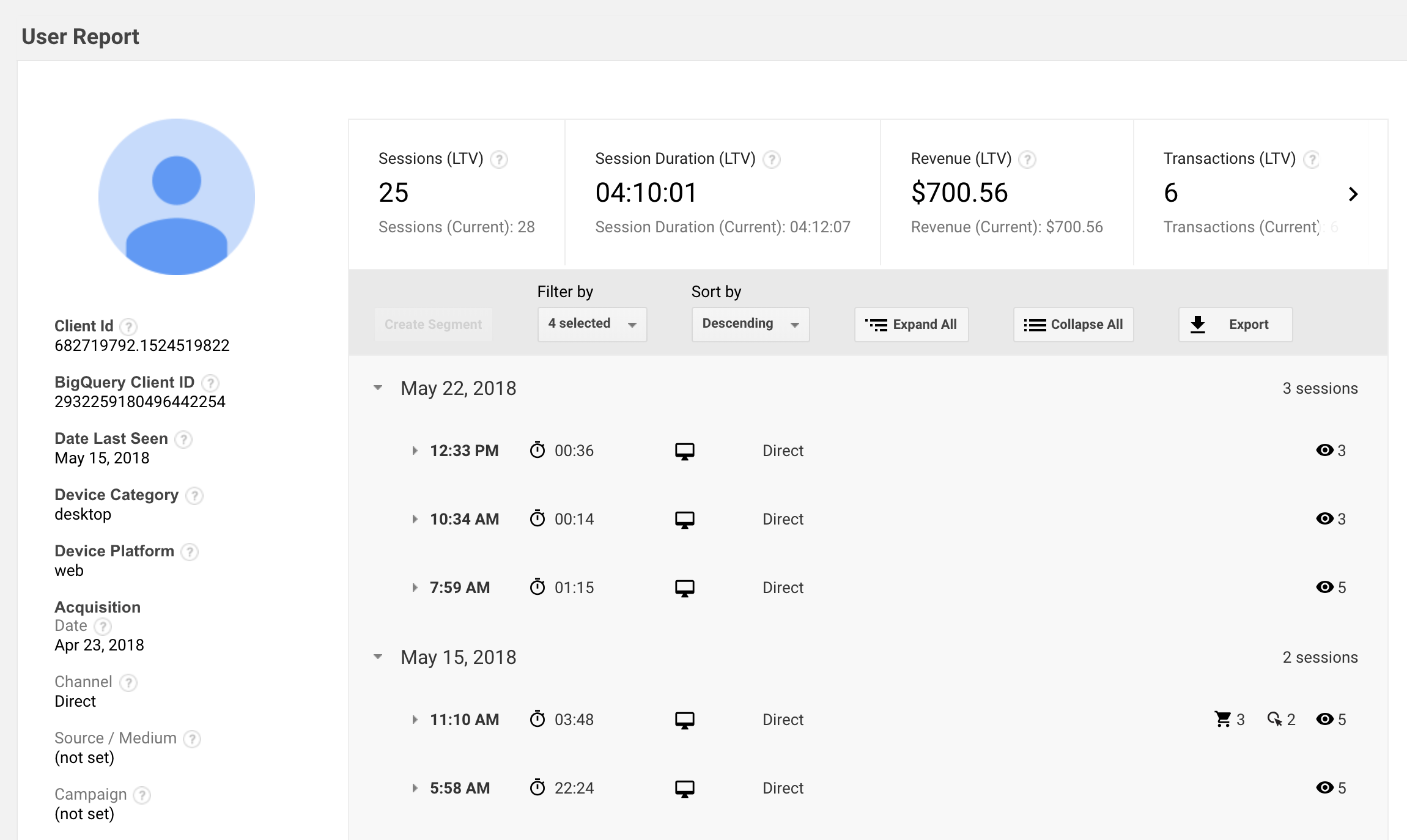
The report allows us to view the different types of actions each user takes on our website. We can see the pages they view, conversions, transactions and even events we’ve implemented to track custom actions, like watching videos and scrolling.
Read my blog post covering the User Explorer report for more details.
5. Goal Flow
The Goal Flow report is very similar to the Users Flow report – you wouldn’t be the first person to get them confused. However, the Goal Flow report only shows you the navigation paths for the goals you’ve configured inside Google Analytics.

Once you’ve configured your goal you’ll be able to see how people travel through each step you’ve defined in your goal funnel. This shows you where people drop-off at particular points, skip steps and loop-back to previous steps in the path.
The path to conversion is likely to be even more complicated than what you’ll see in the report. Today, a linear path to conversion is the exception rather than the rule. So I recommend focusing on areas where people are dropping-off to identify opportunities to optimize those pages. For example, if lots of people are leaving a step to view your privacy policy, then it’s probably a case of including some of those details within the page to reduce friction.
Learn more about the Goal Flow report:
And if you haven’t set up goals yet, then watch my videos covering goal configuration and goal planning.
6. Segments
Applying segments to your reports can provide powerful insights into how people navigate through your website. You can start by creating basic segments, like a segment for a particular landing page.
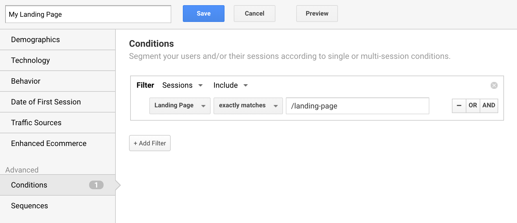
Since this segment is applied to your reports, you can use it to understand the most important marketing channels driving people to the page and whether the page is meeting your objectives in terms of engagement and conversions. You can even apply the segment to the All Pages report and the Navigation Summary we covered at the start of this post.
Once you have the basics down you can graduate to more advanced segments.
You can create a sequence-based segment that requires people to view a series of pages in a particular order to be included in the segment. For example, for people who view one of your product (or services) pages, then your ‘about us’ page, and then complete your contact form.
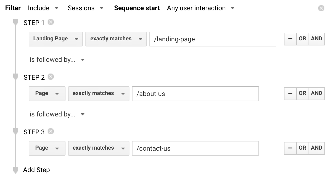
You will be able to analyze how those people find your website and engage with your other content. And you could even create two sequence-based segments for different navigation paths to compare their performance.
7. Path Analysis
If you’re using a Google Analytics App + Web property, then the Path Analysis report lets you understand how people travel through your website. You can see the pages people view and other actions people take as they engage with your content.
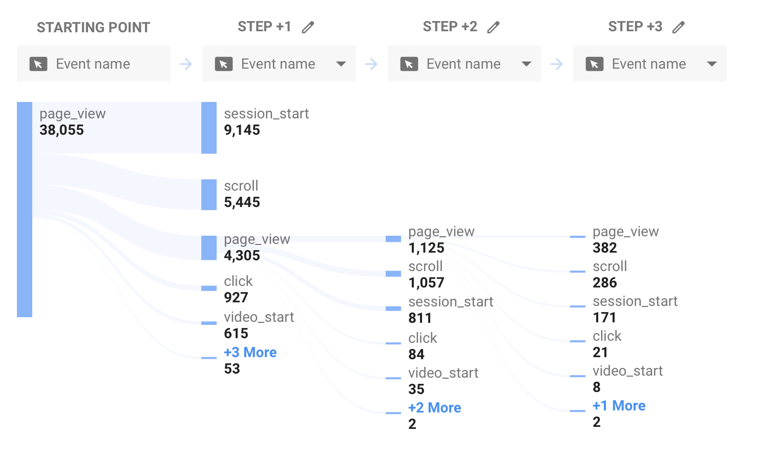
You can apply segments and filters to the report to narrow the focus of your analysis. For example, you can view paths for your paid traffic or for people who have already converted. The report also lets you select a node and view individual users who took the path you have selected. This lets you view a filtered version of the User Explorer report.
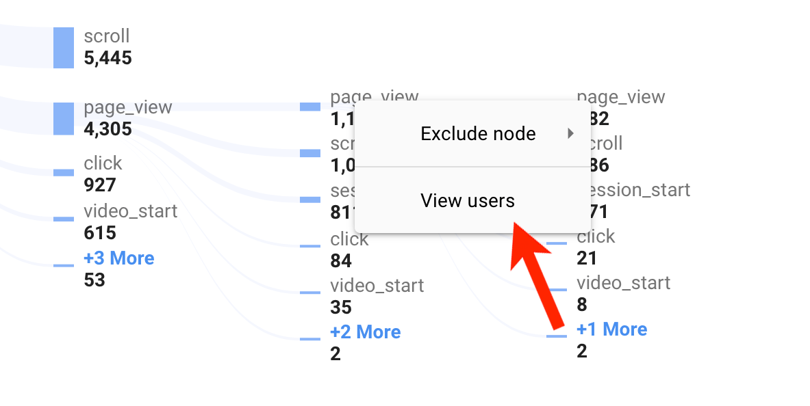
After hovering over a node, right click and select ‘View Users’ to access the User Explorer report.
Read my blog post covering Google Analytics App + Web properties for more details.
Conclusion
The techniques you use to understand navigation paths will ultimately depend on the questions you’re asking and the type of analysis you want to perform. As we’ve seen, Google Analytics provides options ranging from the simple (like Navigation Summary) through to the complex (like sequence-based segments) to help answer your questions.