If your job requires you to extract meaningful data from worksheets with extensive data sets, you need pivot tables. They’re an easy way of creating invaluable reports — simple or not — based on data without wasting hours. Most people use Excel to create pivot tables, and for good reason: it’s the most accessible and popular worksheet program out there.
However, it’s not your only choice. Many companies ditch Excel in favor of better, more powerful online database software that meets their requirements and structure. In this article, we’ll dig into pivot tables, their use cases, and what programs you can use to create them. We’ll also provide step-by-step guides and examples to help you fully understand pivot tables. Let’s get started!
What Is a Pivot Table?
A pivot table is one of the most powerful tools you can use in Excel. It’s an easy and simple way to summarize large data sets. Consequently, pivot tables allow you to easily display, understand, and analyze numerical data.
Pivot tables are available not only in Excel but also in other programs such as Google Sheets. They restructure and summarize complex data into tables that help you answer questions surrounding said data.
Benefits of Using Pivot Tables
Pivot tables are amazing when creating reports and generating insights from huge data sets. Instead of combing through the data manually and one by one, you can be more efficient by using pivot tables to generate analytics.
More importantly, you’ll create reports backed by data — data that is easy to understand for your target audience. A pivot table can group data into categories, count the number of items in each category, and add the item’s value.
Here are more benefits you can get from using pivot tables:
- Simplicity. The most you have to learn when using pivot tables is using a drag-and-drop tool. You don’t have to worry about complex operations or formulas.
- Speed. Because they’re easy to create, pivot tables are time-efficient. You can further speed up your process by organizing data before putting them into the table.
- Flexibility. Your data view isn’t limited to only one. Rather, you can quickly rearrange how data is displayed to meet your needs. You can even clone a table to get separate views.
- Accuracy. Results from pivot tables are generally accurate, provided you set it up properly. Pivot tables also highlight potential problems in data sets, so you have extra guidance when using them.
- Formatting. Need consistent number and style formatting? Pivot tables can do that, too. On top of that, the consistency remains the same even when you change data.
- Filtering. With pivot tables, you can filter data in many ways. You can define the data sets you want to display in the table and vice versa. Visualizations and charts associated with the data are also updated.
- Charts. If you have pivot tables, you can create pivot charts — the visual representation of the tables. Kohezion, for instance, offers plenty of styles and layouts to fit your needs.
Where Can I Use Pivot Tables
Pivot tables’ usefulness is easy to understand: you have a large chunk of data, and the tables help you turn the data set into useful reports and summaries. Visualizations are available, too. The following are the best use cases for pivot tables:
1. Run automatic calculations on summed or counted values
Pivot tables are efficient at performing calculations on large data sets. By summarizing and organizing data, you can effortlessly compute sums, counts, averages, and more.
This feature is perfect if your work requires you to deal with sensitive financial data. For instance, you can benefit from pivot tables if you’re a financial analyst tallying expenses or a sales manager assessing your business’ revenue. Pivot tables are also great if you need to generate quick insights but don’t have the time to do manual calculations.
Because pivot tables are dynamic, you can perform real-time adjustments as changes happen to the underlying data. This ensures accuracy and efficiency in data analysis and management.
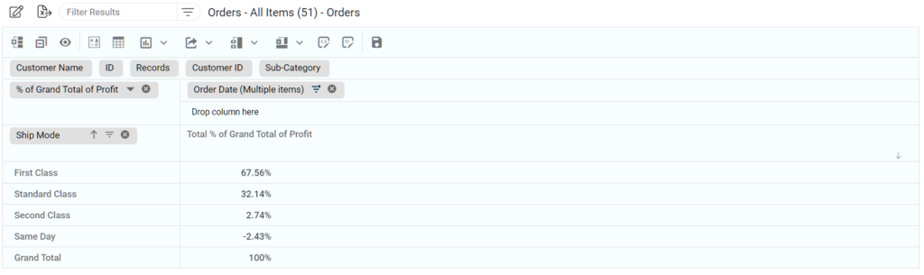
2. Create percentages of totals
With pivot tables, you have a straightforward way of generating percentages of totals. This lets you grasp the proportional contribution of each data category in the data set.
This is perfect if you want to get a holistic view of the data. Marketers, for example, find pivot tables useful when evaluating their campaign’s performance. They’re also ideal for project managers assessing resource allocation.
Using pivot tables, you can transform absolute values into insightful percentages. This improves your data interpretation and decision-making quality. On top of that, you can speed up your workflow by ditching time-consuming manual percentage calculations.
3. Segment data by date, the user, or other variables and calculate totals
Pivot tables allow you to segment data effortlessly. This enables in-depth analysis based on specific criteria such as date, user name, or other customizable variable.
With this feature, you can generate time-sensitive reports invaluable for assessing trends, identifying patterns, and making informed decisions.
For example, if you’re a sales manager, you can analyze revenue by quarter. If you’re an HR professional, you can analyze employee performance by department. Project managers can track progress across different phases.
4. Automatic calculations for organized data [impossible in Excel]
Pivot tables offer dynamic interfaces that let you arrange information into customizable rows and columns.
This is beyond Excel’s basic features. As a result, pivot tables allow you to do complex calculations that would otherwise be cumbersome or tedious to perform manually.
How Do Pivot Tables Work?
Pivot tables are like reports that offer an interactive view of your data without needing complex formulas or effort. They help you look at data from different perspectives. With pivot tables, you can group data into categories and break them into relevant types. You can even build charts with them.
Filters are also available if you need to include or exclude specific categories and variables. Pivot tables are called “pivot” tables because they let you rotate or pivot data in the table to view it from another perspective. You don’t add or subtract anything from the table — rather, you reorganize data to uncover useful insights.
Creating an efficient pivot table is worth its weight in gold. However, getting there is half the battle for non-technical users. You’re not making a pivot table to generate just one report. Instead, you should use pivot tables to summarize and filter data to tell different stories. Don’t be afraid to create as many pivot tables as you need.
Because of its usefulness for analysis, you can answer many critical business questions using a pivot table. Spreadsheets are one of the most popular solutions to create pivot tables. However, the best tools don’t require complicated formulas. You might even have to start all over again every time you need to organize data differently.
Finding a program with a drag-and-drop option to move fields around is a convenient feature. Kohezion offers this feature and many more — browse through its offerings and database examples to find what fits your business best.
How To Build a Pivot Table in Excel?
As mentioned, using Excel spreadsheets is one of the most common ways to create pivot tables. Here are the steps you need to take:
Step 1. Enter Your Data Into Excel
Enter your data into the spreadsheet, and ensure that each column has a clear heading. Organize the data in a tabular format — remember that pivot tables rely on structured data to generate useful insights. Make sure you’ve included all the information you wish to analyze using the pivot table.
Step 2. Format Your Excel Spreadsheet as a Pivot Table
After entering data, format your spreadsheet appropriately to set the stage for the pivot table. Click a target data range (or click CTRL+A to select all), navigate to the Insert tab, and select PivotTable. Confirm that the range is accurate and decide if you want the pivot table should be placed in a new worksheet or an existing one. Click Ok.
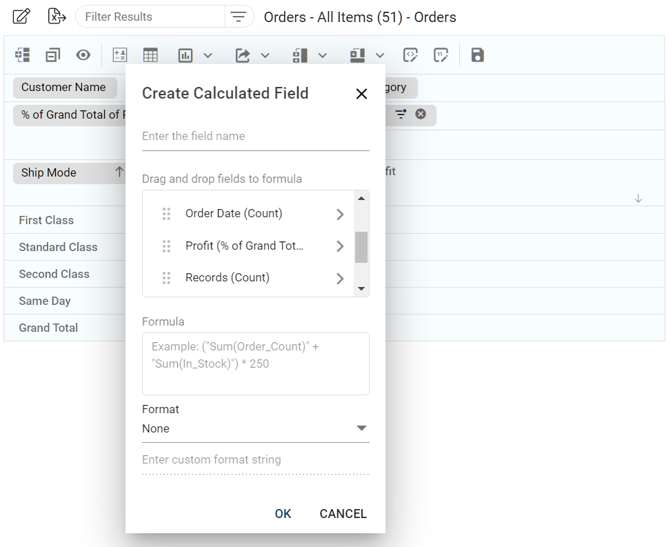
Step 3. Build Your Pivot Table Skeleton
After establishing the pivot table framework, drag and drop variables into the proper box. You’ll see four boxes:
- Filters
- Columns
- Rows
- Values
You can re-arrange variables to achieve different outputs, depending on what insights you want to get. The “values” area helps perform calculations, while the rows and columns areas are for the horizontal and vertical axes respectively.
Step 4. Work with Your Data
After completing step three, start refining and customizing the pivot table to gain more valuable insights. Experiments with arrangements, filters, and summary functions, which include:
- Sum
- Average
- Count
Explore different perspectives and patterns in your data using Excel’s drag-and-drop interface. Also, try formatting the table to enhance its visual appeal and make it more accessible for presentations or reports.
The Challenge With Excel Pivot Tables
While Excel pivot tables are powerful, they also have limitations. Creating them can be a daunting task unless you’re an Excel power user. You need to spend time to learn the functions and overcome error messages.
Even when you’re an Excel power user, you’ll find that customers will need better systems as their businesses become more complex. Moreover, Excel pivot tables lack user permissions, and human error risks escalate over time. Subsequently, the accuracy of data or reports becomes questionable.
Eventually, you’ll have to find a better system in the form of online database software. Such software offers a level of security that Excel doesn’t have. Plus you get more customization and analytical tools unavailable in Excel.
In many cases, enterprise-scale ERP or CRM apps are either not affordable or not a perfect fit. Meanwhile, online database software lacks the intimidation factor that comes with Excel or enterprise-grade ERP or CRM apps. Many such software programs also let you convert Excel to a web app while keeping all your data intact.
So what’s the best alternative?
Alternatives to Excel Pivot Tables
Many other database software apps exist in the market today. You can even build a pivot table in these apps within minutes — a vastly shorter time than what it takes to create one in Excel. More importantly, such software programs have inherent user rights. This ensures that only the right people can access and edit the database.
Of these online database software choices, Kohezion stands out. It offers an online database app that fits nearly every need of small businesses. For one, it’s user-friendly. There are no complicated operations you need to perform, plus it’s time-efficient. Moreover, Kohezion is designed to be a small business database software. It’s the perfect solution for performing quick analyses of large amounts of data.
How to Create a Pivot Table in Kohezion
If you’re ready to try creating pivot tables using Kohezion, follow these steps:
Step 1. Create a Database with Excel
Start by creating a database in Excel. Organize your data into columns and assign each column a specific category or field.
Use Excel’s formatting and sorting functions to structure and arrange your data. From there, consider using data validation to maintain accuracy and consistency within the database.
If you need guidance on creating a proper Excel database, read more about how to create a database in Excel.
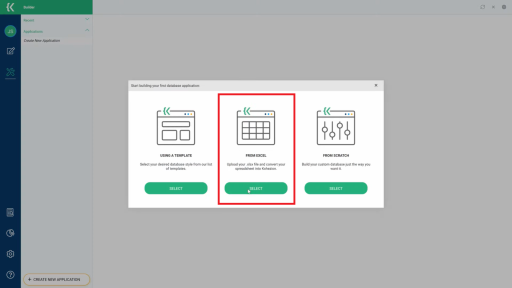
Step 2. Upload Your Excel Data Into Kohezion
Assuming you have an active Kohezion account, import your data into the platform from your existing Excel file. Select the row in a dropdown menu containing your column captions. This ensures your data is properly uploaded to Kohezion. Click Finish.
Step 3. Create Your Kohezion Pivot Table
Navigate to the Workspace tab and make your desired search in the left sidebar. Click on the blue cube (third icon) to switch from grid to calendar view and vice versa.
Step 4. Sort The Data You Have
Drag and drop your desired fields in the boxes to use them as columns and/or rows. Here, you can start creating data summary tables and using Kohezion tools.
Step 5. Edit Table For Your Specific Needs
Start editing the table for your specific needs. Aggregation views include:
- Table
- Bar chart
- Heatmap
- Table with heatmap
- Line chart
And many more. You can also choose an aggregation function: count, sum, average, etc.
 How Does Kohezion Pivot Table Work?
Creating pivot tables on Kohezion is a breeze. With a few clicks, you transform raw data into insightful summaries without needing complex coding or formulas. Kohezion’s intuitive interface lets you drag and drop fields with ease, enabling you to arrange and analyze information in various ways.
To guide you further, here’s a complete video tutorial for creating Kohezion pivot tables.
Kohezion Pivot Table Examples
Kohezion pivot tables can be used in many cases, and the following are some of the most common examples:
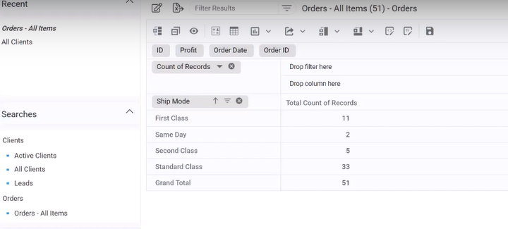
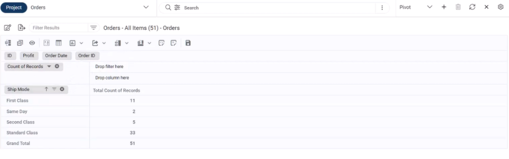
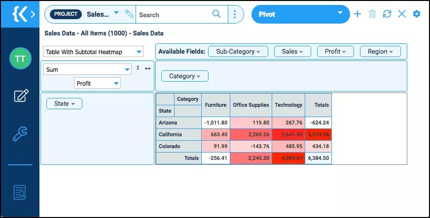
1. Pivot Table With Subtotal – Count Aggregation – Column Only
This pivot table took only 20 seconds to build. It’s a sales tracking database containing a few fields such as categories, profit, and state.
It uses the pivot table functionality, allowing you to create a pivot table to summarize all sales. Simply drag the category as a column and use the table view and sum function. Overall, this is a simple sum function using only one column.
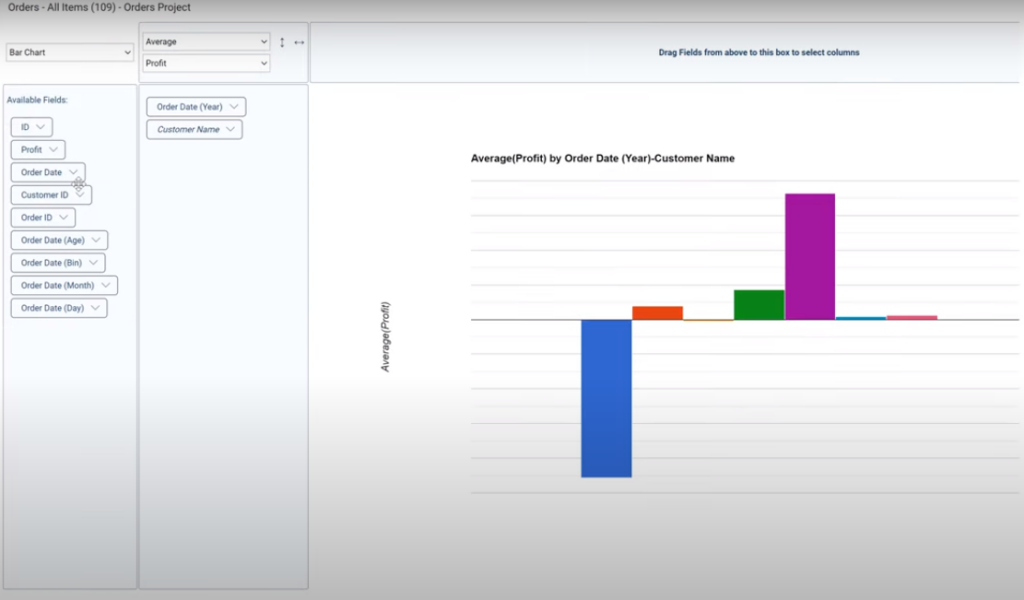
2. Pivot Table With Subtotal Bar Chart – Count Aggregation – Column And Row
You can pair columns and rows to rearrange data, pushing the functionalities a bit further. Within the database, you can pair a table with a subtotal bar chart aggregation view with a simple count aggregation function. From there, you can use the category field as a column and the State field as a row.
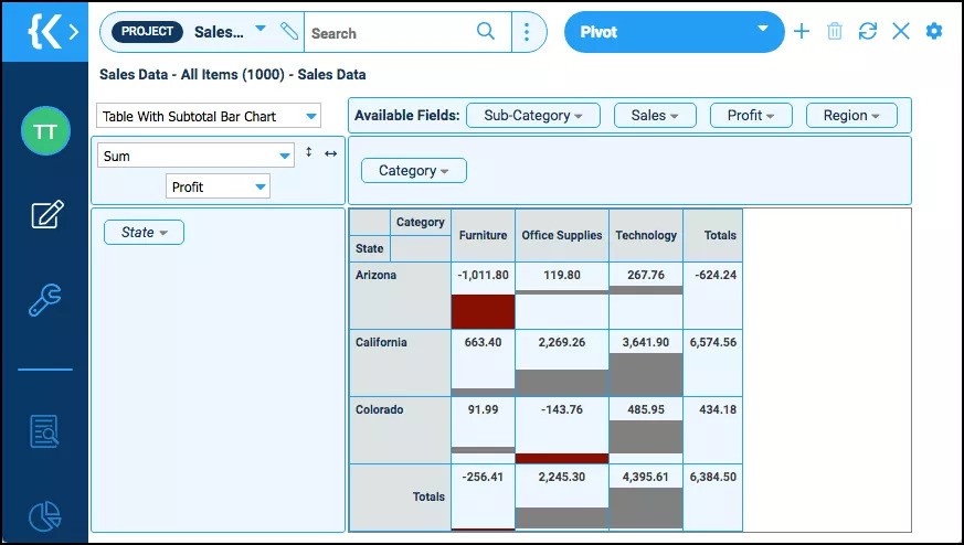
Doing this in Excel would return an error reference. However, this Kohezion table doesn’t generate errors even when some fields are left empty. If you want to explore more Kohezion pivot tables and features, create an account now.
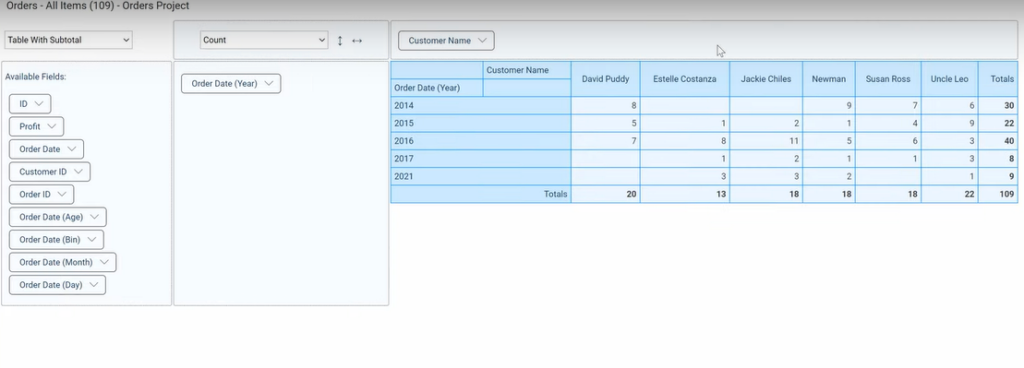
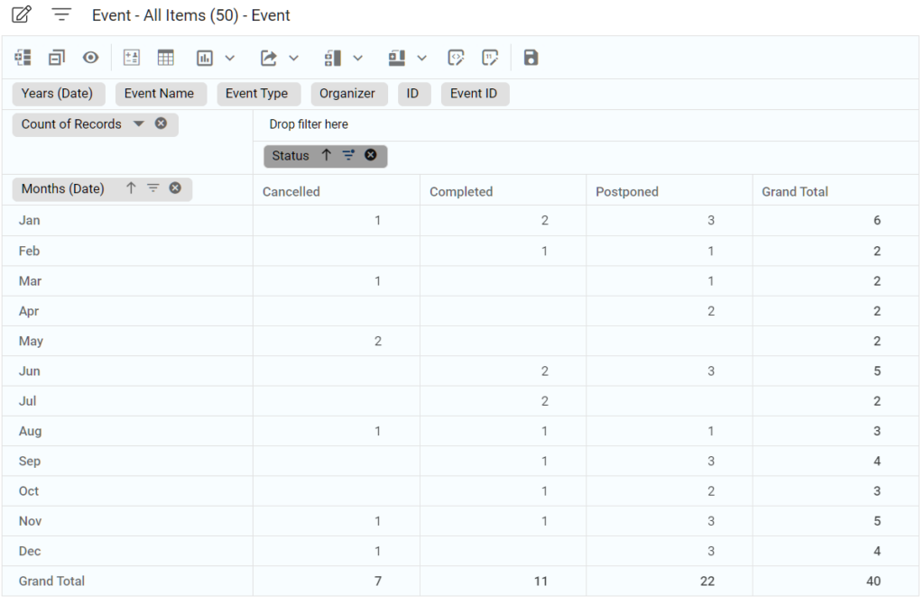
3. Pivot Table With Counts Per “Status” Grouped by (“Date”) Month
This pivot table was created by dragging the "Date" field to the column section and the "Status" field in the row section. The "Date" data was then grouped by months.
This took about 15 seconds to create and the layout can be saved for future usages.
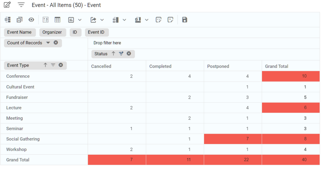
4. Pivot Table With Counts Per “Event Type” and “Status”
A custom formatting was applied to this pivot table, all values above t are shown with a red background. Multiple custom formating are also possible.
This took about 5 seconds to create and the formatting can be saved for future usages.
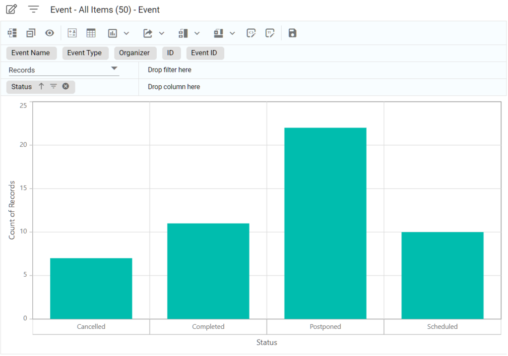
5. Pivot Table With Counts Per “Status” Displayed In a Bar Chart
Pivot table data can also be displayed using various charting format, below is a bar chart. Other options are:
- Line
- Pie
- Radar
- Area
- Scatter
- Funnel
- Pyramid
- and more...
This took about 5 seconds to create and the chart formatting can be saved for future usages.
Create an Effective Pivot Table with Kohezion
Pivot tables are powerful tools for turning chaotic datasets into actionable insights. Whether you’re creating them in Excel or other user-friendly platforms like Kohezion, their usefulness can’t be ignored. With Excel’s limitations, it’s wise to seek alternatives such as Kohezion — its dynamic tables unlock valuable insights without complexity. Check Kohezion out today and start creating pivot tables today.