


Great design is all about attention to detail — and button design is no exception.
Design buttons are a crucial component of user interface (UI) and user experience (UX) design, and they're key to offering an effective experience for visitors. UX buttons are designed to draw visitors’ attention to perform tasks, like adding a product to their cart or opening a blog post.
Buttons direct people to different pages or carry out functions, such as making purchases or submitting a response. They're frequently used as a call to action (CTA) to prompt people to respond, interact with the website, and produce a desired result. But you’ll need to think through your button design and placement to achieve those results.
Let’s break down the guidelines for great button design — along with five examples for inspiration.
Button design best practices
Buttons help drive conversions, whether those are newsletter sign-ups, sales, or survey responses. Here are some best practices to help you encourage visitors to notice and act on CTAs.
Make buttons evident
People using a website must be able to distinguish between what's "clickable" and what's not as soon as they see a button. Generally, people look for familiar visual cues — recognizable shapes, sizes, and colors.
The most commonly used button designs have square or rectangular shapes with rounded corners. These are easy to recognize and do a good job of complementing the input area (where text or icons go). Studies show that rounded corners improve input interpretation and direct our gaze to the center of the button. It’s also common to label buttons with the action they relate to, such as “buy” to add an item to a shopping cart or “subscribe” to subscribe to a newsletter.
If these cues are missing, the visitor needs to spend more time and effort to decode the design element, resulting in a frustrating user experience.
Use different styles for different functions
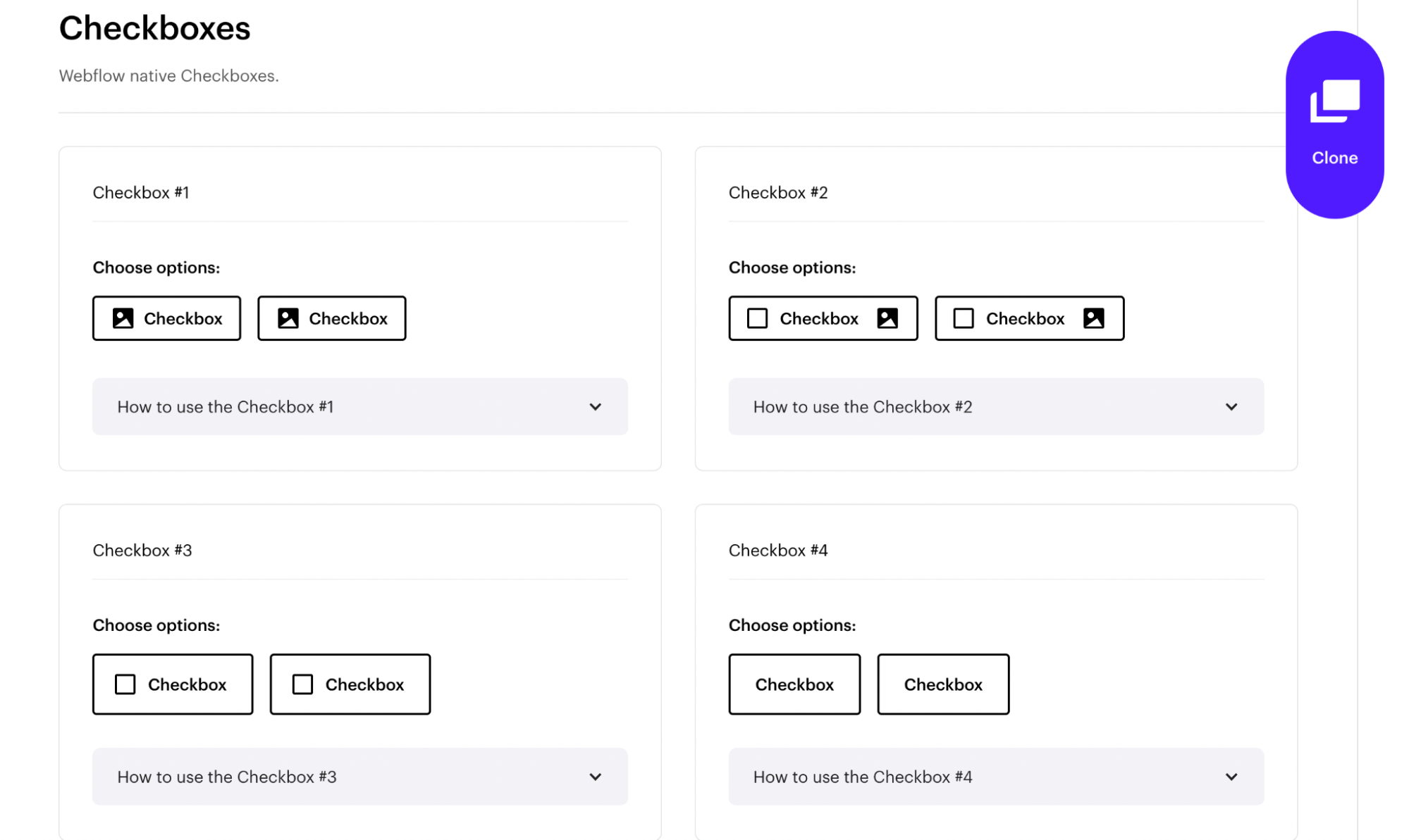
Use various styles to highlight different functions. Different styles exist for the many actions site visitors can take, from ticking off options on a list to refreshing the page. Finsweet’s Accessible Form Filter Components site is a great source of accessibility-tested, clonable buttons for various needs.

Checkboxes, radio buttons, and multi-select chips typically have a two-dimensional appearance, while toggle buttons and choice chips have depth created by drop shadows. The former are generally used for minimalist designs (like smartphone operating systems), while the latter are used for websites that want to offer a 3D appearance with multiple layers. There’s no hard-and-fast rule here, but using different styles helps differentiate between functions and refines the user experience.
However, there’s no one-size-fits-all approach, and it's important to consider a website's audience, goal, and overall design before choosing the right style. Rectangles are the most common button shape, but you can opt for other shapes to make them stand out or match the brand identity. If you decide to stray from conventional designs, we recommend conducting usability tests to ensure people have a pleasant experience despite the deviation.
Use colors and shapes to create a hierarchy
The primary action must be visually appealing and stand out from its surrounding elements. This way, each element is part of a button ecosystem that forms a visual hierarchy. For example, adding a color like blue or green to an otherwise grayscale web page draws attention effectively.
Secondary actions, such as "Back," "Delete," or "Cancel," should be the least appealing. Doing so reduces the possibility of people misclicking while simultaneously pointing them in the right direction.
VIBRAND DESIGN’s website features numerous powerful examples of button style hierarchy at work. Choose from multiple cloneable versions of buttons with the same function but unique styles to draw attention or blend into the background.

Prioritize accessibility
It's essential to design websites that are accessible to visitors with diverse needs. As a web designer, you're responsible for making a website's products and services accessible to as many people as possible. Keep this in mind for all UI elements — not just buttons.
Make buttons large enough to be clicked comfortably (particularly on mobile devices), use appropriate color contrast ratios to ensure buttons are visible, and use web-safe fonts.
Over 62% of people use mobile devices to browse the web. Make sure to optimize UI design buttons and use responsive web design for all devices and screen sizes so your content is accessible to the largest number of people possible.
Change the look depending on the state
People may expect buttons to react when they click on them or hover over them. Depending on the action, this could be visual or aural feedback. When people don't see or hear a response, they could assume the website didn't receive the command and try again. Not only is this frustrating, but such actions often result in numerous unwanted clicks.
To avoid this, use the correct styles and actions for button states. Each function needs distinct contextual cues that set it apart from surrounding elements. One should know when a button is active, loading, or disabled.

If a customer is online shopping, a disabled “Add to cart” button will let them know the product is unavailable. If the button changes color when the shopper hovers over it, they know the button is ready for them to click. These slight visual changes help people intuitively understand a site’s design.
The Cloneable Liquid Effect Button Animation from Veza Digital uses different states to catch visitors’ attention. Hovering over the button with the mouse triggers a dynamic, liquid-like animation that causes the button to fill from white to black, appearing more obvious and clickable against the white background.

Discover the processes and tools behind high-performing websites in this free ebook.
Discover the processes and tools behind high-performing websites in this free ebook.
5 button designs to inspire your next project
Buttons come in many shapes and sizes. Each serves its own purpose, depending on the website and its goals. We’ve compiled five unique web button designs (with sites you can clone) to get you started.
1. Ben Parker’s social button
Ben Parker’s interactive button takes social sharing to the next level. A single click cues an animation that sees all your social media channels roll out into an easy-to-read panel.

Check out a preview of Ben’s button or clone the project for your own site.
2. Marco’s simple, elegant button
Marco Meßer designed a simple button — part of a larger, free template — that’s visually appealing and intuitive. The design is uncluttered, making the button obvious, front and center. Marco strategically uses whitespace well to ensure the button stands out.

The off-white button becomes black when the cursor hovers over it, and an animated arrow directs you to click. The contrasting color and animation are sleek, subtle, and super effective, encouraging you to follow the link.
Preview the button or clone the project to use for your website buttons.
3. Stu's pop-out “Buy” and “Download” button
The hover interaction in this pop-out button, designed by Stu, is perfect for hiding — and showing — non-essential content on a page.
The inactive buttons are blue and orange, but both turn green when you hover over them. Green is a positive and inviting color that shows you’re progressing with your actions on the website.

Apart from turning green, two small pop-ups appear on the top and bottom of the button. These additional elements give the visitor more information and keep them reading — the “BUY FRUIT” button expands to say “A few more clicks sends Vlad a banana,” while the “DOWNLOAD” button expands to “Click to download Sergi’s style guide: 1.4 MB.” These aren’t real people or downloadable assets, but they’re humorous enough to keep you hooked.
Preview Stu’s expandable button or clone the project for your site.
4. Digital Bake’s magnificently minimal button
One of the most popular buttons from Digital Bake's website is this simple, understated button that packs a punch with an unexpected hover effect. The inactive button is a red “SEE MORE” with a right-facing arrow. Upon interaction, however, a rectangular button with rounded corners comes to life, and the arrow perks up with a subtle animation.

The default color is bright red on a clean white canvas, but its minimalism makes it versatile and usable on any site. This button has limitless use cases — simply change the text and colors to suit your website and CTA, and you’re set.
You can preview the button or clone, customize, copy, and paste it for your own design.
5. WebDev’s wonderful back-to-top button
A scroll-to-top button automatically takes visitors back to the top of the web page without them having to scroll all the way manually. They can return to the top of the page with a simple click and access a different menu or navigation bar.
WebDev For You has a design portfolio on Webflow with hundreds of examples of back-to-top buttons. This one, for example, is called Daily Interaction #23, and it’s one of the many web pages that WebDev offers for back-to-top buttons and other interactive design features. If you want to go to Daily Interaction #22, you can click on the left arrow button. If you want to go to Daily Interaction #24, you can click on the right arrow button.
The screenshot below is of Daily Interaction #23. This is what it looks like after you scroll through the 4 sections. As you can see, there’s a white button with an upward-facing arrow in the bottom-right corner.

Clicking this button takes you back to the top of the page. Back-to-top buttons are particularly handy for smartphone users and long pages, like blog articles or product lists. Websites and mobile apps are usually optimized and compressed for phones, resulting in longer pages to scroll through. Having a back-to-top button can be a game-changer.
Preview Daily Interaction #23 or clone it here.
Design effective buttons
Buttons are small but powerful aspects of your overall design. Without buttons, visitors cannot properly navigate through or interact with your website.
To make them as effective as possible, familiarize yourself with the ins and outs of button design. We have a dedicated course that walks you through buttons and their role in web design.
Explore our other tutorials and use your newfound knowledge to make beautiful website buttons and amazing sites today.
.jpg)


