As a small travel operator, you know that your website is your shop window to the world!
Gone are the days of glossy sales brochures and direct mail leaflets.
The Internet is where customers find travel operators, inquire about tours and book their travel experiences.
To succeed as a small travel operator, you need to have a beautiful website that is functional, informative and provides a seamless customer journey.
It also needs to work across multiple devices, especially on mobile.
In this article we cut through the complexity of developing and designing a website to show you quick and effective ways to make your site look amazing.
We start with the technology behind websites, and specifically DIY web platforms like Wordpress that cost a fraction of a custom website build, but look and function like some of the best sites on the web.
By the end of the article you will know:
1. How to develop a beautifully designed and functional website for less than $100.
2. How to structure your site for optimal engagement, enquiries and sales.
3. How to leave a positive and lasting impression with visitors to your website.
Reading Time: 17 Minutes
Is your current website fit for purpose?
It used to be technical, costly and difficult to build a great travel website.
In fact, if you built your site before 2010, you probably had to employ a web development agency and spend a lot of money and time to craft your perfect site.
Nowadays, with the development of DIY web platforms like Wordpress, Squarespace, Weebly and Wix, it’s possible to create a great website without web skills and with a tiny budget.
If fact, we’ll hazard a guess that your current website runs on one of these platforms already.
DIY web platforms are great, as they come with plug and play templates and easy-to-use content management systems. Moreover, platforms like Wordpress power over 20% of the Internet, which means there is a massive community of users, developers, plugin creators and support services that you can leverage for a fraction of the cost.
Given the low barrier to entry in terms of getting a great site, the question is: Is your current website fit for purpose?
Use the quick exercise below to evaluate your current site.
QUICK EXERCISE
Navigate to your website quickly. Take a cold, long look at it. Does it inspire you to travel? Does it represent your brand, today? Are your tours beautifully presented? Does it look professional and modern?
Be honest and note your answers.
Now, in your web browser, grab the right corner of your website and drag it all the way to the left side of the screen, so that the web page narrows to the width of a mobile device.
Does your site respond to the change in size or does the formatting and structure distort and break? In other words, is your website mobile-friendly?
If the answers to the questions above were “No”, then it’s time you refresh your website.
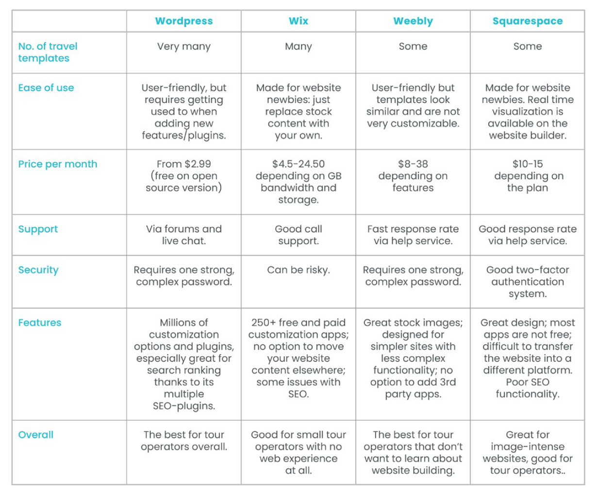
We highly recommend you update your site using a DIY web platform. Use the table below to compare and contrast the main platforms.
Here is a quick comparison of the top four web platform options, to help you choose the best one for you.
What features make for a great website?
Regardless of the website platform or technology, there are a few best practice features that make a travel website great:
- Beautiful design and imagery
- Clear and easy to navigate structure and layout
- Convincing social proof signals
- Carefully crafted tour information and copy
Let’s look at each in turn.
Beautiful Design and Imagery
A beautiful website design is critical to the success of a travel operator. Almost all travelers discover a travel operator and their tours through the web today.
Bespoke web design can be very pricey, but as already mentioned, if you are using a DIY web platform it is very likely that it has specific travel operator website templates that look amazing and function exceptionally well.
QUICK EXERCISE
Take a minute and type into Google, “Travel Website Templates Wordpress” or “Free Travel Website Templates”. You’ll find 100s of fantastic designs to choose from.
Templates like the one below, cost as little as $60 to purchase and are super easy to integrate and use.
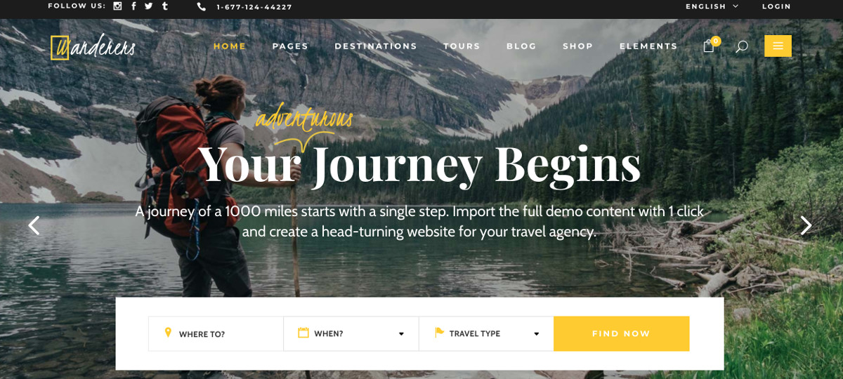
Leveraging these out-of-the-box templates can save you $1000s and lots of time.
With a beautiful design in place, it is important that your website consistently reflects your brand guidelines for colors and fonts (see Value Proposition and Brand), and uses stunning imagery to bring your tour offering to life.
The latter is incredibly important: travel is so emotive that without good imagery, it is really difficult to convert visitors to enquiries.
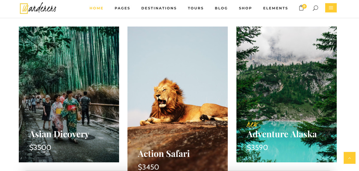
Below is a screenshot of the Wordpress travel template mentioned above. Notice how the colors and fonts are consistent, and how the imagery is engaging and appealing.
Make sure to invest in good photographs, either by building an in-house library of pictures taken by past customers, your guides and during your personal travel experiences, or by leveraging great copyright-free imagery from sites like Pexels, Pixabay and Unsplash.
Alternatively, paid services, like Shutterstock and iStock, offer amazing imagery at very affordable prices.
Don’t cut corners on your website design and imagery. This is your shop window; make sure you leave a lasting impression with visitors!
Clear and Easy to Navigate Structure and Layout
The structure and layout of your website are closely related to your website design. But instead of appealing to one’s aesthetics, they addresses the logical flow of information, and how a visitor browses your site.
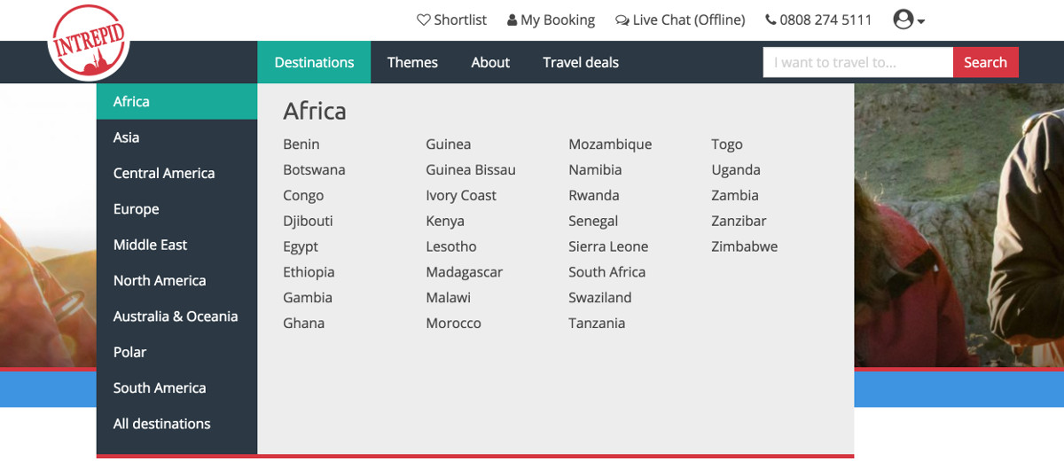
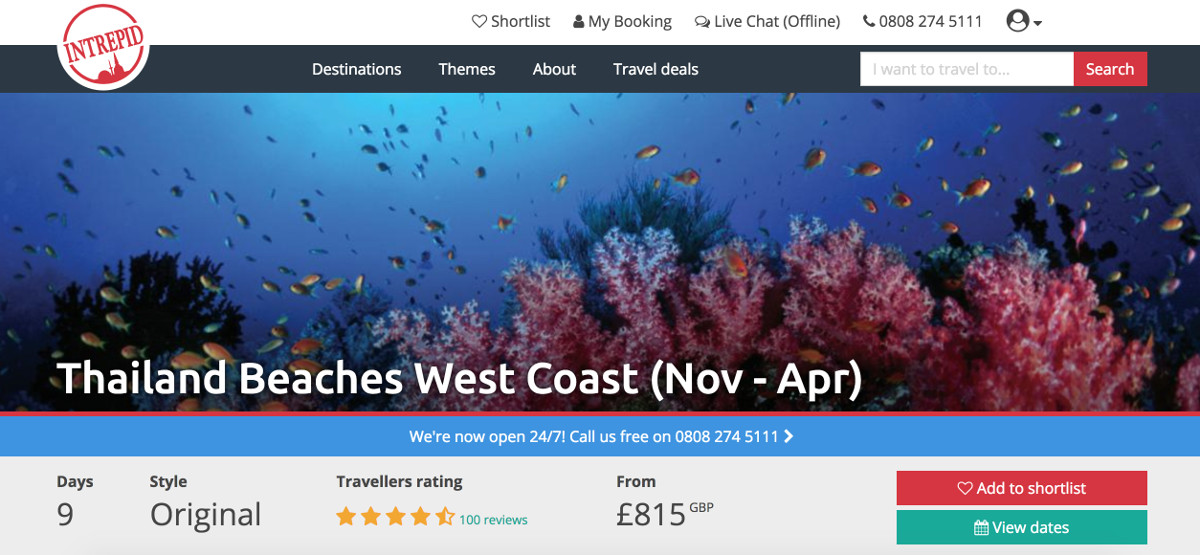
For example, look how global adventure travel company, Intrepid Travel, structure their site by destination and theme. Despite having an inventory of 100s of tours, the company manages to help the visitor search by continent and country incredibly quickly.
In addition to providing a great navigational experience, the site structure and layout are key to making sure a visitor remains focused on the action you want them to take, aka the Call To Action, or CTA.
In the case of a travel operator, the CTA is a structural feature that drives a visitor to inquire or book.
Look again at the screenshot from Intrepid’s homepage. Notice how clean the design is and how, in addition to providing a great navigational experience, the highest value calls to action (i.e. the chat box in the right bottom corner and the phone number in right top corner), remain highly visible on the page.
This becomes even more obvious when you look at one of Intrepid’s tour pages.
See how all the key features of the tour, like price and number of days, are outlined upfront, and the CTA to 'View Dates' or 'Add to Shortlist' jump off the page.
A great site structure and layout not only help a visitor to easily and quickly find what they are looking for, but also lead them to take a certain action, like inquiring or booking.
Let's see if your website delivers the same experience.
QUICK EXERCISE
Pretend you are looking at your website for the first time. What are your first impressions? Does your site look dated, bland and amateurish, or modern, stylish and professional? What about your imagery? Do your images look bright, sharp and inspiring?
Note your answers.
Now turn your attention to your site’s structure and layout. Is your navigation intuitive? Is it easy to drill down to find your tours?
For each page you look at, pay particular attention to the action you want a user to take. Is your CTA on each page clear and relevant?
Convincing social proof signals
Have a look again at the Intrepid screenshot above. Notice how the Travellers ratings appear right at the top of the page and are hyperlinked to the ratings for this tour. This immediately establishes trust in the mind of the reader.
As a visitor spends time on a travel operator’s website, they are picking up cues from the design, structure and copy on how established and trustworthy a company is.
Social proof is the fastest and most convincing way to establish trust.
Get it right and you can win visitors over easily.
The best travel websites build social proof signals into prominent points on their site so as to augment their offer.
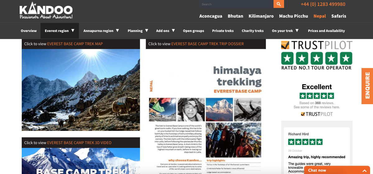
For example, look at how this tour operator uses an embedded widget from Trustpilot, a major review platform, to prominently show-off their reviews.
As a small travel operator our recommendation is to use a 3rd party review sites like Trustpilot or Tripadvisor to build a review profile.
These sites are well regarded and trusted by consumers. As your review profile starts to develop, make sure to embed your reviews throughout your site in a way that is sympathetic to the design, yet is still striking to the reader.
Social proof via reviews is a huge purchasing factor in travel. So much so that we spend an entire article on it – see Reviews. Make sure you build genuine and reliable social proof signals into your website.
Carefully crafted tour information and copy
Many small tour operators fall short when it comes to producing travel copy and tour information on their website.
This is a major downfall as great travel copy goes a long way to converting visitors to customers.
The major tour operators know this only to well. They obsess over their tour information, making sure it is as detailed and comprehensive as possible.
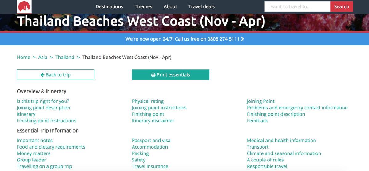
Continuing with our example from Intrepid Travel, have a look at the screenshot below. It shows the trip notes for the company's tour screenshot we looked at above. Each point hyperlinks to a section on the page that covers this information in detail. Notice how comprehensive their trip notes are. And all this is only for one tour.
Great travel copy and tour information does three things:
- It inspires your reader to find out more. The best copy should give the reader a real sense of what they would experience on your tour.
- It establishes trust and demonstrates specialist knowledge in the mind of the reader. Vague or thin copy does exactly the opposite.
- It genuinely informs the reader so that they can properly prepare for a trip and have their expectations met.
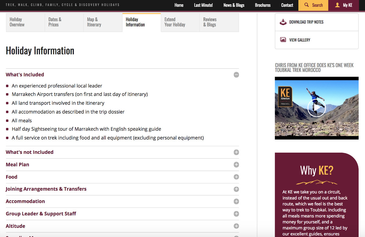
Here’s another major travel operator setting out in detail its tour information. Notice how the company uses tabs to make its content easy to digest, and sets out upfront the inclusions and exclusions in its trips.
If you are targeting a predominately English-speaking audience, but are not a native English-speaker yourself, then you should definitely hire an English copyeditor to spruce up your content.
Good quality copyeditors can be found on freelance websites like People Per Hour and Upwork, and are often very affordable.
Poorly written copy not only undersells a travel service, it can completely undermine it. Make sure you invest in well-written and comprehensive travel copy for your website.
QUICK EXERCISE
Return to your website and start browsing. Do you have any social proof signals? Are they prominently displayed? Do they look genuine and reliable?
If not, start a plan to build a review profile today – it is a major asset for a travel operator, but is often neglected.
Now turn your attention to your website copy. Does it read well? Is it detailed and authoritative? Does it accurately sell your tours and inspire the reader?
Again, if the answers are “No”, then make a plan to invest in better, more detailed and inspiring copy.
Is your customer journey seamless from discovery to booking?
The final ingredient for a great travel website brings all four previous points together – design, structure, social proof and content – to ensure the customer has a seamless journey from discovery to booking.
Imagine walking into a shop. Your journey begins at the door. You get a general impression of the shop from its design, layout, products and atmosphere. You then browse some products; check prices, quality and features. Perhaps you chat with a sales assistant before making a purchasing decision. You then take your chosen product to the checkout counter, where you are upsold a few products, before having a seamless payment experience and leaving the shop.
Your website and how visitors interact with it, is much the same as the physical shopping experience.
The more you can map your customer’s journey and make it seamless, the better the experience will be and the more sales you will make.
Assuming you have nailed the four best practice website features discussed above, the main area of concern, especially for small tour operators, is payment and the checkout process.
This is where the customer experience often becomes complex and complicated.
In the worse case, a travel operator gets stuck in a loop of emails back and forth with a customer and is forced to use 3rd party platforms, like Western Union or PayPal for payment, or costly international bank transfers. Issues of deposits, part payments and group payments make the situation even more difficult.
DIY web platforms, although amazing in terms of design and general functionality, often don’t have the eCommerce capabilities to manage with the complexity of a travel operator’s sales process.
But fear not.
This is where products like Wetravel’s payment and booking software can close the loop on streamlining the payment process for a small travel operator.
Wetravel has built its software specifically for small travel organizers and operators so that they can offer their customers a seamless way to make payment.
The software provides a super easy interface to quickly setup trip pages, with itineraries, photos and custom details (see some examples here). These pages can be shared with customers via email or on social media, or embedded directly on a website.
From the trip pages, customers can easily make payment, and the tour operator can manage all financials (refunds, custom prices, discount codes, payment plans, balance-due reminders) and all communication from within the Wetravel dashboard.
You can see how it works here.
QUICK EXERCISE
Browse your website again. How does the customer journey look like overall? Good, bad, average?
Now explore a few individual page types. Start on your homepage, and then move to your Tour pages, About page, Blog page, Enquiry page and Booking page. Rate the customer journey on a scale of 1-10 across each page type.
Where does the journey become more complicated? How can you improve it?
Pay particular attention to your enquiry page and booking page. Can a customer inquire and book easily? Is it easy for the customer to make a booking and pay?
If the answer to these questions is “No”, and you want to improve your booking and payment process, sign up for a free demo with Wetravel.
Summary
An aesthetically beautiful, informative and functional website is critical to the success of any travel business.
Nowadays, thanks to template-based platforms like Wordpress, a great website can be achieved with minimal cost, however, the design, structure, copy and customer journey still need a lot of attention.
Moreover, a website needs to work seamlessly across multiple platforms, especially on mobile.
Get it right and you will have the perfect base to scale your travel operation.
Nonetheless, you can have the best looking website in the world, but without relevant and high volume traffic you will not generate any business.
To get traffic, you can either buy it though pay per click (PPC) advertising, drive it through social media marketing, affiliates and 3rd party partners, or generate it by ranking organically with Search Engine Optimisation (SEO).
Next, we look at the latter technique – organic traffic through SEO – but you can read our PPC Advertising and Facebook Marketing articles to gather more insight.
Did you enjoy this article? Get a FREE e-book: 150-page guide that covers everything from establishing a winning travel brand to delivering a market-leading service.


