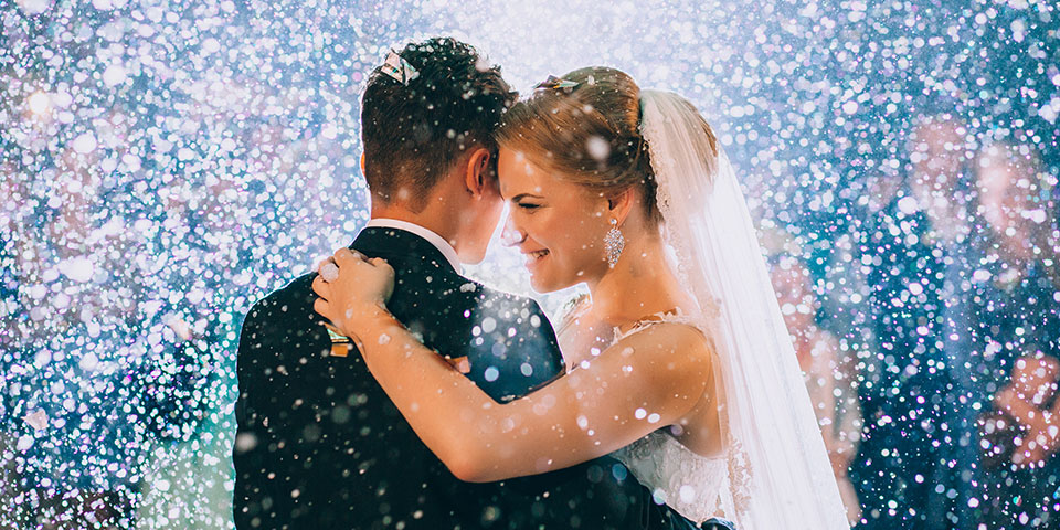
Wedding websites are an amazing tool for communicating with guests, setting expectations, and building excitement leading up to your big day.
But planning a wedding is generally a brand new experience for most couples, so it’s only natural to be feeling a little lost when it comes to wedding website do’s and don’ts!
Your wedding website should serve as a helpful platform for guests, and it’s safe to say the last thing you want to do is leave anyone feeling confused, overwhelmed, or even offended. So today we wanted to share some of the most important wedding website mistakes to avoid, to help you create the best possible resource for both you and your guests.
From miscommunication faux pas to the layout and functionality of your site, keep reading for 7 common wedding website mistakes you should definitely steer away from!
Not Providing Enough Information
The main purpose of creating a wedding website is to prepare your guests with all of the information they need for your big day. So it goes without saying that the more practical details you can provide, the better!
Many couples make the mistake of limiting their wedding website information to the basic who, what, where and when. Although these practical details are obviously the most important, it can still leave plenty of other questions unanswered.
Remember, a wedding website is designed to streamline communication between you and your guests, so that you don’t have to spend weeks fielding text messages, emails and phone calls. So take some time to really think about any questions your guests might have in the lead up to your wedding, such as venue directions or dress code guidelines.
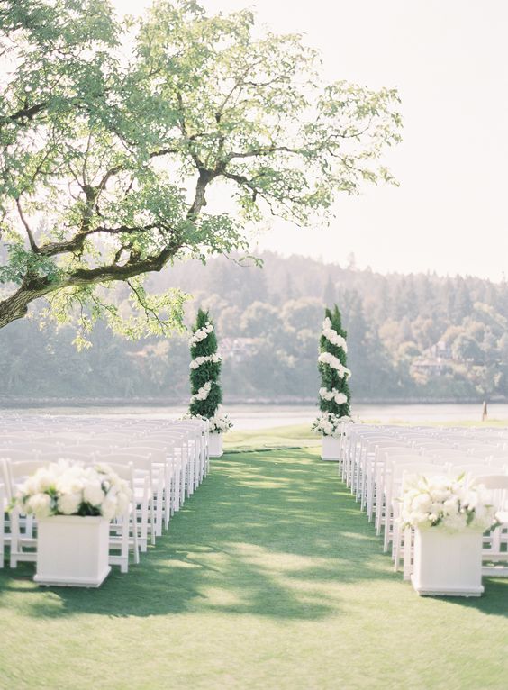
Limited information on your wedding website can not only lead to an overload of questions, but can also potentially cause some unwanted dilemmas on the day. Neglecting to cover important details like parking restrictions at your venue or the cash bar planned for your reception can put your guests in some seriously awkward predicaments.
Instead, create a list of each and every practical detail that will help your guests prepare for your day, and be sure to include them all on your wedding website. It might help to reflect on previous weddings you’ve attended, and the things you wish you’d known in advance!
This is especially important for couples planning a destination wedding, as your guests will have even more questions regarding things like travel and accommodation. It might take a little more time and research on your end to provide them with some additional information, but it will save you having to deal with multiple back-and-forth phone calls in the lead up to your big day!
Oversharing
Your wedding website is a great way to give guests some insight into the relationship between you and your partner as you celebrate this exciting milestone. But be careful to avoid oversharing when it comes to personal information!
Remember that your wedding website is ultimately an information hub for your guests. By all means, use your wedding website to take a trip down memory lane and reflect on your journey as a couple – but try to find the right balance when sharing personal details, to avoid making your guests uncomfortable.
When it comes to the personal sections of your wedding website, it’s best to keep things short and sweet. A few paragraphs detailing how you met and some of your favourite experiences as a couple is the perfect way to give your guests an inside look at your relationship. But a 5-page memoir including a minute by minute breakdown of your first date is probably not necessary!
The same rule applies when it comes to photo and video sharing. A selection of your favourite snaps together will definitely set the tone for your upcoming nuptials, but a complete photo album of your recent trip to Europe is best saved for social media.
Keep in mind that your wedding website will be shared with all of your guests, from work colleagues to plus ones and extended family. Even if you and your partner are an affectionate couple, try to avoid making your wedding website too “mushy” and consider saving these sentiments for your vows, instead!
Using the Wrong Tone of Voice
Clear communication is absolutely crucial when it comes to sharing information on your wedding website. But while you do want to set the right expectations, you should also be conscious of the tone of voice you use to ensure your information is received the right way.
Consider your wedding website wording and tone of voice when it comes to addressing details like kids or plus one. In today’s digital world, tone of voice can be tricky to determine online. For example, while the phrase “no kids allowed!” could come across in a playful, joking way in person, it might be interpreted as rude or demanding on your wedding website without any context.
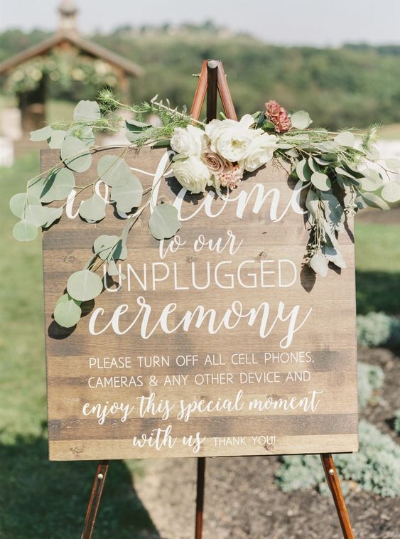
You should also be tactful with topics like your wedding day dress code, unplugged ceremony, or registry information. Instead of making a blunt statement like “No phones allowed”, consider a phrase like “Please switch off your devices during our ceremony to be truly present with us!”.
Stick to a positive, warm and considerate tone of voice throughout your wedding website, to avoid causing tension with guests. You can refer to our wedding website wording examples for tricky situations for some helpful templates and tips for clear communication.
Sharing Private Event Details
Your wedding day will likely come hand-in-hand with some separate celebrations, like your hen’s party, rehearsal dinner or recovery lunch. But your wedding website is definitely not the right platform when it comes to sharing the details of any private events!
Keep your wedding website limited only to information that relates to all of your guests. Organising private events on your wedding website can feel awkward and excluding to those who aren’t invited. On the other hand, it may even be interpreted as an open invitation, leading to some unexpected attendees on the day!
The most appropriate etiquette is to use alternate methods of communication like text or word of mouth to organise any separate events. The last thing you want to do is ruffle any feathers or hurt anybody’s feelings before your wedding.
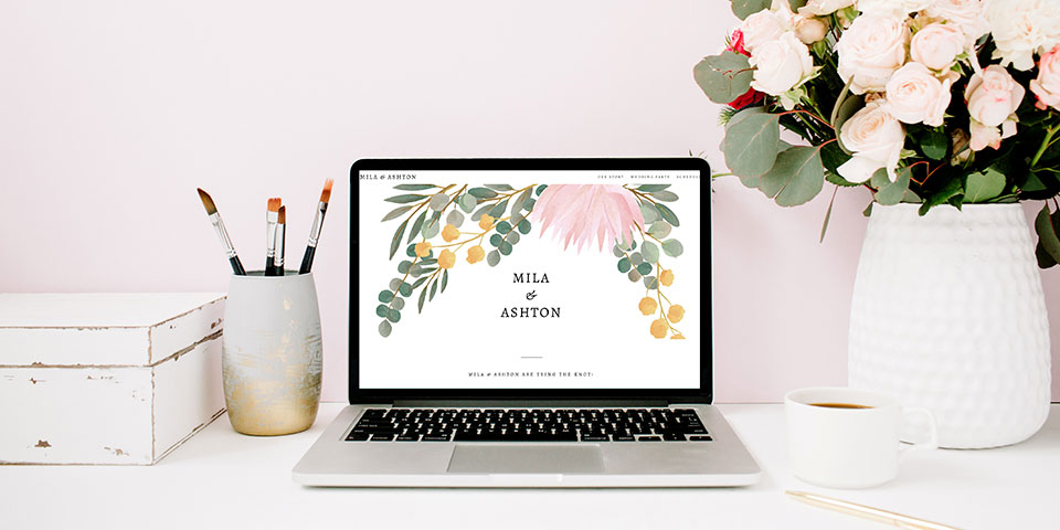
Confusing Website Design
Above all else, your wedding website should be a helpful resource for guests. If the design of your website isn’t user-friendly, this can lead to a whole lot of confusion and defeat the purpose of your wedding website in the first place!
When creating your wedding website, make sure that your layout is easy to navigate. Try to avoid using too many clashing fonts, contrasting colours or crazy graphics – sometimes the best option is to keep things clean and simple.
Your wedding website design should also make it easy for guests to find critical information like your RSVP section or venue location details. You don’t need to be a graphic designer or even have a creative bone in your body to create a beautiful wedding website – these days, you can take advantage of customisable templates with the hard work already done for you!
Once you’ve created your wedding website, consider getting a close friend or family member to read over it and navigate their way through each page. They should be able to let you know immediately if they find your wedding website confusing, or if anything was hard to find. It can be easy to overthink things, so a second opinion with a pair of fresh eyes can often help to spot any critical errors!
Lack of Personality
Practical details aside, your wedding website is your first point of contact with guests, and a way to set the tone for your upcoming celebration. A dull, boring wedding website with no sense of personality is not exactly going to build excitement for the day!
Think about some creative ways you can put your own personal stamp on your wedding website design. If you guys are a playful, fun-loving couple, why not organise a quirky engagement shoot and share the photos on your website? Or, if you have a passion for the arts, consider creating a custom illustration or personalised wedding motif.
The possibilities are endless – you can check out some of our favourite ways to get creative with your wedding website to help you design something truly unique!
Embarrassing Your Bridal Party
Introducing your bridal party via your wedding website allows you to break the ice and provide your guests with some familiar faces before the big day. But remember, your wedding website is a public platform, so embarrassing your bridal party is a definite no-no!
When writing your bridal party bios, keep things light-hearted and humorous without overstepping any lines. Although you might be comfortable sharing inside jokes and reflecting on funny memories in person, the members of your bridal party might not appreciate their embarrassing stories being made public to all 150 of your guests!
Think twice before sharing any stories or personal details in your bridal party bios that may not be appropriate for your wedding website. You might even want to send through each bio to your bridal party members in advance to double check that they’re 100% comfortable with it.
Steer Clear of Confusion
Wedding websites are seriously worth their weight in gold, helping to streamline the communication process and ensuring your guests are well-prepared for your special day.
Which is why it’s so important to include the right details (and steer clear of the wrong ones) to create a truly effective platform that doesn’t cause any confusion!
From the wording you use to the navigation of your site, simply keep these 7 common mistakes in mind to help you create a practical, engaging and valuable resource that both you and your guests can appreciate!