 Web Development
 Managed Hosting & Maintenance
 Fractional CTO

 Guide
Guide
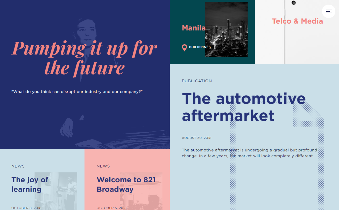
If you’re like most designers, you’ll agree that having a solid grid system is foundational to good UI design. It lets you establish order and hierarchy and gives you a structured foundation from which to build. Not to mention, UI designs based on grid systems accommodate all screen sizes and make the design process smooth for the entire team.
Of course, that’s not to say that it doesn’t have clear disadvantages. Grid systems (quite literally) impose rigid guidelines that hinder creativity and design thinking. As a result, it’s common to end up with designs that feel like copy-paste jobs.
It’s somewhat of a catch-22: designers can’t do without a grid system because it would cause problems later on in the design process but designing within the constraints of a rigid grid leads to monotonous, templatic designs.
With this in mind, in this article, we’ll take a closer look at what grids are, why designers use them, and when you should seriously consider breaking out of the grid. We’ll also share some of the ways you can accomplish just that along with examples of websites that feature broken grid designs.
Let’s begin.
Understanding grids and grid systems
In the context of UI design, grids are used to create symmetry by breaking up the page into proportional sections. Before we show you how to break out of the grid effectively, let’s quickly learn a little more about what grids are, what people use them for, and the benefits and drawbacks of using them in UI design.
What are grids?
In its simplest form, a grid is a network of lines that cross each other to form a series of squares. In design, grids are used to divide pages vertically and horizontally into columns and inter-column spaces (also called gutters).
Essentially, they provide a framework that dictates how to organize elements on a page. They ensure all UI elements – like navigation menus, images, text boxes and headlines – are arranged, spaced, and sized relative to each other by providing guidelines.
The great thing about grids is that they’re useful for designers, developers and users.
Grids contribute to your site’s content accessibility by subtly guiding the viewer from one section to the next helping them find the information for which they’re looking. They help designers establish a firm foundation that allows them to arrange elements in an intuitive order. At the same time, they can also be used to draw attention to specific elements. Finally, having a solid grid in place makes it easy for developers to translate a design into a functional website.
As we briefly mentioned before, the grid has the potential to restrict creativity.
The grid can be incredibly overwhelming and limiting to designers who are new to designing with grid systems. Once they set grid guidelines up on their canvas, it prevents them from thinking outside the box. Another problem designers have with grid systems is that they can be pretty tricky to get the hang of. Usually, establishing a grid with gutters involves a lot of careful calculations.
Types of grid systems
There are four main types of grid systems that designers use both in web design and print. These include manuscript grids, column grids, modular grids and hierarchical grids.
“The grid system is an aid, not a guarantee. It permits a number of possible uses, and each designer can look for a solution appropriate to his personal style. But one must learn how to use the grid; it is an art that requires practice.” – Josef Muller-Brockmann
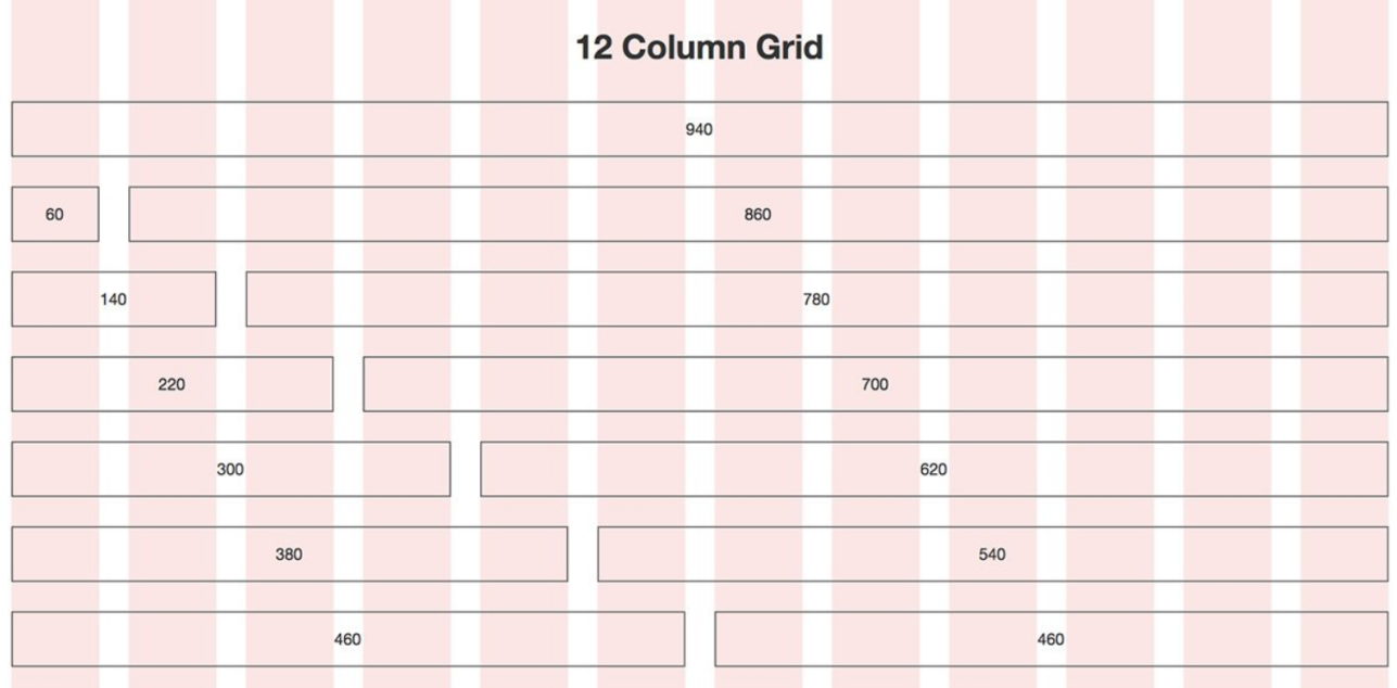
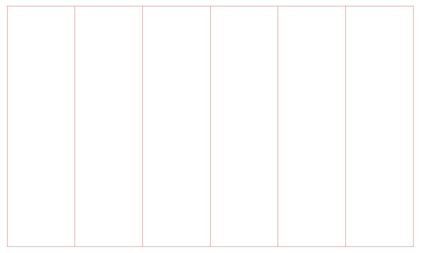
The column grid is the grid system that’s used the most in web design. It splits the page into multiple columns (the number of columns depends on the grid system you’re using).
Some of the most popular grid systems include the 960 grid, the Blueprint grid, and the 1200px grid system. The 960 grid, for example, is based on a width of 960px and can be used as:
- 12-column grid divided into 60px increments with 20px gutters.
- 16-column grid divided into 40px increments with 20px gutters.
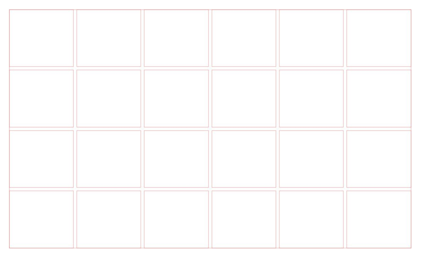
Some designers prefer to use a column and row grid (called a 2D grid or modular grid).
State of grid systems in UI design tools
The tools web developers use to build websites offer features that help manage screen layout complexity. However, that’s not the same for UI design tools. The problem is that designers — not developers — should ideally make layout decisions.
Grid systems in UI design tools (like Photoshop and Sketch) offer basic functionality: snap-alignment and guidelines. The entire grid is simply a network of lines that overlay the artboard or canvas, and designers can snap UI elements to these guidelines. Unfortunately, that’s the extent of the functionality on offer with most UI design tools.
Instead, the UI elements should have a formal relationship to the grid. As a designer, you should be able to use rules to arrange elements. For example, an instruction like start at column 5, span 4 should be enough to establish the element-grid relationship. The benefit here is that, even if the grid changes, the element’s arrangement, size, and alignment will remain the same relative to the grid.
In addition to this, UI design tools should:
- Accommodate responsive design. UI design tools should allow designers to specify grid dimensions in percentages, not just pixels. Doing so makes it possible to build responsive grids quickly without having to do many careful calculations. It also makes it easier to understand how a grid will work across devices with different screen sizes and orientations.
- Allow 2D/modular and nested/hierarchical grids. While column grids cover many use cases, sometimes a design requires modular or hierarchical grid systems. Modular grids, for example, are used for newspaper layouts, masonry layouts (like Instagram), and for designing interfaces with forms and schedules.
- Make prototyping easy. Designers should be able to define grids without having to use a calculator. This would make it easier to experiment with several different design ideas and concepts early on in the project.
When to break out of the grid system (and when not to)
Using the grid is one of the many ways you can enhance your layouts. However, breaking out of a grid can introduce creativity, contrast, and dynamism into your designs.
Grids don’t define hard rules; they’re simply guides. Think of it this way: it’s much easier to break out of the grid with certain UI elements (or on certain pages) rather than arranging elements without a clearly defined structure from the outset.
“Once the grid is established, it is up to the designer when and how to break out of it. This doesn’t mean the grid system will be completely ignored. Instead, elements may cross over from column to column, extend to the end of the page, or extend onto adjacent pages. Breaking out of the grid can lead to the most interesting page designs.” – Jim Krause, Design Basics Index
Grid systems guide design decisions and facilitate creativity because of their inherent rigidity. The restrictions grids impose help you build your design and make it easy to determine when you need to break out of the grid.
Let’s take a look at an example:
When a client defines design constraints, like including a banner ad above the fold on your homepage, you have the option to (1) build your design grid around the ad’s dimensions or (2) create a design with your grid system and break the grid to position the ad as per the client’s requirements.
In this scenario, it’s easier to begin designing with your existing grid system and break the grid when you’re positioning the ad in it.
Simply put, you should follow your design instinct and break out of the grid whenever the design needs it.
10 Ways to break out of the grid
Approaching the grid as a set of guidelines, instead of hard rules, opens up the opportunity to try something different while maintaining a solid foundation. Here are some of the ways you can effectively break out of the grid:
#1: Animation effects
Adding subtle animation effects to your UI designs lets you break out of the grid and introduce some dynamism into your projects. You can use animations to make an element stand out, provide visual delight, encourage interaction and user engagement, or offer contextual help.
Here are some examples:
Example: Deer Run Media
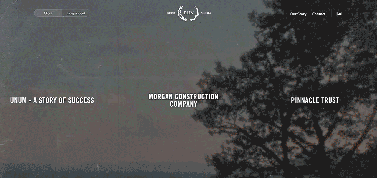
At first glance, the Deer Run Media homepage looks like it follows a strict grid. However, if you hover over the large content boxes, they’ll slide smoothly from side to side based on your mouse movement.
Example: Leeroy
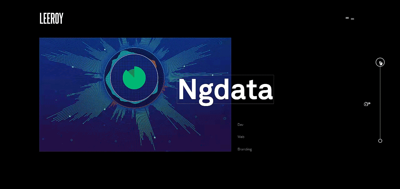
This creative agency’s website encourages visitors to drag the scroll bar down to view the company’s portfolio. Each portfolio item appears with a zoom-and-slide animation that’s designed to break the grid and draw in the viewer’s attention.
Example: Femme and Fierce
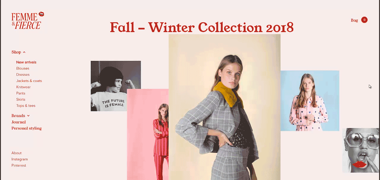
The photos on the Femme & Fierce online store’s homepage break out of the grid as you scroll down the screen. It’s a neat way to focus the visitor’s attention on the products and provide visual delight at the same time.
#2: Parallax scrolling
If you’re following a modular grid system, you can break your UI design’s horizontal grid using parallax scrolling. Parallax scrolling effects make it look like the background of the web page is moving slower than the foreground. This creates a 3D effect as the user scrolls down the page while maintaining focus on the content.
Let’s look at some examples:
Example: A-dam Underwear
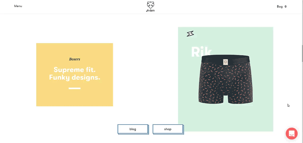
The A-dam Underwear website implements a parallax scrolling effect to break the grid horizontally. Notice how the tiny icons move across the screen as you scroll down the page? It creates visual delight and improves the website’s overall visual appeal.
Example: Myriad
The Myriad website is a great example of how you can use vertical parallax scrolling to break out of the horizontal grid and vertical grid. Take a look at how the text moves into the center of the screen and the content box moves from the bottom up when you scroll down.
#3: Layering
Overlaying images with text or icons creates a layering effect in web design that gives the appearance of UI elements breaking out of the grid. When done right, it appears as if the top layer is overlapping the grid’s guidelines. This also creates a perception of separation and depth between the layers.
Here’s a look at some examples of layered web design:
Example: Aaron Grieve
![]()

Aaron Grieve uses a layered design technique in his portfolio website to break out of the grid. Browsing through his portfolio, you’ll see how he layers text, images, icons, buttons, and background to create a visually appealing design.
Example: Artists Web

The Artists Web homepage uses a unique animation effect to layer text and a 3D image when you mouse over them. It gently breaks the grid and creates a dynamic design that’s anything but boring.
Example: Henry Cotton’s

Using animation effects isn’t the only way to use layering to break out of the grid. Henry Cotton’s, for example, simply overlays golden text on an image to give their homepage an asymmetrical look and feel.
Example: Red Collar

The Red Collar website layers text on text on image to create a grid-breaking design that’s hard to forget.
Example: Roche Musique
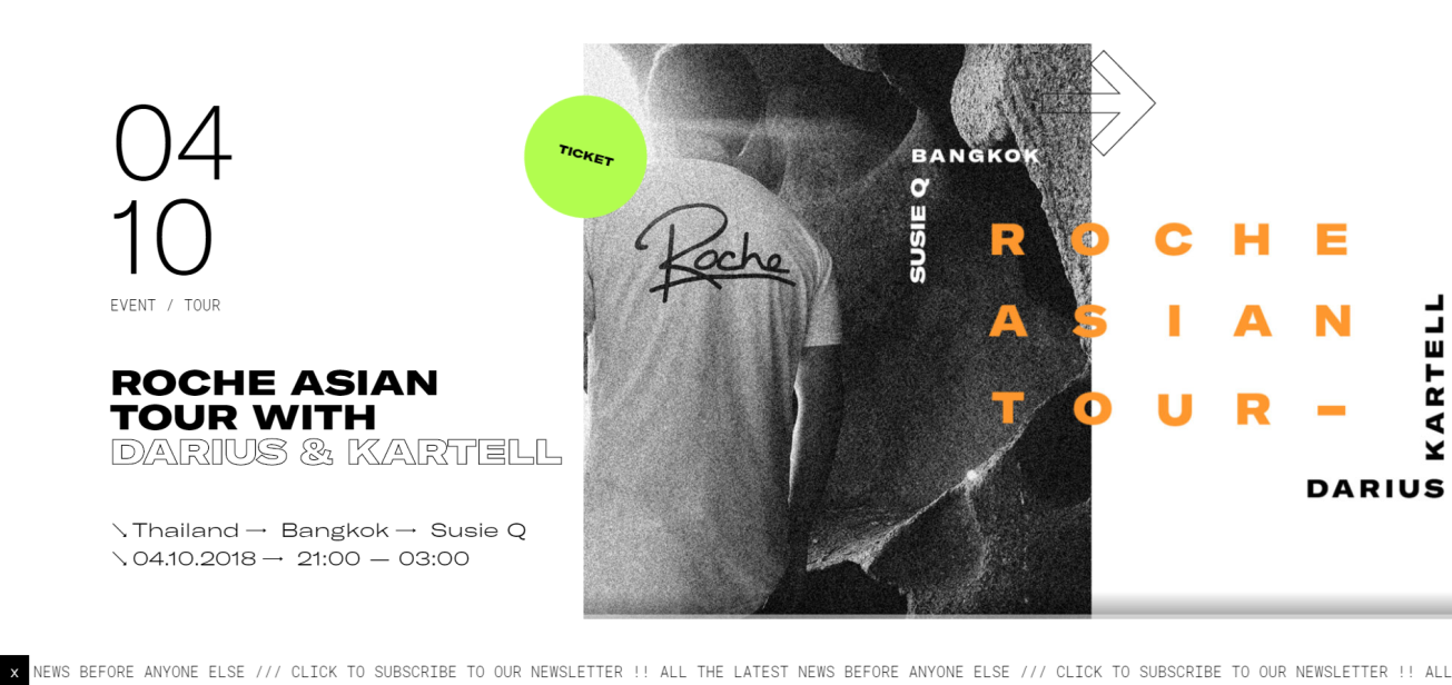
Similarly, Roche Musique overlays a badge, text, and arrow graphic on the featured image to create an asymmetrical design for its event site.
#4: Collapsing the gutters
As we mentioned above, most popular grid systems have gutters (usually 10px or 20px) that are there to create space between columns (and rows, in the case of a modular grid). They improve readability and let your design breathe. Collapsing gutters in your designs is an easy way to break out of the grid while still maintaining organization and structure.
Here are some examples of websites that create a grid-breaking design by eliminating gutter space:
Example: Johnson Banks
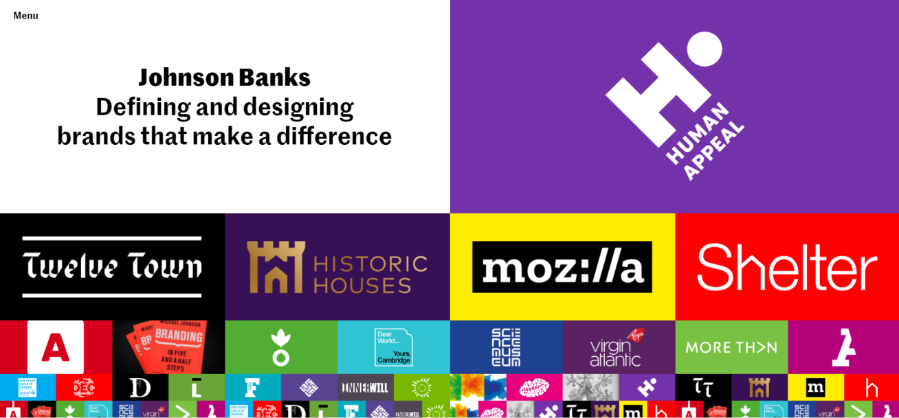
The Johnson Banks homepage uses a collapsed gutter layout to break out of the plain old grid layout. Simply eliminating gutter space allowed the designers to effectively create a 32-column design that’s incredibly visually appealing.
Example: Woodwork

Similarly, the Woodwork website has a layered, collapsed grid effect on its homepage that’s designed to showcase the portfolio.
Example: The Verge
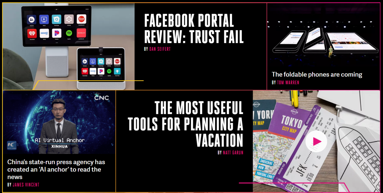
The Verge also implements a collapsed grid-like design to draw in the reader’s attention to featured articles and stories. Notice how the byline design on featured articles gives the illusion of a broken grid.
#5: Containers
Grouping elements together in a container lets you break out of the grid while maintaining cohesiveness. You could use a background image, content boxes, or layering to group elements together in container layouts.
Let’s look at some examples:
Example: Digital Horizon
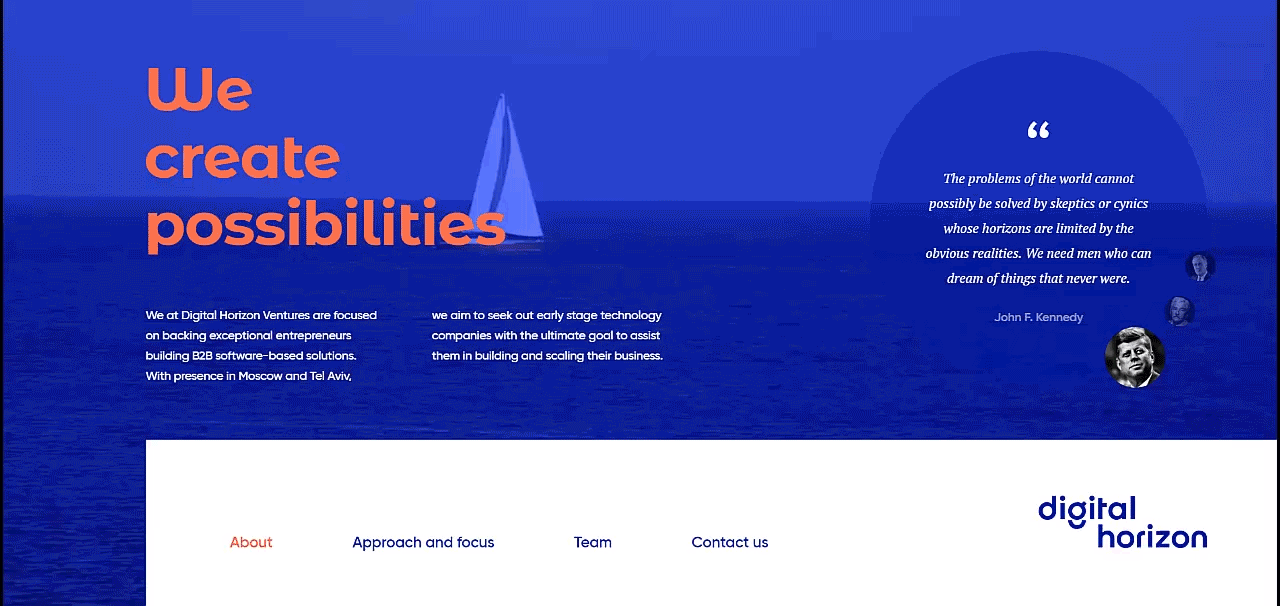
The Digital Horizon website’s homepage features a video background with text and a pull quote layered on top. And although the design clearly breaks the grid, the video background acts like a container making it look like the different elements are grouped together.
Example: Echo Aventura

Echo Aventura’s interactive homepage uses a background image as a container to display text, an interactive clock, tooltips, and buttons in a grid-breaking layout.
#6: Whitespace
Creating purposeful whitespace in your designs adds emphasis to the focus point. There are many ways to break out of the grid by adding some whitespace to your interface designs. That said, it’s important to note that breaking the grid doesn’t mean you have to forego alignment.
Here are some examples of websites that use whitespace to break out of the grid:
Example: Michael Nelson

The Michael Nelson website maintains horizontal alignment in its grid-breaking homepage that features whitespace, text, and cut-out imagery.
Example: CRRTT
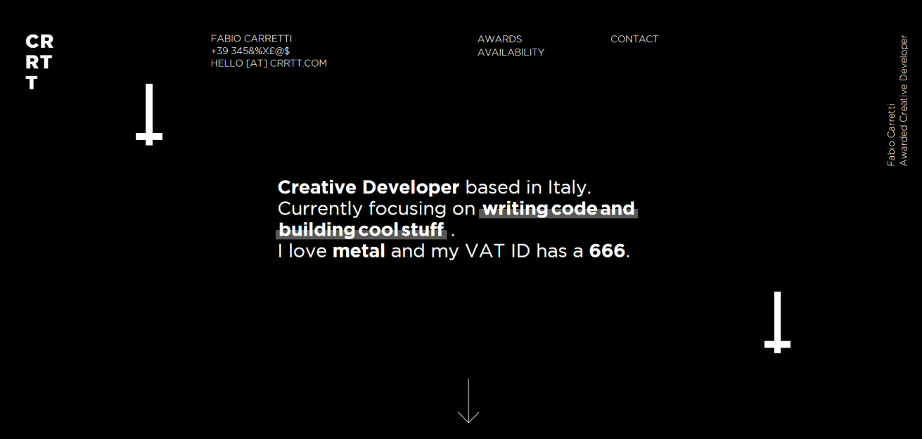
Fabio Carretti uses well-proportioned whitespace on his portfolio site to break out of the grid layout. The design establishes typographical hierarchy to improve readability.
Example: Volta Footwear
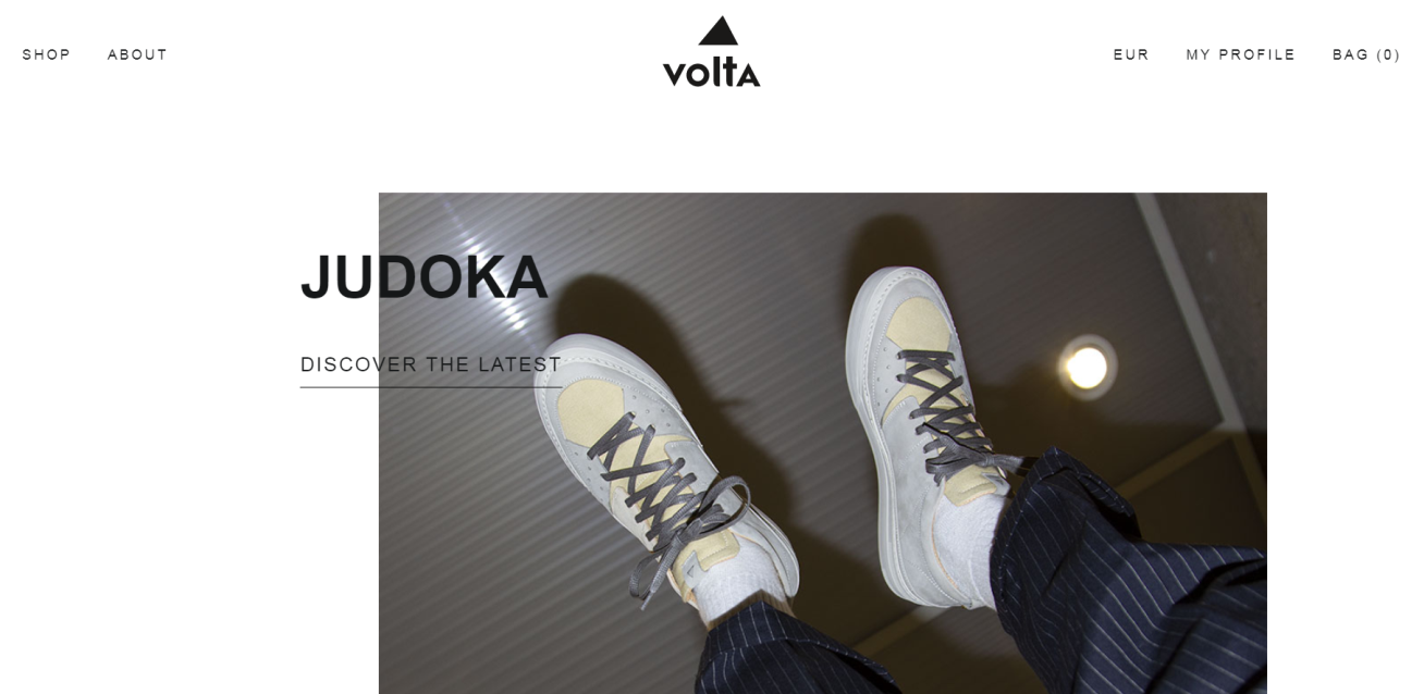
The Volta Footwear online store uses whitespace and layering techniques to break the grid above the fold. Notice how the image is slightly off center thus drawing attention to the product name and creating contrast at the same time.
#7: Accent colors and elements
Remember how we said you need first to establish a solid grid system to be able to break out of it effectively? Using accent colors and elements lets you just that. Once your UI design is ready to go, consider adding accent elements to break out of the grid.
Accent colors, for example, are excellent for encouraging visitors to interact with your site or take action. You might consider using accent colors in call to actions or other clickable elements.
Accent elements create aesthetic appeal and can help subtly guide the visitor through your content. Using absolute placements will make it so the accent elements fall outside of the grid and stick absolutely to the nearest element.
Let’s take a look at some examples:
Example: Grana
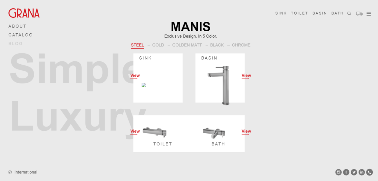
Grana uses its logo’s red color to accent the dynamic, grid-breaking View links on product images. The links encourage the viewer to click through to take a closer look at the product.
Example: Cancer Research Foundation

The Cancer Research Foundation website uses orange accent boxes to break out of the grid. It’s an attention-grabbing design element that matches the company’s brand.
Example: KOBU
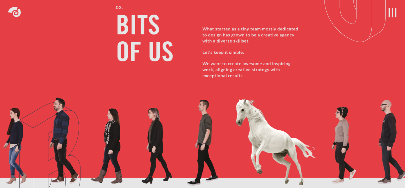
The design agency, KOBU, uses different white accent elements – including a horse – to break the horizontal grid. Together the unaligned text, feet, and hooves create an unusual design that makes the viewer scroll back up and take a second look.
Example: Global maritime forum

The Global Maritime Forum’s website uses a call to action button as the accent element to encourage the visitor to click through and learn more about their upcoming event.
#8: Typography
Getting creative with typography opens up many opportunities to break out of the grid. You can play around with different font styles, font sizes, margins, spacing, line heights and alignment. The great thing about using typography to break out of the grid is that it lets you maintain structure in your designs.
Even something as simple as altering a chunk of copy to look a little different will make the design feel like it’s breaking out of the grid.
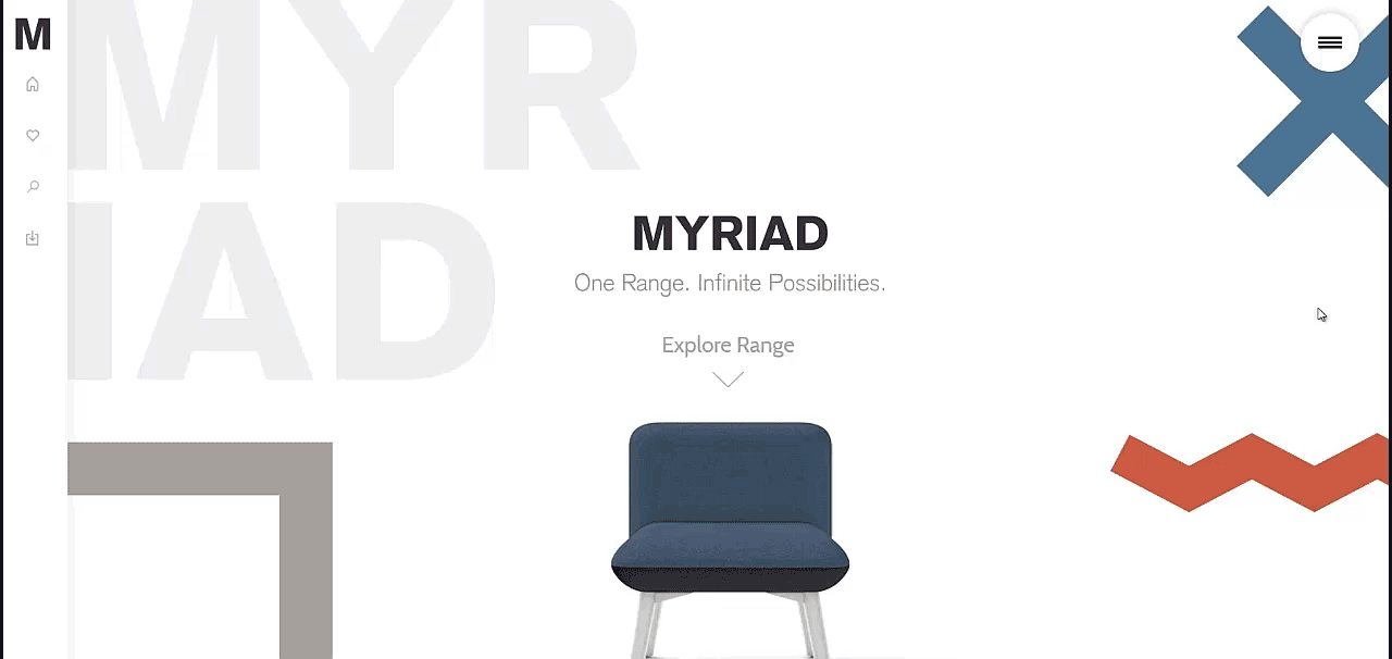
Example: M
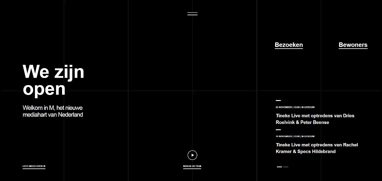
The M website quite literally uses typography (and a little animation) to create a grid-breaking design.
Example: Qvartz

Qvartz is an excellent example of how to break out of the grid with typography. The site’s design pairs a left-aligned, sans-serif typeface with a center-aligned serif typeface. And as you scroll down the page, there’ll be even more grid-breaking layouts that feature layering techniques.
Example: A Message from Earth
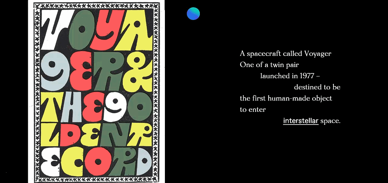 A Message from Earth is another gem of a website that uses typography to break out of the grid. It features everything from serif/sans-serif typeface pairings to different text alignments within the same paragraph.
#9: Illustration
Illustrations in web design make it easy to break out of rigid grid guidelines and create visual delight. An easy way to get started is by intentionally positioning illustrative elements in a way that overlaps the grid.
Here’s a look at some examples:
Example: Spicy No Spicy

The Spicy No Spicy website uses sketch illustrations and layering with text to create an engaging broken grid design.
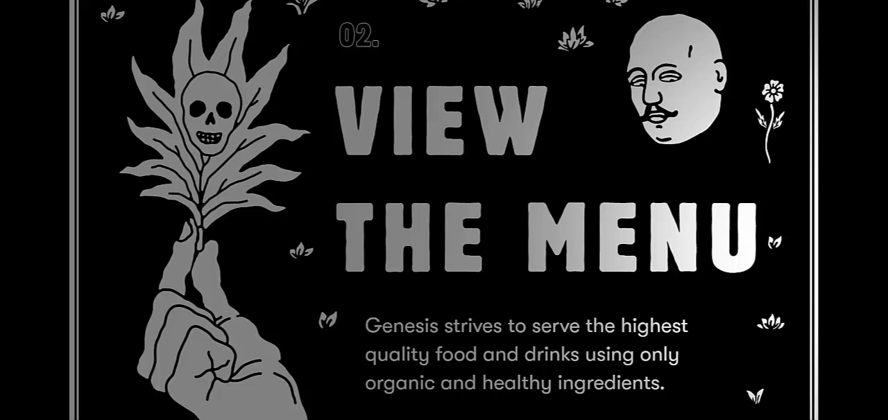
Example: Genesis
Genesis’ one-page design uses animated illustrations to create an artistic, grid-breaking design that’s difficult to forget.
Example: ESPN
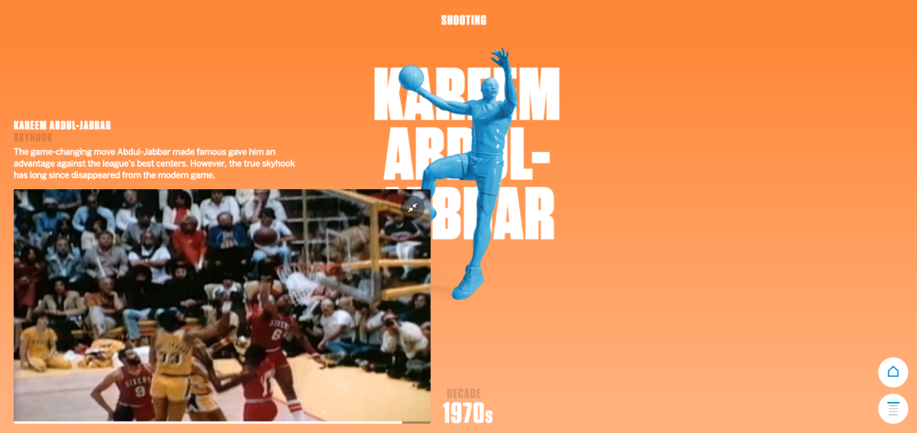
ESPN combines illustrations, text, and videos to create a fun grid-breaking website that highlights the history of basketball.
Example: Calar
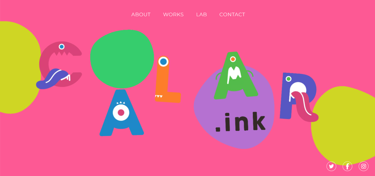
Calar uses an illustrated font to captivate the visitor’s attention and create visual delight.
#10: Pull quotes
In the context of design, pull quotes bring many possibilities to the table. You can use different typefaces, weights, alignments, formatting, and sizes to make them stand out. For similar reasons, they make for excellent grid-breaking UI elements.
Here are some examples of websites that use pull quotes to break out of the grid effectively:
Example: Paperock Creative
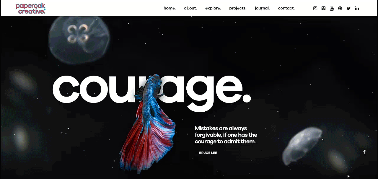
The Paperock Creative website uses pull quotes on its homepage to create a visually appealing design that also features illustrations and layering. The grid breaks more and more as you scroll down the site.
Example: The Verge
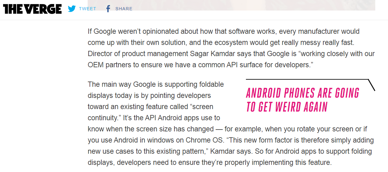
The Verge uses pull quotes to make text stand out in its articles. For online magazines and content-heavy pages, it’s an easy way to draw in the reader’s attention and deliver value to skimmers.
Example: 99designs
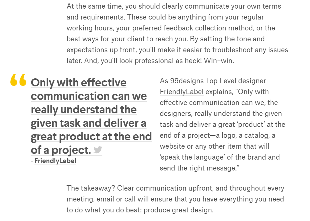
Similarly, 99designs’ underlined, tweetable pull quote grabs the reader’s attention at first glance.
Bonus: Vertical grid
You can use a simple vertical grid to break out of the horizontal grid effectively. This creates an illusion of a structured yet chaotic design. Essentially, you’re following the grid’s guidelines even if it doesn’t appear like you are.
The key benefit here is that you’re able to retain the benefits of a grid-based design while still allowing yourself some creativity.
Here’s how Agnes Lloyd-Platt achieves this on its portfolio website:
Example: Agnes Lloyd-Platt
Conclusion
The key to effectively breaking out of the grid is simple: establish a grid, create your design, and then break out of that grid.
Let’s recap some of the techniques you can use to break out of the grid:
- Adding slight animation effects breaks the grid while adding some dynamism to your interface.
- Parallax scrolling creates a 3D-like effect that creates visual delight.
- Overlaying images using layering techniques makes it look like your UI elements are crossing over the grid’s guidelines.
- Collapsing the gutters lets you create simple, grid-breaking designs.
- Using containers in your designs gives the illusion of grouped UI elements giving you the opportunity to position elements however you’d like.
- Whitespace can be used to break out of the grid and draw attention to the focus element – at the same time.
- Adding a pop of accent colors and elements is perhaps the easiest way to break out of the grid once you’ve based your UI design around one.
- Use different typefaces, font sizes, and alignments to break out of the grid using typography.
- Illustrations give you the freedom to position elements in a grid-breaking way on your artboards.
- Adding pull quotes to content-rich pages lets you break out of the grid and captivate the reader’s attention.
- Bonus: you can break out of the grid without actually doing so by using a vertical grid.
If you’re just starting, we’d recommend going with a popular grid system (like the 960 grid, the Blueprint grid, or the 1200px grid system) to get started. Once you have a solid design foundation, try implementing one of the grid-breaking techniques we covered above to create a creative and unique UI design.
With the 12-column grid, for example, there’s space for every imaginable UI element – even placements that you’ll likely only use once. This sort of implementation will appear to be breaking out of the grid every time.
What are some of your favorite grid-breaking techniques? Share your thoughts in the comments section below.
