
GIJN’s Data Journalism Top 10: History of Infographics, Colorism in Fashion, Weather Trends


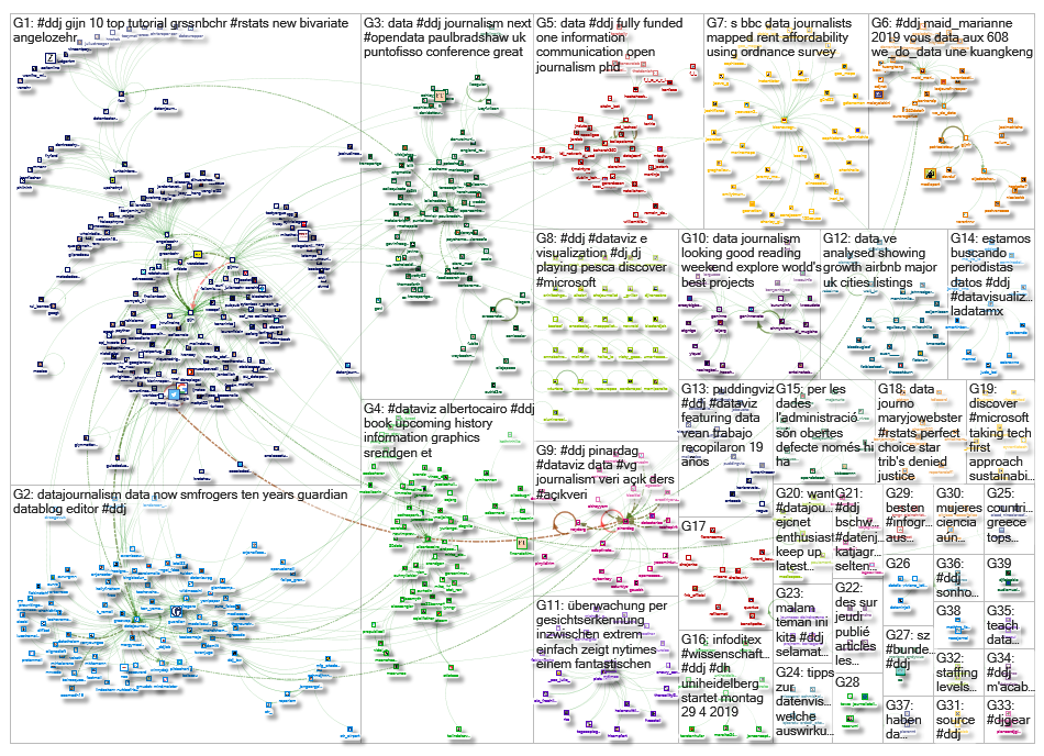
What’s the global data journalism community tweeting about this week? Our NodeXL #ddj mapping from April 22 to 28 finds an interesting breakdown of colorism in fashion by @puddingviz, a series of gorgeous maps on US natural disasters and extreme weather trends by @PostGraphics, a preview of a history book on infographics by @srendgen, and @UpshotNYT‘s recap of its best articles from the past five years.
Investigating Colorism in Fashion
Ethnic diversity in the fashion industry might be improving, but representation of dark-skinned women is still lagging behind. Data scientist Malaika Handa investigates the problem of colorism and tokenism in fashion by looking at 19 years of Vogue magazine covers.
Mapping Wicked Weather
No place in the United States is particularly insulated from natural disasters and extreme weather phenomena. In this gorgeous series of maps, Tim Meko highlights where flash floods, tornadoes, hurricanes, heat waves, cold snaps, wildfires, lightning strikes and earthquakes tend to strike. Read about his map-building process here.
History of Infographics
Visualization strategist Sandra Rendgen gives a short preview of her upcoming book “History of Information Graphics,” which will be released this month. In it, she looks at how the field of infographics and data visualization has changed and expanded in the last century, with contributions from David Rumsey, Michael Friendly, Michael Stoll and Scott Klein.
Five Years at The Upshot
To celebrate its five-year anniversary, The Upshot — The New York Times’ data-driven reporting and analysis team — showcased a selection of its most enlightening and successful stories since inception. The glorious list covers a wide range of topics, ranging from electorate issues to gender bias, medical maladies to income inequality, and more.
EIJC19 & Dataharvest
Check out the program for the European Investigative Journalism Conference & Dataharvest happening May 16 to 19 in Mechelen, Belgium. It’s chock full of juicy sessions such as tracking weapons, investigating corporate lobbying and covering religious sects.
Putting Data in Context
Data is typically collected by institutions for internal purposes and not intended to be used by journalists or others. In this piece, Catherine D’Ignazio explains how understanding that context is important and provides some examples of how not knowing the who, what, when, where, why and how of the data’s collection can lead to incorrect reporting.
White, Male and Over 60
A recent census in England of councillors (called city council members in the US) showed that a large proportion are white, male and over 60, and this makeup doesn’t look likely to change in upcoming local elections. The BBC analyzed potential candidates and found that there are almost 1,000 candidates named either David or Dave, compared to 151 candidates called Sue, the most popular female name.
Data Journalism Research
Ilo Aguiar, a PhD researcher in digital media, compiled a list of 12 academic papers on data journalism in Portugal and Brazil published in 2018. (In Portuguese.)
Python & Plotly
Plotly Express, launched in March, is a Python visualization library for rapid data exploration. It’s a wrapper around Plotly.py that exposes a simple syntax for complex charts.
DataViz Survey
As part of his research, Rodrigo Cunha, a professor at Brazil’s Federal University of Pernambuco, is conducting a survey on the relationship between readers and data professionals in digital journalism. Take five minutes to fill it in, if you please.
https://twitter.com/cunhares/status/1120728291797872641
Thanks, once again, to Marc Smith of Connected Action for gathering the links and graphing them. The Top Ten #ddj list is curated weekly.
 Eunice Au is GIJN’s program coordinator. Previously, she was a Malaysia correspondent for Singapore’s The Straits Times, and a journalist at the New Straits Times. She has also written for The Sun, Malaysian Today and Madam Chair.
For a look at Marc Smith’s mapping on #ddj on Twitter, check out this map.

This work is licensed under a Creative Commons Attribution-NoDerivatives 4.0 International License
Republish our articles for free, online or in print, under a Creative Commons license.
Republish this article
This work is licensed under a Creative Commons Attribution-NoDerivatives 4.0 International License
Read Next

Data Journalism News & Analysis
From Space to Story in Data Journalism
Over the past 10 years satellite imagery has become an important component of data journalism. In the next 10, it will likely evolve further, from a tool used primarily for illustrating stories to an integral part of research and investigative reporting.

Data Journalism
10 Outstanding Data Projects Win the 2024 Sigma Awards
There were 52 data journalism entries from 22 countries in shortlist for the 2024 Sigma Awards. Here are the top 10 winning projects.

Data Journalism Data Journalism Top 10
Trump’s Disappearing Donors, Tracking the Mars Rover, and the Ongoing Wars in Gaza and Ukraine
Our column of the best in data journalism also features stories on AI’s ability to forecast the weather, analyzing the Argentine president’s Tweetstorms, and apathetic EU voters.

Data Journalism
Updating the Inverted Pyramid of Data Journalism
Data journalist and instructor Paul Bradshaw has updated the Inverted Pyramid of Data Journalism — and brought together resources for every stage.