Examples of bad UI design are everywhere, and we've surely all wanted to hit our head against the wall when we've seen a terrible UI fail. From forms that take far too long to complete, to confusing menus and infuriating scrolling systems, there are many elements where a user interface can go wrong.
There Good user interface design improves the overall user experience. It makes the user’s interaction with an app or site simple, intuitive, efficient and fluid, so much so that when it works well, the user might not even notice it’s there. Many a team appreciates the apparently effortless simplicity of Trello’s lists to manage their pipelines, fantasy sports fans can attest to the easy digestibility of a huge amount of information in the ESPN Fantasy Sports app, and Artsy’s sleek lines and colour palettes make great design for a small handheld device look easy.
But when it goes wrong, people really notice. Bad UI can dissuade, or directly prevent, users from continuing their experience. The ten bloopers below, some comical, some just plain annoying, can all teach us something, even if it's just what to avoid.
For pointers on how to get it right, see our expert guide to the things you need to consider when designing a UI. And remember that bad UI can sometimes be a result of poor prototyping and testing, so make sure you see our round-ups of the best UI prototyping tools and our tips for UX research and testing.
You might want a refresher on the difference between UI vs UX. And finally, if you want to learn more about UI and UX, consider signing up for our online UX design course, UX Design Foundations.
01. Want 120 eggs with that?

A fundamental of UI design is to choose the right tool for the job, which should normally mean respecting existing conventions and employing control elements in a way that users are already familiar with. So perhaps you’re training like Rocky Balboa and really do want to add an extraordinary number of eggs to your order, but checkboxes? The legend appears to prohibit the ordering of 120 eggs, because of course that would be ridiculous, but the fact that they’ve had to say that demonstrates that perhaps the wrong tool has been used.
What if I told you there was a better way to design this UI? pic.twitter.com/tvxeluJF9NMay 13, 2019
Checkboxes are used for when we can mark more than one option, and radio buttons for when only one choice is allowed, although perhaps here a plus and minus button may have worked better. Either way, we’re even more disappointed that there’s no discount for ordering 15 eggs.
Get the Creative Bloq Newsletter
Daily design news, reviews, how-tos and more, as picked by the editors.
02. Change your phone number to use our service

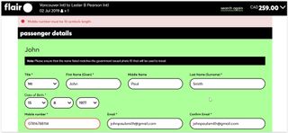
There are cases when you may want to cater solely to users from one geographical region with its own specific formatting conventions, but the website of an airline operating out of several international airports is probably not one of them. In this example from Canada’s Flair Airlines, if you’re from a country where phone numbers have more or fewer than 10 digits, you have no choice but to enter a false number. Although, since there’s no field for a country code, they won’t be able to call you anyway.
When designing a UI for anything that will have – or could gain – users from multiple regions, make sure use isn’t constrained by local naming and numbering conventions. Adapt to users rather than forcing them to adapt to your interface.
03. How do you say 'switch language' in Chinese?

So you go online during a trip abroad and you’re greeted by something like this. Where do you look first? Top right? Nothing there. Top left? Nope. Your third guess might have you scroll all the way down to the bottom in search for anything that looks like a dropdown menu, and in this case, that’s where you’ll find the language option. But considering that changing the language is the first thing you’re going to want to do if you end up on a site that you can’t read, it probably makes sense to make that option as easy to find as possible, and ideally selectable before having to perform any other action such as logging in.
A globe icon or the language icon designed by Farhat Datta may help people find the option. Whatever you do, just don’t use flags to represent languages unless you want to upset an awful lot of people.
04. When clarification obscures
@Homeburger this is breaking my brain;Uncheck no lettuce to remove lettuce.So checked No lettuce means lettuce? pic.twitter.com/1Z3vt8lR1UMarch 12, 2019
We’re all perfectly used to marking checkboxes to add things, and clicking checkboxes to say we don’t want things is by no means beyond us, so on the face of it, there shouldn’t be much room to mess this up, but here, Homeburger’s attempt to explain the process just leaves us baffled. You have to uncheck the thing you don’t want in order to not get it? Beware of ambiguity, but also beware of attempts to avoid it that just make things more complex.
05. Can we fit anything else in here?

There’s nothing like a cluttered interface to make a user feel from the outset that they’re in for a painful experience, and unfortunately, there’s no shortage of examples of big players with overly busy UI design that hurts the eyes and takes too long to navigate.
Few people are mourning the death of Apple’s iTunes, while many big name online stores (including Amazon) continue to throw in everything and the kitchen sink on to their shopfront in a way that hardly facilitates navigation. Even the application of colour theory and wise use of contrast can do little to make an overly cluttered UI look more appealing, so make sure you pare it back. But don't go too far, there’s also danger in going to the other extreme of absolute minimalism. The options still need to be findable.
06. Death by dropdown

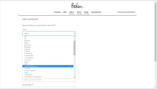
Everyone hates dropdowns, so it’s perhaps strange that some UI designers still haven’t realised this. When it comes to filling in online forms, there are few things more frustrating than having to find your country if it’s at the bottom of the list, or choose your year of birth rather than simply type it in, which just seems a perverse form of torture for the young or old, and one that’s no more likely to prevent someone from making a mistake.
This example from Boden is at least entertaining, if a little deflating to anyone lacking a fancy title – there’s not option of Mx we notice. Perhaps the broader lesson in this example is that sometimes you have to stop and ask, is this even necessary? Just pity all the wing commanders out there who have to scroll all the way down the bottom of the list.
And if you want to know more about designing forms, see our post on 6 form patterns and when to use them.
07. Waiting around

Animation and novel ways of interaction have been heralded as a way of producing a delightful experiences, but let’s make sure they don’t become an excuse for designers to show off. Remember that while look and feel is important, the core of a great UI is function: Even something as innocent as Twitter’s 'like' button animation earned vitriol for being annoying and childish, and while a playful loading icon can raise a smile first time round, it will have people hating it if they have to see it too often.
Any unnecessary interaction that creates friction in using the UI can be just as irksome. KLM’s iFly50.com showcase of 50 travel destinations has some great imagery but is anyone really going to hold down a button for several seconds each time they want to see more information? Avoid adding friction unless the point is to put users off performing an action.
08. Say what?
Hey @teamweek your new mint colour is cool looking, but it makes your button unreadable with a white label. A UI fix is required! #usability pic.twitter.com/ih1n8no7s7January 10, 2018
Bright, and even fluorescent colours have become a bit of a trend in UIs and they can be very effective in making content look sharp and stand out, but remember that text needs to readable. Teamweek's mint green looks a treat, but it’s not so easy to read white text on a mint green button.
Colour isn’t the only cause of readability fails. The trend towards lower contrast may aim to be easier on the eye, but it doesn’t help if you have to strain to read the type, while fine fonts and unresponsive sites can also hurt users’ eyes. Check text is easy to read, and check it can be read on different devices.
And if you are looking for your dream font, then don't miss our list of free fonts.
09. Thinning out content

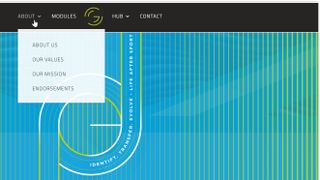
Is someone really going to want to enter separately into 'about us', 'our values' AND 'our mission'? These might be separate concepts in the eyes of the company but it seems unlikely that a user would want to enter to one of them specifically, and why make the user go through five clicks to get the whole story? This example from The Grit immediately looks like thin content that would be better merged together, otherwise a user may not read any of it.
10. Shame on you!

Confirmation shaming is not big and it’s not clever. This example from Paleo Flourish is one of the more aggressive in a trend of shaming website modals. Occasionally, it can be done in a humorous way, but in general insulting your target audience by forcing them to choose between 'Go on then', or 'No, I prefer to remain a sad, lonely, loser, thanks' is no way to win them round.
Read more:


