The Scientific Case for Two Spaces After a Period
A new study proves that half of people are correct. The other is also correct.
This is a time of much division. Families and communities are splintered by polarizing narratives. Outrage surrounds geopolitical discourse—so much so that anxiety often becomes a sort of white noise, making it increasingly difficult to trigger intense, acute anger. The effect can be desensitizing, like driving 60 miles per hour and losing hold of the reality that a minor error could result in instant death.
One thing that apparently still has the power to infuriate people, though, is how many spaces should be used after a period at the end of an English sentence.
The war is alive again of late because a study that came out this month from Skidmore College. The study is, somehow, the first to look specifically at this question. It is titled: “Are Two Spaces Better Than One? The Effect of Spacing Following Periods and Commas During Reading.”
It appears in the current issue of the journal Attention, Perception, and Psychophysics. As best I can tell, psychophysics is a word; the Rochester Institute of Technology defines it as the “study of the relationship between stimuli (specified in physical terms) and the sensations and perceptions evoked by these stimuli.” The researchers are also real. Rebecca Johnson, an associate professor in Skidmore’s department of psychology, led the team. Her expertise is in the cognitive processes underlying reading. As Johnson told me, “Our data suggest that all readers benefit from having two spaces after periods.”
“Increased spacing has been shown to help facilitate processing in a number of other reading studies,” Johnson explained to me by email, using two spaces after each period. “Removing the spaces between words altogether drastically hurts our ability to read fluently, and increasing the amount of space between words helps us process the text.”
In the Skidmore study, among people who write with two spaces after periods—“two-spacers”—there was an increase in reading speed of 3 percent when reading text with two spaces following periods, as compared to one. This is, Johnson points out, an average of nine additional words per minute above their performance “under the one-space conditions.”
This is a small difference, though if a change like this saved even a tiny amount of time, or prevented a tiny amount of miscommunication, the net benefit across billions of people could be enormous. Entire economies could be made or broken, wars won or lost.
Or so it would seem. The conclusions she drew from that data pushed people into their corners on social media, where they dealt with it in variously intense ways.
Justin Wolfers, a professor of economics and public policy at the University of Michigan, tweeted in reference to the study: “Science can blow your mind sometimes, and this time it has come down on the side of two spaces after a period.”
Nicholas Christakis, a professor at Yale University, wrote: “Hurray! Science vindicates my longstanding practice, learned at age 12, of using TWO SPACES after periods in text. NOT ONE SPACE. Text is easier to read that way. Of course, on Twitter, I use one space, given 280 characters.”
There’s a lot going on in that tweet, but you get the idea.
Others were less ecstatic. Robert VerBruggen, the deputy managing editor at National Review, shared the study with the comment: “New facts forced me to change my mind about drug legalization but I just don’t think I can do this.”
My colleague Ian Bogost tweeted simply, “This is terrorism.”
Full disclosure: I also shared a screenshot of the study’s conclusion that “the eye-movement record suggested that initial processing of the text was facilitated when periods were followed by two spaces.” I said about this only, “Oh no.”
I find two spaces after a period unsettling, like seeing a person who never blinks or still has their phone’s keyboard sound effects on. I plan to teach my kids never to reply to messages from people who put two spaces after a period. I want this study’s conclusion to be untrue—to uncover some error in the methodology, or some scandal that discredits the researchers or the university or the entire field of psychophysics.
So let’s look for that. Because this really does matter: In a time of greater and greater screen time, and more and more consumption of media, how do we optimize the information-delivery process?
In much the same way that we’re taught to write in straight lines from left to right, most of us have been taught that one way of spacing is simply right, and the other is wrong. Less often are we taught to question the standard—whether it makes sense, or whether it should change. But what is the value of education if not to teach children to question the status quo, and to act in deliberate ways that they can justify with sound, rational arguments?
Such an argument is extremely difficult to make when it comes to sentence spacing, because the evidence is not there for either case. The fact that the scientifically optimal number of spaces hasn’t been well studied was odd to Johnson, given the strength of people’s feelings on the subject. The new American Psychological Association style guidelines came out recently, and they had changed from one space to two spaces following periods because they claimed it “increased the readability of the text.” This galled Johnson: “Here we had a manual written to teach us how to write scientifically that was making claims that were not backed with empirical evidence!”
She was intrigued and designed the new study “to add some scientific data to the conversation.”
Her rationale for two spaces gets complex—verging into the domain of rather high-level psychophysical theory (email me). As the researchers explain it, it’s all about mechanics of the eye, and what causes us to trip up or pause, even for a split second. In the current study, when text was presented with two spaces after periods, some readers’ eyes were more likely to jump over the “punctuation region” and spend less unnecessary time fixated on it. The extra space seemed to make it easier for readers to “extract the lines and curves from the text.” The space also comes into the periphery of one’s vision before it arrives, and that helps to signal that the sentence is wrapping up.
The Skidmore study was small and less than definitive—essentially dipping a toe into a long-unquestioned practice. There were only 60 subjects, and they were all college students—meaning they were probably more interested in “hooking up” and “Snapchat” than actually reading. (Ed.: This is too much editorializing, apologies.)
Most importantly, the effects appeared early in processing, and spacing did not affect overall comprehension. And that’s what reading is all about, no? The fact that our eyes may move a little faster is less important than whether the concepts make it into our brains.
“It’s not like people COULDN’T understand the text when only one space was used after the periods,” Johnson said. “The [human] reading system is pretty flexible, and we can comprehend written material regardless of whether it is narrowly or widely spaced.”
Angela Chen at The Verge also gave a pointed critique of the methodology:
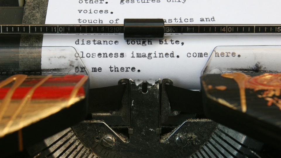
The two-space convention is left over from the days of typewriters. Typewriters allot the same amount of space for every character, so a narrow character like i gets as much as a wider character like w. (This is called a mono-spaced font.) With a typewriter, it makes sense to add an extra space to make it clear that the sentence has ended. Today’s word-processing software makes fonts proportional, though, which is why we only need one space. Also, it looks better. The Chicago Manual of Style and the Modern Language Association Style Manual also take this stance.
“I’ve gotten a lot of flak for using a mono-spaced font (Courier New) in the study,” said Johnson. Her defense is that most eye-tracking studies use monospaced fonts, and that many word-processing systems still, in practice, act like typewriters (in that they don’t add additional space between sentences even when using proportional fonts; to increase the amount of space between sentences relative to the amount of space between any two words within the sentence, two physical spaces are still needed following the period). “Although I agree that future research should look at these effects using other types of fonts, research in this area suggests that font differences in general are small or nonexistent.”
Even in the studies where researchers have removed interword spaces altogether, reading comprehension is still very high. For example, Thai and Chinese are typically written without spaces between words, even though studies have found that when space is added between words, reading speed increases. The standard comes down to aesthetics, tradition, conservation of paper and space—basically, the fact that reading is an act of much more than information delivery.
Recommended Reading


I’ve written before about the effect of color gradients on reading, and how it goes against the findings of science that our words should be in a single color, usually black and usually on a near-white background, and usually presented in lines of a certain length. This is all a matter of tradition and style, not optimal information transfer. This standard does not work well for everyone. It’s why I thought, for a long time, that I didn’t like books. I wasn’t good at the mechanics of reading. When I found text-to-speech programs and actual audiobooks, it was like finally seeing the turtle in one of those Magic Eye posters that everyone else at the party saw hours ago.
All of this is to say that if we really wanted to do evidence-based delivery of text for maximum comprehension, it wouldn’t be like debating one space or two. It would look totally different: words spewing into your face by some sort of torrent that syncs with feedback about your perception, and slows or pauses when you are distracted, and speeds up when you are bored.
Still, this has been a good exercise in challenging beliefs, at least for me. What is important is that this question not be what breaks us—that Americans remember that we are united by the ideals of democracy, freedom, liberty, and justice that we still hold dear, and which demand our allegiance above any person or party or spacing issue.