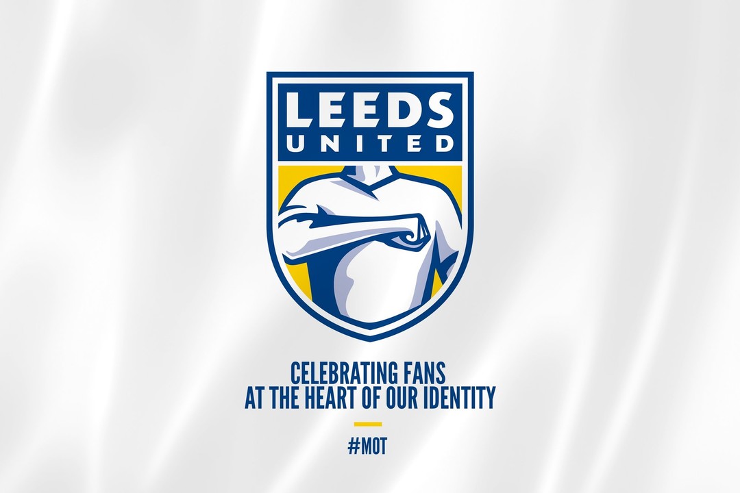
An air shot of a logo
This is Leeds United Football Club's new logo. This is so derisible that I was nervous about commenting on it in case it's a wind-up.
As I make my living from creative communications, I'm trying to figure out why it's so bad & the subject of such vitriol online. Other than, in my opinion, it looks terrible among the pantheon of great club crests, I suspect it's because they're answering the wrong question.
The strap line is an attempt to qualify the redesign: "Celebrating fans at the heart of our identity".
Okaaaay… However, it's all well & good wanting to put the fans at the heart of the club, it's just that this isn't the place for such a noble ambition.
While fans often carry ideas & opinions far above their pay grade, they don't follow football because they're egotists & need to be put on a pedestal, they follow football because they want to celebrate something transcendent, something beyond their reach – individually or collectively – whether it's the magic of football played at its best, the mesmerising drama & theatre of competition, or the glory of winning games & trophies.
In other words, this badge sets the bar far too low. Fans want something to look up to celebrate, not themselves! How is it that no-one at LUFC realised this??
So while there is at least some attempt at embedding values in this visual identity (most noticeably pride) the problem here is that there is no aspiration to this approach. There's no expression of vision; of a brighter future to be grasped. And there's no allusion to the club's fine pedigree & fantastic history giving it context & gravitas.
In short, if this logo was a penalty kick, it'd be an air shot…
Owner at Brother
5yIn the main, football fans tend to be traditionalists who are resistant to change. And superstition runs deep for fans and players alike. Change things at your peril. Henrik confesses a lack of interest in sport and arguably this could be levelled at Leeds owners for arriving at this tub-thumping, badge-kissing solution with uncomfortable fascist overtones. It's like the brief was 'illustrate pride' rather than give the fans something they would be proud to wear. When Leeds claim it is a new badge to usher in a new era and you finish in mid-table mediocrity, it's not a fresh air kick, it's an own goal.
Tech savvy visual designer
6yI held the account for a prominent football club for more than a decade and can confidently state that club management can be determined to do things their way. Mindsets at the top are pretty fixed. Im please to hear that the critique addresses the Club's decision to select a design that is not communicating the essence of their brand, no doubt, a direct result of their briefing. Designer off the hook.
Cheetah Play / HN-Graphic / G4S
6ySo far I've only heard "Don´t like it" - Looks horrible" "Worst logo ever" etc. Not a single person explaining what it is that is wrong or what could be improved. I'm not a sports fan- and I do not know the club. I went to look up the old logo- and surprisingly I thought "Meh" that doesn´t look good- or better. The new logo is kept in the same old colors=good. If the "Heart of the sport and fans of the club" was and is close to Leeds Football Club.. I think the logo shows just that. Anyway- some prefer green, others blue or red.
Graphic Artist, Web Developer and IT Consultant
6yI have to agree. The artwork is.. "meh" at best, and the, "Celebrating Fans" business... while this may be great to do as a separate campaign of some sort, that is NOT the point of your LOGO.
Hall of Fame Creative Director/designer
6yOne of the worst logos I've seen lately. What the hell is it?