
Fabric to Ministry of Sound: the new book on the graphics of clubbing
Designer Rick Banks has compiled Clubbed, a book exploring the last 35 years of graphics used on the UK club scene, and launched it through Kickstarter. Banks talks to us about how he hunted down so many printed relics and his obsession with dance music.

Update 9 May 2018: Clubbed has now been published and is available to buy through designer Rick Banks’ studio website, Face37. For more information, head here.
Design Week: Why did you decide to compile Clubbed?
Rick Banks: I grew up on dance music. I was too young to go to the clubs but I was a massive fanboy. I used to collect flyers off walls, I just loved the style of them, especially the 1990s era. No one had done a clubbing book for a long time and I thought this might be quite a cool idea. I asked one of my friends if I could have all of his ‘90s magazines, like MixMag and Muzik Magazine, as he collected them. I cut out the bits that I loved and put a scrapbook together, and I realised there was something in it.
I looked back to the ‘80s, to the launch of Hacienda in Manchester, the first really relevant and influential club. I didn’t want it to just be about nostalgia though, so I looked at current clubs that are still running too.

DW: How did you source all the print material?
RB: It was relatively easy to get hold of the imagery for the newer clubs. The Hacienda was really hard; it took the longest to source. Peter Saville has been amazing, he put me in touch with Peter Hook, who owns the Hacienda brand, and who also co-founded Joy Division and New Order.
A book called Factory Records by Thames & Hudson was also really useful, and I also visited Manchester-based graphic designer Trevor Johnson, who has an amazing archive. I also scoured the Manchester Digital Music Archive (aptly, MDMA). There’s also a massive sub-culture of flyer collections online. I had to contact all the designers to ask their permission to use them of course.

DW: What challenges did you come across?
RB: It took me 10 months to complete this project. One of the most challenging things was getting hold of old design files – they were all created on a now-deceased program called FreeHand. It was just by luck that one designer I visited – who created the graphics for Cream – had an old Apple Mac, which could open up an old version of the program and convert the files.
Then there were the old mark-ups, which I got my hands on. I’m a relatively young designer at 32 years old, so I’d never seen mark-ups like this before. The name of the typeface and the Pantone shades would be written in pencil on a print, then sent to a printer, who would work it up. It would keep going backwards and forwards, and the design would gradually build. I had those and some physical hard copies to go off, but I had to redraw and digitise a lot of the printed materials from scratch, particularly the typography.

DW: What graphic styles feature in the book?
RB: It includes a mix of everything. Clubs started off in the 1980s doing graphics, but they moved away from that because it became so common. It moved into surreal photography, particularly Fabric’s posters. There was a lot of illustration as well. I tried to make it as varied as possible; lanyards, menus and logos feature alongside flyers and posters.
DW: How much do you think designers were influenced to create surreal graphics based on the rise of “club drugs” like MDMA?
RB: This was definitely a factor. The acid house era was dominated by a yellow smiley face. Pantone, fluorescent inks were massively overused, so that posters would stand out on streets. And yes, garish, bright colours would probably look way more alluring when someone is off their face rather than sober.
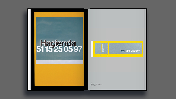
One of my favourites that jumps on this trend, is an advertising poster Mark Farrow designed for a club night called Fac51 at the Hacienda. It used reflective inks to contain the code “51 15 25 05 97”, which meant that the club night was 15 years old on 25 May 1997. It was invisible in daylight and only visible when a light was shone on the poster in the dark, like from car headlights. The point was that the club was only important to people who were out after dark.

DW: How is the book structured?
RB: It’s split up by club, and is chronological, starting with the Hacienda’s founding in 1981 through to the Ministry of Sound, which is still open. I got Bill Brewster, who is a DJ and writer, to write the introductory text for each club. I wanted these to be about the history and context, rather than focus on design. I’ve captioned the designs myself. I wanted the book to appeal to designers and non-designers.

DW: How did you decide what went in the book?
RB: By speaking to designers and avid collectors about the clubs they remembered. A few superclubs had to come out – Xoyo is huge, but visually its graphics don’t look nice.

DW: Do you have any personal favourites?
RB: Cream and Gatecrasher (Sheffield) are two of my favourites. I grew up on that stuff – I bought all their albums and compilations. I used to love opening the packaging, it was so intricate. My favourite chapter in the book is on the Hacienda, though. It was before my time, but I remember the 1997 designs. I think that chapter’s really strong because it shows a design culture that had never been seen before in the club world. One of my favourite spreads is one advertising Flesh, a gay club night at the Hacienda, which celebrates gay culture. This was 1991, so it was pretty forward-thinking for back then.

DW: You’re too young to have experienced many of these clubs – how did you become so interested in the topic?
RB: It’s still a nostalgia thing in a way; I grew up buying that stuff and collecting the flyers, and I wanted to catalogue the era. With clubs constantly shutting down, I didn’t want the art of the printed club flyer to be lost forever. Also, the design side of things has disappeared because of social media in recent years. Back then, flyers were how you knew about a club night – now with smartphones and instant notifications, you don’t need them.

DW: So do you think club graphics have lost their spark?
RB: Yeah, massively so. The music industry on a whole does not have as much money invested into it now. Trevor [Johnson] told me that he used to have one-to-two weeks to design a flyer. Other designers have told me they used to charge £10,000 for a record sleeve. Back in the day, clubs invested in good designers and famous design studios. Now, small designers are given half a day with little-to-no payment to turn something around. They’re expected to do it for free, just for the prestige.
There are a few clubs that still really appreciate graphic design, such as a Scottish club night called Numbers. It employs design studios in the Netherlands to create its look and feel. But the majority of clubs don’t give a shit anymore, mainly because the budgets aren’t there.

DW: Are you a clubber yourself?
RB: I absolutely love the music, I listen to it every day, but I’m not the biggest clubber at all. I’ve only been to Fabric and Cream. My two biggest passions are dance music and design. I’ve always looked at the correlations between them – I’m fascinated by the flyers and logos when new clubs come out.
DW: Why was now the right time to publish this?
RB: I wanted this to be a really good reference book for today, inspiring people with all the graphic techniques it includes. It’s also interesting to see the trends change. The idea of a club as a respected corporation only really came about when Cream opened in Liverpool in 1992. The idea of giving a club an official logo, a bespoke font, a whole range of branded merchandise, was so forward-thinking.
But really, it makes me sad that young people today will never have the experience I did as a teenager: going to a record store, collecting flyers on counters, and buying CDs or records with beautiful, overproduced design. Now, that experience is just a small, .jpeg file on someone’s Twitter or Spotify account. I wanted to hero what it used to be like and how that experience got me into design.
Clubbed: A Visual History of UK Club Culture has now reached its Kickstarter crowdfunding target of £30,000. Backers can still pledge £40 to pre-order the book. It is available to order internationally, and pre-orders will be shipped in May 2018. The book will then go on general sale for £40 on Rick Banks’ website. For more information, head here.


Yes, this is iconic! Love the UK focus, it’s really a deep dive into the culture and how graphic design has influenced nightlife culture AND vis-versa. I’m now curious to see if there are any similar compilations focusing on the Berlin scene, as that’s where we’re located.