Widely used by web design gurus, it is a concept that means a web design made in design software must be perfect pixel by pixel, that is what pixel perfect web design means, each of the 72 pixels that make up each inch of our design must be perfect and in harmony. And even though a graphic designer loath maths, if you want to be part of the modern age, you must use it. Pixel perfect web design, measurements, additions and multiplications are everything.
Understanding a Graphical User Interface (GUI) is much more complicated than creating a masterpiece. Moreover, while art is an expression of human creativity and aesthetics, a graphics interface also functions as an architectural space and as a functional tool. However, even the best GUI can fall become a burden if they are not user-friendly enough. Ergo, an ideal GUI must be Elegant, Simple and above all Functional. That is why you deserve to know a little bit more about a pixel perfect web design.
What is pixel perfect web design?
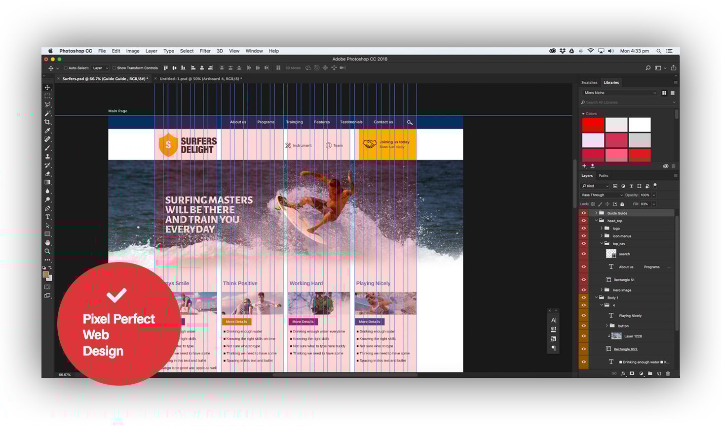
In web design, a design is pixel perfect when each element of the interface is delimited precisely by the baselines of a sketch or wireframe. Every wireframe must present a grid divided into columns that allows demarcating the width and the location of each block of the page. If you want your design to be pixel perfect, you must also draw horizontal rows. The alignment and size of the blocks should be restricted to the drawn lines.
A shift of barely half a pixel will make the design stop being pixel perfect. Minimal appearance flaws, such as blurred edges, objects that “jump” position between pages and colour differences, undermine the image that the user will have regarding your brand.
However, pretending that all the objects are located precisely where the wireframe indicates it presents some problems:
The structure sketched by the designer (through tools such as Photoshop) can be technically challenging to recreate by the developer.
A pixel perfect web design has, by definition, a fixed width in pixels. That is not at all convenient in a time where, due to the increasing variety of devices to browse the Web, there are more and more screen resolutions. It is possible to design several pixel-perfect templates of different sizes, but this multiplies the development time and does not cover the entire variety of existing widths (as the responsive design can do).
So, the main difference between a graphic designer for print and a web is that while the printed one sends a TIFF or JPG image file to be published, the web designer must send its source PSD file, which will be cut and sectioned to create the necessary application or system. That is why, first of all, we must know how to organise a PSD for its manipulation. Despite the problems of the pixel-perfect approach, designing wireframes is always an excellent starting point to achieve a good harmony between the elements that make up our interface.