


Component architecture in Figma

Last year I published the article “Building flexible components in Figma”. Since writing that article, Figma has added improvements which expand on the many ways you can structure components by allowing you to nest components within others, and easily swap component instances, and so I thought it was a good time for an updated look at components in Figma.
One of the best things about Figma’s component system is that you can access the layer stack of every instance of a component. This can have a huge impact, across the span of an entire design system because it can help keep components contained and reduce the number of components required.
Another recent update introduced drag and drop instance swapping. This can take place locally within your file, or straight from your shared team library (a separate Figma document). Being able to do this can have a huge impact how you structure your components.
Here are a few ideas on how you can maximize modularity, and in some cases, reduce the number of components required.
Nested components
Figma lets you nest components within components. This means you can structure them in all sorts of modular ways. Here are a few different ways to use nested components:
Building blocks
Often I will create a “building block” component, and use that as the basis for another component. For example, in these buttons, I have created a basic rounded rectangle for the button shape and turned it into a component. This component does not get published to my team library, instances of it just get used in other components that I build, like the actual button components (which do get published).
The advantage to this method, is that all of my buttons and button states make use of this base component (with style overrides applied) which maintains a link back to that base “building block” component. Should I need to make a globalized change, such as changing the button shape, I can simply go back and edit the original component and the change affects all of the components which are based off of it.
Each button nests the building block component within it, and applies style overrides to the base component to create the different states.
Instance swapping
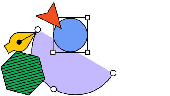
Another advantage to nesting components is that you can swap/replace them out for other components. For example in the tile header below, I just have to build one component for the tile header, and simply swap out the nested component for a different one. If you are familiar with Sketch, you are probably already familiar with this concept, however, the interaction In Figma to swap out components is different (drag & drop).
Shortcuts:
To swap out a component — Hold option when dragging. To swap out a nested component (within another component, frame or group) — Hold ⌘ + option when dragging.
Instances of different icons can be swapped out for others from your document or shared team library.
Masking
Update: The usefulness of this method has been depreciated thanks to the introduction of global styles in Figma 3.0. To do this, make some swatch components (a shape with a fill), and put an instance of the component on a layer above the artwork you wish to mask. With both layers selected, apply a mask, and all you have to do to change the color is use the method outlined above to swap instances of the fill component, with another swatch.
Show/hide components
Because you can access the layer stack of each instance, there are times when it makes sense to house the various states within a single component. The simplest example of this is a checkbox or radio button. Rather than have two components (checked and unchecked), you can simply include the “checked” state in your component. Showing and hiding the checked layer will toggle the state.

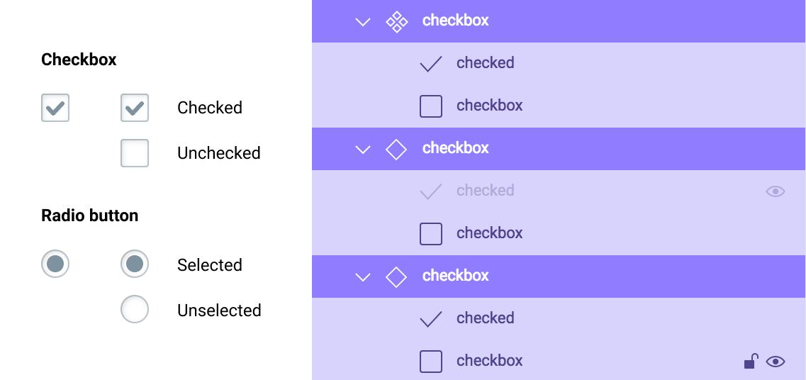
Accessing the layer stack of each instance allows you to show/hide layers.
Shortcuts: Select the checked layer and press the Delete key to hide the layer. Alternatively, ⌘ +Shift + H, will also toggle the layers visibility.
Cropping components
Think of components as jacked up frames—all of the same things that you can do with frames also apply to building components, including being able to crop them.
Create a component, and configure the constraints within it—while holding ⌘, drag the frame of your component to crop the contents, or adjust the dimensions in the properties panel. The contents of your component may shift if you haven’t setup the constraints, so make sure you do that first. This is great for creating a “repeat grid” of rows/columns, or setting up tabular data. You can create more rows than you need, and use this method to show only the number of items that you want. Couple this technique with constraints, and you can even setup components which will hide or reveal content as their parent component expands and contracts. Make sure “Clip Content” is checked in your properties panel to see the cropped result.
Groups of instances can be assembled as components and then cropped using the “clip content” option.
Setting up the cropped grid components:
- Setup your initial repeatable componentInstances of this component will get repeated for each row or column. This could include nested components, text boxes, image placeholders (shapes with a fill), etc.
- Setup the constraints Configure the constraints for the repeatable element, think about how you want it to react in relation ship to the parent component (which will be your grid).
- Adjust the frame sizeHold ⌘ while adjusting the component frame size to enlarge the dimensions of component so that you can build in the padding of your component into its overall size(if applicable to your design).
- Duplicate instancesDuplicate your repeatable element, you can use the Pack Horizontally or Pack Vertically commands in Figma (under the Arrange menu) to make sure all the components are perfectly butted up against one another. This is why I recommend building the padding into your component.
- Make your “grid” componentTurn your group of repeated instances into a new component.
- Setup the constraintsSetup the constraints within your new grid component; think about how you want each of the grid items to respond when your grid container is cropped, and the direction it will expand.
- Clip contentCheck off “clip content” in the properties panel. This will hide the content which exceeds the boundary of the frame.
- Adjust the frame sizeHold ⌘ while adjusting the component frame size to crop the component to the desired amount.
Once you start setting up these grids, the possibilities are endless. Overriding text, symbols, and adding images are a breeze!
This technique, combined with “Place Images” (Shift + ⌘ + K), allows you to populate a grid with image content very quickly.
Text components
Since Figma 3.0 launched, a more efficient way of handling text styles is using the new Styles features to centrally manage type properties. That said, text components can still be useful vessels for combing multiple properties/styles as a single object.
Until there is a alternate way to handle text styles (🤞), building them out as components is the next best thing. This works great because like any other component, you can add them to your team library and sync them across your designs. You can also easily override properties like color, alignment, style and weight. Here are a few steps for creating your text components:
Components can work for text styles. Swapping the style is easy from the components panel.
- Make a text boxClick once to make a text box (don’t drag to make a box). Style it with the font/weight/color/line-height/alignment/etc. that you desire.
- Convert this text box to a componentSet the constraints of the text box within the symbol to: “Top and Bottom”, and “Left and Right”. This makes sure your text box stays sized to the component.
- Rename layersRename your component to your desired text style name.
Rename your text layer to something generic like “Text”. You will rename this layer the same on all subsequent text components. - Use your new componentsAnytime you need to change a text style, you can simply swap out the instances to a different text component. Because we renamed all the text layers within the components to be the same, this enables the component to map any overridden text to the swapped instance.
Combining techniques
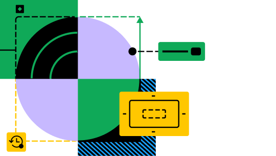
In the example below, all of the techniques above have been used to create an extremely flexible tile component that accounts for different states and variances for use within mockups and prototypes.
Here is a summary of a few of the different component variations:


A well-constructed component can take on many different forms simply by swapping out nested components, and toggling the visibility of layers.

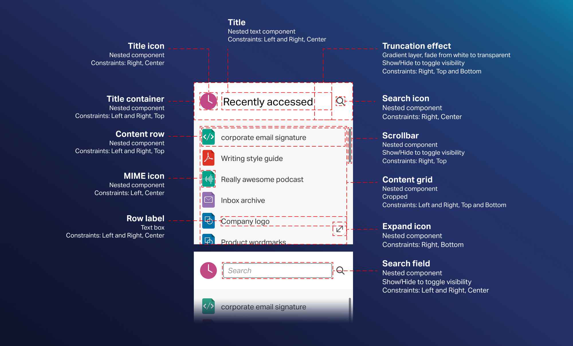
Breakdown
Nested within the tile component, shown above, are a number of elements which can be turned on/off, or swapped to different components.
IconsThe icon throughout are nested instances and can be easily swapped out for other icons.
Tile contentThe content area in the tile is also a nested component. To create the base tile component, there is a placeholder component with a red dotted line which outlines the dimensions, and also establishes its constraints within the tile. I can replace the placeholder component with my actual content grid components. Combining this with the cropped “clip content” method, I can display a version of a “repeat grid” view which will grow with the parent component.
ScrollbarThe scroll bar is simply a nested component whose visibility can be toggled if we want to communicate that the content inside is scrollable.
TruncationA small vector with solid white to transparent gradient is situated above the tile title text component. It’s visibility can be toggled on or off to show our fade-out truncation effect when required.
SearchSituated within the tile header, is a search input component that can be toggled as well. Since this particular element is a also a nested component, it allows me to swap out different states of the input field from placeholder, to populated, to populated with focus.
Here it is in action:
Additional tips on component architecture in Figma
Instance menu

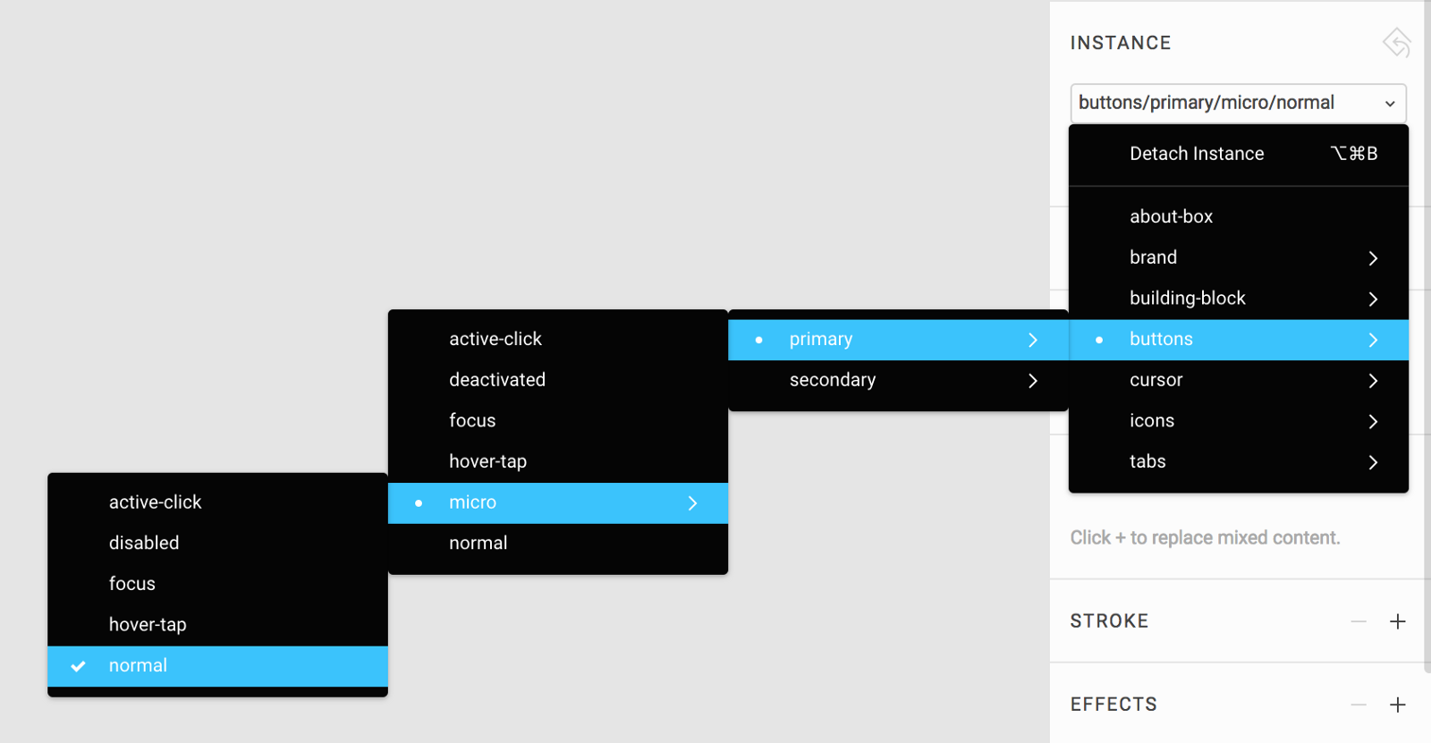
Components local to your file can also be swapped out from the instance menu. A consistent naming pattern with forward slashes helps sort your components into more manageable buckets.
Another way to swap components is to select a component and access the instance menu from the properties panel. From here you can choose a different component to swap. This works only for local components because the list is populated only from components which already exist in your document.
Using forward slashes to segment your naming scheme, will not only organize your components into groups within this menu, it will also organize your exported assets into subdirectories too.
Replacing components

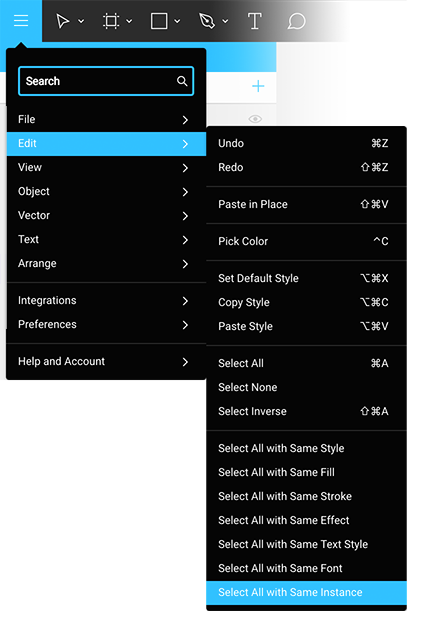
Changing many instances of a frequently used component sounds like it would be daunting task, especially if spread out across many different frames. We know changing the instance is easy, the problem is finding them all. Luckily, Figma has a feature to make selections based on commonalities.
Documentation
Figma enables you to add descriptions to your main components. If you have variations in similar components, specific use cases, or even a redesigned component you are validating, this is a great place to add useful information to accompany your component which will be easily available to designers, right from the component and team library panels.

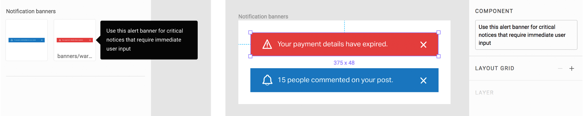
Descriptions added to your main components, appear on hover, inside the components menu.
Documentation is not only critical for designers, its equally important to consider the collaboration with the developer. Encapsulating every detail in a small description field is not possible, so try to put yourself in the developers shoes, and identify what they need to know. With so many applications becoming component centric in their structure, there is a good chance developers want to take the same approach to writing code, and want to understand the full gamut of each component and its various states that are spec’d in the design. It’s easy to fall into the trap thinking you need an elaborate style guide, documentation website, or additional tools to accomplish this, but the reality is, many small teams simply don’t have the time or resources to do this. The good news is, that is not a requirement to be successful—keep it simple and avoid complicating it.
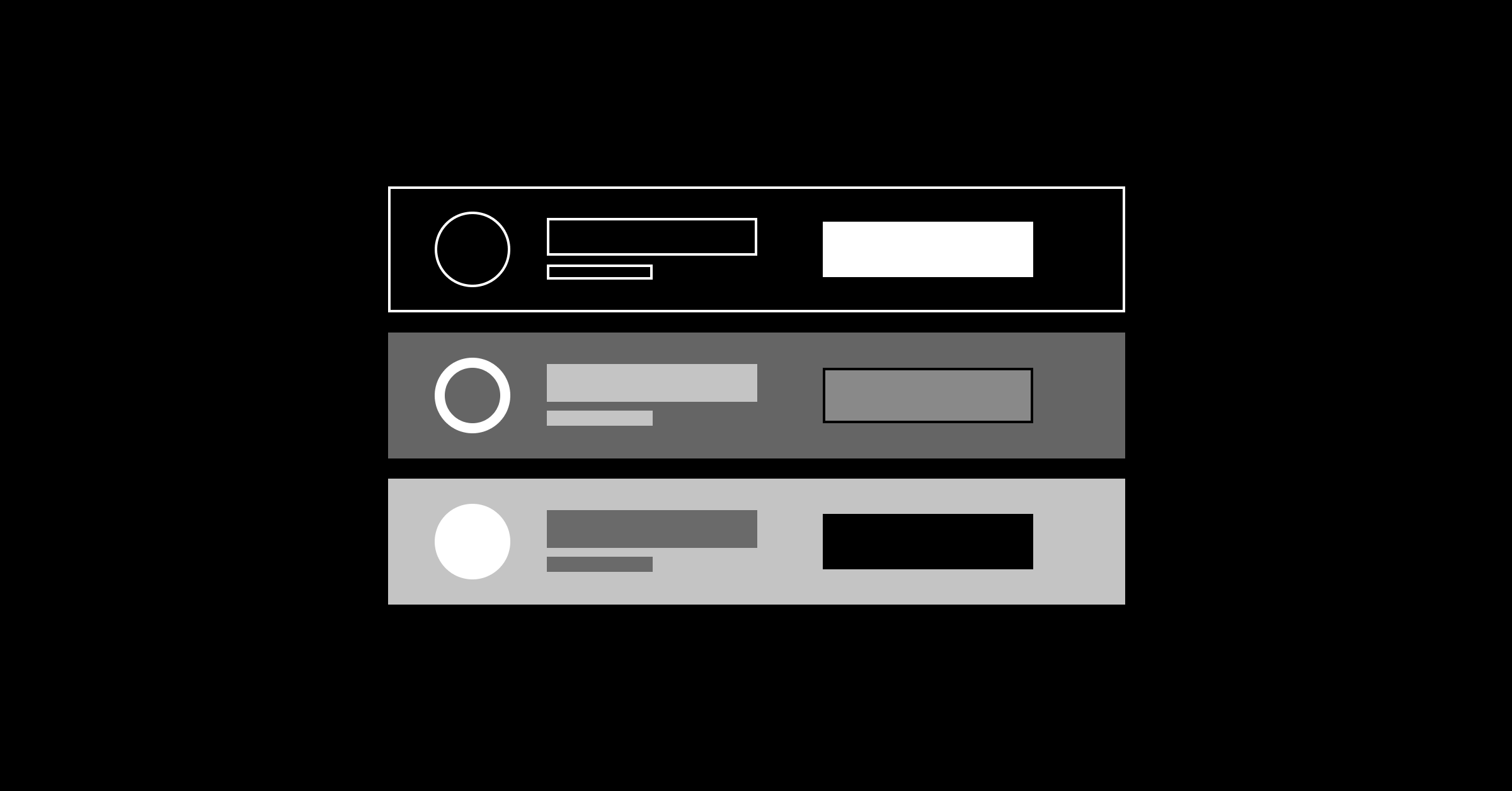
Figma can help facilitate the developer handshake, and the collaborative nature of what that process should always aim to be. Consider the example below. A date picker component with various states. This particular component is inside a file setup to be a repository for all UI components in the design system. The components within it are shared to other files which contain the screen mockups. Rather than sending just the screens to the developer, consider sharing a link directly to your team library documents to accompany the mockups.

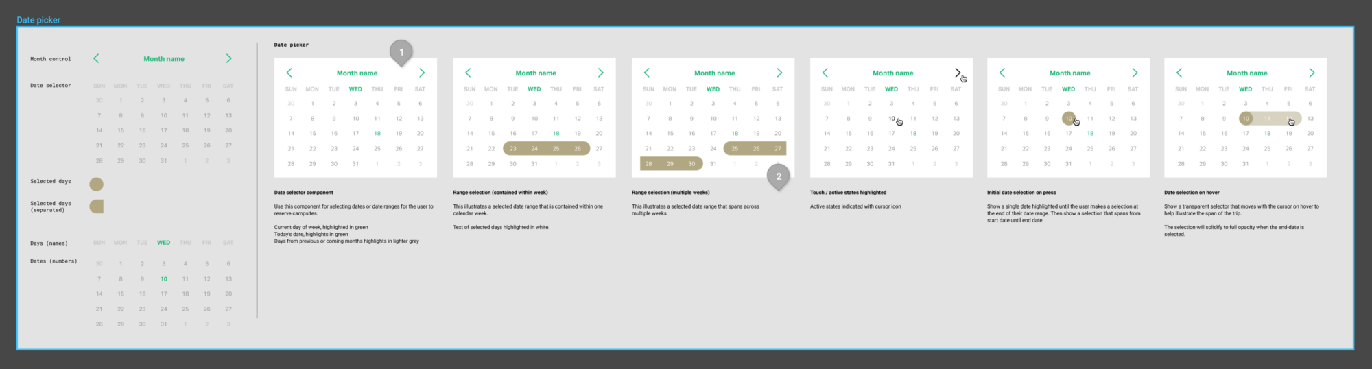
The main components which make up the date picker reside in a frame (named appropriately so they get grouped in the component panel). The main components are located on the left. These are the components the designers will have access to from their team libraries panel when working on screen mockups. To the right, are just instances of the main components (so you don’t have to worry about these cluttering up your team library when accessed from other files). Those instances can be assembled to illustrate various states of the component. Documentation can be as simple as adding some notes and collaborating with the developers via comments. This puts everything in one place and saves the developer from having to hunt around your various screen mockups just to understand the full scope of what they need to build.
Deleting main components

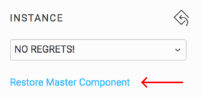
Clicking the blue link will restore your main component. Phew!
Deleting a main component could be disastrous. Imagine every linked instance of said component all of the sudden detaches and turns back into a frame! Figma has you covered. Instances will actually maintain their instance status in case you have to revert this later. This allows you to either select them all and swap them out to a different component (which exists) or, you actually restore the original main component.
Thanks for reading. If you have questions join us on Spectrum.