
The recent boom in “data-driven” journalism projects is exciting. It can elevate our knowledge, enliven statistics, and make us all more numerate. But I worry that data give commentary a false sense of authority since data analysis is inherently prone to bias. The author’s priors, what he believes or wants to be true before looking at the data, often taint results that might appear pure and scientific. Even data-backed journalism is opinion journalism. So as we embark on this new wave of journalism, we should be aware of what we are getting and what we should trust.
Economics blogger James Schneider recently opined on how journalists highlight research, even if it’s not credible, that confirms their argument and ignores work that undermines it. The recent coverage of economic research on the costs of increasing the minimum wage is a good example. But Schneider’s fellow blogger Bryan Caplan points out this bias isn’t limited to journalists; even well trained social scientists seek out methods that confirm their biases. Anytime you use data it is subject to bias and it can be manipulated to push a particular point of view.
When I first started writing for non-academics, a more experienced economist and journalist, Michael Mandel, gave me some advice: “You have the skills and training to do some impressive things with data and that will distinguish you as a writer.”
But Mandel also implored me to be mindful of how I used data in my writing. Because I, like everyone else, am prone to the same biases. Data analysis is more of an art than a science. I recently asked him what he thinks of the new wave of data journalism, where few, if any, data journalists have graduate-level training in empirical methods.
He responded with the following: “I applaud the increased use of data in journalism. But they can’t just hire graphic designers to make pretty pictures. Making sense out of raw data requires more analytic firepower and more willingness to do independent research than journalists have traditionally been comfortable with. But it also requires a new set of ethics about how to responsibly use data. That conversation hasn’t started yet.”
So here’s a set of ethics that data journalists might follow to avoid common pitfalls:
In a perfect world the data would just speak for itself, but that’s never the case. Interpreting and presenting data requires making judgments and possibly mistakes. First, you must select the right data to answer your question. I once worked on a project with someone who looked at the number of manufacturing firms (which employed lots of low-skill labor) that opened and closed in Europe (where labor costs are high) after opening up to trade. Based on this, he concluded that trade kills entrepreneurship. But all he really proved was the Theory of Comparative Advantage, or that trade flows toward countries that are relatively rich in a factor of production, in this case cheap labor. To get a more accurate result, he needed to include firms in different industries. His limited sample created a biased result.
Once you choose your data you need to inspect it, identify outliers, and get a feel for your population. Then you usually discard some observations. Knowing what to throw out takes judgment and experience. Deleting data might seem like dubious manipulation, but if you don’t scrub and get to know your data, you’ll have a biased and unreliable sample. It’s simply unavoidable. One of my favorite data sets, the Federal Reserve’s Survey of Consumer Finance aims to inform about American households’ financial health. But the survey contains more wealthy households than you’d typically find. If you don’t account for that, Americans will seem richer than they really are.
Be mindful of the economic meaning in your data. Suppose you wanted to know if Americans are saving enough. You could look at data from the Bureau of Economic Analysis (perhaps a controversial data source) on the annual flow of personal (or non-corporate) saving and believe it’s been increasing, or if you account for inflation, not fallen much since the 1980s.
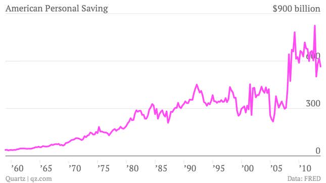
From this picture, all is well and Americans are saving enough. But it’s important to put saving in the context of income. It tells you more about saving behavior and the purpose of saving, which is to replace income if something happens. It’s necessary to look at the saving rate—savings as a percentage of disposable income.
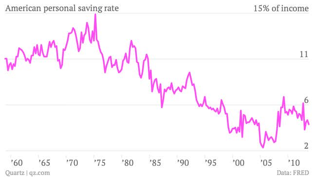
In this context people are saving less, a very different result.
When it comes to using statistics in my writing, I limit myself to simple calculations (usually taking simple averages). The choices an author makes are less clear once she uses the data to make more complex calculations like running regressions or making predictions. Last week, I wrote an article about the fact that unionized manufacturing workers have fewer years of tenure at their jobs. I believe it’s a trend that has been going on for years and represents structural economic changes. To prove this, ideally, I would have taken the first year of data, 1989, and compared it to the most recent available year, 2010. But I worried 2010 was influenced by the recession. I also noticed the population had aged nine years. In a different context I would have de-trended the data (taking recession effects out) and controlled for the aging population. But for me, that crossed the line. The more complex your calculations, the more scope for biased results, which I didn’t think was fair to the reader. So instead, I used 2007 data and included age in my table. It is a less powerful result, but totally transparent, and I still made my point.
Empirical researchers spend years learning how to apply statistics and countless hours dissecting data. And then even the most experienced, well-intentioned researcher might end up with biased results. Priors and human judgment are a combination that naturally create bias. That is why credible, statistical results go through a peer review process, or at least many rounds of aggressive seminars. Human judgment features too heavily in the process to take anyone’s results as given. An army of people with similar training must assess the work’s validity before it becomes a matter of record. But expert review and this level of training are not realistic in fast-paced world of journalism, which is why without more stringent standards, I am wary of anything too complicated or opaque. That may limit the scope of how data is used in journalism, but the risk of misleading the public justifies that limitation. Besides, if it takes a lot of data manipulation and fancy calculations to tell your story, the odds are you’ve created a biased result. Either that or what you are trying to prove is so complicated it should be a research paper that undergoes peer review.
Nearly all researchers and data-oriented journalists would never intentionally mislead their audience. As flawed as it is, data is a powerful tool; it is they best way to understand the economy. On net, I think data journalism is a positive innovation. But any innovation can outpace our existing infrastructure and cause harm. We can minimize that possibility by understanding data’s limitations and how to use it responsibly. I propose we keep data analysis simple, clean, and transparent. And even then we should exercise humility and not take our results too literally.