*Update: I've switched entirely to using Sketch for design. You should check it out.
If you’re new to Photoshop and you’re designing UI or exporting assets there are some important settings you should use to get the best results. This guide uses iPhone apps as the example settings, but the basic principles apply to all design work in Photoshop. Let’s get to it.
New File Settings
The first step is to open Photoshop and set up a few basic presets for all of your UI work.
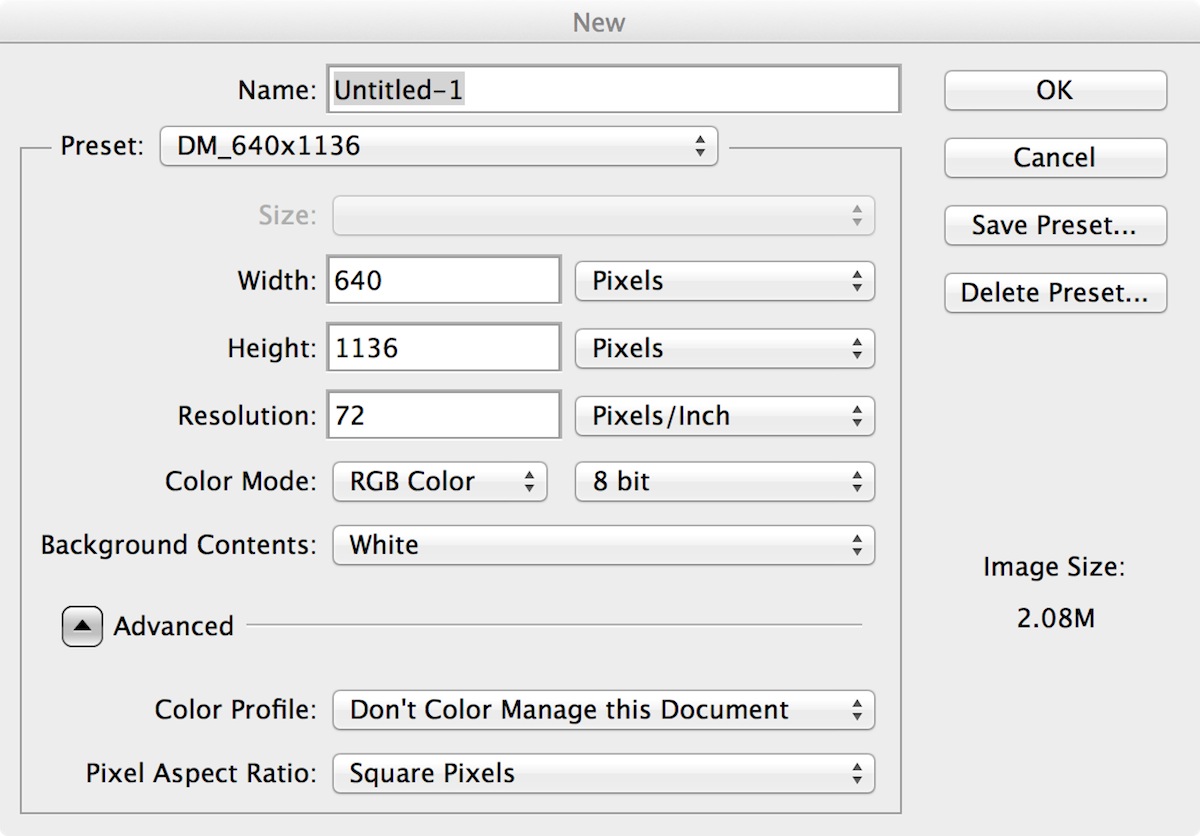
Open Photoshop → File → New
Width: 640 pixels
Height: 1136 pixels (4 inch iPhone device)
Resolution: 72 pixels / inch (PPI)
Color Mode: RGB Color
Background Contents: White (optional)
Color Profile: Don't Color Manage This Document (more on color settings later)
Pixel Aspect Ratio: Square Pixels
Save these settings as a preset so you can re-use them for every document you create. This is especially useful when you’re designing layouts to support the different iPhone screen sizes (3.5 inch and 4 inch) or you’re also targeting iPad. Save a preset template for each device configuration and you are done.
Snap Settings
One of the most important things to get right to is make sure all of your UI assets are as sharp and crisp as possible. In Photoshop it’s very easy to end up with blurry edges if your work is not aligned to pixel boundaries. To fix this, you need to use the correct snap settings so that every pixel stays sharp.
Open your Photoshop file and enable pixel snapping for all objects:
Open Photoshop File → View → Snap → “Checked”
Open Photoshop File → View → Snap To → “All”


Snap Settings - Snap Vector Tools and Transforms to Pixel Grid
The setting ‘Snap Vector Tools and Transforms to Pixel Grid’ is a global setting that applies to vector drawing and editing, and ensures that your vector tools will snap to proper pixel boundaries when creating, editing, or transforming. Make sure this on so you are always working to the pixel grid.
Photoshop → Preferences → General → Snap Vector Tools and Transforms to Pixel Grid → “Checked”
Snap Settings - Align Edges
The Align Edges setting forces the edge of objects to snap to the pixel boundaries. It works per vector layer, rather than as a global setting. The idea here is that the setting may help you get sharp object edges without compromising the internals of the object. In practice however, this does not appear to be the case, and Marc Edwards actually recommends against having Align Edges switched on:
“The way it works is a bit confusing — it snaps the layer’s bounding box to the grid automatically, which can push interior points out of alignment. Align Edges can be pretty frustrating if you don’t notice it’s on or understand it fully, because the vector path is shown as you’ve placed the points, but the rendering of the object is shown after the Align Edges adjustments. I have it turned off 99% of the time”.
If you do wish to enable this setting go to your Options Bar, where you can switch it on or off for each layer in your document.
Open Photoshop File → Options Bar → Align Edges → “Checked”

Text Settings
Text anti-aliasing settings have a huge impact on the quality of your work. Until recently there wasn’t a clear consensus on which Photoshop anti-aliasing settings were the best to use for iOS UI design work. Some designers preferred the Crisp setting while others prefer the Smooth setting. Personally I like Smooth as an approximation of the native rendering on iOS devices.
If you’re using Photoshop CC, then Adobe has recently added several new anti-aliasing settings (Mac and Mac LCD). The best option for rendering type for iOS UI is to select Mac anti-aliasing rather than Crisp or Smooth.
You can set your anti-aliasing settings in a few different places, e.g. in the Options Bar (to enable this, go to Window > Options > “Checked”) or in the Character Palette (to enable this go to Window > Character > “Checked”). The anti-aliasing setting itself is marked with a double lowercase “aa”. The screenshot below shows Mac anti-aliasing, set from the Options Bar.
Regardless of the anti-aliasing settings you choose, most of the text rendering in your app will be done on the device itself. The anti-aliasing settings you choose in Photoshop are just for preview purposes, unless you are also exporting UI assets that contain baked-in text.
Select some text → Anti-aliasing selector (aa) → “Mac”

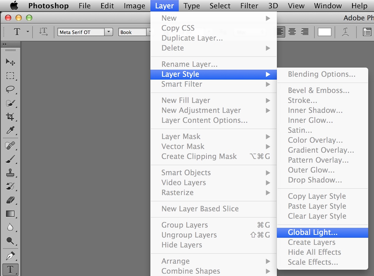
Lighting Settings
Following the Apple iOS Human Interface Guidelines you should set all lighting in your app to 90°. Open Photoshop, make sure you have closed all files, and go to the Layers menu to set the default value:
Close Photoshop Files → Layer → Layer Style → Global Light → 90°
Grid Settings
One of the best ways to produce UI assets for Xcode is to design your Photoshop layouts to an underlying retina base. Set your macro grid (columns, rows, and gutters) to whichever dimensions you prefer, but make sure you work to an underlying base set in 2 pixels increments.
When you combine this 2px base with the correct Snap settings for your document, all objects in your layout automatically work for both retina and non-retina devices (anything sliced to the retina grid will also give you sharp pixels boundaries on a non-retina device). Any objects that are not aligned to the 2px grid will end up blurry on a non-retina device. If you zoom into the pixel grid (e.g. 3200% as below) you'll see the individual pixel boundaries (shown in light grey). Make sure that your work aligns with increments of two pixels (shown in green).
Photoshop → Preferences → Guides, Grid & Slices →

Export Settings
When designing iOS apps we want to export our UI assets as PNG files for use in Xcode. The best way to do this is to use the Save For Web function in Photoshop, but it’s a common mistake to use the default Photoshop settings which will degrade your design work during the export process.
There are a couple of really important settings that you need to change from the default Photoshop settings when using Save for Web:
Photoshop → File → Save for Web →
Preset: PNG-24
Transparency: Checked
Interlaced: Unchecked
Embed Color Profile: Unchecked
Convert to sRGB: Unchecked
Quality: Bicubic
A quick note on downsampling: if you’re not sure what you’re doing with the Quality settings then just select the Bicubic setting from the quality drop down selector (there are also Nearest Neighbour and Bilinear options, and two additional bicubic settings, but in short, Bicubic is best for creating smooth gradients, Bicubic Smoother is best for enlargement, and Bicubic Sharper is best for reduction). The Nearest Neighbour (hard edges) setting can be useful if you need to preserve hard edges, but it can also produce jagged edges, so it works best for images with hard edges and no anti-aliasing. Marc Edwards also notes that scaling type doesn’t matter if you’re not actually scaling.

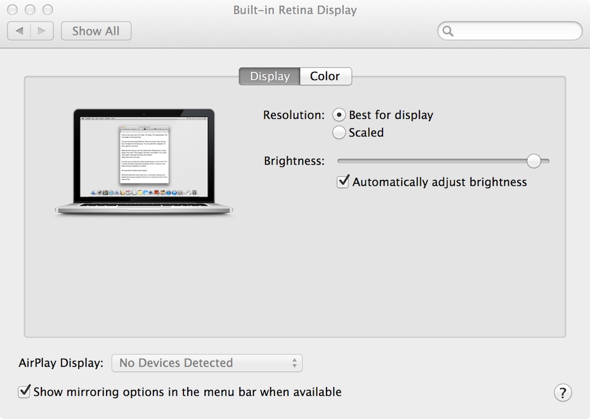
Retina Display Settings
If you are using a Retina MacBook Pro you should make sure you're using the native screen resolution size of 2880×1800 pixels (1440×900 points). This is called Best for display.
Apple Menu → System Preferences → Displays → “Best for display”
Color Settings
Color management is an extremely complicated beast, and rather than re-inventing the wheel I suggest you follow the excellent advice provided by Marc Edwards from Bjango. Marc has written the definitive article on color management for UI design and you should refer to his article here:
Colour management and UI design, by Marc Edwards
Here's a quick summary of Marc's article, with regards to iOS design
1. Edit → Color Settings and set the working space for RGB to Monitor RGB.
2. More Options → turn off Blend Text Colors Using Gamma
3. Open a document → Edit → Assign Profile → Set it to Don't Colour Manage (do this for every document you're working on).
4. View → Proof Colors → Unchecked
5. When using Save for Web, make sure that Convert to sRGB is turned off.
6. When copying layers between Photoshop documents make sure both documents have the same color profile (just use Don’t Color Manage This Document everywhere).
Performance Settings
We've all run into performance issues when working with large UI documents in Photoshop. Luckily there are many settings you can tweak to get the best performance on your machine.
I’ve written a separate guide to getting better performance out of Photoshop, as optimizing for performance is a big topic:
Note: this guide to Photoshop is really just a quick intro to help you get started. Beyond this point most designers will have many additional custom settings that they use for UI design. Let me know if you use any particular Photoshop settings and I’ll add them to this post.
Do you prefer to use Sketch app by Bohemian Coding for UI work? Let me know, and I can do a post for Sketch too.