


Buffer runs seven days at a time. Many of our improvements, metrics, experiments, and tasks fit into one-week slices, which helps us to move quickly on new ideas and to revisit our results right away. Instead of it being early April around here, it’s just Week 14.
This weekly perspective has some big advantages across all our departments, including marketing. Reviewing and improving our marketing metrics week over week, for the blog and our social media accounts, lets us quickly experiment, test, and analyze where to best invest our time and effort.
I’d love to share some of our favorite ways to view metrics week over week, as well as some ideas on how to improve key stats and keep things on pace for monthly goals and benchmarks.
(As far as monthly goals go, we have those, too. You can read our latest monthly reports at our Open blog.)
Weekly reports, right in your email
The weekly emphasis on analytics is made much easier when these reports come hand-delivered to your inbox every seven days. Thankfully, many services now send weekly digests of your activity and performance, often with a comparison to performance form the week before.
Here are a few of our favorites. (We’re a little biased with the first!)
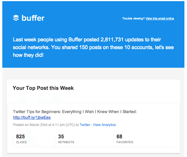
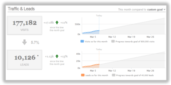
Social media overview—Buffer’s weekly digest email
Every Monday, Buffer sends out an email digest, covering your best content from the week before as well as key data on all your connected accounts with week-over-week comparisons. (Buffer user? See yours here.)
The first bit of personal data you’ll see is your most popular post of the week, complete with numbers on clicks, shares, and other interactions. The example below was taken from last week’s digest for our Buffer accounts:
Facebook page activity – Facebook’s weekly page update
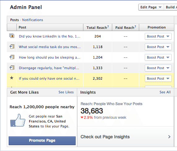
Facebook, too, sends out a weekly digest with important stats on each of the pages you manage. These stats include how many likes you gained since last week, how many Facebook users are talking about your page, and the weekly total reach of the content you post on Facebook.
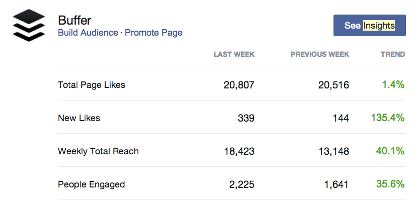
Additionally, your latest posts are listed with a quick view at each post’s reach (and an upsell to boost the post if you’d like).
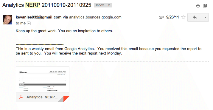
Google Analytics weekly reports
You won’t receive a Google Analytics weekly report automatically, but it’s easy enough to ask for one.
In fact, almost any report inside Google Analytics can be created as an email report and sent to you in a variety of forms—csv, excel, pdf. I choose to receive mine as pdfs.
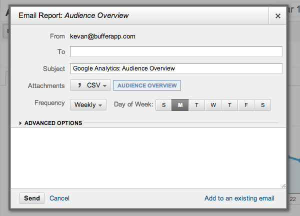
To create an email report in Google Analytics, click the Email button near the top of your desired report. You can find the button immediately below the report name and next to buttons for exporting and adding reports to your dashboard.
When you click on the Email button, a popup will appear that lets you set the parameters for your email report. You can set the recipients, subject, type of attachment, and frequency of the report.
Sometimes, I even go so far as to customize the message text with something rather silly and uplifting.
I schedule these emails to be delivered on Mondays, along with my Buffer digest, and then I batch all my analytics analysis into one big session. The reports I subscribe to are:
- Traffic overview
- Popular content
- Keyword report
- Referrals
Drive by your social sites for more detailed data
If digests do not drill down as deep as you need, you can always check for data on a more detailed level by visiting the analytics on your social profiles to see the performance of individual posts.
Social media expert Mari Smith shared some great advice for what to track when you’re examining your posts at such a granular level. Her advice was specific to Facebook, but much of the advice carries over to Twitter, Google+, and LinkedIn, too.5 key areas of Facebook posts to test: Frequency, Timing, Type, Length, @ tags. #smmw14
— Mari Smith (@MariSmith) March 27, 2014- Frequency: How often do you post? Observe daily frequency and weekly frequency.
- Timing: What times of day and days of the week do you post?
- Type: Are your posts questions or statements? Do they include photos or videos or just text?
- Length: How many characters are in your posts?
- Tags: What tags (if any) do you use in your content?
View analytics on Facebook
Facebook offers deep analytics for its pages, and admins can access these from right within the Facebook page. Data appears in the Admin Panel in the header, displayed in reports for posts, insights, messages, and notifications. The well-designed dashboard for posts shows you icons of the type of content you posted as well as data on the total reach of your post.
View analytics for Twitter
Twitter offers an analytics dashboard for users, but the setup process is a little more involved than places like Facebook and LinkedIn (you may have to add meta tags or implement Twitter Cards).
As an alternative, you can use third-party apps like Buffer to track the individual performance of tweets. I know I’m biased, but Buffer’s simple reporting and clean design saves me a lot of time when I’m analyzing the past week of posts. I can see at-a-glance what type of content worked best: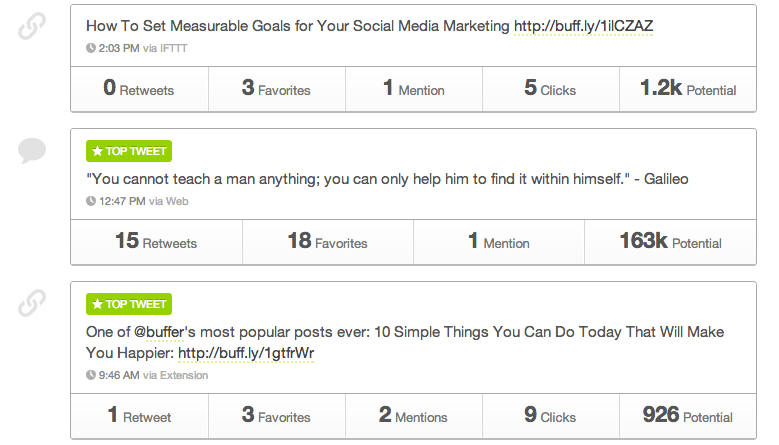
on Google+
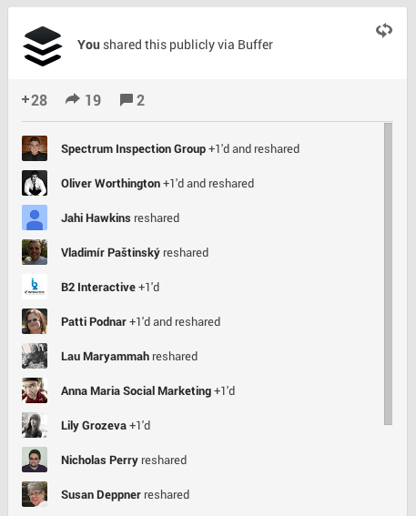
Similar to Twitter, third-party tools like Buffer will be the ideal way to view posts at a glance for Google+. However, if you’d prefer to glean some metrics straight from your Google+ page, you can. Here’s how: Click the down arrow in the upper right-hand corner of a particular post, and you’ll see a list of menu options. From this list, choose “View Post Activity.”
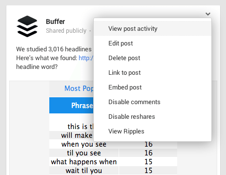
Here you can see a complete breakdown of who +1’d the post, who reshared the post, and who commented.
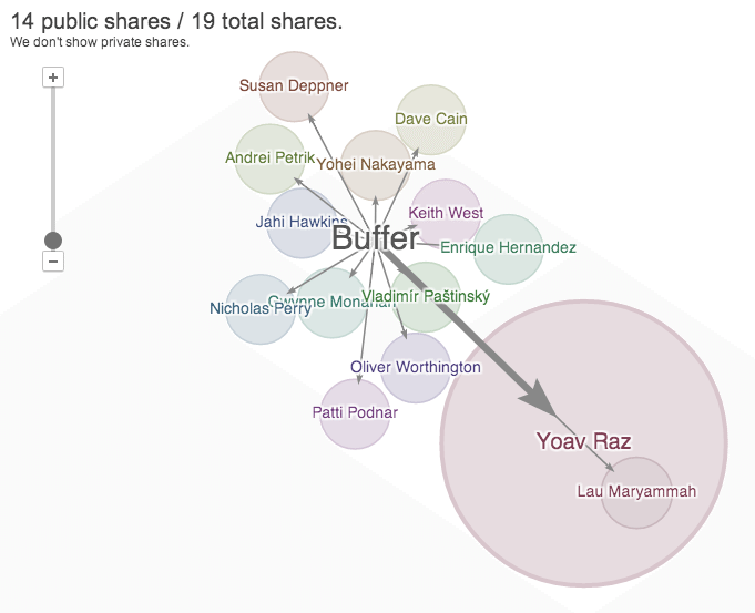
In addition, Google+ posts have the option to View Ripples, which will show you how your content spread. You can see at a glance the circle of influence of each of the people who shared your post, and you can get a better sense for where the greatest reach occurred.
View analytics on LinkedIn
Like Facebook, LinkedIn has an analytics section for page admins baked right into the page. LinkedIn Analytics can be found by clicking the Analytics link at the top of the page, just underneath the page logo.
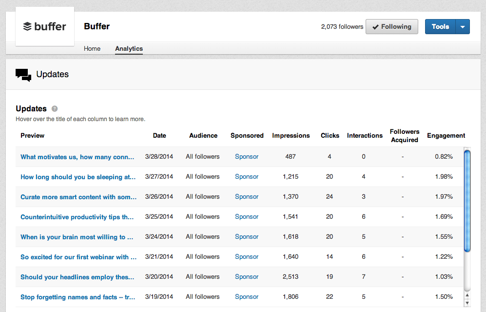
Here you can see all your recent posts at a glance and compare easily what posts performed the best. In the example above, I’d be keen to remember the relative success of the “Should your headlines employ these …” post, which seemed to outperform the rest when it came to impressions.
View your best performing posts on your blog
I mentioned above the standard analytics that are in each of my weekly email digests. One of those is the performance of individual posts. In other words, which content did readers most engage with?
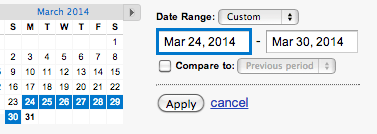
To pull this report, log into your Google Analytics dashboard and select Behavior from the left menu, then Site Content, then All Pages. You can customize the date range for the past week to see the most popular content from the past seven days.
The resulting data will be your top 10 most popular posts for the date range that you set. I like to view more than just 10 results at a time, so I often end up changing the view to the top 50 or top 100. This way you can get a feel for the general scope of the content that is most popular.
Now what? 4 metrics to analyze and improve
1. Engagement with your blog content
Measuring engagement with your website—the time that readers spend actively reading, watching, commenting, and sharing your content—can be an important metric as it helps you understand how much value your content has for your visitors. Some of the standard reports inside Google Analytics can get you started with this metric.
- Bounce rate will tell you the percentage of visitors who left your site after viewing only one page.
- Time on site can show how long a visitor spent browsing your content.
- Pages per visit will show the number of pages that the average visitor hits before leaving.
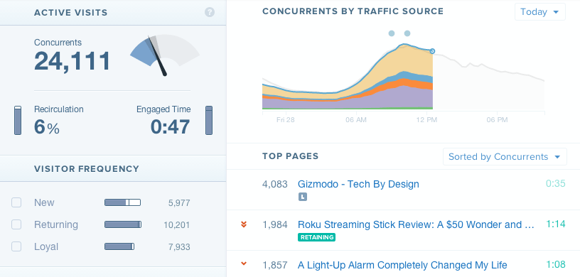
These stats can give you an idea of engagement on your site, and there are other analytic tools like Charbeat that can tell you precisely how long individual visitors are spending with your content. Here is a sample Chartbeat dashboard from Gizmodo that shows these numbers in action. (Click through to the demo page to see these numbers move in real time.)
Improve: How do you get readers to stay longer on your content?
- Learn from your best posts. Find strong-performing content and analyze it for category, media, timing, layout, keywords, and more. The best way to get readers to stay longer is to give them a reason to stay—with killer content! Find what worked before and duplicate it.
- Shorten your paragraphs and use lots of headings. Huge blocks of content are likely to scare away readers. Set up your blog posts for easy scanning.
- Link to your own content from within a post. On our Buffer posts, we aim for 10 internal links to other posts of ours, hoping that readers will continue to find quality posts on a variety of different topics referenced in the original content.
2. Followers and social media reach
This is the big one! Follower count is the ultimate vanity metric, it would seem. But more followers means a larger audience for you to share your incredible content. I’ll focus on a pair of important follower counts here: Twitter and Google+.
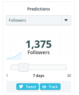
One of our favorite ways to track follower growth at Buffer is TwitterCounter. The app shows you follower growth over time, and you can compare the data on the same graph along with tweet frequency, retweets, and more (some stats are premium features).
The neatest thing for a weekly metric tracker is TwitterCounter’s prediction box. TwitterCounter tells me how many followers I can expect to have seven days from now as well as when I will hit my next follower milestone.
Google+ followers (called Circles on Google+) are valuable for their benefit on search results pages. If you have Google authorship enabled, your profile picture and Circles will appear next to your content on search results pages. The more followers you have on Google+, the greater social proof your content might carry.

Improve: How can you grow your followers?
- Link to important social media profiles on your blog. In your bio or in your byline, you can include widgets and links to your social profiles so that readers can connect with you. An extreme example of sending blog readers to your social accounts is Copyblogger, which recently turned off comments on its website in order to take the conversation to social media.
- Learn from your weekly growth metrics. Find out what led to a particular bump in followers during a given week, and repeat the formula again. Was it a certain piece of content? A timely tweet? A mention by a big influencer?
- Start conversations with people. This can lead to improvement in a couple of ways. First, by joining in more conversations, your account will seem alive and active. Second, your conversations could get your profile in front of more eyes, especially if the conversation grows in scope.
3. Referral sources—social and otherwise
Where does your website traffic come from? If you can find this out on a weekly basis, you can learn where your efforts are paying off—social media, republishing on other websites, networking, etc.
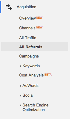
Google Analytics tracks all this information for you, and there are specific reports you can pull to view your social referrals or referrals as a whole. To get to these reports, click on Acquisition in the left menu and choose All Referrals.
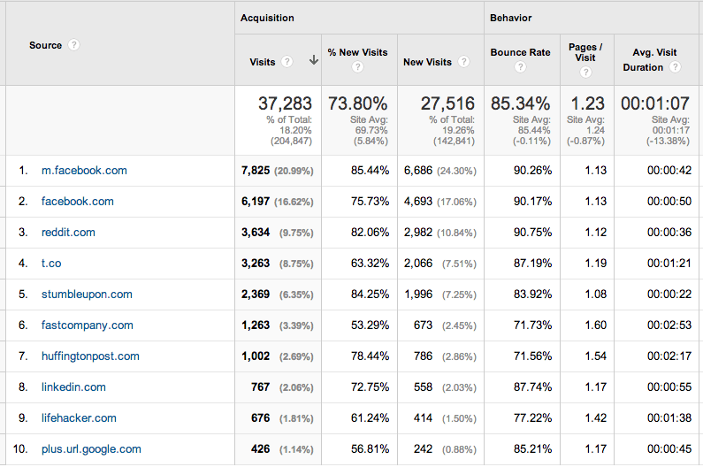
The All Referrals report will group every site that sends you traffic, so your social referrals and inbound links will be in the same spot. The Top 10 of the Buffer blog’s referral report shows our traffic from top social sites and from our republishing efforts at places like Fast Company and Lifehacker.
In addition to the basic All Referrals report, you can view other reports that show only your social referrals, your search traffic by keyword, or a combination of traffic from search, social, and inbound links.
Improve: How can I increase my referral traffic?
- Guest posting. The Buffer blog grew to where it is today in large part thanks to guest posting by our COO Leo Widrich. Writing killer content for others could be the most helpful thing you do to boost your blog traffic: It gets the word out about you, creates solid backlinks, and builds relationships and authority.
- Post your content more than once. Reposting content on social media is great for hitting followers in different time zones and for reaching new followers who may have connected with you after the content was first posted. The biggest advantage, though, would be that reposted content boosts traffic. Our own experience at Buffer has confirmed this.
- Increase your frequency. Post more often on social media to give yourself more opportunity to gain social referral traffic.
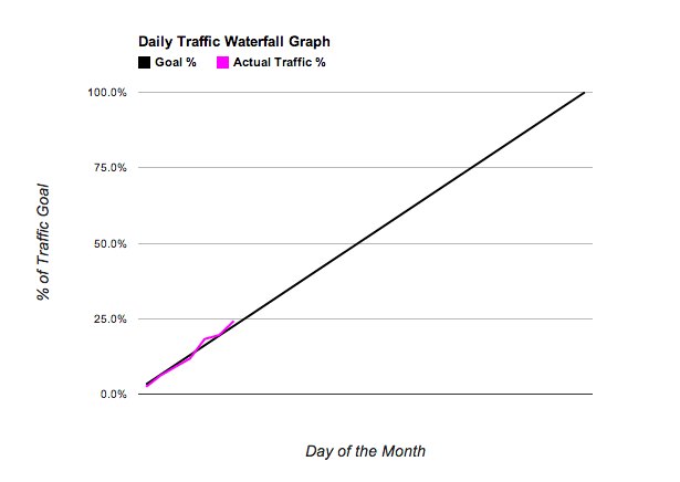
4. Traffic waterfall
You might find it helpful to stay on top of your website traffic on a weekly basis so that when month-end rolls around you don’t find yourself with a big drop in traffic and no time left to do anything about it. Hubspot creates traffic waterfalls to guard against surprise deficits like these.
Basically, the waterfall is a visual representation of where you stand on your progress for the month. Hubspot’s Mike Volpe created a spreadsheet you can use to track this for your website traffic. (Here’s the Google Spreadsheet version, if you’d prefer.)
To create a waterfall for yourself, simply input your desired monthly traffic goal and then come back to the spreadsheet weekly to enter in your actual traffic numbers.
Improve: How to grow traffic to your website?
- Increase your volume of content. Hubspot found that companies that increased their blogging from three to five posts per month to six to eight posts per month nearly doubled their leads.
- Take advantage of your highest-traffic days. Publish your best content on your best days so that you can get the most traction—links, shares, etc.—when the most people are reading. Wednesdays are our biggest days on the Buffer blog. How about you?
- Repurpose old content. Evergreen content that is as helpful today as the day it was published can be promoted and reused on the blog.
What stats do you track weekly for your website and social media accounts? Is weekly or monthly reporting a part of your marketing? I’d sure love to hear what you work with.
P.S. If you liked this post, you might also like The 15-Minute Social Media Audit Everyone Can Do and 5 Social Media Metrics to Track and How to Improve Them.
Image credits: atomicShed
Try Buffer for free
140,000+ small businesses like yours use Buffer to build their brand on social media every month
Get started nowRelated Articles

This article looks into social media benchmarks for various industries and platforms.

A guide to the content marketing metrics that will help you measure success, plus guidance from top content marketing leaders.

In this guide, we’ll go through everything you need to know about TikTok analytics — from what metrics and insights are available to how to get all of them for free to what you can do with them to boost your growth on TikTok.