In my last article, Obvious always wins I showed how important it is that users are able to understand your website or application and can use it without any effort. The first thing to be sure of is that your interface is simple and intuitive, utilizing familiar icons, actions, and features.
One of the greatest challenges for developers is to find and implement a functional navigation menu that works well on mobile devices.
You cannot create a good user experience without a functional navigation bar. New users will look for and scan your navigation so it is crucial to give a good impression and avoid disappointing their expectations.
Among the professionals who have written on this topic, the first that deserves a mention is Brad Frost. You can discover his approaches and examples of patterns for mobile navigational menus on Brad’s website.
In this article I’ll focus on 5 of them. Think carefully about the best to use in your next projects based on your users’ needs.
Top Nav or “Do Nothing” Approach
One of the most frequently used solutions for navigation is to keep it at the top. Because of its ease of implementation, it’s the one adopted by the majority of websites.
Left Logic, for example, uses this approach.

Positives
One of this method’s greatest advantages is that you don’t need to depend on Javascript, or play tricks with HTML lists. It flows naturally.
Negatives
Unfortunately, this method has some disadvantages. Firstly, height issues. This will become an even bigger problem on smaller screens since your screen real estate becomes scarcer.
Generally, websites adapt to the width of a mobile device, but not for the height, and we all know how important height is on mobiles. Imagine you are visiting a website on your smartphone and the height of the company logo and the first two items of the menu fills all your screen. You have to repeatedly scroll until you finally see the content you’re looking for.
We all know that the sooner people find what they are looking for, the better. It is what everyone involved with a website wants, especially its users. This means letting users focus on the core information on a page, avoiding the possibility of confusion with other page elements.
Secondly, the “Do Nothing” approach is not scalable and you could face several issues if you want to add new links. You need to be careful to not place links too close together, since this choice can result in unwanted clicks.
Finally, you could encounter cross-device issues. Devices have different methods of rendering fonts and websites can look great on an iPhone but not so great on other platforms.
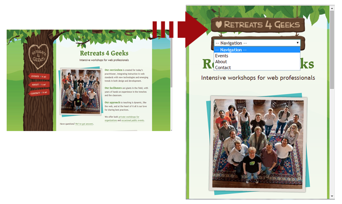
Select menu
The ‘Select menu’ is a simple and common menu approach. Select menus are accessible in every browser, easy to implement, and familiar to everyone. Their simplicity is their main drawback. Select menus are generic looking, and might not fit with the feel of your site.
Positives
This method frees up plenty of space and keeps interactions in the header where users are accustomed to finding web navigation.
They are easily recognizable through a clear label such as “navigation” or “menu” and pull up native controls, with each mobile browser handling select menus their own way.
Negatives
With select menus you lack design and styling control. Each browser handles them in their own, usually clunky, manner.
They are potentially confusing, especially when handling nested lists, that can look strange. Child elements are typically handled by indenting with dashes, and while this method might get the point across, and Brad Frost also sees it as confusing and ugly.
The other disadvantage is that select menus rely on Javascript. It is needed to rewrite the page markup and transform an unordered list into a select list. The method doesn’t require much code to convert the list to a select menu, but should be noted.
Toggle
With the toggle approach, a menu slides open in the header. It’s a good-looking approach, scalable and user-friendly. This pattern is not difficult to implement and allows you to keep your whole menu and for users to easily navigate with it.
For its mobile version, the University on Notre Dame has chosen this approach.

Positives
The user is presented with an accordion type navigation. The toggle menu appears in place and keeps the users there, without the risk of disorienting them.
It’s simple, elegant, composed of a smooth animated flyout or basic show/hide and is easy to scale. Through the use of CSS, you only have to hide the mobile trigger and show the menu when the appropriate breakpoint is reached. That’s all.
Negatives
This method relies on a small amount of Javascript needed to trigger the toggle, so you could face some minor issues with a few browsers. This method also relies on animations, these can perform poorly on mobile devices and may need to be disabled.
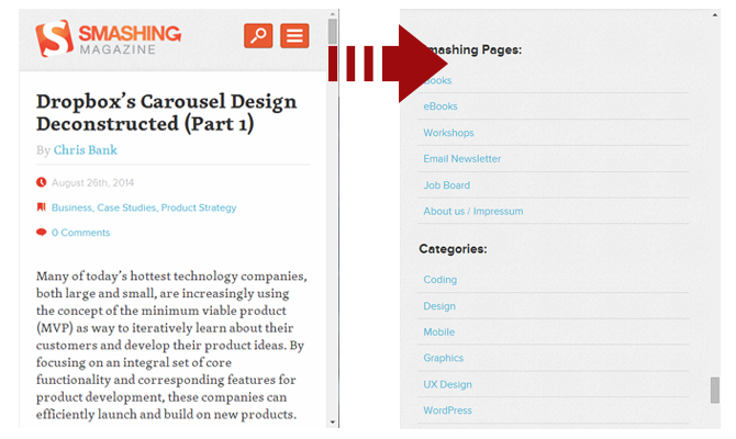
Footer-Anchor
Footer navigation is appealing for the same reasons as top navigation. It’s easy to implement and makes sense for simpler sites. This pattern is pretty self explanatory, navigation is placed in the footer.
It can be applied in two possible methods. The first is including an anchor in the header pointing to the main navigation at the bottom of the page. The second skips the anchor and assumes you’ll figure it out. The second method is more direct and cuts down on endless scrolling.
Smashing Magazine employs the Footer-Anchor approach.
Some websites get away with just having links in the footer with no menu at the top. Others have implemented a direct jump from a menu button to the footer. The jump to the footer can be a little disorienting and can make the experience worse.
Positives
It’s simple to implement (anchor at the top and menu on the bottom), doesn’t use Javascript and leaves plenty of space for core content.
Negatives
Quickly jumping to the footer of the site can be disorientating and unelegant.
Footer only
This approach is like the footer anchor approach but without the anchor in the header. It follows the content-first, navigation-second model, however it requires mobile users to scroll all the way to the bottom in order to navigate the site.
Positives
It frees up header space.
Negatives
Users find it difficult to discover and access, especially on mobile devices.
There are not so many examples of this approach. To give you an idea, here are the links of the websites discovered by Brad Frost himself:
Conclusion
In this article we’ve looked at 5 common approaches for creating a simple, good-looking and functional menu. Try combining these styles and approaches to create interesting navigational methods and let me know what you discover.
Frequently Asked Questions on Mobile Navigation Menus
What are the key elements to consider when designing mobile navigation menus?
When designing mobile navigation menus, it’s crucial to prioritize simplicity and ease of use. The menu should be easily accessible, preferably at the top or bottom of the screen, and the icons should be large enough to tap without difficulty. It’s also important to limit the number of menu items to avoid overwhelming users. Additionally, consider using familiar icons and labels to improve user understanding and navigation.
How can I make my mobile navigation menu more user-friendly?
To make your mobile navigation menu more user-friendly, ensure it’s responsive and adapts to different screen sizes. Use clear and concise labels for your menu items and group related items together. Also, consider using visual cues like icons to help users navigate more easily. Lastly, ensure your menu is easily accessible from any page on your site.
What are some common mistakes to avoid when designing mobile navigation menus?
Some common mistakes to avoid include overcrowding the menu with too many items, using vague or confusing labels, and placing the menu in a hard-to-reach area of the screen. Also, avoid using complex animations or transitions that can slow down the site and frustrate users.
How can I use anchor links effectively in my mobile navigation menu?
Anchor links can be used to direct users to specific sections of a page. To use them effectively, ensure the linked section titles are descriptive and accurate. Also, consider highlighting the current section in the menu to help users understand where they are on the page.
What are some examples of effective mobile navigation menu designs?
Some examples of effective mobile navigation menu designs include the “hamburger” menu, which hides the menu items behind a three-line icon, and the tab bar, which displays the main navigation options at the bottom of the screen. Other effective designs include the priority+ pattern, which shows the most important items and hides less important ones behind a “more” button, and the mega menu, which groups related items together in a large dropdown menu.
How can I test the usability of my mobile navigation menu?
You can test the usability of your mobile navigation menu by conducting user testing sessions. This involves observing users as they navigate your site and asking them for feedback. You can also use heat mapping tools to see where users are clicking and how they’re interacting with your menu.
How can I improve the accessibility of my mobile navigation menu?
To improve the accessibility of your mobile navigation menu, use large, easy-to-tap targets and ensure your menu is easily navigable with a keyboard. Also, use high contrast colors for text and background to improve readability, and provide alternative text for icons and images.
How does the design of my mobile navigation menu impact SEO?
The design of your mobile navigation menu can impact SEO by affecting user engagement and bounce rates. A well-designed menu can help users find what they’re looking for quickly and easily, which can increase engagement and reduce bounce rates. Additionally, clear and descriptive labels can help search engines understand the content of your site.
What are some tools I can use to design my mobile navigation menu?
There are many tools available to help you design your mobile navigation menu, including Sketch, Adobe XD, and Figma. These tools allow you to create interactive prototypes of your menu and test its usability.
How can I optimize my mobile navigation menu for larger screens?
To optimize your mobile navigation menu for larger screens, consider using a split navigation pattern, where primary navigation options are displayed on one side of the screen and secondary options on the other. Also, use larger, easy-to-tap targets and take advantage of the extra screen space by displaying more information or images.
 Annarita Tranfici
I have a Bachelor's degree in European languages, cultures, and literature from the University of Naples. I'm passionate about graphics and web design, and for several years I've been working on projects and designs for many companies. I'm a writer for the Audero User Group; my specialties are HTML, CSS, Web Design, and Adobe Photoshop.