
Scalable, Fluid or Responsive: Understanding Mobile Email Approaches
Mobile is a wildly popular topic in email design, which makes sense—emails opened on mobile devices have grown more than 400% since 2011, and mobile email opens hit the 50% mark in 2013. We’ve talked before about how important mobile has become to email marketers and the need to optimize campaigns for mobile audiences. But it’s not always clear which mobile email approaches (scalable, fluid, or responsive) work best for mobile audiences.
Since the writing of this post, there has been a huge movement towards hybrid design. We examine the differences between responsive and hybrid design, and cover the pros and cons of each.
To make matters worse, many marketers are confused about what strategies actually exist. Eliminating the possibility of not doing anything at all, mobile email design can roughly be broken down into three categories:
- Scalable Design
- Fluid Design
- Responsive Design
For marketers to choose the approach that best suits their needs, it’s important to understand the differences between these three approaches.
Scalable Design
Let’s begin with what many email marketers are currently using: scalable design. Scalable design can be defined as any design that works well across both desktop and mobile without using code to adjust table or image sizes, or display or hide content between the two platforms. While we’re using the term “scalable” to describe this approach, you may have also heard these concepts referred to as mobile aware, mobile friendly, agnostic or mobile first.
Scalable designs are typically the easiest to implement. Since scalable emails don’t adjust the widths of tables or images between devices, and don’t use CSS media queries (we’ll get to those later) to swap content or change the size of text, it’s important to use a number of techniques to keep the content of scalable emails enjoyable not only on desktop, but when viewed on mobile devices as well.
- A simple (usually single-column) layout that scales down nicely.
- Large text that is readable on screens of all sizes.
- Large, touch-friendly calls-to-action.
For more information on scalable design, Lauren’s post on the differences between scalable and responsive design is a great place to start. Our Anatomy of the Perfect Mobile Email infographic is another excellent resource.
One thing to keep in mind when designing scalable emails (or any email) is the Android “Grid of Grim.” In some Android email apps, messages are not scaled at all, resulting in the need for subscribers to scroll both vertically and horizontally. Ideally, you should place the most vital information in your campaign on the left side of your email—keeping things like logos, important copy, and CTAs visible without having to scroll horizontally.
When optimized using the techniques above, scalable emails are a great way for marketers to engage with their mobile audiences without the need to drastically change process or introduce new workflows. They typically require no extra coding or knowledge beyond what most email designers already know—it’s just a matter of making mobile users a priority and altering the overall email layout to accommodate their needs.
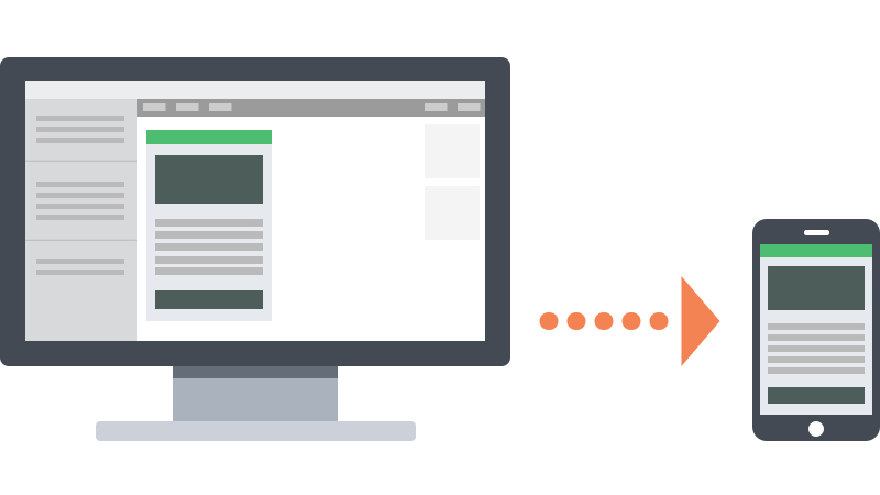
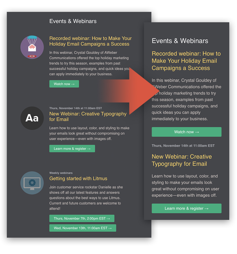
Check out these great examples of mobile-optimized, scalable emails:
While scalable emails are good for teams that need a quick solution, more advanced solutions allow for better control over campaigns on different devices.
Fluid Design
In between scalable and responsive is what we term “fluid” design. Fluid emails use percentage-based sizing to make the width of tables and images adapt to the screen size on which they are viewed, similar to what is known as “liquid” layouts on the web. Fluid emails are similar to scalable ones, in that they don’t purposefully alter the layout or content of an email, but they have the added benefit of having content “flow” to fill space on the screen. For this reason, fluid designs typically work best for text-heavy layouts since there’s less control over how copy and images relate to each other.
Implementing a fluid layout is relatively simple. Instead of using pixels for sizing tables, you use percentages.
<table border="0" cellpadding="0" cellspacing="0" width="100%">
    ...Content...
</table>
However, Campaign Monitor makes a good point that you will need to constrain the width of your emails on larger screens. If left completely fluid, emails on these screens will be too wide and the copy will be hard to read.
Line lengths can become unwieldy in unconstrained fluid layouts
While websites can use the CSS max-width property to constrain the layout to a specific size, this technique isn’t widely supported in email clients. However, we can use alternative methods for limiting the width of a layout. The best way to achieve this is by wrapping the content of your email in a container table with a fixed width.
<table border="0" cellpadding="0" cellspacing="0" width="500" class="wrapper">
    <tr>
        <td>
            <table border="0" cellpadding="0" cellspacing="0" width="100%">
                ...Content...
            </table>
        </td>
    </tr>
</table>
Then, you can make that fixed width fluid by targeting it in a media query:
@media screen and (max-width: 525px) {
table[class="wrapper"]{
width:100% !important;
}
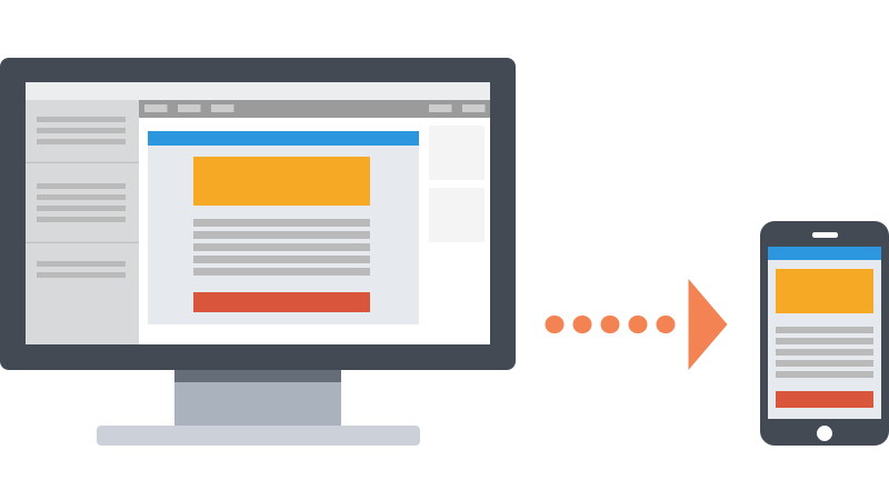
}Now, your tables and images will flow beautifully on most mobile devices, while still being readable on larger screens, just like some of these great emails:
It should be noted that fluid email designs are becoming less common these days. Fluid tables and images are almost always coupled with responsive design techniques to allow for the most control over email designs. Don’t let that discourage you from using fluid techniques, though! It’s still an excellent way to optimize for mobile if you don’t have the resources to devote to a completely responsive template.
Responsive Email
Responsive email takes everything from scalable and fluid emails and builds on it by adding more control via CSS media queries. While media queries are also used to help contain fluid layouts, it’s a simple implementation of media queries—nothing too advanced was happening. Responsive email, on the other hand, uses media queries to change the layout of emails, adjust the size of text, images, and buttons, and, in some cases, hide or even swap content between desktop and mobile devices.
CSS media queries allow you to target things like device and screen size to set up conditional styles for those sizes.
@media screen and (max-width: 525px) {
    img[class="hide"]{
        display:none !important;
    }
}
Using media queries, you can perform some impressive email acrobatics. Content can be shifted around, hidden, and even swapped out, providing email designers with amazing control over their campaigns on mobile devices.
For example, you can take a complex, multi-column layout on desktop and streamline it into a single-column, easy-to-scan, easy-to-scroll design on mobile—complete with larger text and more touch-friendly buttons.
Responsive design can be an amazing tool, but some designers have found it hard to wrap their heads around, which is why we made our How-to Guide to Responsive Email Design. Anna Yeaman over at STYLECampaign put together an amazing video that goes into what is possible with responsive email design. Our friends at Campaign Monitor also have a wonderful guide on the subject. Finally, if you don’t have the resources to build your own responsive templates, our friends at Stamplia recently built 7 Litmus-exclusive responsive email templates.
While responsive email design is the most powerful tool for dealing with mobile, designers should be aware that media queries and responsive techniques don’t work everywhere. Depending on your audience, though, you can start using responsive techniques today. We suggest starting small by using simple techniques (enlarging fonts on small screens for example) and then gradually working your way to more advanced concepts as you grow more comfortable with media queries. Using mobile-aware techniques as a foundation for your responsive emails allows you to design an email that falls back gracefully in clients that don’t support media queries.
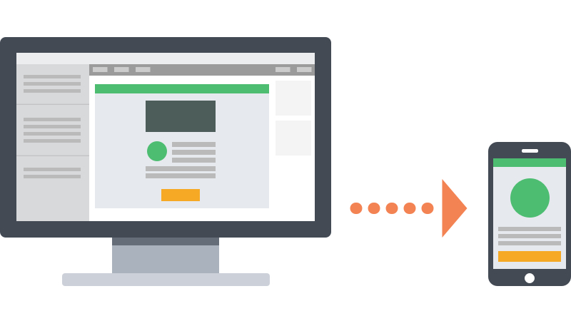
Here are some of our favorite responsive emails:
Which of the mobile email approaches is best?
Once you understand the differences between scalable, fluid, and responsive email design, you can determine which strategy works best for your team. If you lack the know-how or resources to implement a responsive campaign, both scalable and fluid strategies are a great way to keep your emails friendly for mobile subscribers. However, if you have the time to go fully responsive, the added control can be exactly the thing needed to set your campaigns apart from the competition.
Scalable Design |
Perfect for: |
Testing the mobile waters |
Reliable rendering across clients and devices |
Teams with limited resources |
Fluid Design |
Perfect for: |
Simple layouts |
Emails with mostly text that can flow |
Teams with limited resources |
Responsive Design |
Perfect for: |
Large mobile audiences |
The most control over layout |
Teams with knowledge of media queries |
 | Try Litmus Community’ Responsive TemplatesWant mobile responsive designs right out of the box? Try Litmus Community Templates, a collection of free, pre-tested designs for you to use in your next campaign. |
Jason Rodriguez
Jason Rodriguez was the Community & Product Evangelist at Litmus
 Blog
Blog 