The Lost, Surprisingly Soulful Art of Corporate Identity
A book compiles some of the most influential, paperbound graphic bibles from a previous era of business.
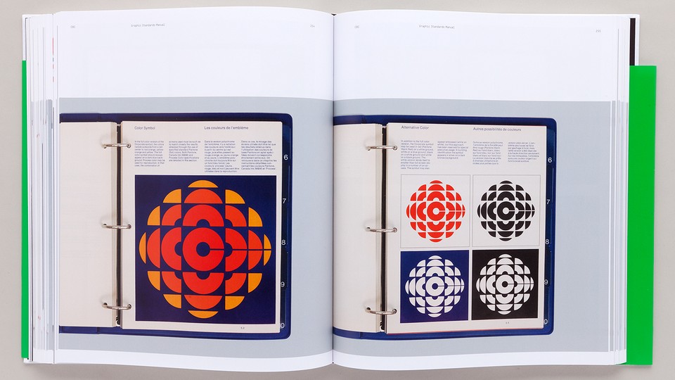
Before corporations, entertainment companies, sports franchises, and political parties acquired “brand narratives,” the notion of branding was a subset of a practice called “corporate identity.” CI, as it was known, required companies and design firms to develop, refine, and maintain an integrated identity system defined by laws set down in a bible known as the graphic standards manual.
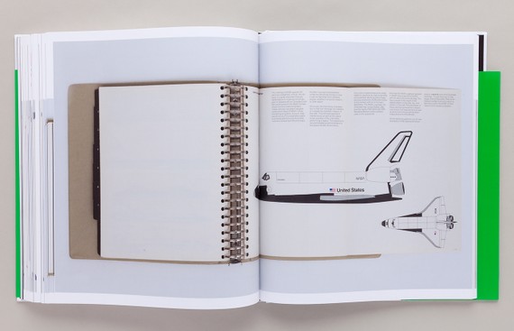
This gospel according to the design-creator was handed down to supplicant designers whose job, like scribes of old, was to precisely apply the logos, adhere to the corporate color and typographic palettes, and follow the formats without diverging even a fraction from the established guidelines. For designers and collectors of graphic design, some of these manuals—including ones for IBM, Lufthansa, the New York Subway System, and NASA—are sacred texts, revered for how they help shift graphic design from simply an intuitive practice to a rigorously strategic one.
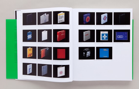
Nonetheless, manuals are ephemeral, and many were simply discarded when identities changed or businesses merged or closed. Now, a thick, rich compilation with the deceivingly dreary title, Manuals 1: Design and Identity Guidelines (Unit Editions) digs back up some of these treasured tomes.
Unit Editions is a London-based independent book packager, founded by the graphic designers Adrian Shaughnessy and Tony Brook, that appeals to a growing design audience online. It was Brook who spotted the need to showcase old CI manuals. “He is a longtime admirer of these wonderful documents, and although I shared his enthusiasm, I doubted that there was a book in it,” Shaughnessy recently wrote me in an email. “As we began to compile the stuff we realized we were engaged in an important work of graphic design archeology. These beauties needed to be preserved.”
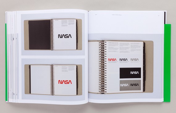
The duo had acquired a few specimens when working on their earlier books on the Dutch design firm Total Design and the late British designer FHK Henrion, both known for their magnificent identity manuals. Other specimens came from friends, collectors, and fellow designers. “The NASA manual was a major surprise to me,” Shaughnessy said. “I was aware of the famous 'discarded' NASA identity [the so-called worm versus the meatball], but I didn't know that there was a hugely detailed manual. It's a delight.”
The golden era of manuals began in the 1960s with the rise of the first big global corporations. It wasn't long before everybody from small companies to sports events, even cities, needed a corporate identity—and if you have a corporate identity, said Shaughnessy, “you need a manual.” The early examples in Manuals 1: Design and Identity Guidelines represent a period in American and European culture when the corporate world was rapidly changing. In the 1960s and ‘70s, corporations grew, often with numerous subsidiaries, and it became clear that a coherent and sustained visual identity was essential. So lots of smart graphic designers (Paul Rand, Saul Bass, Lester Beall, Otl Aicher, Chermayeff & Geismar, Josef Muller-Brockmann, and many more) stepped in to service this need.
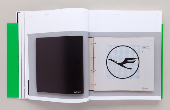
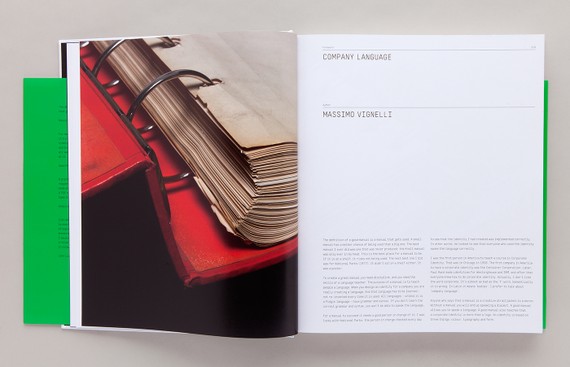
This was a time when Massimo Vignelli (who wrote an introduction to Manuals 1) and Bob Noorda created the New York Transit Authority (subway system) manual. “It is a brilliant document because it is designed to be used by non-designers—sign makers, trades people, technicians, etc.,” Shaughnessy said.
For CI manuals, it wasn’t enough to simply look great. “Corporate identity demanded a systems-led approach,” Shaughnessy said. “It required planning skills, logistical skills, and a vast knowledge of materials and surfaces. The graphic designer suddenly had more to worry about than the choice of typeface for a letterhead. Designers could no longer be inspired amateurs. The great manuals of the second half of the 20th century are the evidence of that reinvention.”
The genre of intensely detailed printed manuals is over. Brand identities still come with guidelines, but they tend to be presented in PDFs and downloadable templates. In the book Shaughnessy quotes branding critic Armin Vit as saying, “A PDF seems so ephemeral. It's hard to take it seriously, especially when they are labeled on the cover as Version 1.0 or Version 1.5. What's the point of following this if it might change next month?”
It’s not merely that “branding” has replaced “CI” as a buzzword. “Unlike corporate identity (from the pre-branding era) today's branding is largely controlled by non-designers who view design as 'look and feel', an afterthought, something that can’t exist without the life support system of strategy and focus groups,” Shaughnessy wrote. “Branding really is marketing, which CI never was.”
Although manuals are not produced today, the precision does seem to pique the interest of up-and-coming designers. Shaughnessy believes “it appeals to a youngish audience (under 40) of designers who view this work as coming from a time when clients were more respectful of design. These clients were less well-informed about design than today’s clients, but they weren’t so market-driven, with the result that the work has an integrity that it lacks today.” What’s more, as designers are grappling with ways to organize even larger data deluges in print and on screen, Shaughnessy asserts and Manuals 1 shows “that the great manuals of the past are triumphs of information design—something that is greatly prized today.”