ADV @ UNDERCONSIDERATION Peek here for details
BROWSE
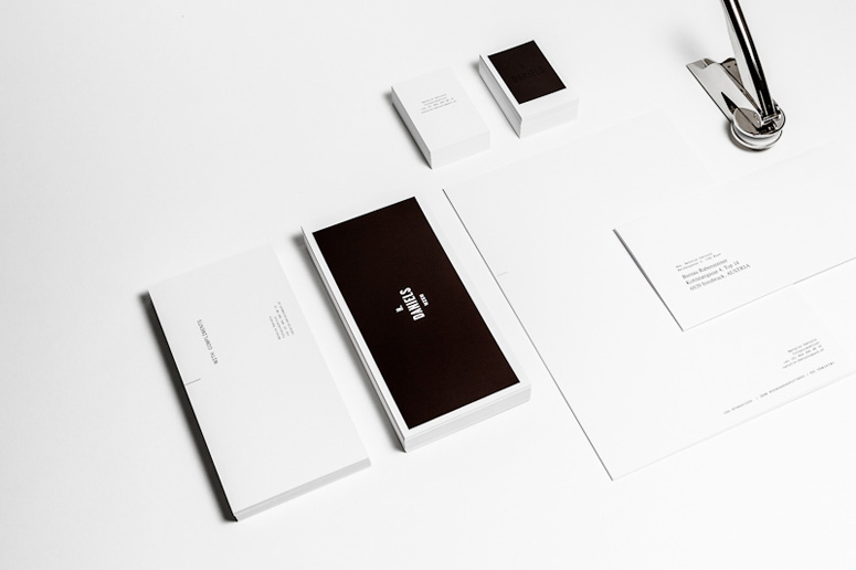
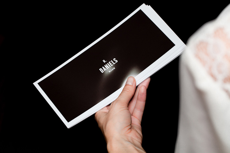
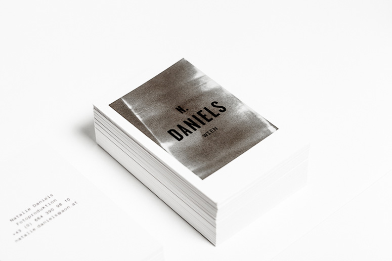
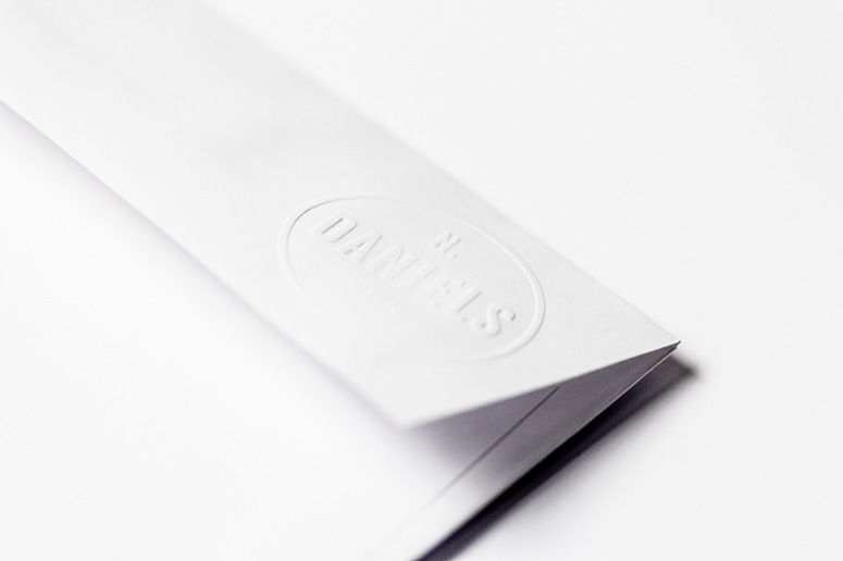
N. Daniels Stationery
Production Method
Offset
Silkscreen
Design
Bureau Rabensteiner
Isabella Meischberger
Mike Rabensteiner
Printing
Hernegger Druck
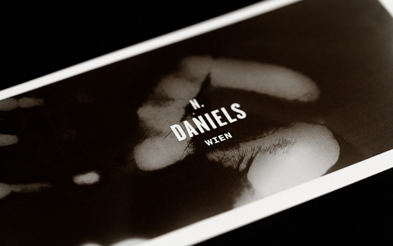
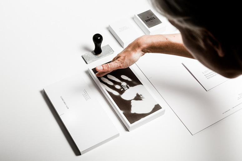
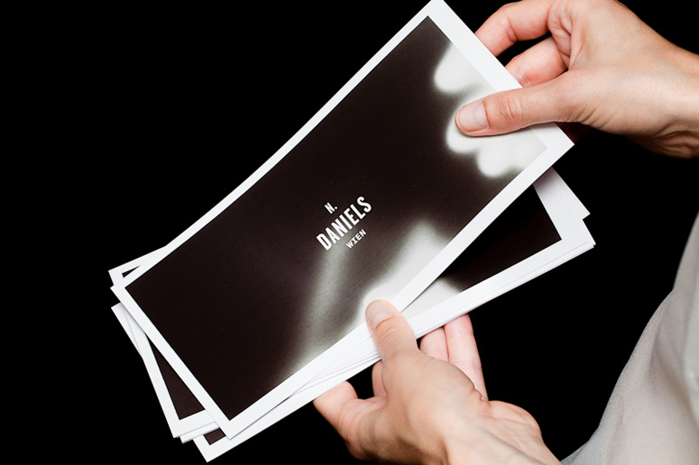
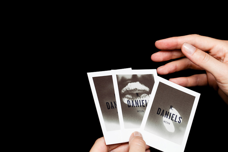
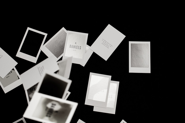
Thermo-sensitive black varnish that loses it’s color in response to heat creates a dynamic, ever-changing stationery set for Vienna photo rep and producer Natalie Daniels.
Client
Natalie Daniels
Quantity Produced
1,000
Production Cost
$985
Production Time
4 weeks
Dimensions (Width × Height × Depth)
–
Page Count
–
Paper Stock
Fedrigoni / Ispira purezza / white / 360 g/m2
Number of Colors
1
Varnishes
Thermo sensitive ink
Binding
–
Typography
Garage Gothic
Nimbus Mono
Project Description
This is the stationery design for N. Daniels, a rep and photo producer in Vienna. It's simple, cool and thermo-sensitive. The black color of the varnish fades at body temperature — as soon as you hold it in your hands you literally produce an image by yourself. It's a dynamic and living design — the business cards are little Polaroids with a constantly changing surface.Production Lesson(s)
It was a very stretching project from beginning to the end, because the printer didn't have any experience with thermo-sensitive varnish on stationery applications. We had to experiment with materials and temperature. In the end it was worth it and we are very satisfied with the outcome.
Post Author

Kelly Cree
Writer for UnderConsideration LLC.
More: Online / On Twitter
Date Published
September 6, 2012
Filed Under
Offset
Silkscreen
Stationery
Tagged with
photography
thermo-sensitive varnish


About
FPO (For Print Only), is a division of UnderConsideration, celebrating the reality that print is not dead by showcasing the most compelling printed projects.
FPO uses Fonts.com to render Siseriff and Avenir Next.
FPO is run with Six Apart’s MovableType
All comments, ideas and thoughts on FPO are property of their authors; reproduction without the author’s or FPO’s permission is strictly prohibited
Twitter @ucllc
Sign-up for Mailing List
Mailing list managed by MailChimp
Thanks to our advertisers
About UnderConsideration
UnderConsideration is a graphic design firm generating its own projects, initiatives, and content while taking on limited client work. Run by Bryony Gomez-Palacio and Armin Vit in Bloomington, IN. More…
blogs we publish
Brand New / Displaying opinions and focusing solely on corporate and brand identity work.
Art of the Menu / Cataloguing the underrated creativity of menus from around the world.
Quipsologies / Chronicling the most curious, creative, and notable projects, stories, and events of the graphic design industry on a daily basis.
products we sell
Flaunt: Designing effective, compelling and memorable portfolios of creative work.
Brand New Conference videos / Individual, downloadable videos of every presentation since 2010.
Prints / A variety of posters, the majority from our AIforGA series.
Other / Various one-off products.
events we organize
Brand New Conference / A two-day event on corporate and brand identity with some of today's most active and influential practitioners from around the world.
Brand Nieuwe Conference / Ditto but in Amsterdam.
Austin Initiative for Graphic Awesomeness / A speaker series in Austin, TX, featuring some of the graphic design industry's most awesome people.
also
Favorite Things we've Made / In our capacity as graphic designers.
Projects we've Concluded / Long- and short-lived efforts.
UCllc News / Updates on what's going at the corporate level of UnderConsideration.

Related entries
Reticence Stationery
Rebecca Polewsky Stationery
Prieto Estudio Identity Materials
Hechizoo Stationery
The Hideout Stationery