

New year, new designs. 2017 has some interesting design trends that can bring your eLearning game to the next level if you know how to use them. In this post, we’ll take a walk through some of the things you’re going to be seeing this year and the best ways to use these styles in eLearning.
It’s worth noting before we get started, that not all of these trends are great for every situation and trying to combine too many of them will make your courses look cluttered instead of fresh and exciting. Also, eLearning designers will serve themselves and their clients well by being able to describe the problem their design choices are intended to solve and why elements are in your course. Hint: “Because it looks cool” is not a good enough reason.
With that side note out of the way, let’s look at some ways you can update and renovate your eLearning designs.
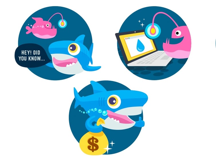
1) Cartoon-Style Never Gets Outdated
Take a break from staid, boring corporate styles of eLearning design by giving a cartoon personality to your courses. While this trends is not new, and it might not be for every topic, animated cartoons and graphics are being used increasingly in web design to appeal to adults so why not in eLearning? We grew up with cartoons, and while we might not want to watch the same things we watched as kids, the colorful, lively style still appeal to us adults.
This isn’t just about looks, though. By having a style that is more engaging, we are better able to get and keep our audience’s attention. Cartoons also help us avoid the pitfalls of illustrating a point with a stock photo that isn’t quite right or looks kind of cheesy.
See this example made by Sam Oxley for Digital Ocean referral program:
Find more examples here: 20 cartoon-style web designs
Find free cartoon vectors here: Freepik
2) Bespoke Illustrations
Illustrations are full of personality. They often inject an element of playfulness and are more approachable than other type of visuals.
Illustrations exclusively created for your eLearning design help to brand your style and also create cohesiveness in your course. With so many styles of illustration to choose from, this can be an easy way to set a tone for your course.
Since you have to capture your audience’s attention in seconds, these custom illustrations are the perfect way to quickly charm your learners. They provide a visual with a true sense of personality, something that stock photos can’t do so easily.


Images by Ibnu Mas and Josh Warren
3) Get Retro, Stay Modern
Retro and vintage are often confused terms, but they refer to different time periods (typically). Vintage mostly refers to the first half of the 20th century while retro or modern retro is inspired by the late 1970s through the 90s.
This is a style marked by old 8-bit video games, pixel art, chunky fonts from the 80s and 90s and similar color palettes to these eras. Modern retro has been gaining traction in the past few years, even though the original versions of these styles weren’t that long ago. They invoke nostalgia and are appealing to a variety of age groups.
This is a great example of modern retro inspiration by Daniel Jewel. If you played any old Skool Nintendo games, this design should have a very similar feel to that for the 80s and 90s kids.

Why Modern Retro?
Modern retro can have a way of looking both old and new at the same time and can appeal to a variety of age groups. Their use of bright hues and simple shapes are fun to work with and are easy to work with and can grab people’s attention quickly.
When Doesn’t Modern Retro Work?
While we’re digging this style, it isn’t for every audience. Learners who aren’t familiar with the original designs might not find them appealing and will, instead, find them just plain old looking. Modern retro designs also don’t play too well with other styles so you gotta keep ‘em separated. Because of this, modern retro isn’t a good choice unless you really want to commit to it and use it throughout your entire course.
4) Photo Realism
Like the design below, which features a realistic table and real ingredients, learners get a version of photo-realism that is almost more real than an actual kitchen. This makes your design seem more tangible and easier to engage with than other designs.
The level of realism also makes your course look like another place, a place that draws your audience in and gives them a space just for learning.
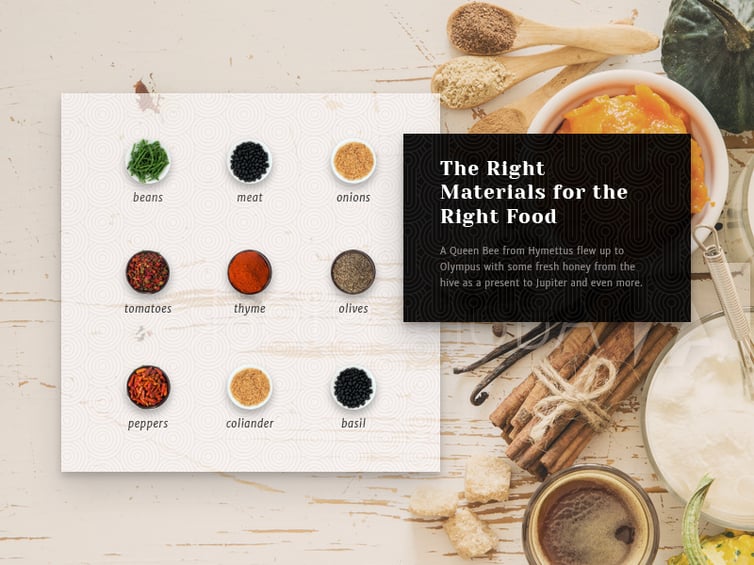
Image by Oxygenna
5) Bold Typography
This year, typography will be more than just words. You’ll see fonts being bolder and bigger on the page and become far more of a design element that will equal the weight of other visuals. Fonts will get more creative as well as the sheer number of web compatible fonts rises. Designers are allowed more freedom because of this and are taking typography chances they wouldn’t have in the past.
eLearning Designers and audiences who are sick of all the usual fonts can rejoice this year as we incorporate vintage and retro lettering, bespoke typefaces, and more. It’s a way for you to flex your creative muscles and make a statement with your typography.
See this example:
Image source: www.thebestdesigns.com
6) Colors and Gradients that Dazzle
Things are happening in the design world that will make bold colors and two-tone gradients huge this year. Green will be especially big as Pantone picked Greenery as their 2017 color of the year as a symbol of new beginnings.
Google’s Material Design has made certain color combinations trendy as well. Find them here. Notice that all the colors are decidedly bright and forward with little in the way of muted colors. Other useful sites for choosing colors include: Material Design Palette and MaterialUI.
Duotone photos will also be a part of this bold color palette for 2017. These photos use two colors to make a kind of alternative black and white photo with contrasting lettering or other elements like the photo below:
You’ll notice this type of photo color scheme on popular sites like Spotify or in thumbnail images on Youtube.
Also see this example:
Image source: www.cssdesignawards.com
More Than Just Looks: These bold colors aren’t just about making your courses look good or grabbing attention. They also improve user experience by creating buttons and navigation elements that are easier to see and use.
Gradients: While bold, minimal colors are nothing new, gradients are making a comeback and changing the way we use them. No longer are you confined to big blocks of complimentary colors, you can now use gradients to blend a few colors together. This gives you more options in where you put the colors and how you use them.
7) Minimalism isn't going anywhere
Despite the emerging trends of creative typography and cartoons, minimalism will remain a popular design choice for eLearning courses. Minimalism is especially good for eLearning design because it suits a wide range of topics and audiences well. The simplicity of minimalism also makes it easy to highlight and draw attention to important elements because there is far less chance of cluttering the page than with other design strategies.
To create an effective minimalist design, keep your editor’s eye open and use one element less than you want to. Both your colors and typeface choices should be small in number, possibly only one or two of each.
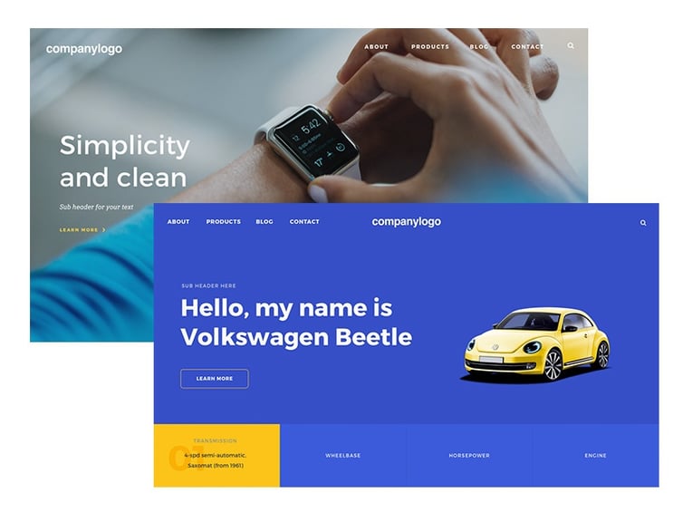
Image by Tito Rahadi.
With a minimalist style, don’t underestimate the power of white space. All designs require a certain amount of white space for visual relief, but minimalism is even more connected to adequate white space.
Despite this lack of things, minimalism can still incorporate a wide range of elements including animation. For animations to work in minimalism, they should be simple and show restraint. But, when done well they can bring classic elements together with modern ones. Above all else, have fun with your design. Your audience will enjoy it more when you’ve enjoyed making it!
Sources:
https://designshack.net/articles/layouts/minimalist-design-is-taking-over-heres-why/
http://www.onextrapixel.com/2010/08/31/a-detailed-look-into-popular-styles-in-web-design/
https://premium.wpmudev.org/blog/web-design-trends-2017/
http://info.webbege.com/blog/11-dynamic-web-design-trends-for-2017
https://designshack.net/articles/graphics/design-trend-modern-retro/
