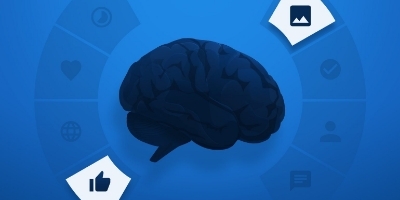
It’s hard to believe, but it’s true: Your brain is working against you.
As it turns out, some thought processes and mental shortcuts we use to make better decisions can actually do the opposite. They can lead us to behave irrationally.
The worst part is, we’re largely unaware of these tricky cognitive processes. However, the few who are aware of them hold great power over the choices of others and their own.
What is a cognitive bias?
In 1972, researchers Amos Tversky and Daniel Kahneman gave those self-sabotaging thought patterns a name: cognitive bias — a systematic error in mental processing that causes us to exercise poor judgment.
More than four decades later, countless experiments have studied the ability of cognitive bias to affect our daily lives — from decisions on what to eat, wear, read, and even buy. Skilled marketers who know how to use them in ads and post-click landing pages will benefit from more conversions.
Cognitive bias examples that impact your conversion rate
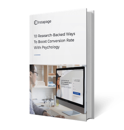
Learn about six cognitive biases that impact conversions, then grab your copy of “10 Research-Backed Ways To Boost Conversion Rate With Psychology” to discover more techniques for boosting conversion rate with psychology:
The current moment bias
While we spend a lot of time thinking about the future, research shows it’s hard for us to imagine ourselves there.
In one 1998 study, participants were asked to plan their diet for the day or week. When they were planning for the week ahead of time, 74% chose to add fruit to their meals. But in the moment, when they were planning for the current day, 70% chose chocolate instead.
How this cognitive bias affects your conversion rate
People like the idea of a better future, but they don’t like making sacrifices for it.
They want to be healthier, but they don’t want to give up junk food. They want to be smarter, but they don’t want to read. They want more money, but they don’t want to work harder.
That’s why, on your post-click landing page, it’s important to emphasize two things:
- How your product or service will improve your prospect’s future
- How quickly and easily your offer delivers results
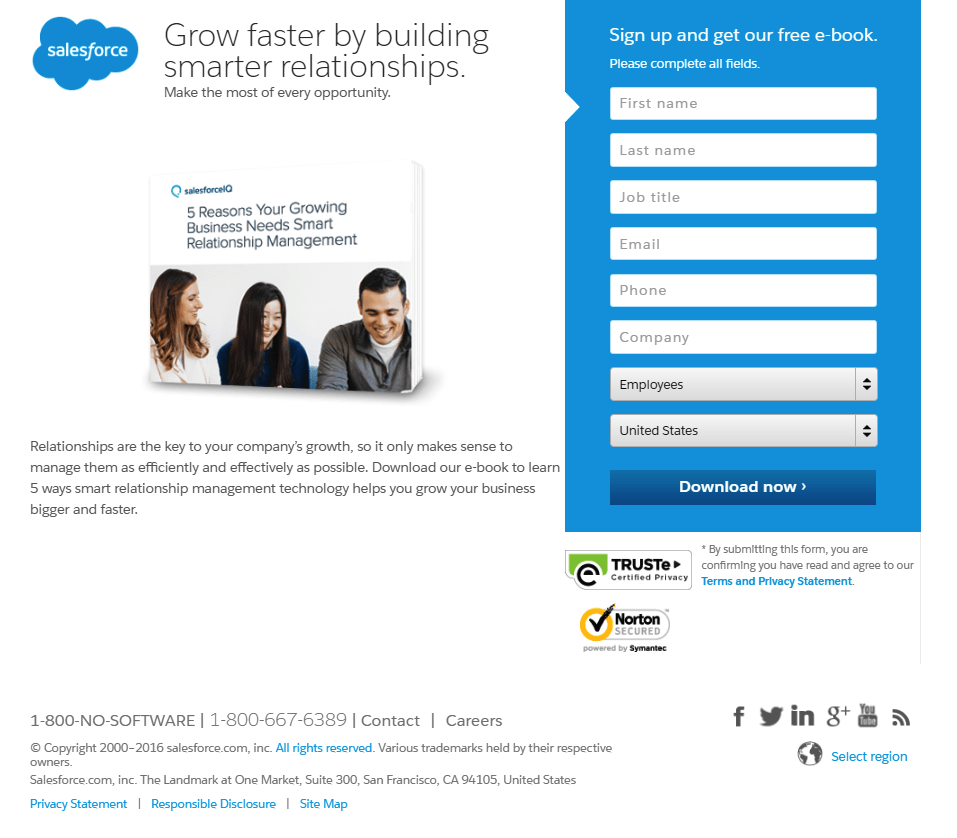
The more quickly and easily your offer helps them improve, the more likely your visitors are to claim it. Here’s an example of emphasizing quick, easy, powerful results:

The curse of knowledge
It’s a simple concept, but the problem it presents for post-click landing page designers is anything but. The curse of knowledge refers to the idea that once you know information, you can’t un-know it, which makes communicating with someone who doesn’t have that same knowledge difficult.
Consider a 1990 experiment at Stanford, in which test subjects were separated into two groups. The first was asked to think of a popular song, like “Happy Birthday” or the Star Spangled Banner, and tap its beat.
The second group, not knowing what the first group had picked, would have to guess the song based on the rhythmic tapping.
Members of group one were confident that 50% of their group two counterparts would be able to guess the song. But, test results showed they had overestimated. Only 2.5% of those in group two correctly guessed the song that was being tapped.
Because members of group one already knew the song, it was easy for them to recognize “Happy Birthday” or the Star Spangled Banner from their own tapping. But, to group two, the tapping just sounded like… well… tapping.
How this cognitive bias affects your conversion rate
As an expert on your product or service, you know everything about it — its complex features, immense benefits, return policies, and more. And that puts you, as a post-click landing page designer, in the difficult position of trying to sell it to people who know little to nothing about it.
According to the curse of knowledge, it’s not enough to imagine yourself in the position of clueless prospects. Instead, one case study shows, you have to find out what those prospects want to know.
When heat mapping software, Crazy Egg, was released, it wasn’t selling the way its founders had expected. So, they charged the Conversion Rate Experts with improving their homepage design. The original looked like this:
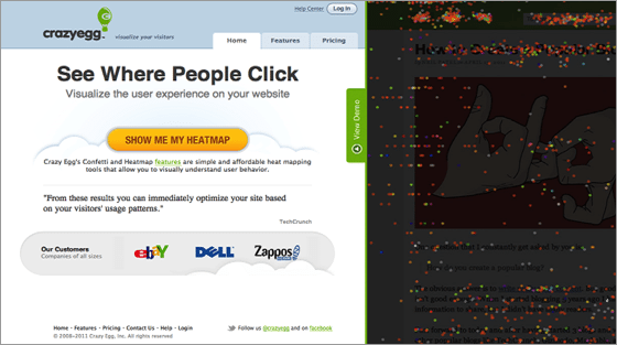
Before the team got to optimizing the homepage, though, they needed to figure out what was keeping customers from purchasing. According to surveys and conversations with customers, these were the hurdles to conversion:
- Some of Crazy Egg’s visitors were unclear about how heatmaps worked and exactly what sort of reports Crazy Egg would generate.
- As with many products, price was an objection.
- Some visitors thought that Crazy Egg was no different from overlay reports in Google Analytics.
- A subset of visitors thought that Crazy Egg had fewer features than some competitors’ tools
All of them involved the curse of knowledge. To combat it, the team at Conversion Rate Experts replaced jargon on the page with plain language; they informed prospects of the high cost of traditional eye-tracking studies; and they described all the differences between Crazy Egg and its competitors.
The result from just those optimizations was a page 20x longer than the original, and a conversion rate 30% higher.
Insensitivity to sample size
A town is served by two hospitals: one large and one small. In the small hospital, 15 babies are born each day, and in the large one, 45 are born each day. Statistically, we know that about 50% of those babies should be boys.
For a year, each hospital recorded all the days on which more than 60% of babies born were boys. Which hospital do you think had more of those days?
- The larger hospital
- The smaller hospital
- About the same (within 5% of each other)
If you said “about the same,” you’re like 56% of the study participants Amos and Kahneman asked this question to. Options 1 and 2 were picked by respondents at an even rate — 22% each.
Despite being a lesser popular answer, the correct one is option 2 — and that’s because smaller sample sizes (15 babies) are more likely to show variation than larger ones (45 babies). As the number of babies born continues to grow, the more likely the ratio of boys to girls will be an even 50/50.
How this cognitive bias impacts your conversion rate
The concept holds true for A/B testing results too. The bigger your sample size, the more accurate your data will be. That’s why it’s crucial to collect a large volume of samples before ending your test.
Too often, though, experimenters don’t. They conclude their test after seeing a big lift in conversion rate, or after their testing tool declares a winning variation. And that mistake can result in a false positive — an imaginary lift where there is none.
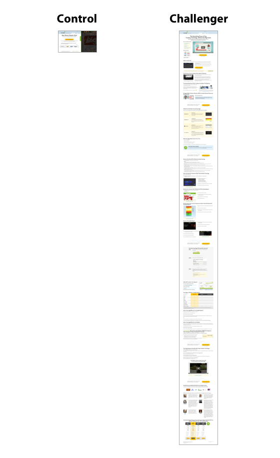
For example: Take a look at this data from A/B testing software used by marketer, Chase Dumont, to compare two sales pages:
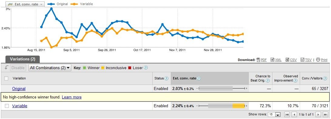
If Chase had concluded his test before Oct. 17, he would’ve been under the false impression that his original post-click landing page (in blue) performed better than the variation (in orange).
Luckily, he didn’t. He kept it running and continued to gather more data. And eventually, six months after the test began, he noticed that the original page’s conversion rate had regressed to the mean. It had averaged out over time, as all things do.
Whether it’s heads vs. tails, boy babies vs. girl babies, or your original post-click landing page vs. its control, all things eventually regress toward the mean. Decisions based on small sample sizes of quantitative data are misinformed ones, and they can be costly to your business.
The contrast effect
When we compare things, we do so with a reference point. For example, if you’ve ever watched a professional basketball game on TV, the players don’t look obscenely tall. And that’s because you’re comparing them to other tall basketball players on the court.
Take this photo of 7-foot-6-inch Yao Ming among his teammates:
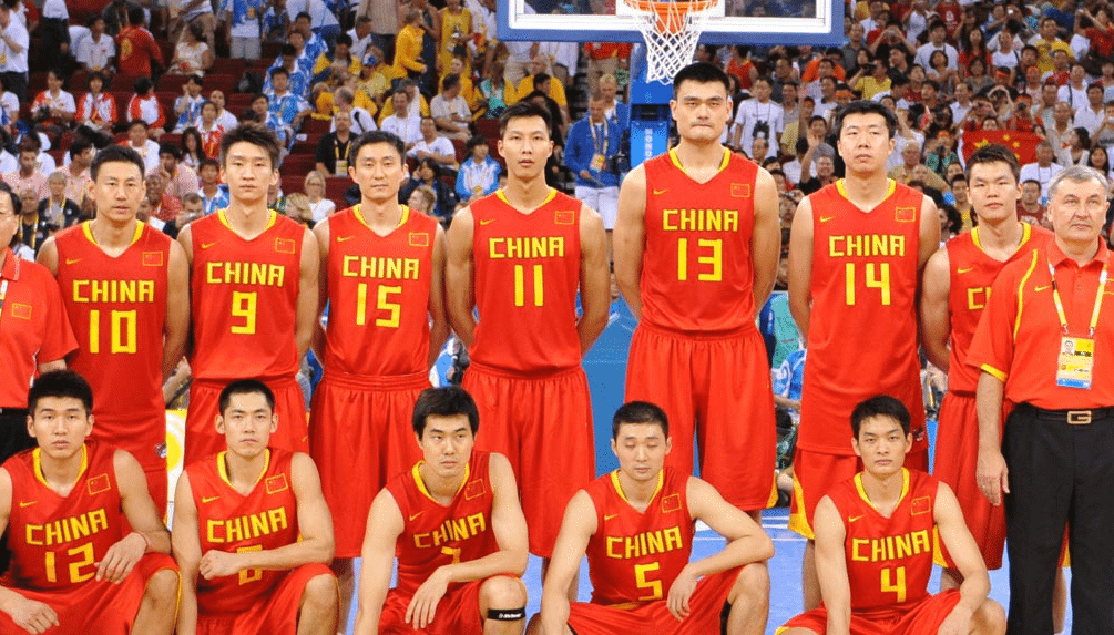
Sure, he looks tall here (five from the left). But, it’s not until you see him with everyday people that his size really sinks in (look at how small that wine glass appears in his hand!):
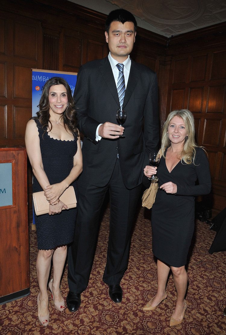
Ming hasn’t grown between the first photo and this one. The only thing that’s changed is the reference point we use to compare and contrast his height.
How this cognitive bias affects your conversion rate
The contrast effect is what gets your call-to-action button noticed, and your post-click landing page color scheme has a lot to do with it.
On this post-click landing page, the color blue draws attention:
But on this post-click landing page, the color blue makes the CTA button almost unnoticeable:
And that’s because contrast is dependent on surroundings. When a blue button is surrounded by colors other than blue, it stands out the way Yao Ming does when he’s surrounded by everyday people.
To make your button attention-grabbing, the color you choose to fill it with should be present on no more than 10% of your post-click landing page. And, that hue should be complementary to the color it’s surrounded by.
Loss aversion
The fear of loss is far more powerful than the joy of gain. That’s the idea behind loss aversion.
Consider an example offered by Aurora Harley of Nielsen Norman Group: Would you rather be given $900, or take a 90% chance of winning $1,000 (and a 10% chance of winning $0)?
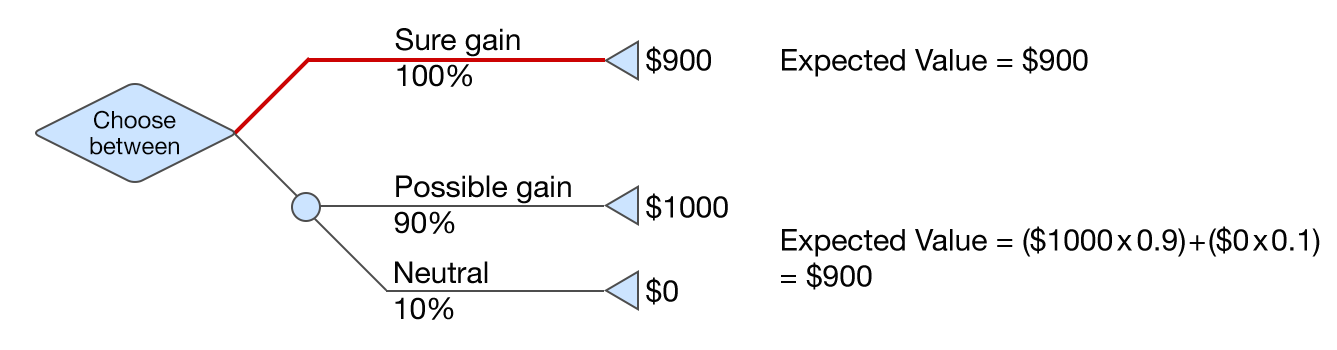
According to the concept of loss aversion, you’d be more likely to take the sure thing — $900 over the the possibility of getting $1,000 or $0.
On the other hand, if we told you that you could either lose $900 or gamble with a 90% chance of losing even more — $1,000 — and a 10% chance of losing nothing, you’d likely choose to gamble.
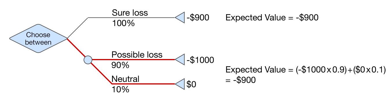
In both cases, you’re trying to avoid a loss — first by picking a sure $900 in the initial example, then a possible loss of nothing in the follow-up example.
How this cognitive bias impacts conversion rate
Like you, your prospects don’t like losing — especially things lower on Maslow’s Hierarchy of Needs, like money, that provide safety and stability.
If your offer is something that could protect your visitors from losing that safety and stability, emphasize it. Here’s an example from Fisher Investments:

And even if your offer isn’t directly related to helping your visitors avoid losses, your post-click landing page elements should be. Because, before they convert, prospects will look for indicators that convey it’s safe to click your CTA button. Those include:
- Reviews from highly satisfied customers.
- Security badges that let visitors know their information is safe.
- Indicators of authority — like titles, clothes, and trappings — that prove you’re a trustworthy source.
- Credibility signals that back up your authority with proof.
- “HTTPS” in your URL, which lets visitors know their information is safe from hackers.
- A privacy policy that details exactly what will happen to visitors’ personal information. once they click the CTA button.
- Money-back guarantees or return policies that allow visitors to reclaim what they’ve lost if they’re not satisfied.
Together, these elements will ensure prospects they have no loss to fear by converting on your post-click landing page.
The decoy effect
If you could eat at either a 5-star restaurant that’s far away, or a 3-star restaurant that’s close by, you’d probably have a hard time choosing. The tradeoff is quality for convenience.
But, you might change your mind when a third option is introduced:
- A 3-star restaurant that’s close by.
- A 5-star restaurant that’s far away.
- A 4-star restaurant that’s farther than both options (decoy).
Now, the 5-star restaurant is starting to look pretty appealing, isn’t it?
At Duke University, researchers posed this same question to a group of subjects, who were more likely to choose the 5-star restaurant once the 4-star restaurant was introduced. At that point, it was not only higher-quality than both options, but closer than one.
To further test their theory, they asked a similar question to a different group of subjects. These participants could choose from:
- A 3-star restaurant that was close by.
- A 5-star restaurant that was far away.
- A 2-star restaurant that’s between the 5-star and 3-star in proximity (decoy).
And the same thing happened. Because the 3-star option was now higher-quality than the 2-star option and closer than both others, subjects gravitated toward this one.
How this cognitive bias affects your conversion rate
The decoy effect is particularly useful when your post-click landing page features two pricing options. By strategically introducing a third asymmetrically dominated decoy price, you can nudge visitors toward the option you want them to choose.
The most well-known example of the decoy effect comes from an old Economist pricing page:
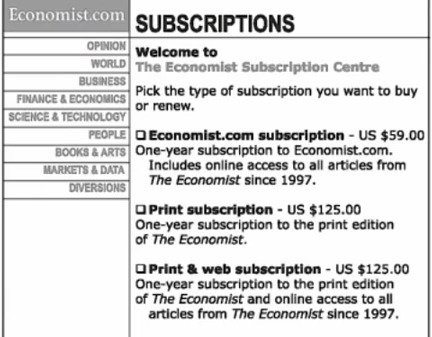
Behavioral economist and author of “Predictably Irrational,” Dan Ariely, asked 100 MIT students which of these subscriptions they’d prefer. Of that group, 84 said the print & web subscription, 16 said the web subscription, and 0 said the print subscription. Based on this poll, revenue to the Economist would’ve been $11,444.
Then, he removed the middle option (print only) and asked the same question to a different group of 100 MIT students. Of that second group, 68 chose the web only subscription while 32 chose the print & web subscription. Based on this poll, revenue to the Economist would’ve only been $8,012 — a fraction of what it was with the decoy price.
The key to succeeding with the decoy effect is making sure the third option is asymmetrical to the other two. If the print subscription had been $66, it wouldn’t have nudged visitors in either direction (because the digital, $59 + the print, $66 = print & digital, $125). But at $125, it made the print & digital subscription looks like the best offer. At that price, if you were to buy the print and the digital separately, it would cost $184.
Understanding cognitive biases in decision making is key to marketing success
Cognitive biases affect more decisions than you likely realize. Understanding them is the key to preventing irrational behavior that could ruin your business, and using simple persuasive techniques to increase your conversion rate.
Start tapping into the conversion-boosting power of cognitive biases by building professional post-click landing pages faster, sign up for an Instapage Enterprise demo today.

See the Instapage Enterprise Plan in Action.
Demo includes AdMap™, Personalization, AMP,
Global Blocks, heatmaps & more.
