


Whether you’re a novice or an old hand, how to use color is one of the most contentious and elusive questions in design.
Colors have myriad cultural, social, and emotional meanings, and the complexity of choosing a palette isn’t made any simpler by the fact that a designer’s options are practically infinite.
In this week’s article, our in-house design guru, Patrick Multani, shares his tips for how to build great color palettes. Let us know what you think in the comments – and feel free to share any other tips that you use in your work!

Before starting to pick colors, I often think of Dustin Senos’ short article about design principles. He explains that, at Medium, they use principles like “direction over choice,” “appropriate over consistent”, and “evolving over finalized”. I think this way of forming principles also works for colors: white over gray; harmony over disconnect; cool over warm. I try to keep these ideas in mind as I work. They serve as a kind of sense-check — a bit like how a user persona guides UX designers.
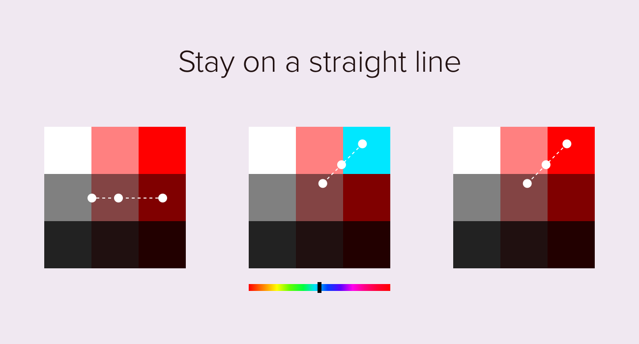
When choosing colors, I try to stay on a straight line, either diagonally or from left to right. This gives any palette an immediate sense of relationship and progression. The resulting set of colors could be used to indicate active and inactive buttons, borders, or backgrounds. We can also leave the dot in the same place on the color selector, but cycle through colors using the hue slider. This can produce exciting, harmonious palettes, like the one illustrated (above, center).
[MID_ARTICLE_CTA]
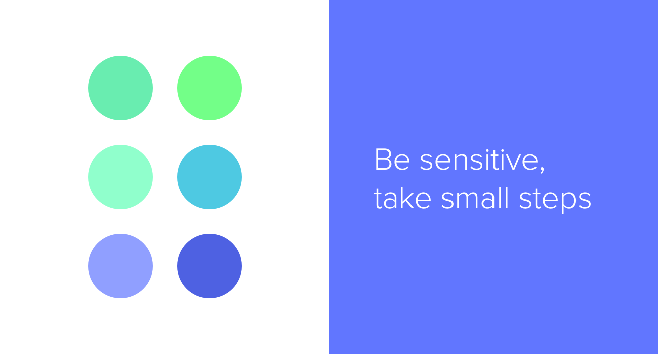
What I experience over and over again is how fragile color palettes are: a slight adjustment can make a huge difference to a color scheme’s overall effect. So I find it’s important to be sensitive, and make changes in small steps. For example, choosing a cool or warm gray can dramatically increase the harmony of a design. We can become more sensitive to the subtleties of color by picking a lot of them, truly looking at them, and iterating repeatedly.
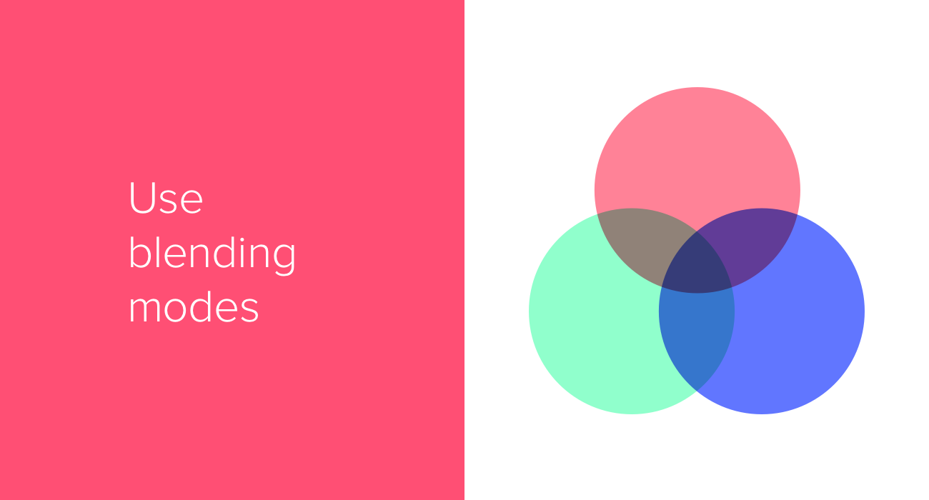
I use blending modes to help create exciting color palettes. By simply creating two overlapping shapes, and selecting the “Multiply” blending mode, we get a third, matching color. On a white background, we can also experiment with the opacity setting to quickly adjust lightness. I always find it’s worth trying the opposites as well: a black background, in combination with the “Screen” blending mode. Blending modes offer a new way of interacting with color, and they are often used extensively by experienced designers.
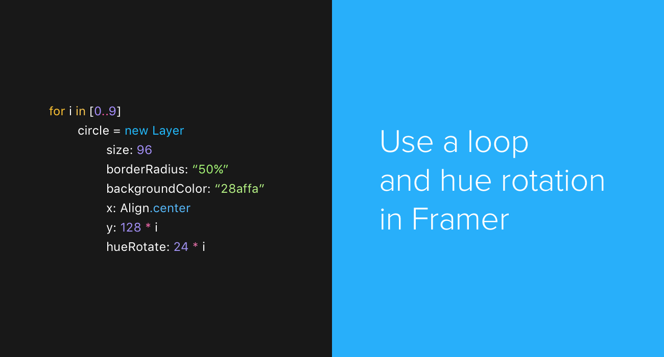
On the Framer website recently, I spotted an example prototype of four rotating squares, with different hues and opacity levels. It was beautiful, so I immediately fired up Framer to create some color palettes using a simple for loop. Set a starting backgroundColor, and use hueRotate together with opacity to generate colors. The hueRotate ranges between 0 and 360, the opacity ranges from 0 to 1 (decimals work too), and depending on these numbers we get different palettes. I’ve found this so valuable that I now use Sketch in conjunction with Framer, to see what certain colors looks like in a loop. To pick colors from Framer to use in my designs, I take a screenshot of the Framer canvas, paste it into Sketch, and then use the color picker.

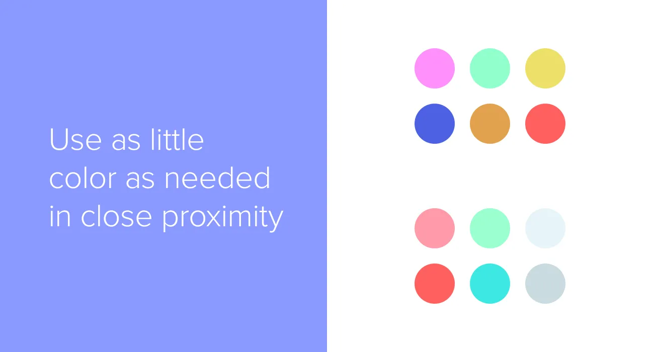
Picking great colors is one thing — using them effectively in a visual design is another. Colors can look great out of context, but once they’re applied to a particular design project, the palette can fall apart. Using as few colors as possible in close proximity can calm down a design. For example, using different kinds of blue for text, icons, and borders can work nicely. This approach leaves us the option of using a different hue to highlight something when we really need it to stand out.
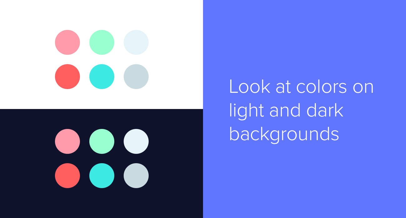
I remember working on a project which required a scalable color system. I picked tons of nuanced colors, and it was getting difficult to distinguish between them. So I made a copy of the colors, and added a dark background to find another perspective. This helped me to make better decisions.
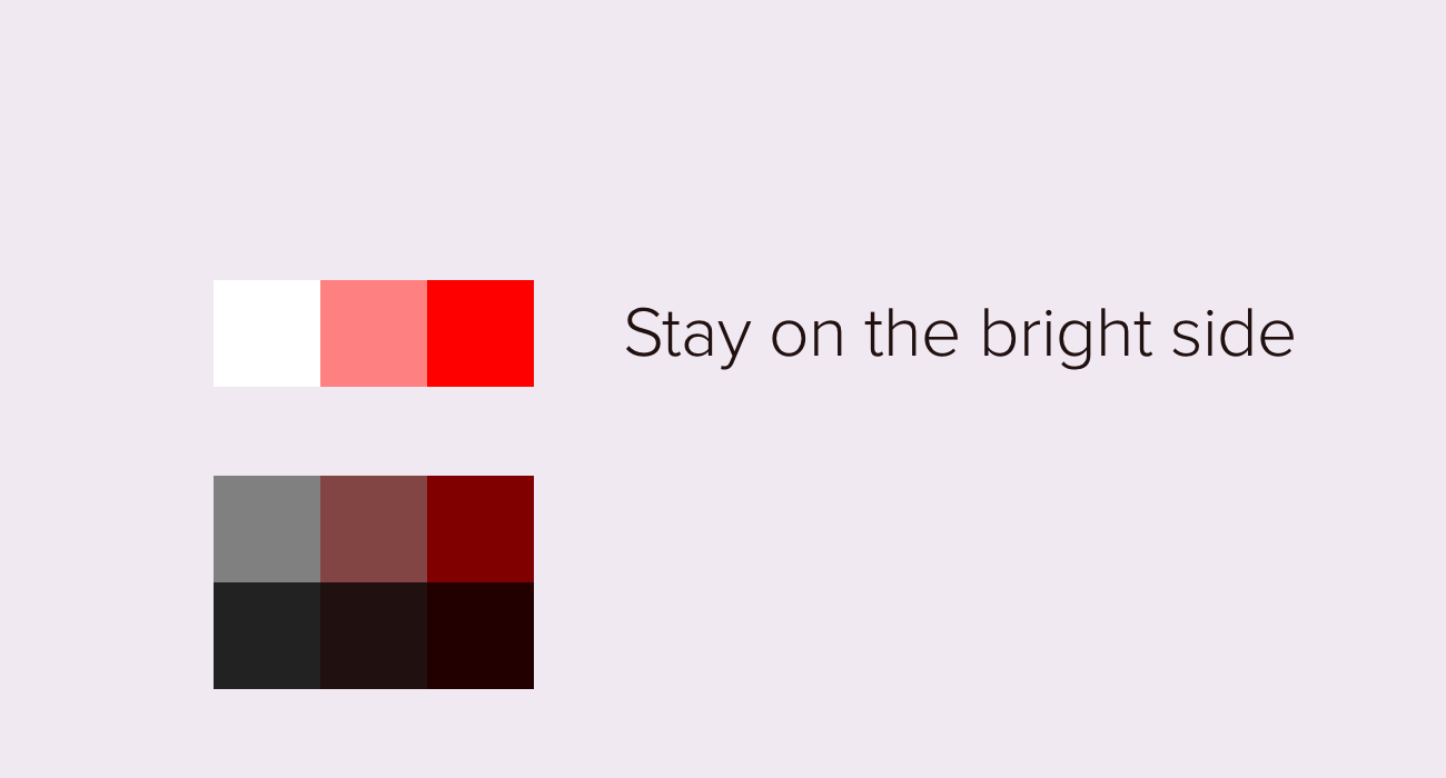
Choosing from the top-right corner of the color picker can be a safe way to find appealing color combinations for visual design. In nature, dust and dirt add gray and black to colors. Although adding gray or black to colors can add weight to a design, using too many heavy shades can subconsciously convey dirtiness. I try to create designs with clean and bright color schemes.
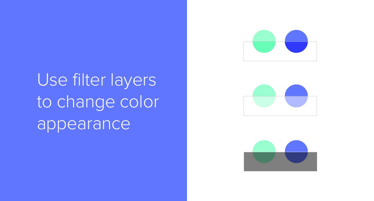
Imagine a white sheet of semi-transparent paper. Think how it would “lighten” any colors we put underneath it. We can mimic this in Sketch by creating what I think of as “filter” shapes. Using opacity, blending modes, or a combination of the two, we can lighten and darken colors with white and black filter shapes. Sometimes, when working on UI projects, I use this technique to temporarily lighten or darken whole areas of an interface. This is quicker and easier than changing colors individually, and it maintains the harmony and relationships between colors.
The illustration above shows:
- Black layer, Overlay blending mode, opacity 50% (increases saturation)
- White layer, Normal blending mode, opacity 50% (lightens)
- Black layer, Normal blending mode, opacity 50% (darkens)
When deciding on background colors, as a first step I like to take the foreground color and lighten or darken it. Rather than choosing a neutral gray (i.e. lying between white and black), choose a slightly warm or cool gray to give objects a human or mechanical feel.
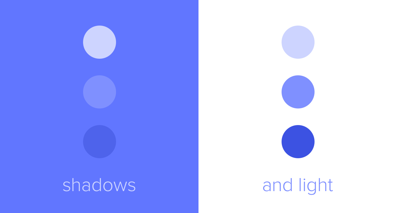
Finally, remember the effect that light and dark have on our perception of visual depth. Against a dark background, lighter colors will appear to come to the front; while against a light background, it’s darker colors that are foregrounded. I often think of this in terms of sunlight: in the illustration above, we can imagine the sun directly illuminating the circle on the top left, and the circle on the bottom right being backlit by the sun and forming a silhouette.
More Sketch Tips
- Sketch Tips Part 1: Objects, Layers, and Artboards
- Sketch Tips Part 2: Editing and Exporting
- Sketch Tips Part 3: Composition, Light and Shadow
- Sketch Tips Part 4: Symbols
If you'd like to learn more about the fundamentals of UI design, explore our UX Academy Foundations course.


%20(1)-min.png)


